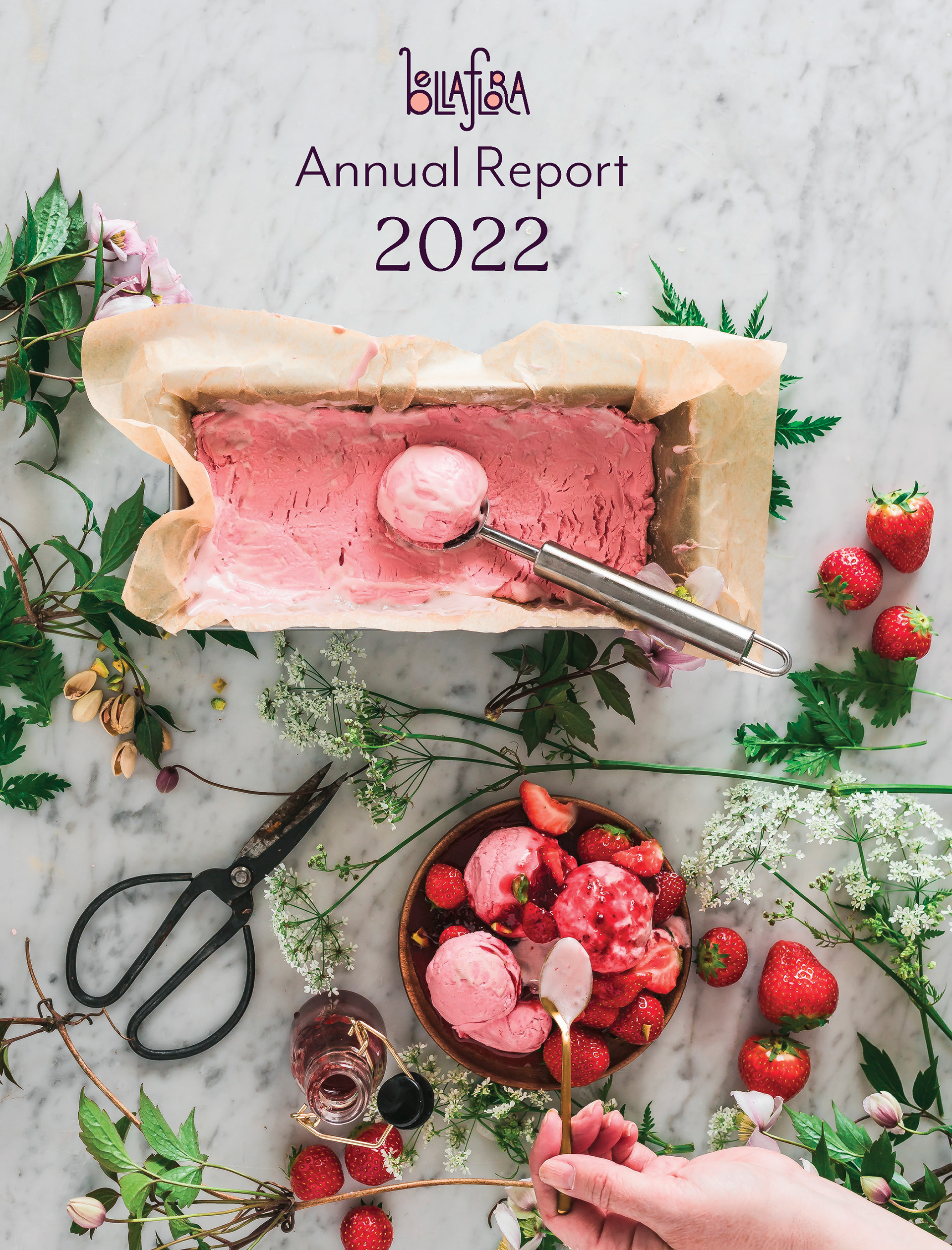

For our annual report, we needed to design a cover, a president page, a company page, charts and graphs, as well a balance sheets page. The company page must include a jump line, and overall we need to include headers/footers/siders and headlines, page numbers, and various extras if we so desire (or if we have the time, oof, what a precious thing that I wish I had a better concept of.)
Research and Brainstorming

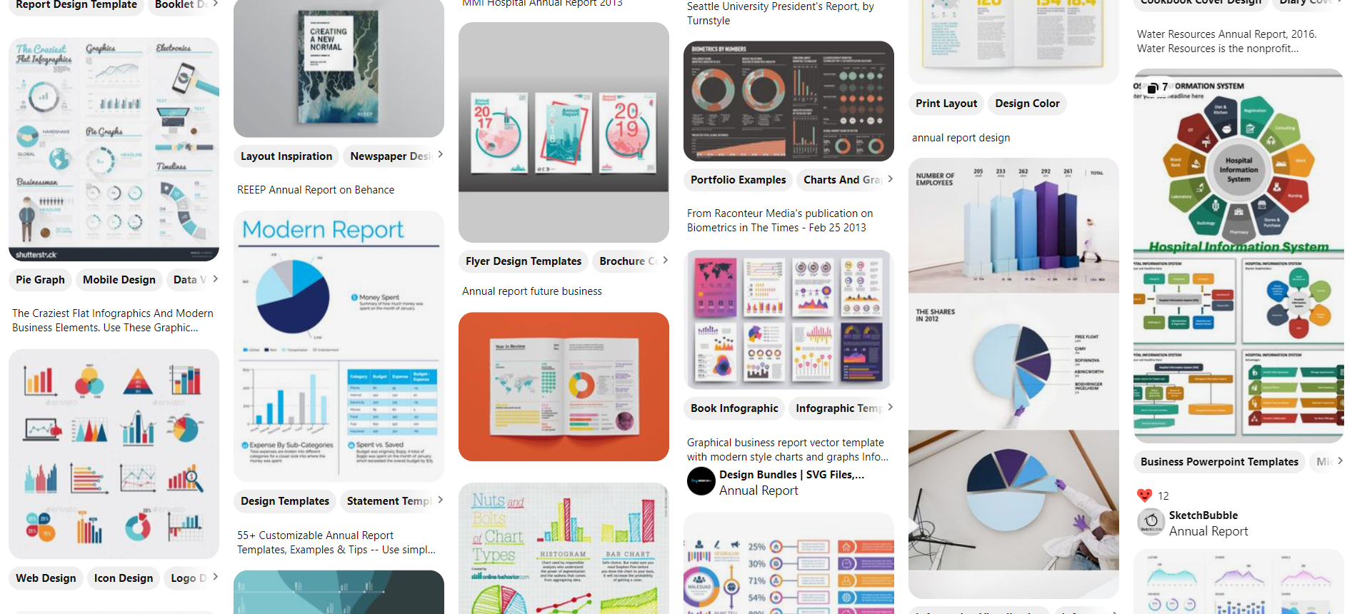
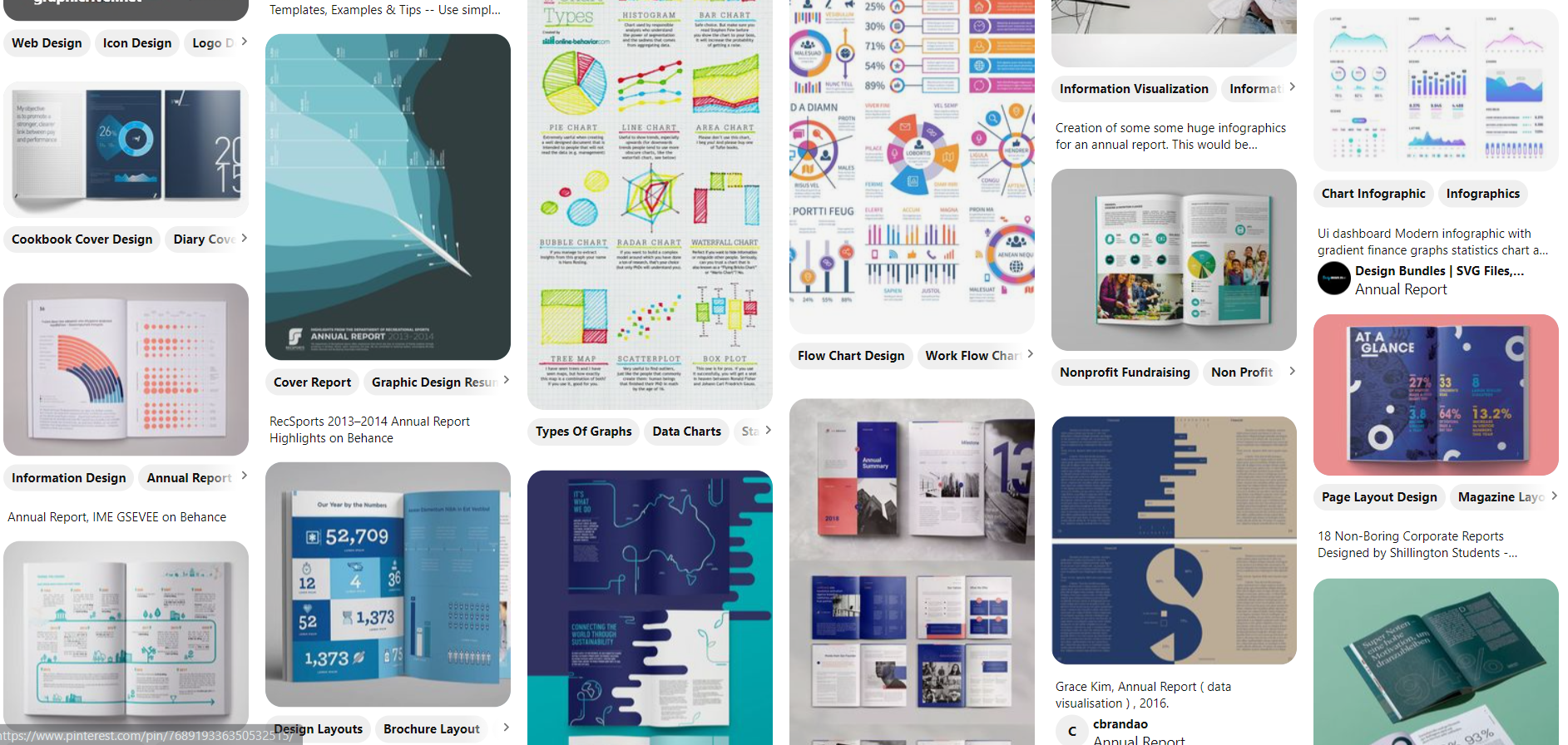

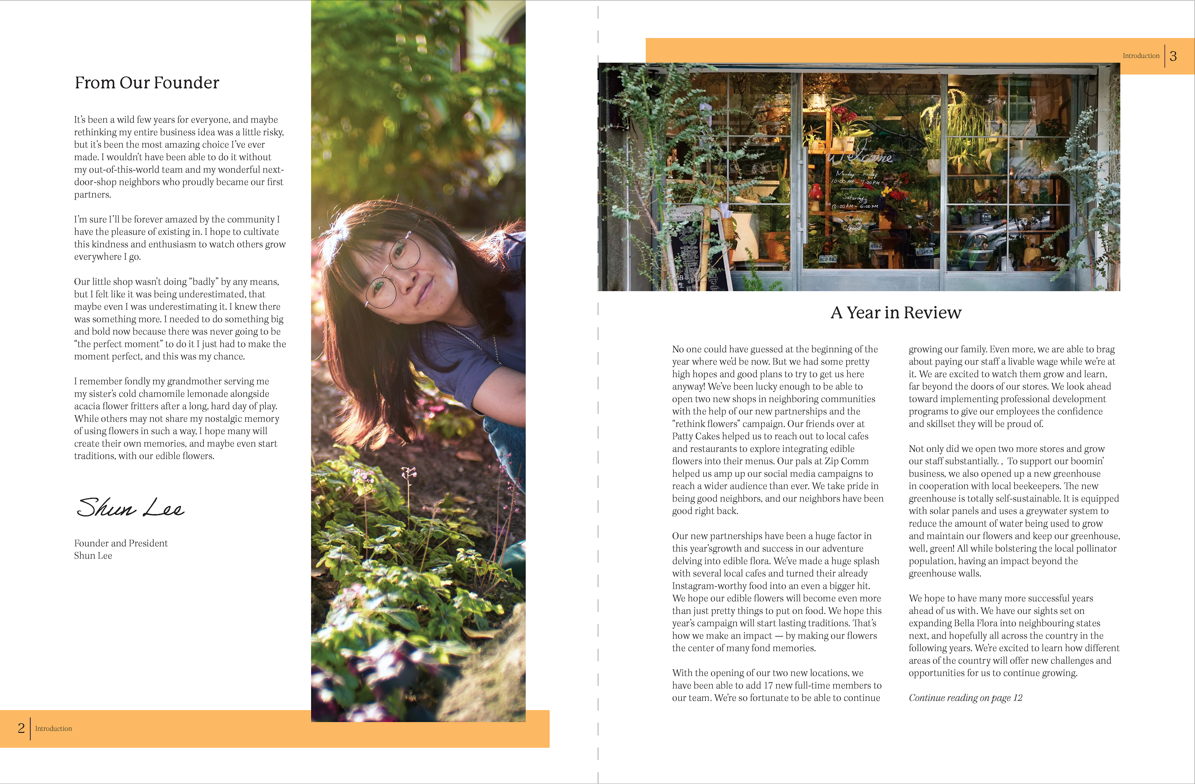
I had a difficult time finding Annual Report covers that had a similar feel to what I wanted to give off. Many newer ones I was seeing were very graphic-heavy while most of my collateral has been very photo heavy.
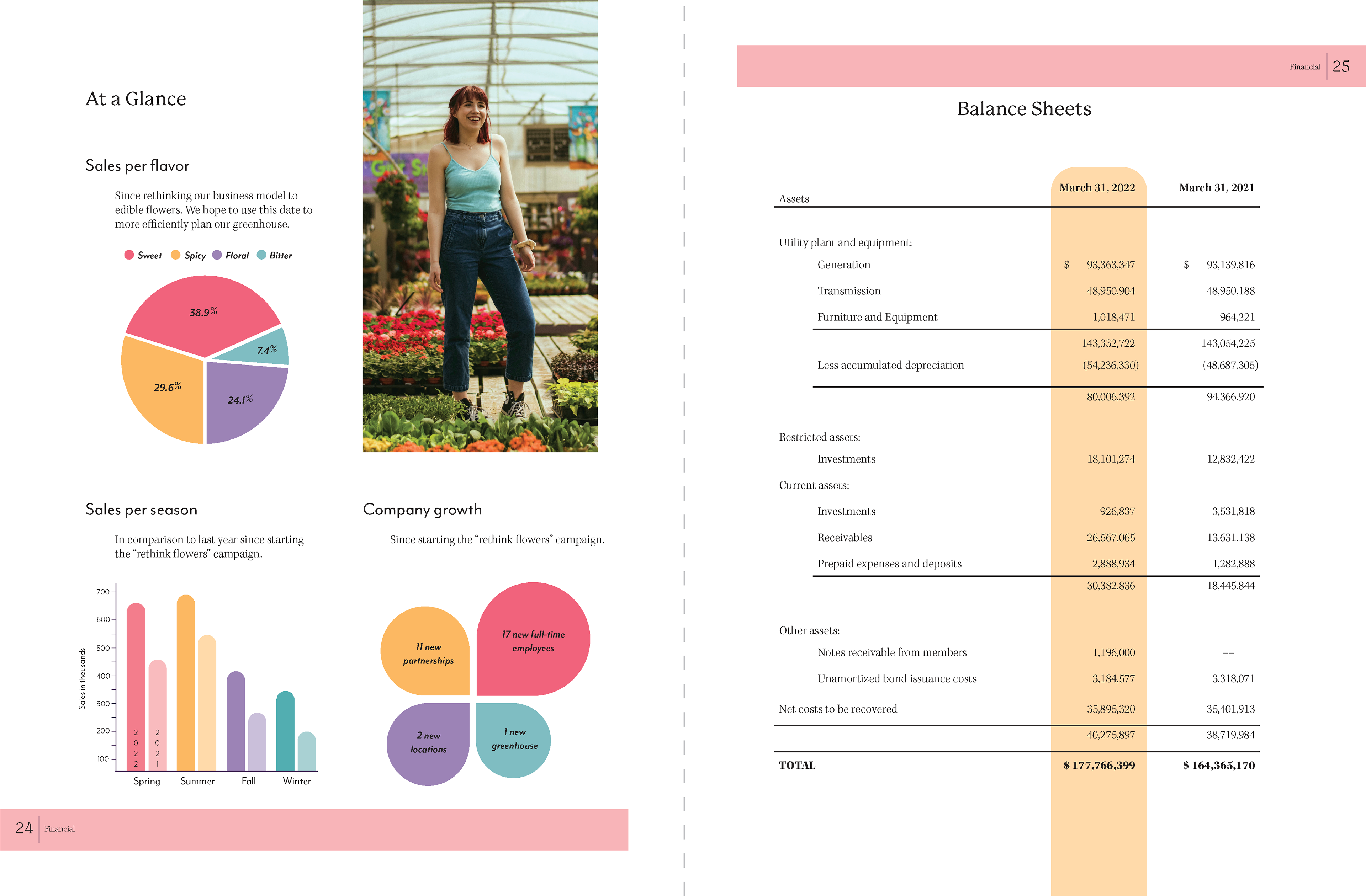
Charts and graphs are also intimidating as hell, so I threw those into my interest board when they popped up, which I'm very thankful I did, thanks past me.
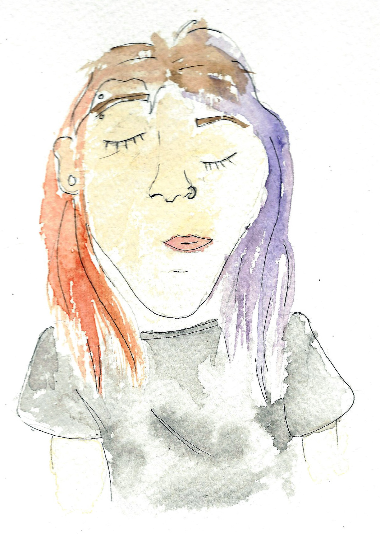
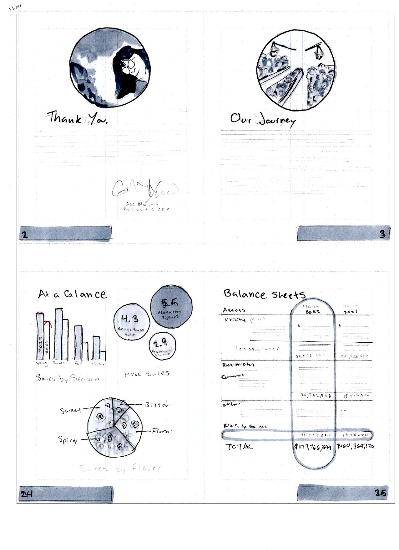
Sketches and Doodles
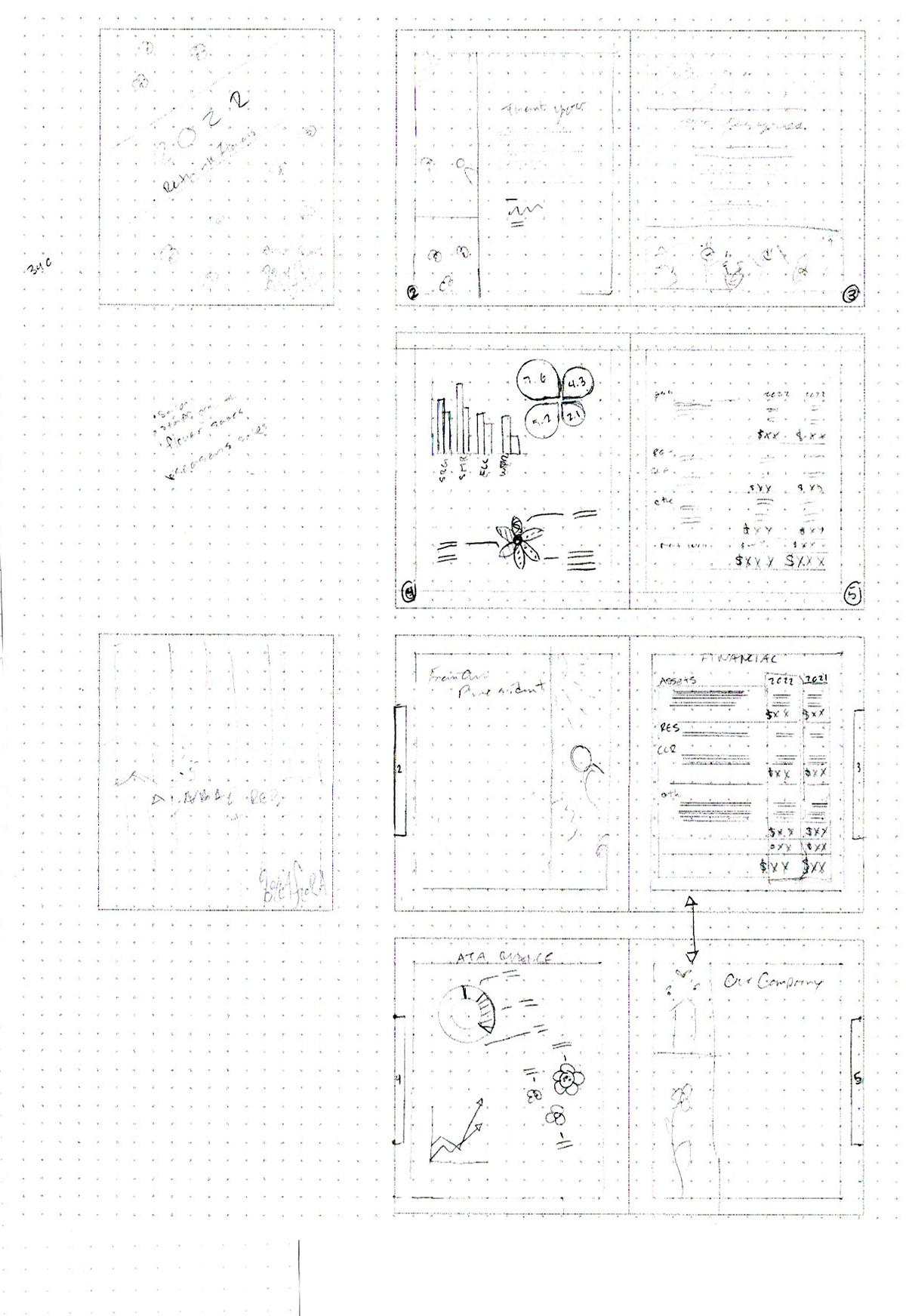

So I guess I have actually no confidence in making a shell. I feel like I'm always told "nail the shell down" and deep down I'm crying because that's what I thought I was doing. I think my problem is I create a "shell" (or what I think is one) then just start drawing everything on top and not making it it's own thing to show my process n such.
In the past color coding a form helped me nail a layout and spacing and all the good stuffs, but it wasn't as helpful in this situation for me for the balance sheets, but I'm glad I tried to do it anyway. My first ideas for the graphs where definitely the strongest and I ended up going back to them when it came to crunch time.
Thumbnails
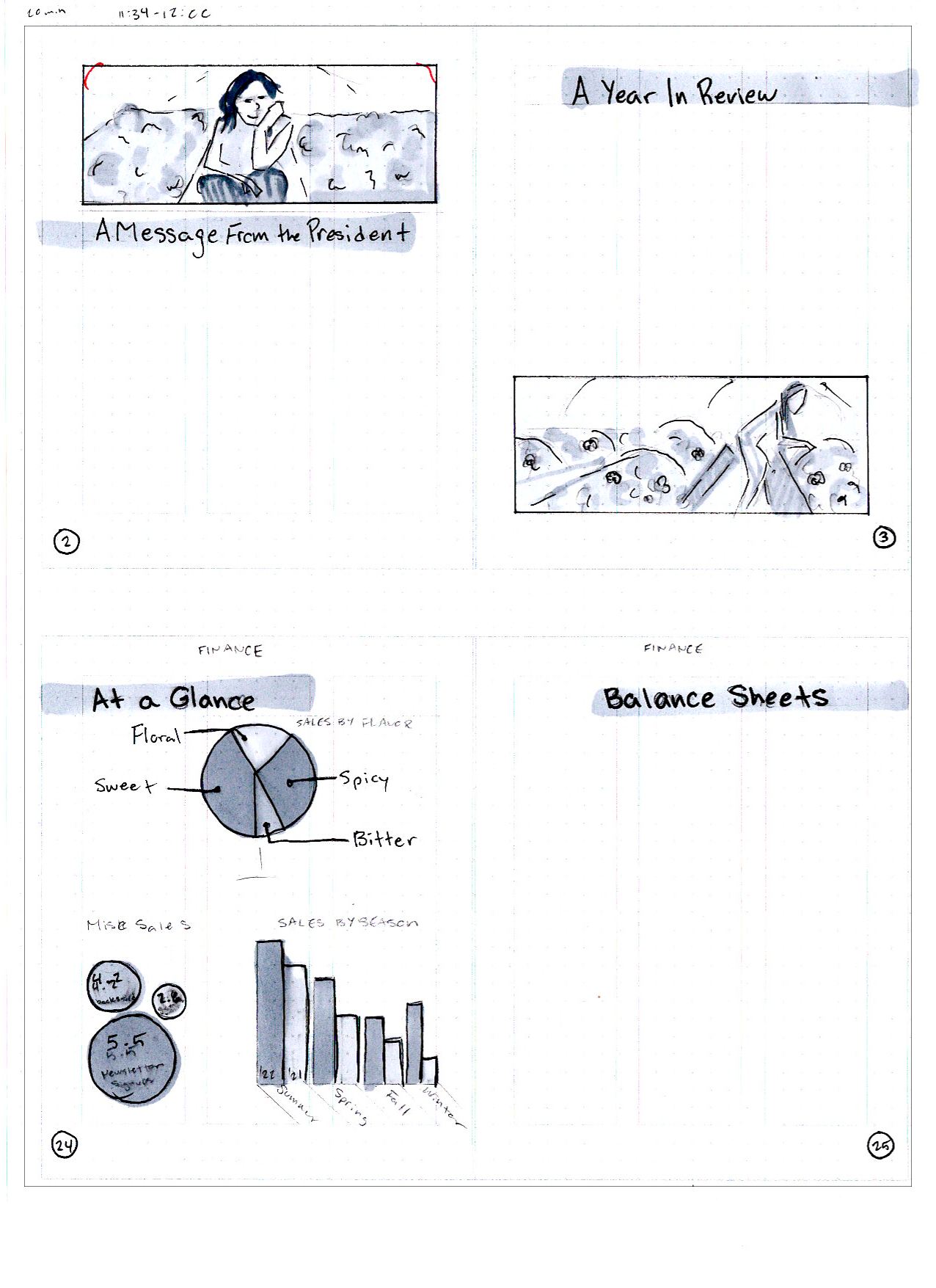
All hail the marker overlords, we shall accept them as our leaders, follow by their holy example.
Every time EVERY time, I underappreciate the value of my markers, and every time you step back, and it almost always enhances it. They're intimidating as hell, but they're never not gonna be intimidating until you mess all you things up with it and learn all the ways to not use em, and I'm glad I did that earlier, rather than now. (Not that I'm still learning how to not use em)
Computer Progressions

I did more progressions than this, and believe it or not, I have the files SAVED, but times ticking, and I need to choose my battles.
My charts and graphs page needed the most lovens, apart from the obvious missing page that I didn't print out at this time. The things I feel the most confident about seem to be the things that become the least confident thing I have.
Final Digital


We made it, I don't know how I survived, I really wasn't so sure I was gonna, but we did! I did the most work on the charts and graphs page, and during the presentation on Saturday, it seemed that that was the favorite page among them all, aside from the cover.
One issue that was pointed out was that my piechart has some accessibility issues with colorblindness, and my original pie graph with the arms coming off of each section as the label would solve that problem, but either way I should do more research and take greater care in being mindful of how accessible the content I create is, and what I'm doing to help or worsen it, it's kinda my job.
I'm sorry this website page is such bare bones. It huge lesson learned in time management on my part. Thanks for getting through it.