
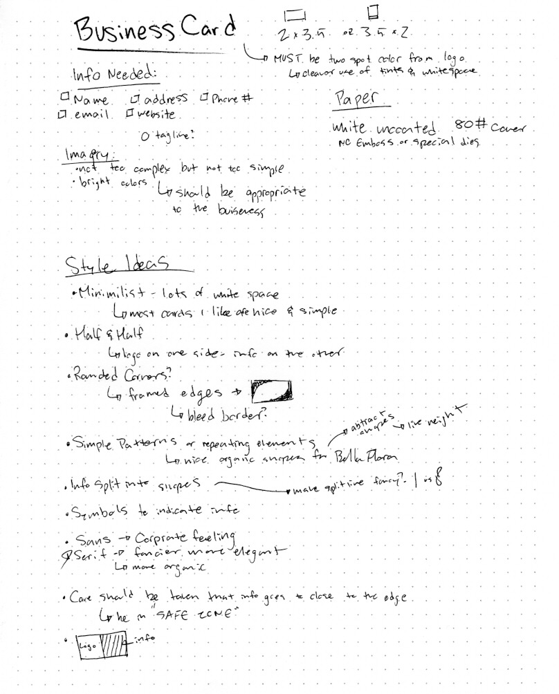
This project was to create a stationery package that included a letterhead, envelope, and business card, all using only two spot colors.
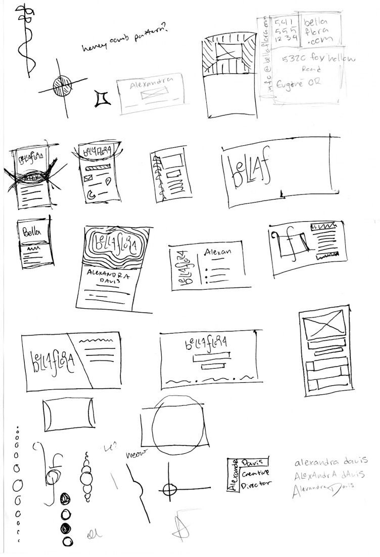
Research and brainstorming

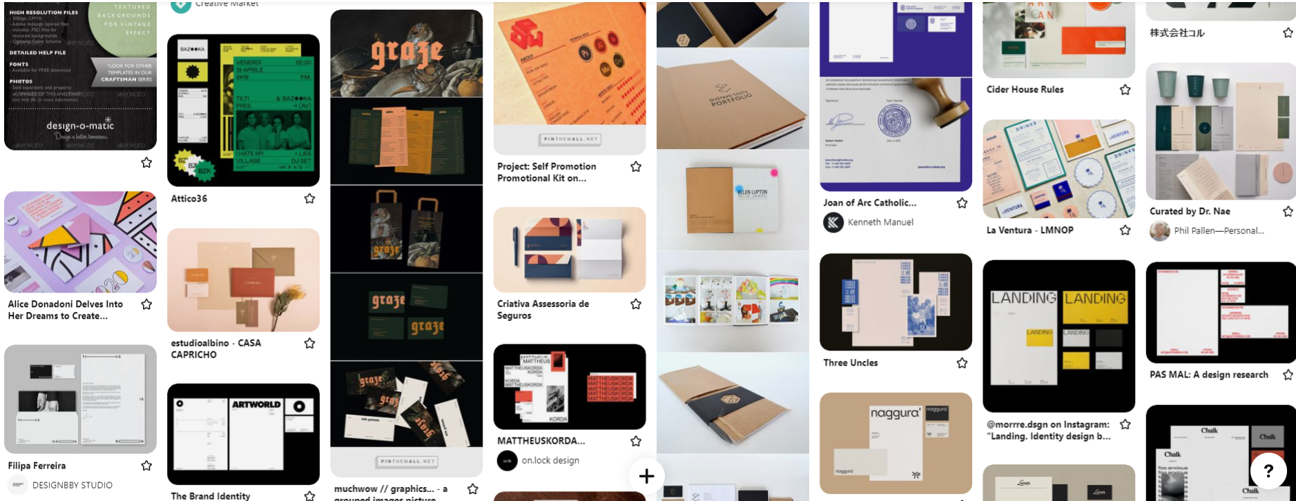

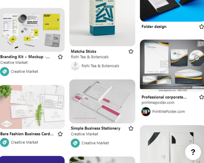

At this point in the semester, I still didn't really know what I was doing (I say that as if I know what I'm doing NOW). Many business cards I found were double-sided (which we couldn't do) or the ones I was most attracted to were odd shapes with special die cuts.
I focused mostly on the business card while doing research and brainstorming, if you get a solid business card down, the rest just sorta comes (and I was really banking on that "just sort of happening" thing to happen")
Sketches and doodles
The hardest part of this project was keeping it simple. I kept feeling like I wasn't doing enough, so I kept wanting to add visual elements, making it become messy and overwhelming (which made ME overwhelmed). It was a big struggle between "is this simple" and "is this incomplete".
I wanted to try to use organic shapes and or circles (because you know, the floral shop aspect and my logo be having circles.)
I've accepted that I'm probably not going to particularly love anything I make for Bella Flora (but don't tell Bella Flora that), but I would be ecstatic if I was able to prove myself wrong in that regard.
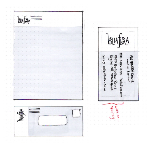
Thumbnails
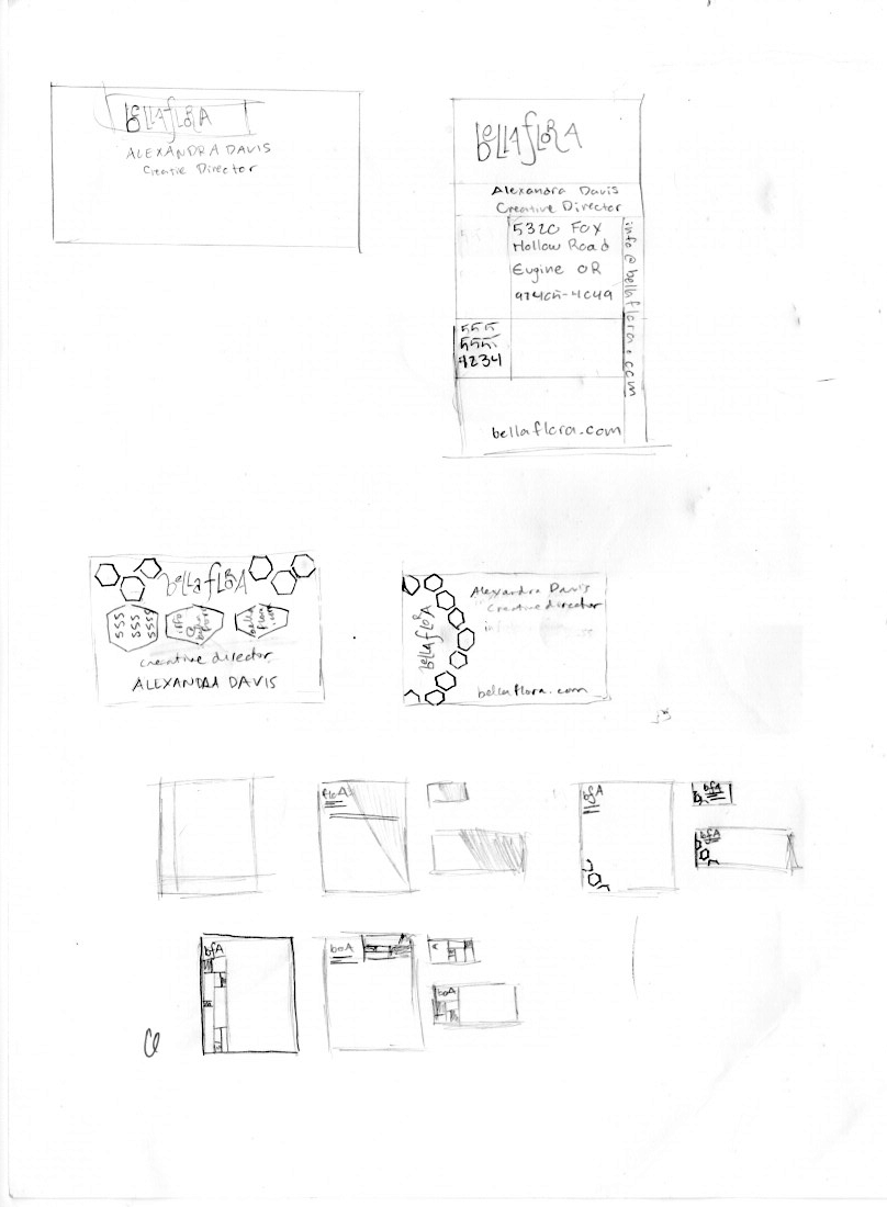
I wish I had experimented a little more with letterhead and envelop layouts at this stage, but in the interest of time and my mental health, I chose to focus primarily on the business card. At this stage, I was still trying to kind of get some organic shapes in with some circle aspects but had largely abandoned many of the more "abstract" designs in favor of simple color blocks.
Because of the stacked nature of my logo, I wanted to try out a mandarin layout, and at the time I felt most strongly about it (partially because it was recommended by my peers) but it didn't look as classy and chic as I felt I wanted Bella Flora to feel, and thought maybe if I got a letterhead figured out I wouldn't hate it.
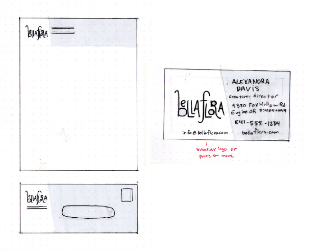
(I hated it even more)
(I hated it even more)
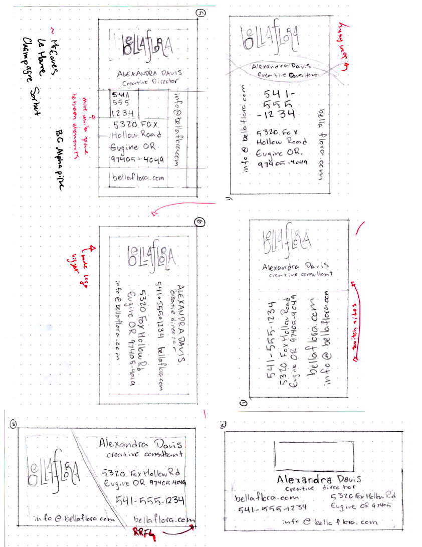
intermediates

The blessed moment when the markers get broken out! Everything seems to feel so much more alive as soon as you get markers to it, even if it's a bad marker job.
As you can see, I stuck with super simple, partially in the interest of time, partially because I just wanted to be done with it, and partially because it looks nice when there's practically nothing there to be complained about. (not that anyone of my peers or teacher is a complainer, but because I'm a complainer, and I never win the argument with myself.)
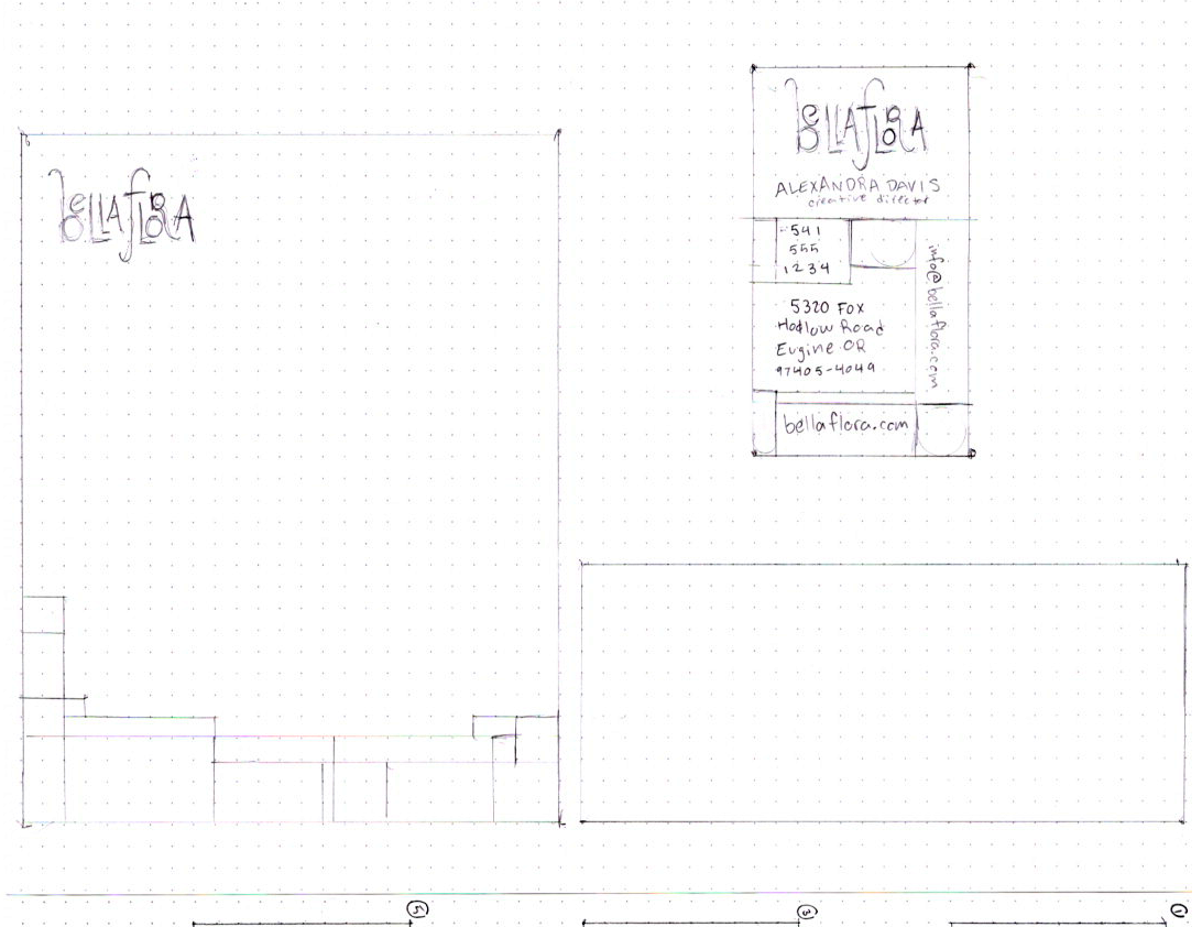
Computer Progressions/Color Applications?
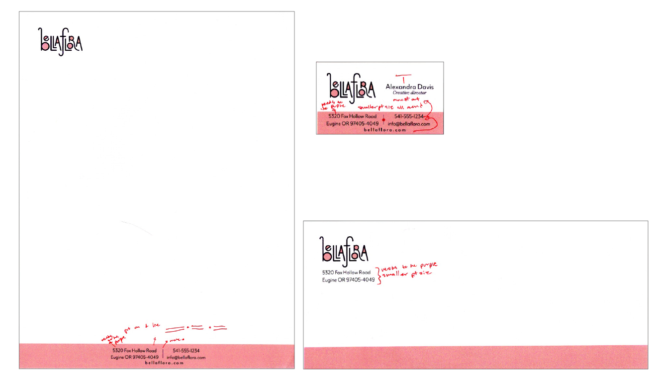
These were them good ol' days before I realized the importance of multiple outputs (did you know: I learn that WAY too late, especially in this class.) I think part of the reason I didn't particularly see the value of doing that at this point was "Oh, I only have two colors anyway, so it won't REALLY make a difference." completely neglecting the fact that tints make it a million times more complicated or that even without tints, there are a million different ways to apply two colors. Thinking two colors makes it easy is like thinking binary is easy because it's technically only two numbers.
Final
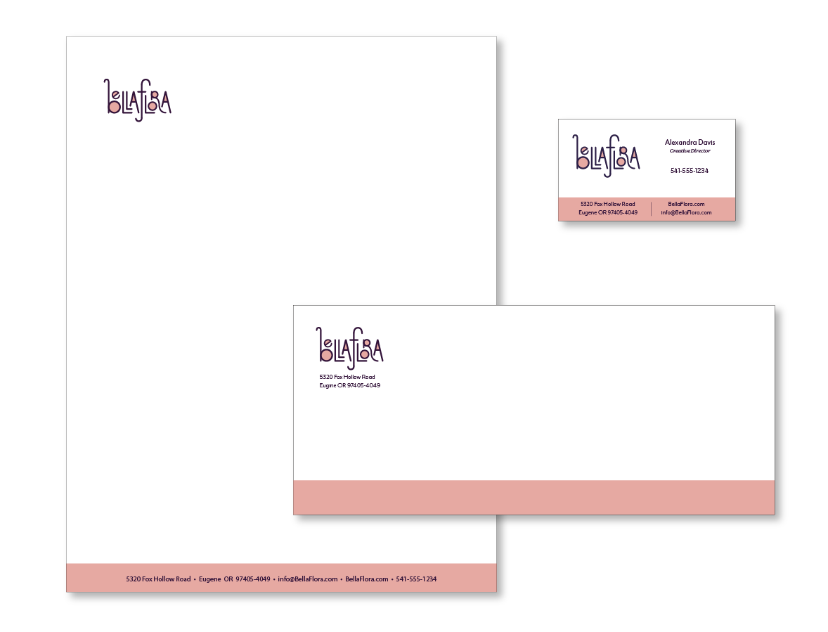
Here it is, the final output, the one I'm going to mount and present.
Looking back, I feel a lot better about it now than I did way back at the beginning of the semester when we were first doing this. Even at the pre-crit I just accepted that I was going to hate everything I make for Bella Flora, and that I was just going to have to push through anyway.
I'm glad I eventually found inspiration for Bella Flora as a whole, though it wont be for another project or so.