
This project was to create a newspaper ad for a travel agency called Tandells. For this ad we needed to have five items/services each with an image and corresponding prices as well as Tandells logo and contact information all packaged cohesively inside a theme.
RESEARCH AND BRAINSTORMING

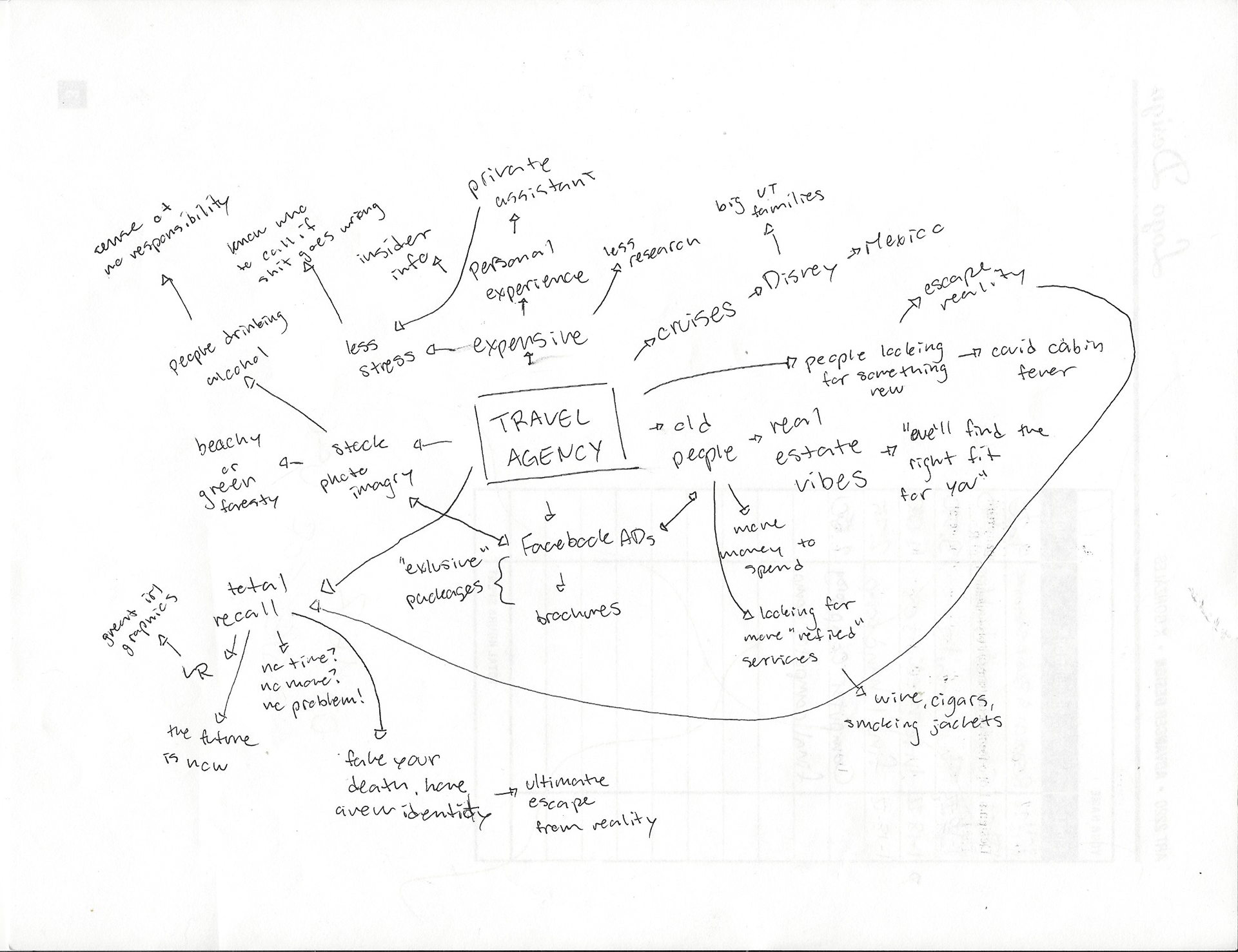

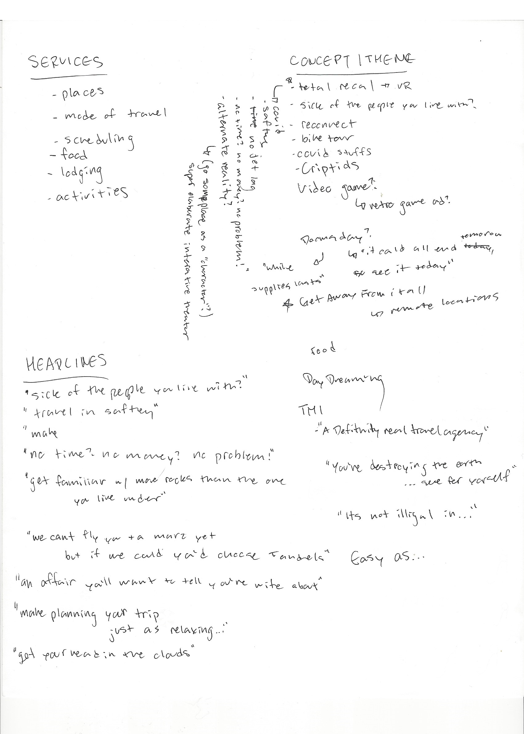
To get started with research, I did a few brain maps to give myself jumping-off points. I wanted to get a feel for how other travel agencies presented themselves and their ads. Unfortunately, I found mostly generic "your text here" templates. I took my search into a different direction and focused more on ads that had multiple items or services at multiple price points, as well as clever headlines and "themes".
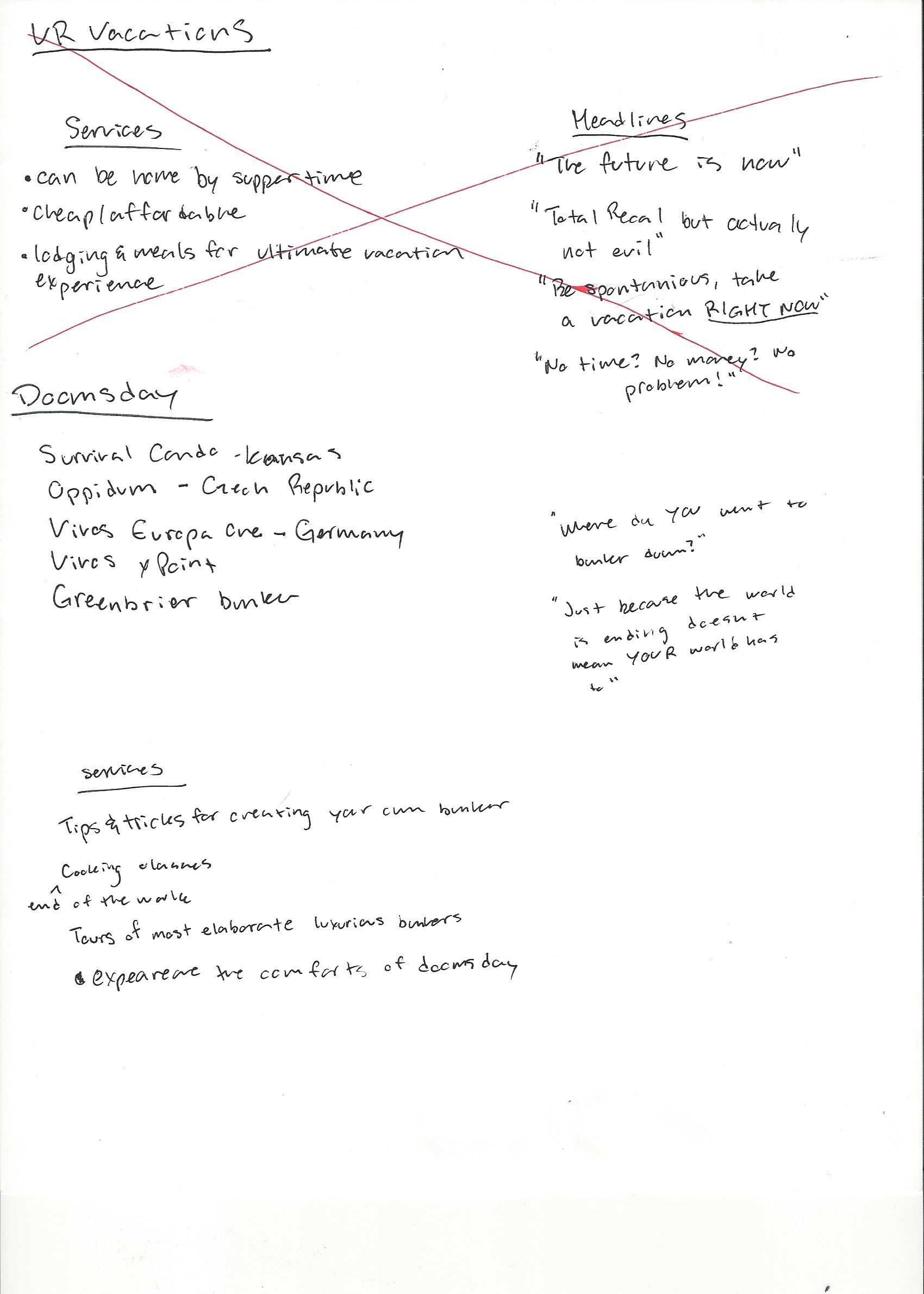
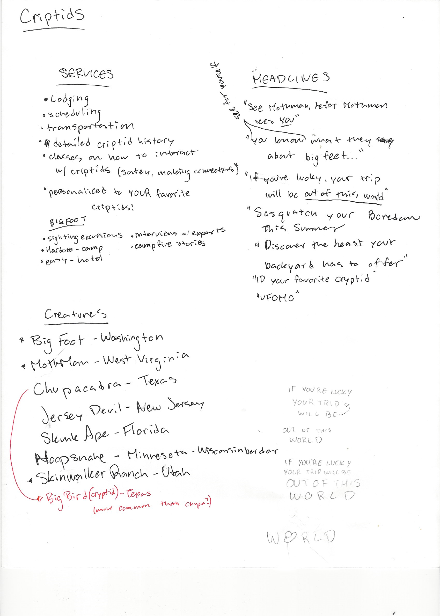
Feeling uninspired, many of the initial ideas I felt excited about did not fall within the requirements, and I had to kill my precious, precious darling (RIP VR vacations "like Total Recall but totally not evil" I'll return to you and explore you further, I promise.) Then, out of the blue, the blessed "auh-ah!" moment. I thought to myself "who could possibly be a bigger inspiration, a bigger role model, than Big Foot himself?" but then the even bigger problem, of finding two more ideas I didn't hate.
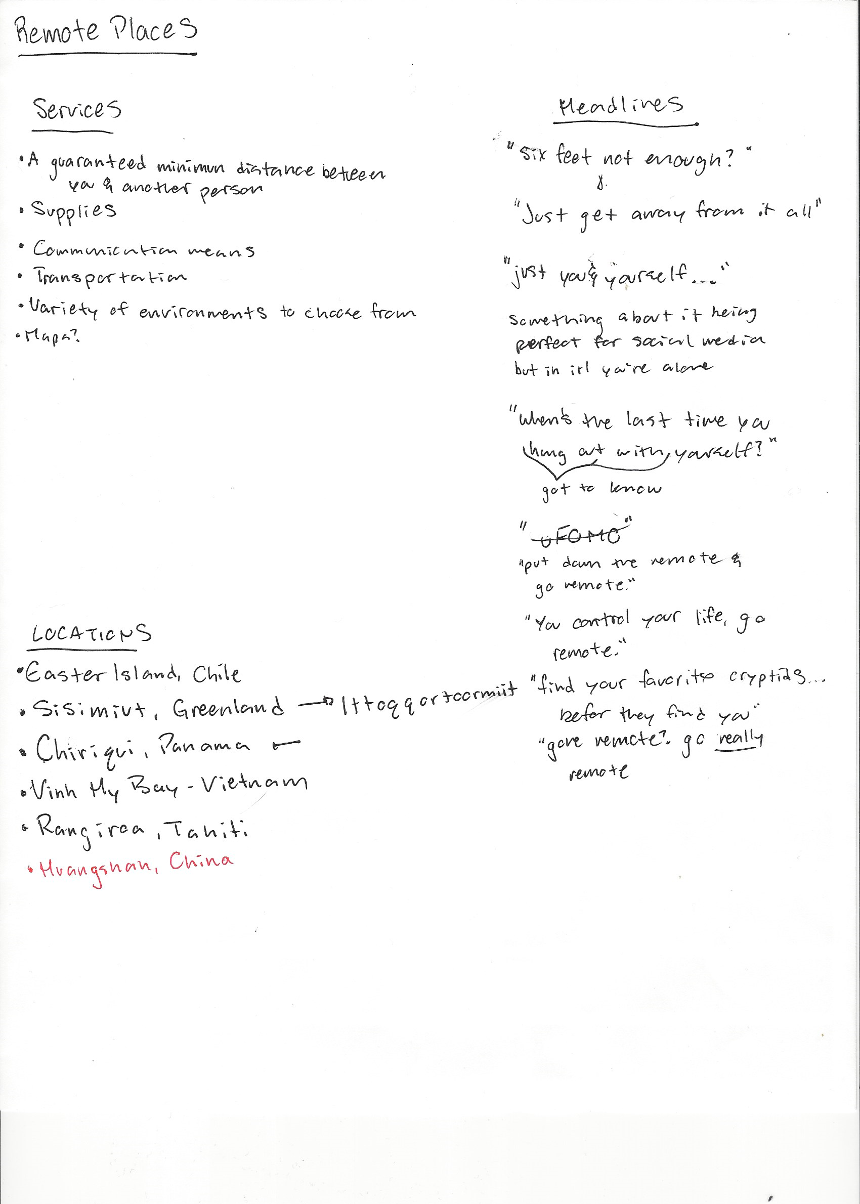
The three that made it are: Cryptids, remote places, and doomsday bunkers.
Sketches and Doodles

Looking at my sketches and doodles, I think it's clear to see which one I was already drawn to. I struggled with making the layouts different across the bored, and I think they're pretty boring. In the beginning stages, I always want to play it safe, which is silly since it's the best time to be big, bold, annoying, and wrong.
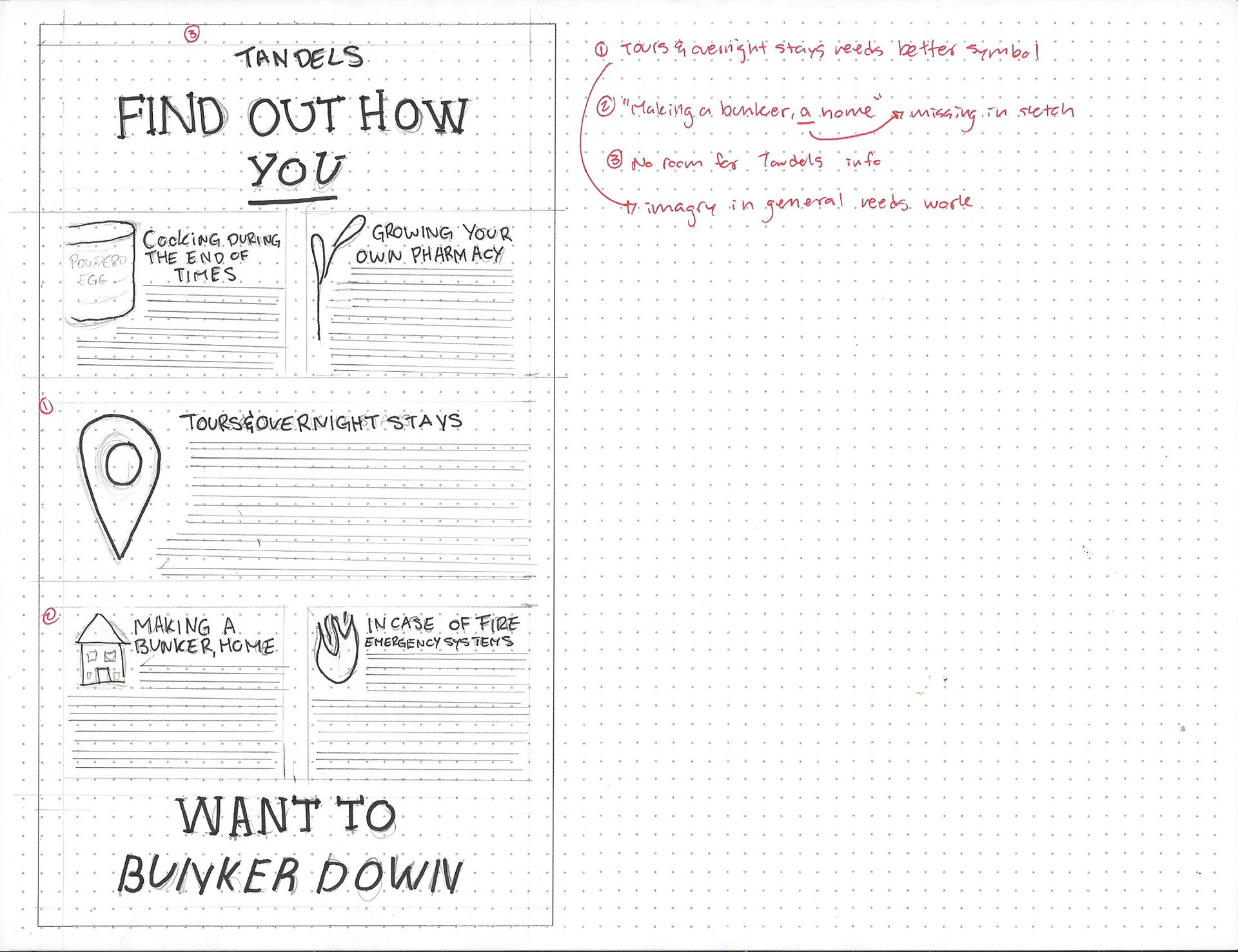
For my bunker theme, I thought it would be fun to have a fallout shelter underground blueprint type style, but quickly realized that it was far out of my ability.
Though "Just Get Away from it All" is generic, I really thought I did a big brain move by wanting to have a LOT of white space around the headline, but it didn't translate as a big brain move on paper.
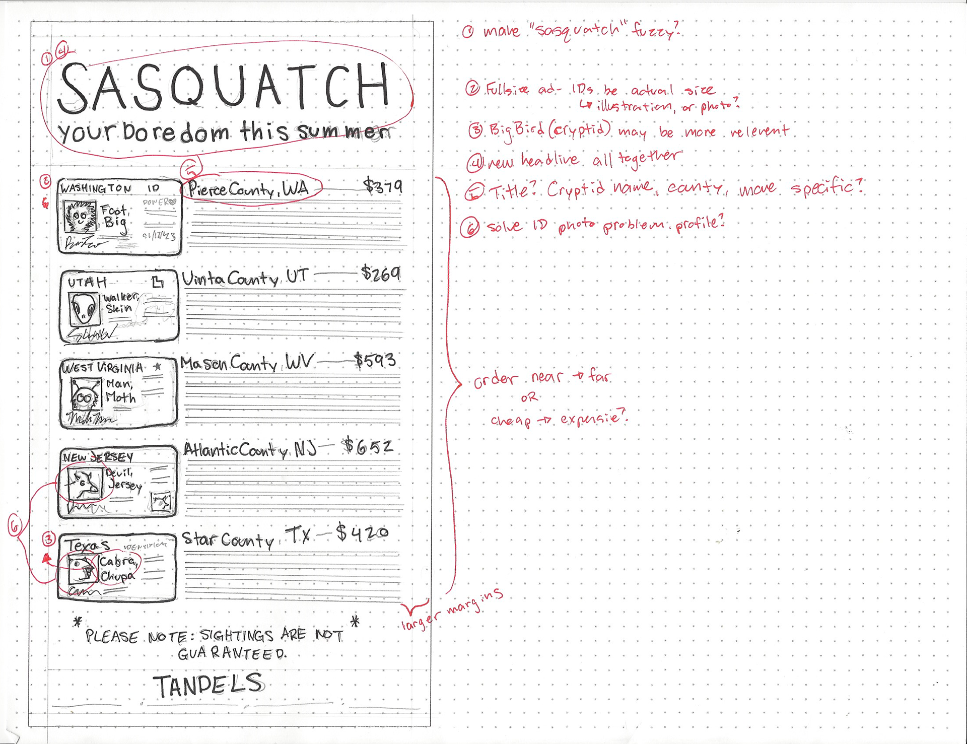
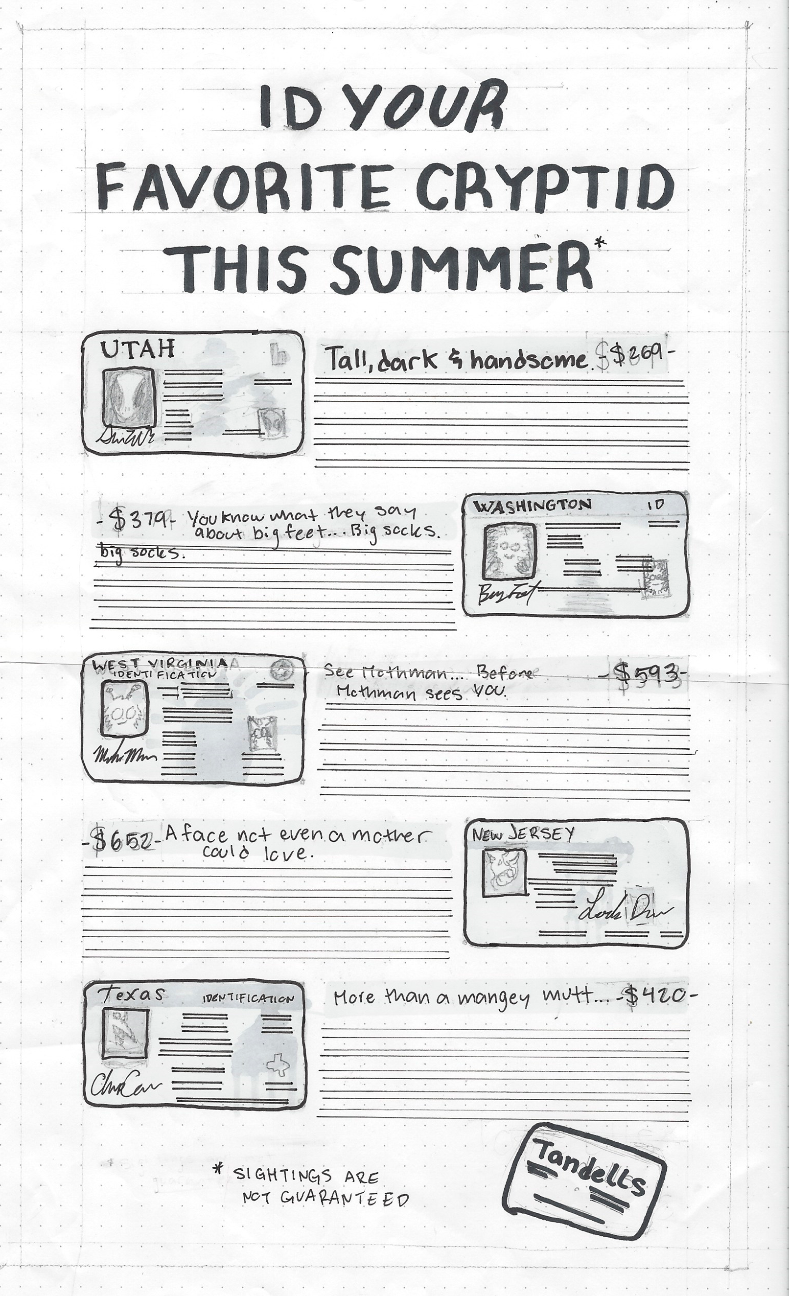
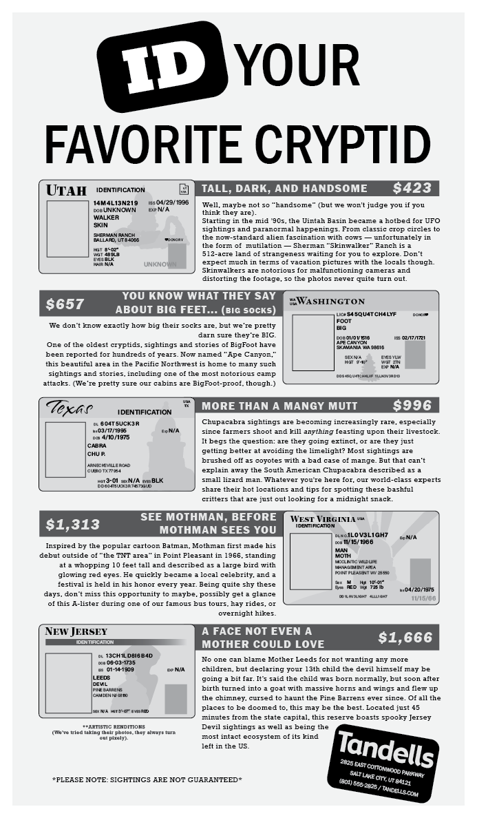
Pretty early on I thought of the ID's for the cryptids, but my original plan was to just have three cryptids with two services, but I couldn't quite pin down what those services would be, and how I could tie the images in with the IDs.
I also struggled with having my headlines match the layout or theme across all three.
THUMBNAILS

All hail these thumbnails, the first thumbnails I've felt proud of and wasn't dreading getting a peer review for (except for the bunker one, that one is still pretty sad), but hopefully far from the last, the only thing that'd make it better was if I had the gall to use my markers at this stage (I convinced myself to use the pens as a less-that-half-way-but-still-something point to try and make up for it.)
My "How do YOU want to bunker down" ad is by far the weakest, but was also by far the one I felt least drawn to. It's hard to put work and effort into something you already know you don't want to do, but it's still a good skill to have; life is full of "I don't wanna" and I still need to do it and I should still do it with care.
Trying to force my "just get away from it" headline, it still doesn't work. I changed the layout dramatically from my sketches as well. Looking at examples, though, I noticed that the layout was extremely common. They say "great minds think alike, but fools rarely differ", I don't think we're fools for having similar ideas, but it shows that it's not the big brain moves we're looking for.
I quite like the "sasquatch your summer" headline, it's pretty punny, but it also didn't tie in well with the ID theme. The overall layout is still pretty boring as well.
Luckily I have some pretty darn good peers who gave me some great ideas for the headlines for remote places "Put down the remote and go remote" as well as the cryptids "ID your favorite cryptid"
Intermediates
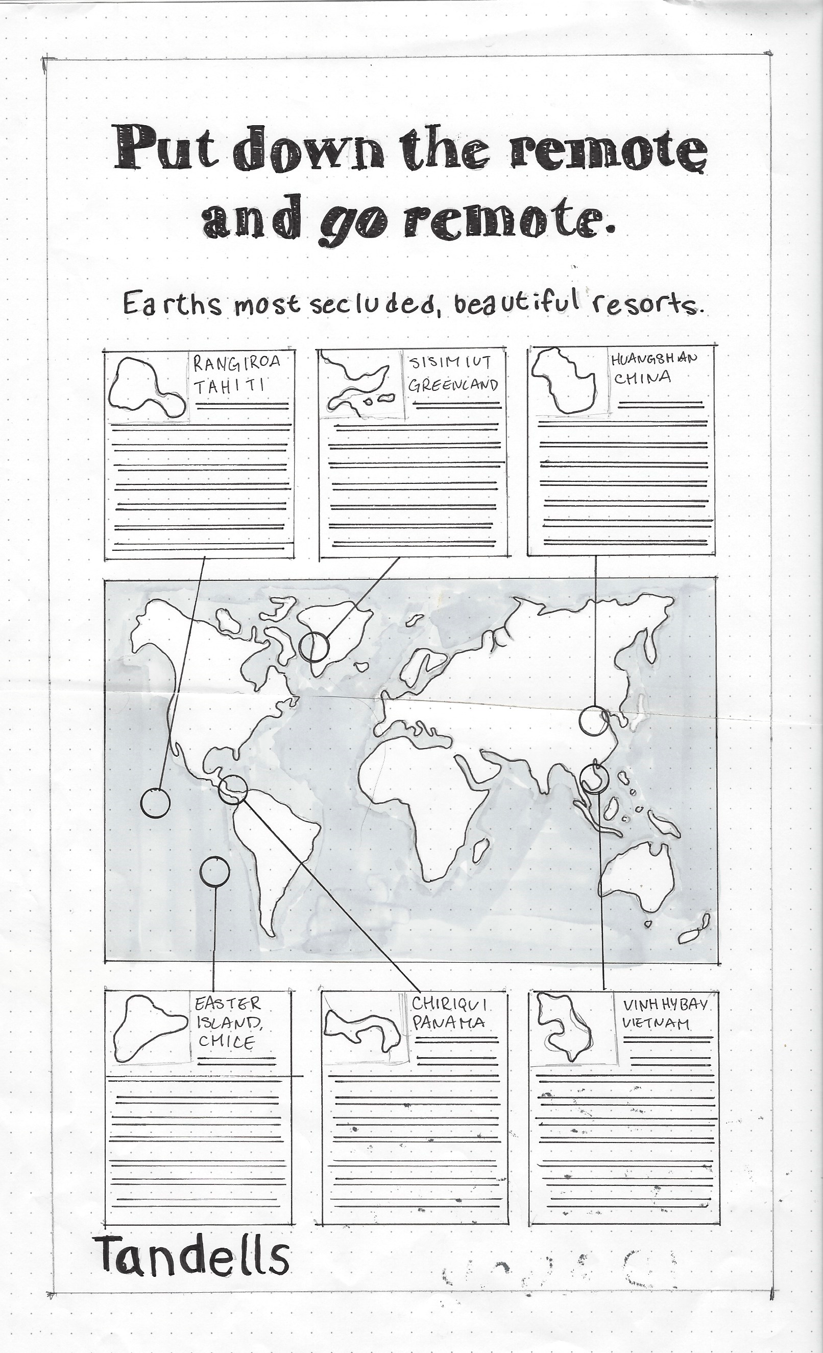
Can you tell I'm still too scared to get adventurous with typefaces? (well, too scared to try and indicate a typeface), but got over myself a little bit with the remote places headline; at this point though I knew I wasn't moving forward with it.
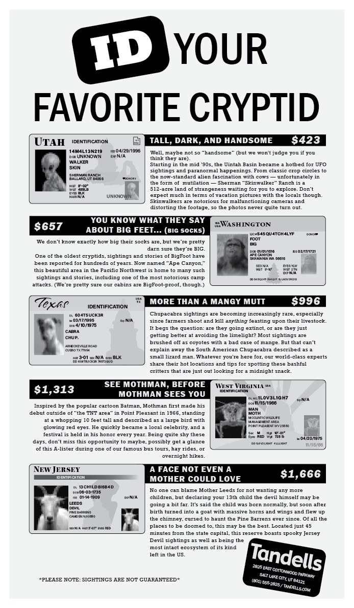
Overall I sorted out quite a few problems with my cryptid one, I decided to alternate the ID's to create a bit more visual interest, as well as playing around a bit more with how I treat "Tandells" and the corresponding information.
Final Hand Comp
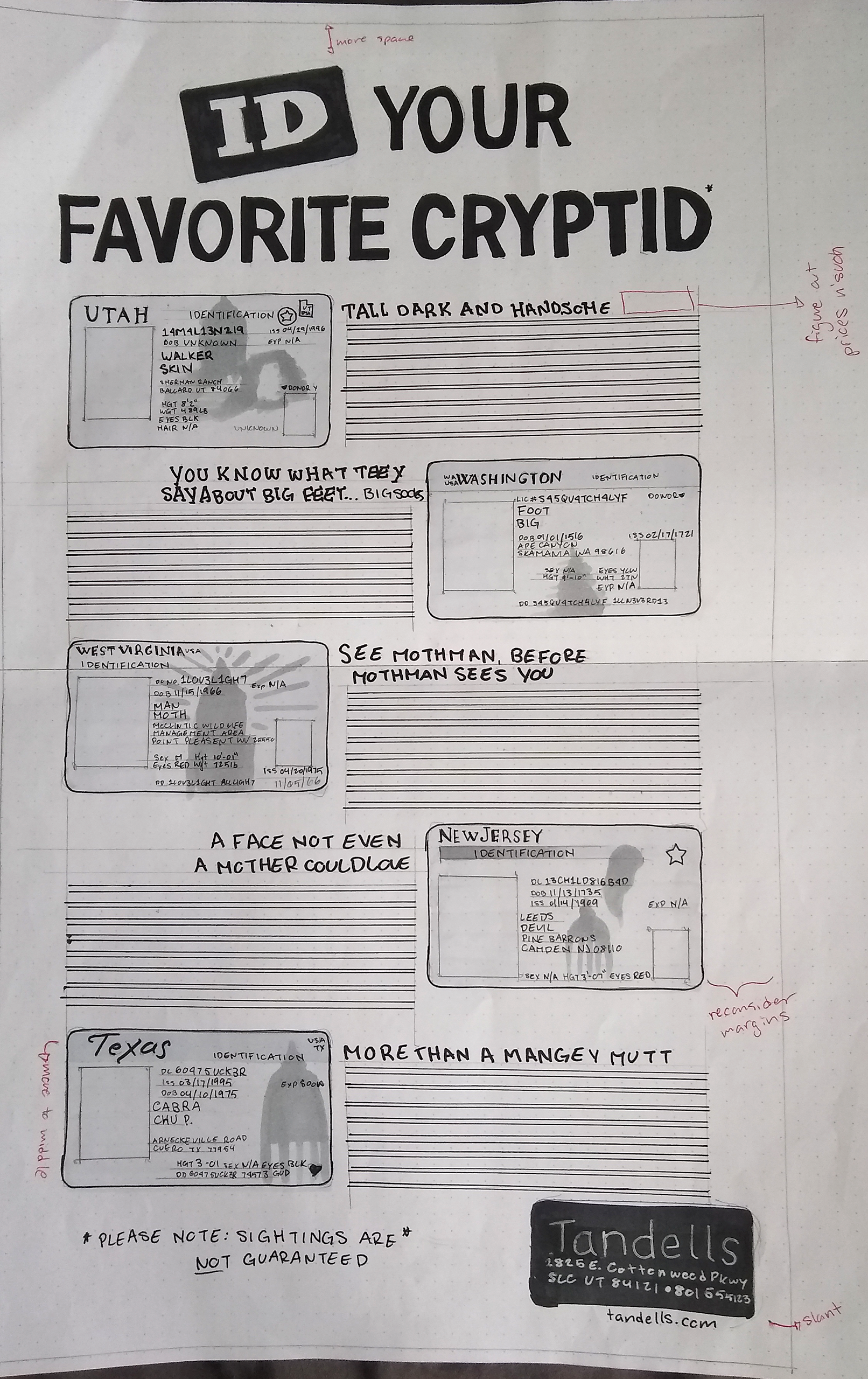
I'm so incredibly proud of this, the tightest hand comp I've done so far, and I'm only going to get better from here! I worked out some of the headlines a bit more, as well as finally played around with the headline treatment. I saw the "we card" sign at a gas station and immediately ran home to write it down. The Tandells at the bottom is still a bit funky (and it doesn't get much better).
Computer Progressions
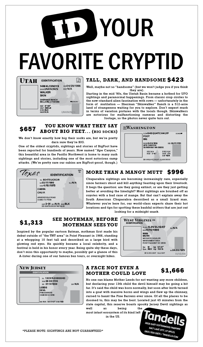

"Print them out and make markups," you said "the computer lies to you," you said, and I still waited until the last minute to print out my computer progressions, which, naturally would have helped me loads IF I didn't do that. Many things also looked nice on my printer, but when I sent it to a printer that could print it full size (ain't no way I'm taking this as an opportunity to practice splicing on anything other than the protective layout paper) it came out much darker and I had lost a lot of my shading because there wasn't enough contrast.
This was also the stage I realized that I absolutely did not think about how I was ACTUALLY going to do my images. Originally I thought about getting proper ID stencils and filling it in, but something told me "maybe don't buy something from a website called "real fake ID's" that would also probably give me a virus." So I stuck with the hand-drawn look. I moved onto the actual cryptids themselves, and tried to find some good photos I could possibly use and pixelate them (have you ever seen a good photo of Big Foot or of an Alien?) but it felt out of place, and was a big slap in the face of "I lost my charm."
Drawing on the computer is not something I've practiced, it's not something I'd put down in a list of my skills, but I'm pretty damn happy with how they turned out. They're goofy little things, but it matches with the ID and ultimately, the goofy lil guys were what made all my preliminary work fun.
Final
