


This project aimed to create a tin-tie style bag for plant bulbs using only three spot colors. We needed to include basic plant care information (how to plant them), the quantity of bulbs and a UPC code, and the standard "distributed by... address, website, phone number" stuffs.
Initial Research and Brainstorming


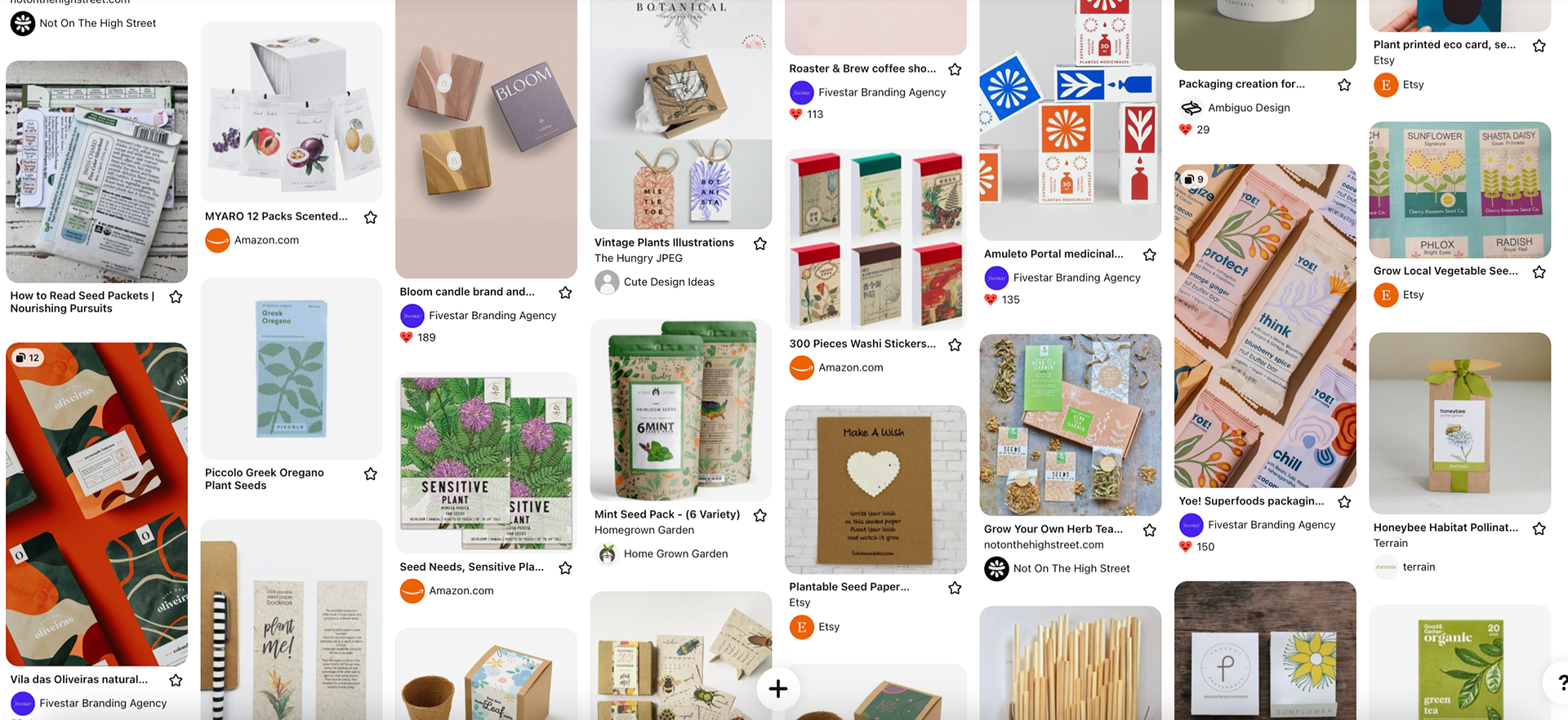

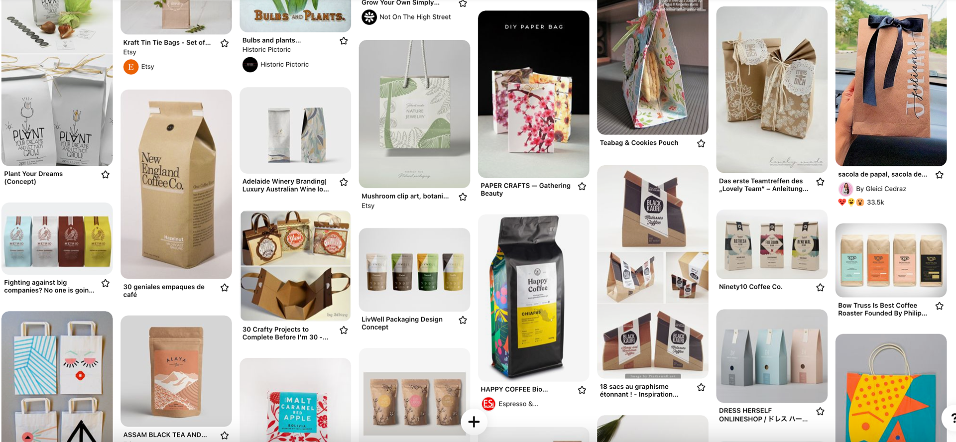
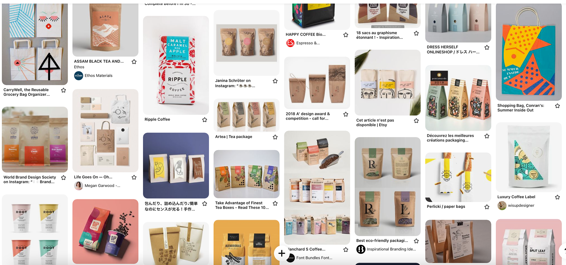
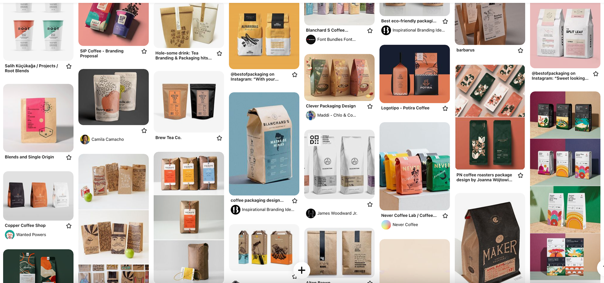
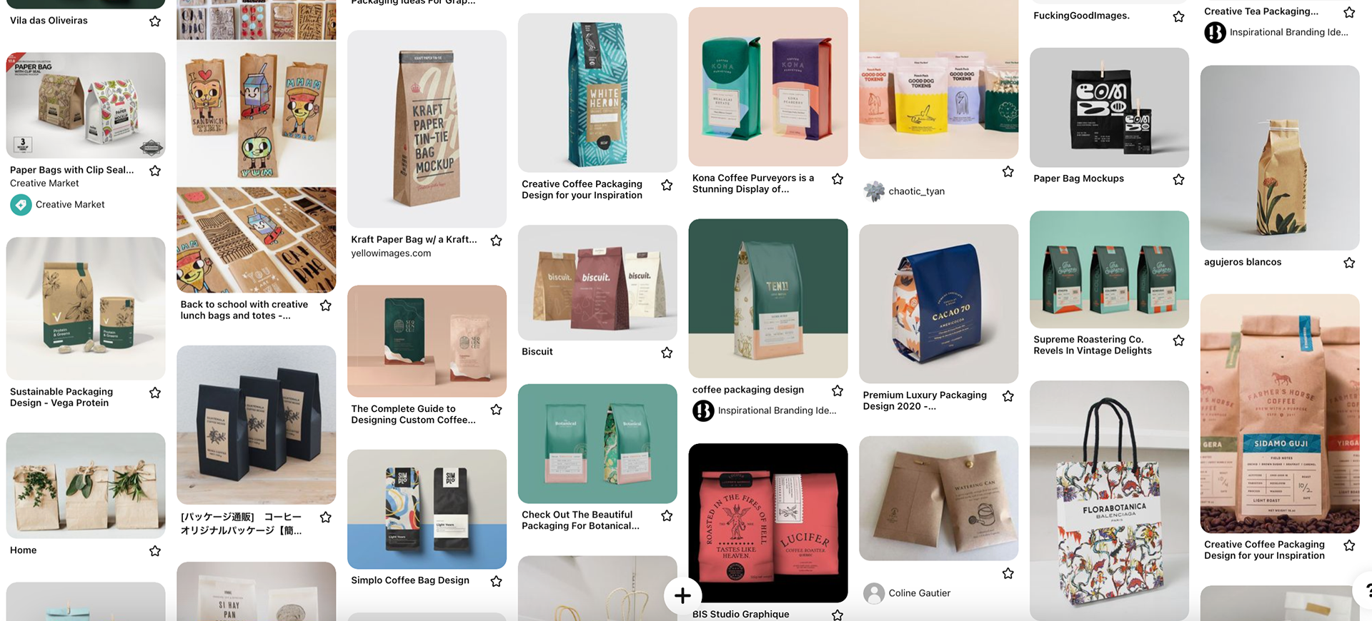


As usual, I went to Pinterest for some inspiration, perhaps an ungodly amount. I wanted to look at a lot of examples of seed packets, and see what sorts of things they were including on the front and the back. I also looked at some packaging designs for similar bag styles, I really needed to see how the sides of the bag were getting treated.
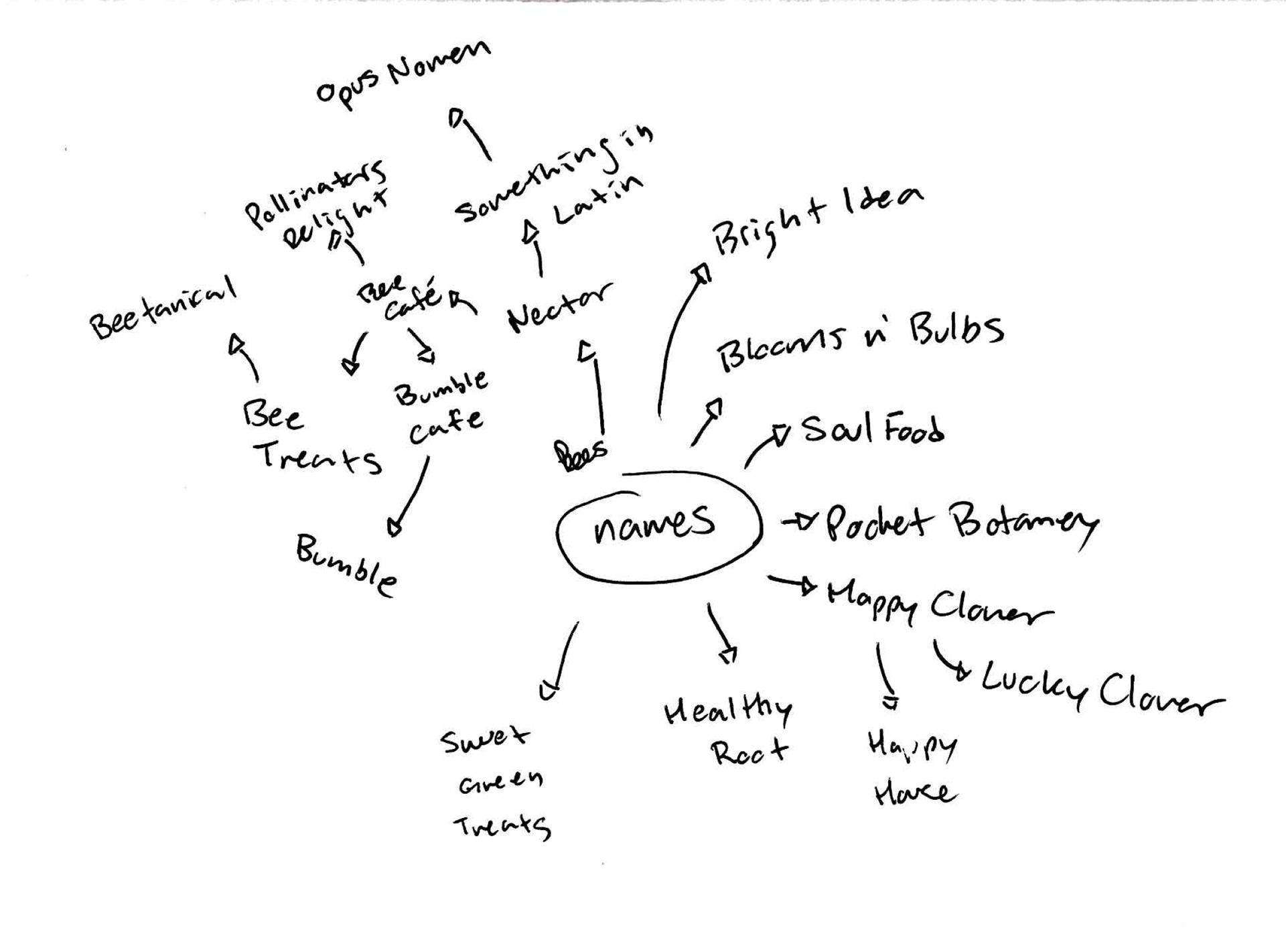
Before, during, and after browsing Pinterest, I worked on some brain maps. I struggle hard with names, and I often discourage myself by googling said name and finding out it's taken (of course, all the obvious off the top of your head ones ARE gonna get got real fast) even though I could have just feigned ignorance.
I was interested in doing house plants, or more specifically bulbs to be planted indoors. Lots of forms on the internet combine "bulbs, tubers, and corms" together so it made it more difficult to really sift through plants that weren't traditional garden bed flowers. (Spoiler alert, it didn't REALLY happen, it did kind of, but, you'll see)
At this point I'm also brainstorming themes or "categories" to help narrow things down regarding sketches and doodles so I have some direction.
Initial Sketches and Doodles
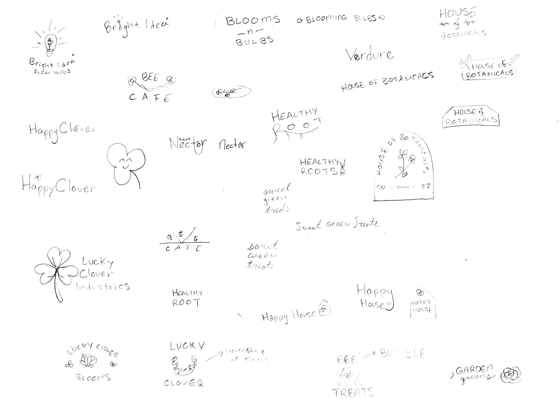
Company logo doodles

Parent company logo doodles
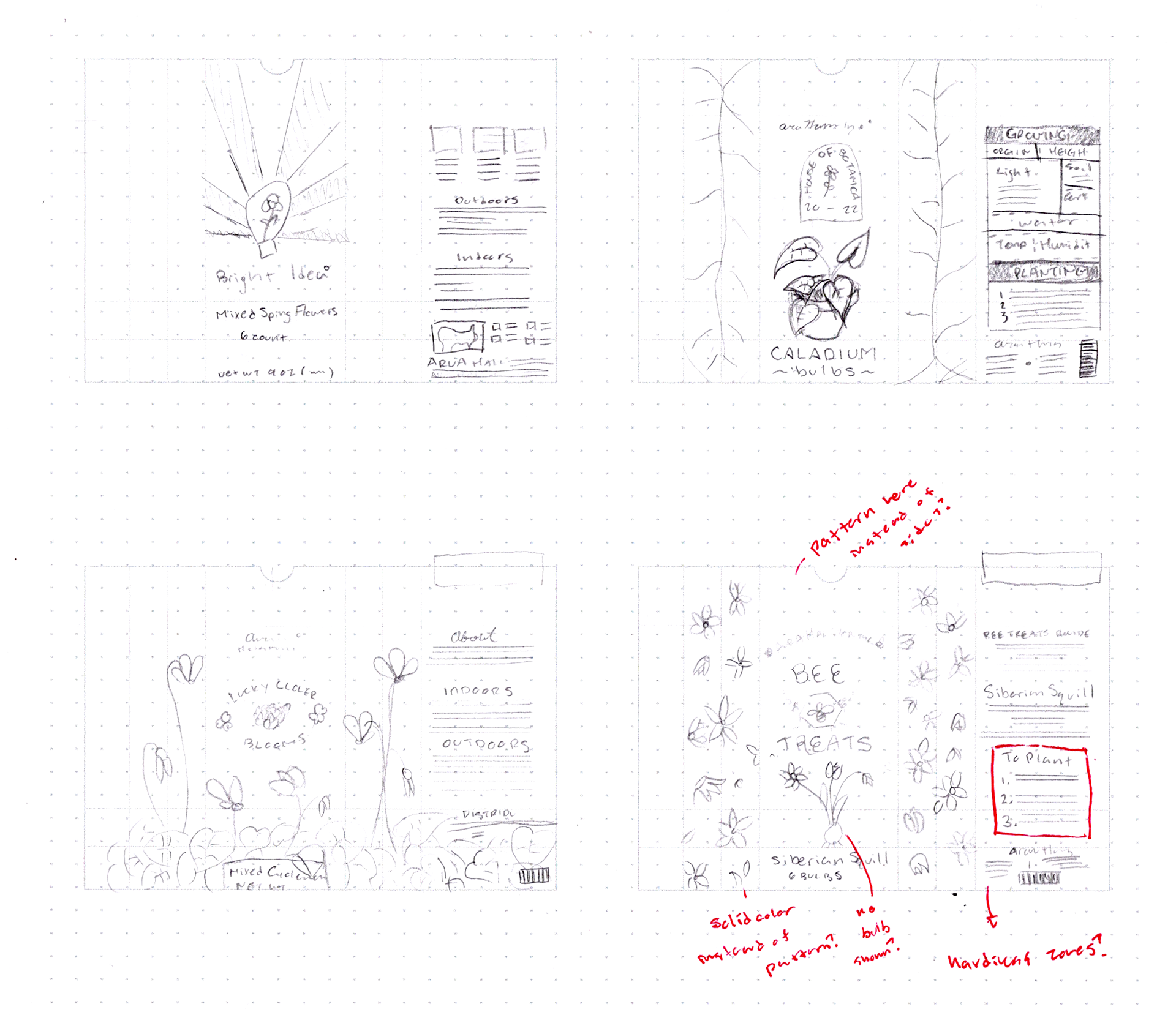
Layout sketches set 1

Layout sketches set 2
The categories I chose to narrow things down were a houseplant, a vegetable or edible thing of some sort, and a more classic flower with "save the bees" "100% compostable packaging" vibes.
I dread creating a look for the parent company name, I'm just not happy with my ability to indicate different typefaces, which is really all I WANT the parent company name to be. Even more than that, it's long, most examples I found in my house of parent company names felt like one four-letter word so it was easier to get creative and funky. When it's long, you can't really use such a funky or ornate typeface. I just kind of gave up on it. Congratulations future self, you just inherited a problem you gotta solve!
I say I dread creating the parent company look, but I'm also not a huge fan of just logo creation in general, it's stressful and nerve-wracking, especially in the real world, where whatever it is is essentialy the face of the company, big oof, that's a lot of responsibility.
I mostly focused on marking up the ones I was moving forward with, I'm sure doing it with everything would have unlocked some secret potential my brain is harboring from me, but you know, time.
Tell me why in the heckeroonie it takes me 3 days to do just this much of sketches and doodles but it takes me one day to whip out thumbnails? Art is so hard because you can't really crunch creativity. With writing a paper or something of the sort, I absolutely can and will crunch that and whip it out in just a few hours, the majority of the pages on this site alone can attest to that, but with creativity? No way.
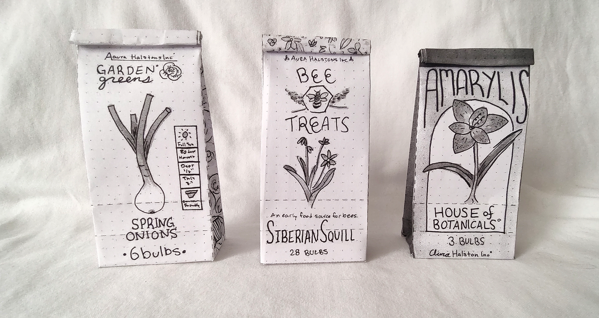
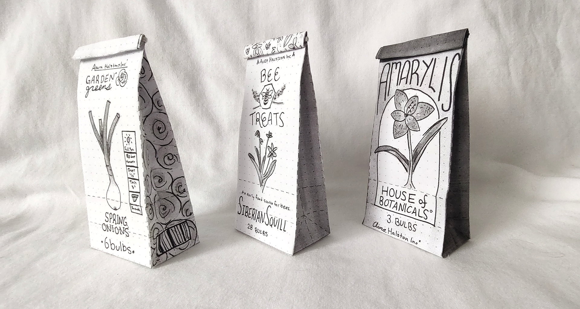
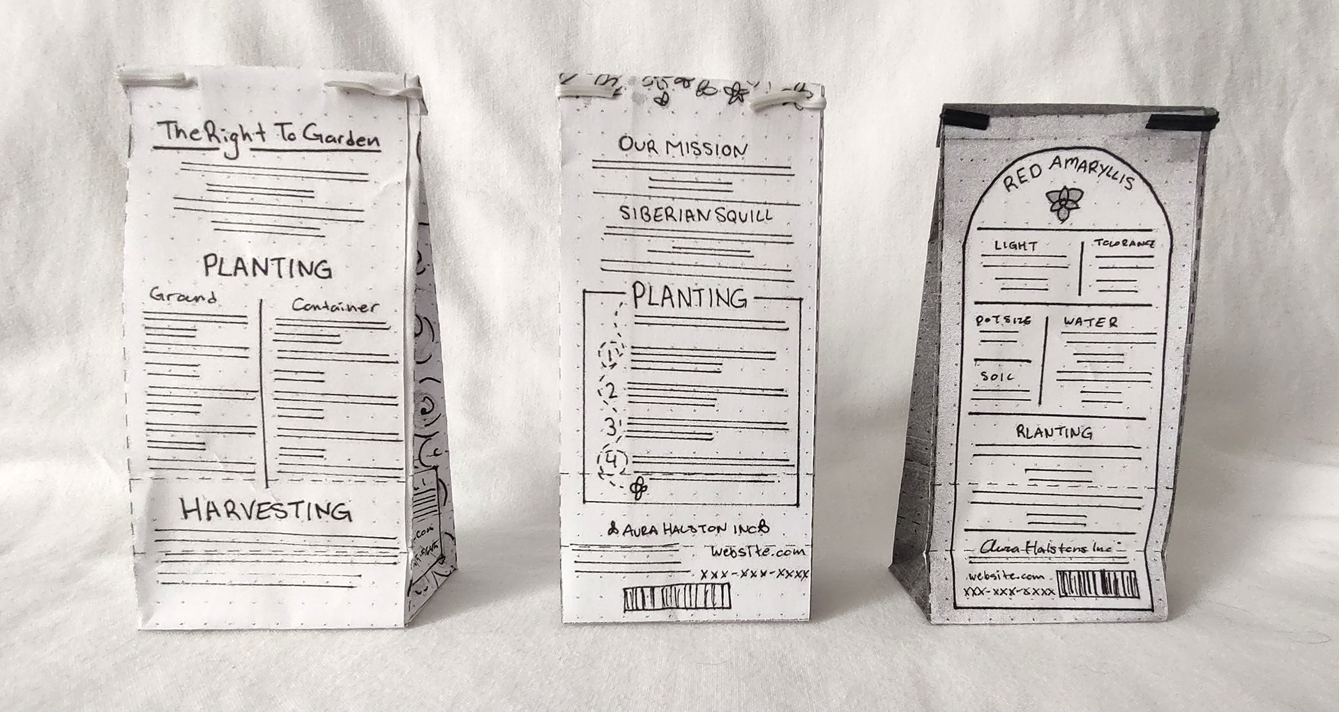
Thumbnails - Flat

Garden Greens (aka Green Gardens) Thumbnail
Bee Treats Thumbnail

House of Botanicals Thumbnail
So far I think my biggest gripe with adobe portfolio is that I can't nicely display three images side by side unless I make them all one image in a row, harumph harumph.
Going into peer review "House of Botanicals" was my favorite, it's got that sweet sweet arch and that nice Mondrian layout, but people seemed the most drawn to Garden Greens and Bee Treats. It seemed that people overall liked Bee Treats best, but really liked the sides of Garden Greens with the cross sections of onions and the "at a glance" tab on the front.
Unfortunately, upon further research, I discovered you wouldn't really ever buy BULBS of onions or garlic n such to plant, but you can use bulbs to propagate existing plants that you've munched on (i.e. putting the spring onion butt back in water to grow new greens for later snacks) otherwise they're planted from seed. Farewell veg, 'twas good knowing you.
I felt so gosh darn genius with the Bee Treats flower banner thing where it folds, easily some of my best work, I'm glad my peers liked it as well.
It's funny how the best ideas, are always the easiest to mark up for changes. As much as I liked House of Botanicals, there was hardly anything there to even make comments on to change.
Thumbnails - Dummy
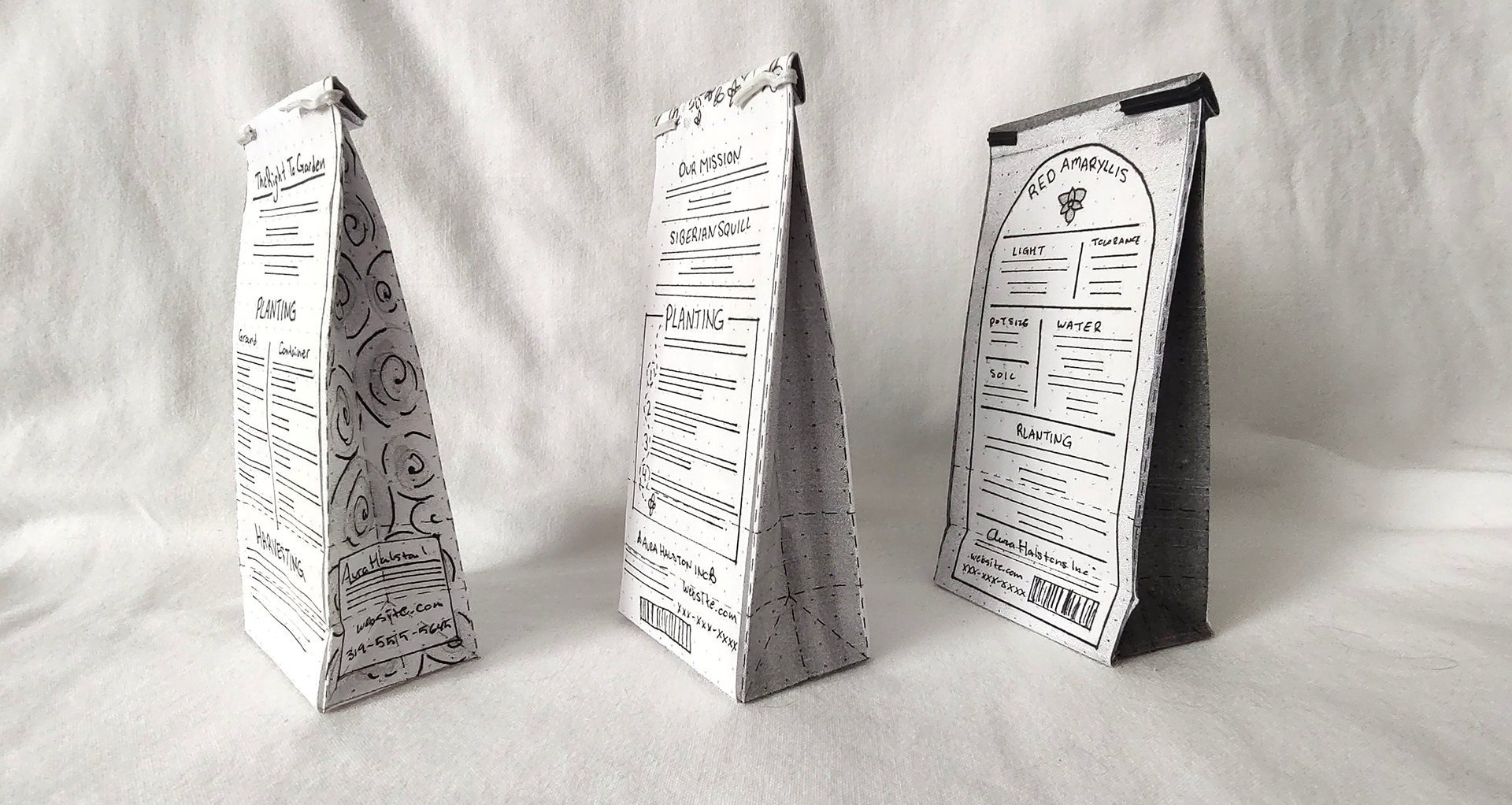
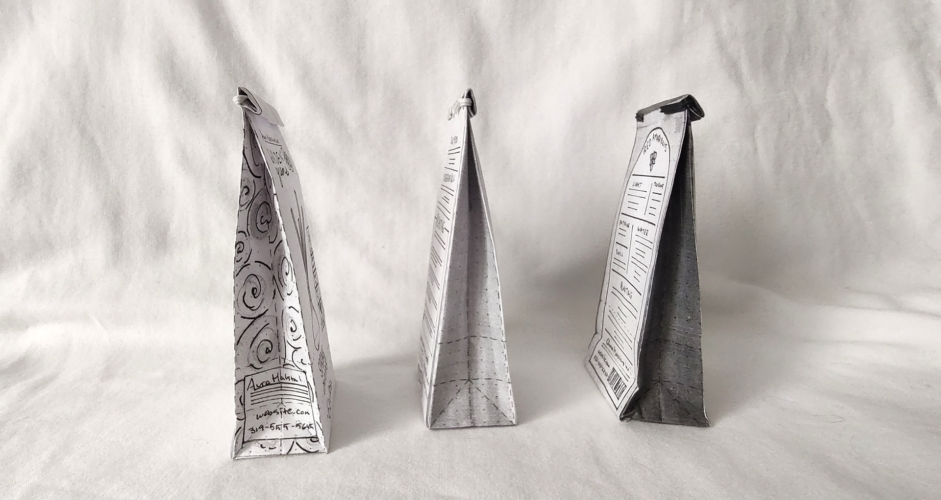
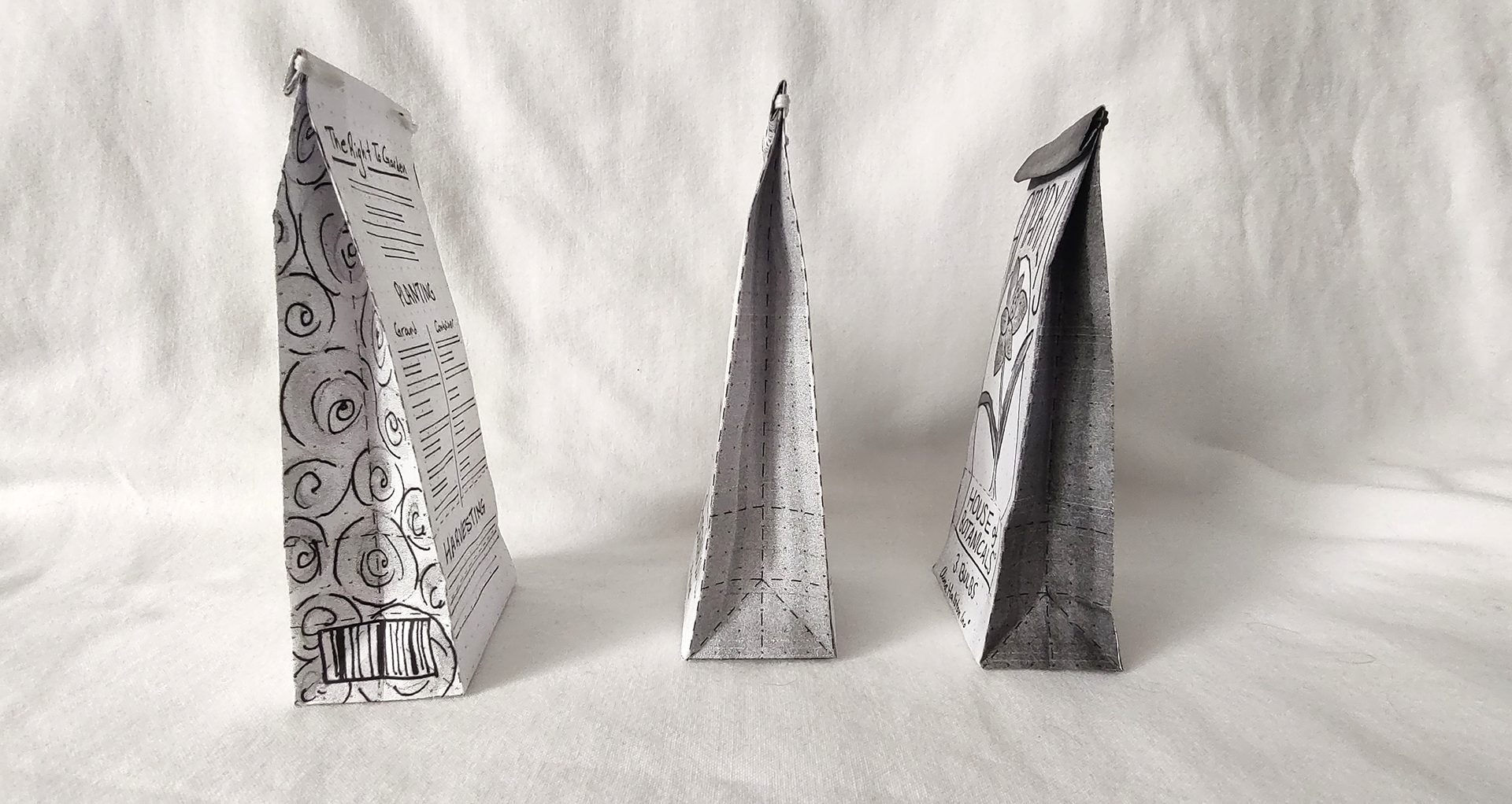
The littles are always my favorite ones, but boy, they're hard to assemble.
Intermediates - Flat

Green Garden (PKA Garden Greens) Intermediates

Bee Treats Intermediates
The first order of business is to do the one you're least excited about. Even do it in life, I eat the crust off my sandwiches first so all the remaining bites are just the best ones.
I first changed Garden Greens to Green Garden, I originally wanted it to be like "greens" as in leafy greens, but since I ruled out doing veg, that name felt like it didn't make a whole lot of sense to me. This also meant that I couldn't do my awesome onion cross sections. I looked into bulb cross sections but it still read as "onion".
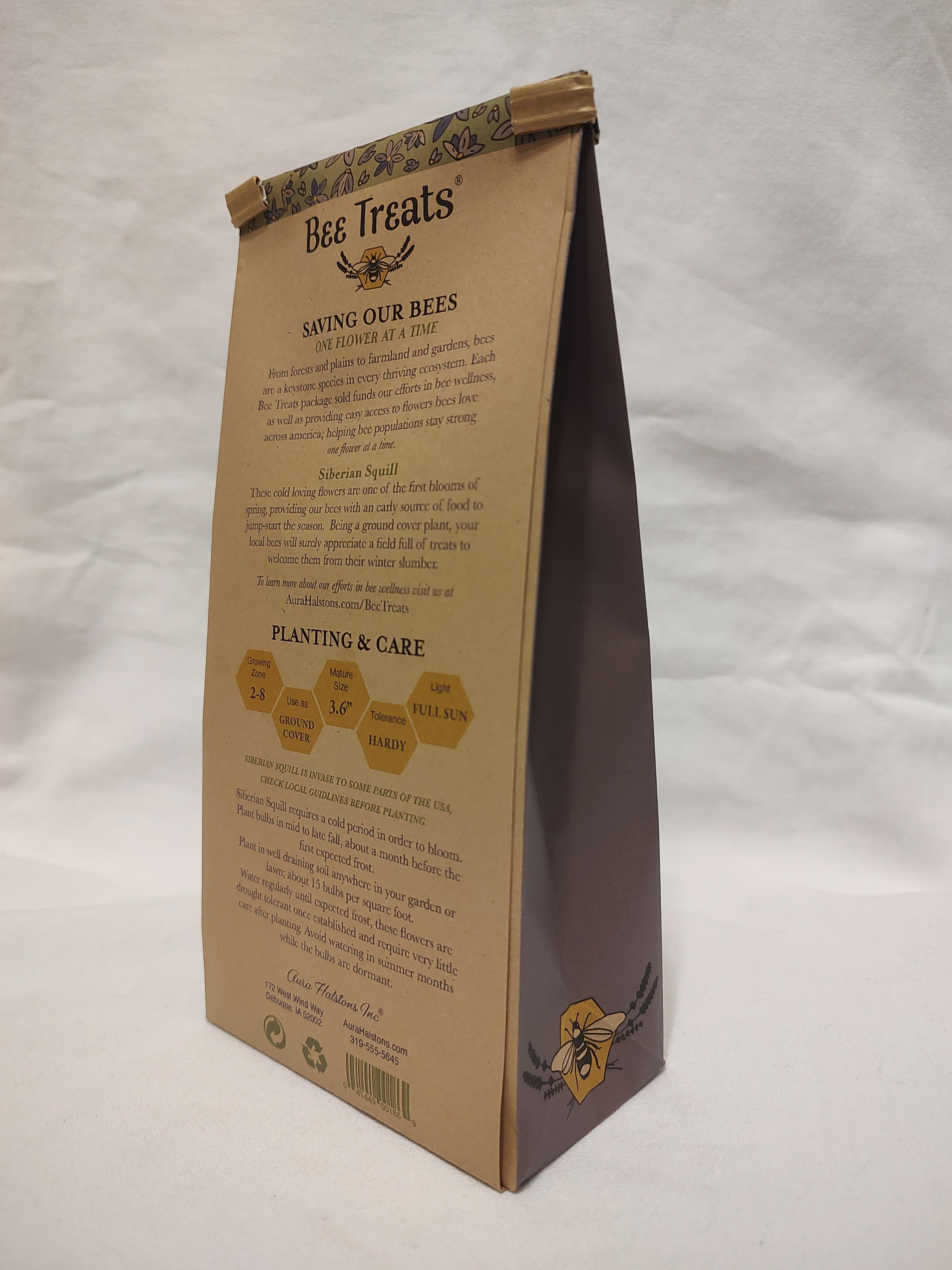
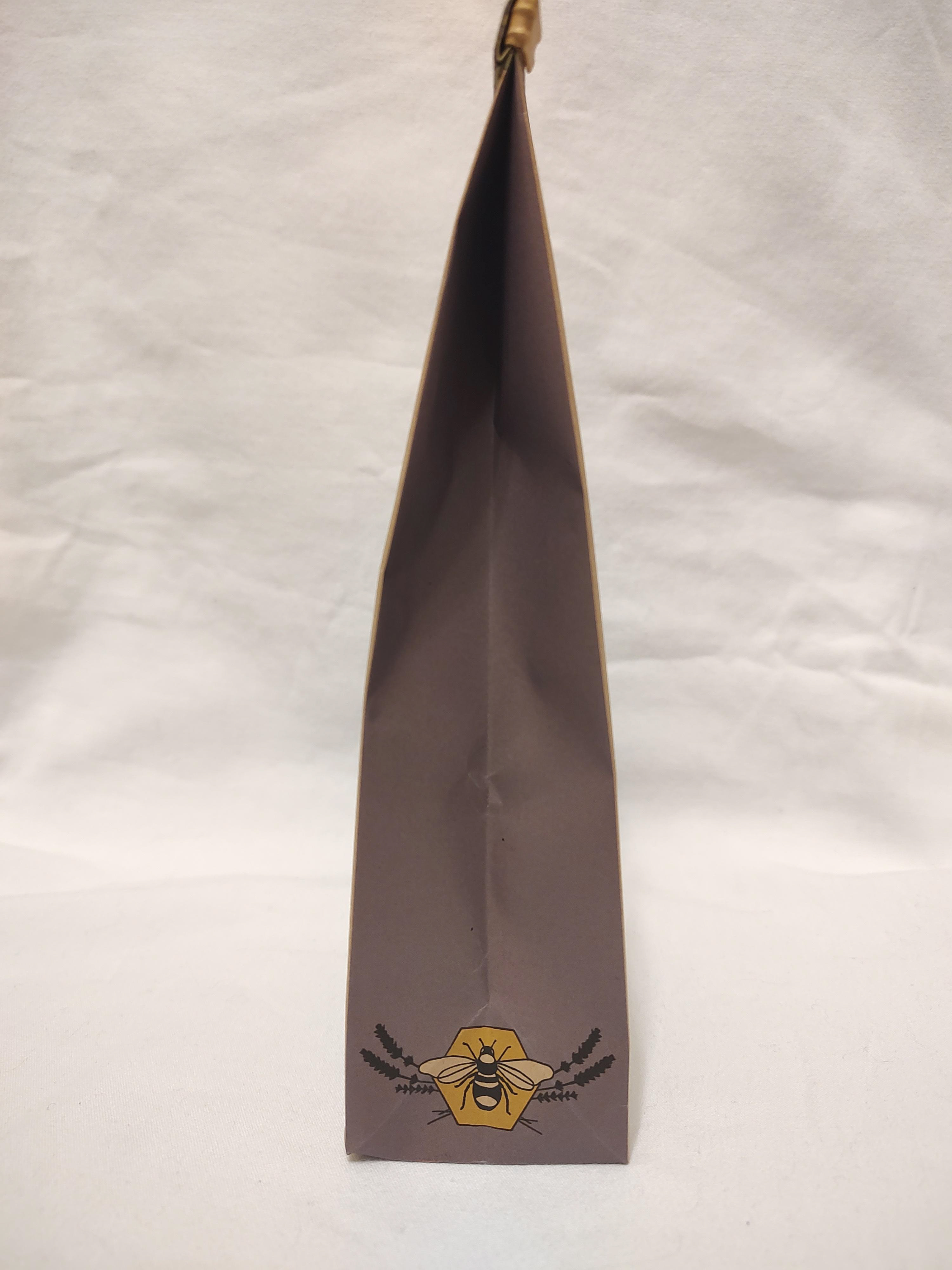
I tried to keep a few things from House of Botanicals I really liked (mostly the layout, I spent so long trying to find examples of it, that I just couldn't kill my darling yet). I also added the logo to the sides, originally I wanted a repeating pattern of the logo on the sides, but when I realized I'd have to draw that, I very politely put my pencil down and said "no thanks."
I tried to keep a few things from House of Botanicals I really liked (mostly the layout, I spent so long trying to find examples of it, that I just couldn't kill my darling yet). I also added the logo to the sides, originally I wanted a repeating pattern of the logo on the sides, but when I realized I'd have to draw that, I very politely put my pencil down and said "no thanks."
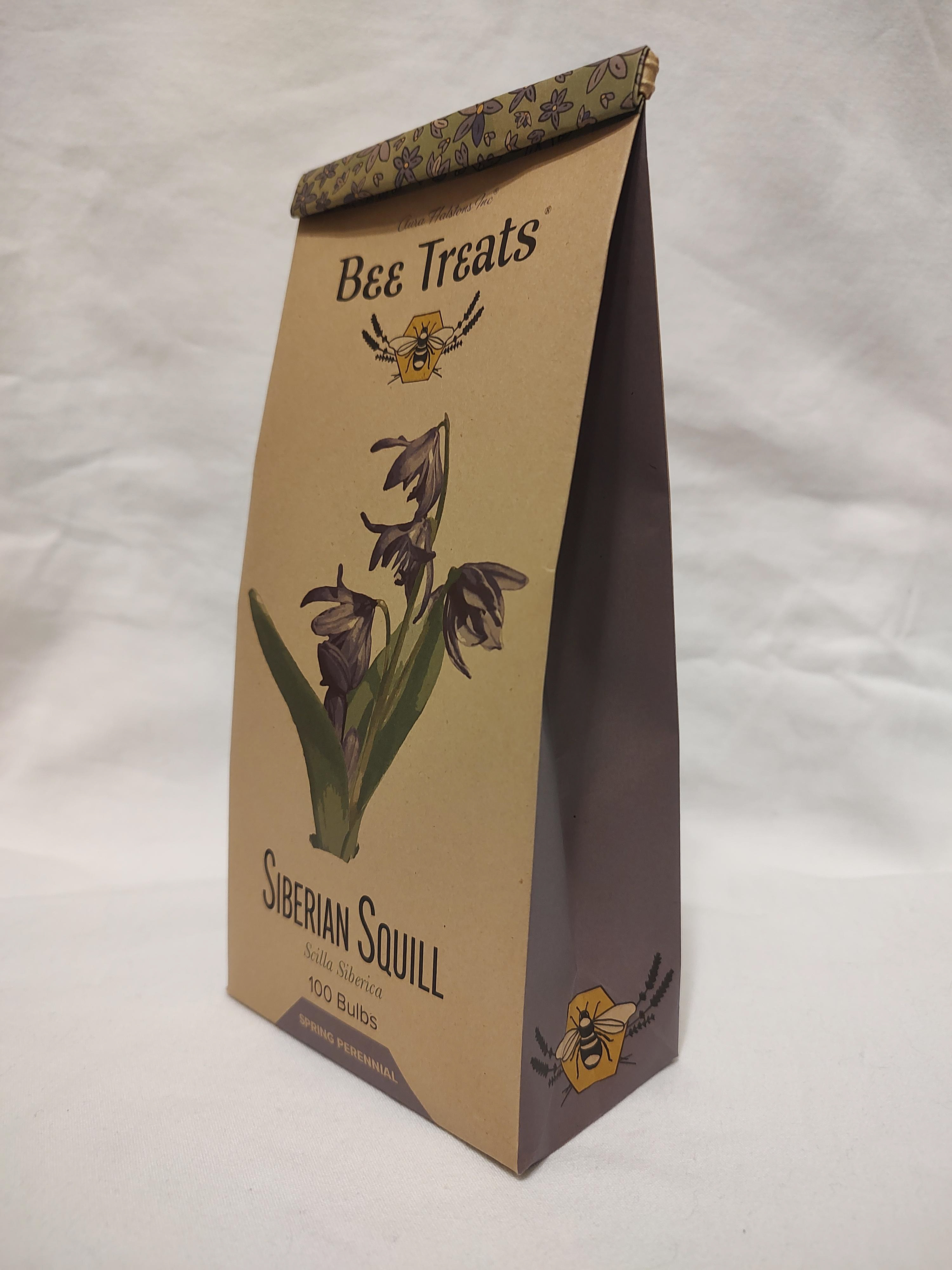
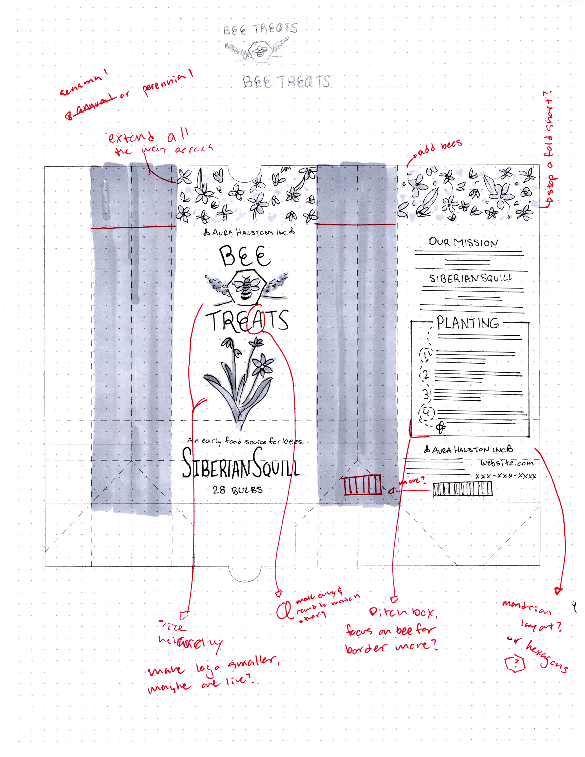
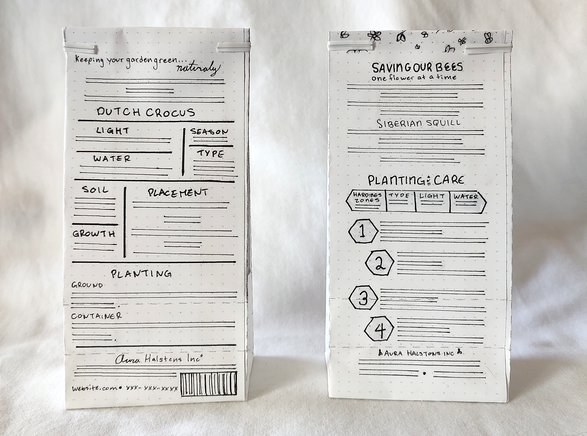
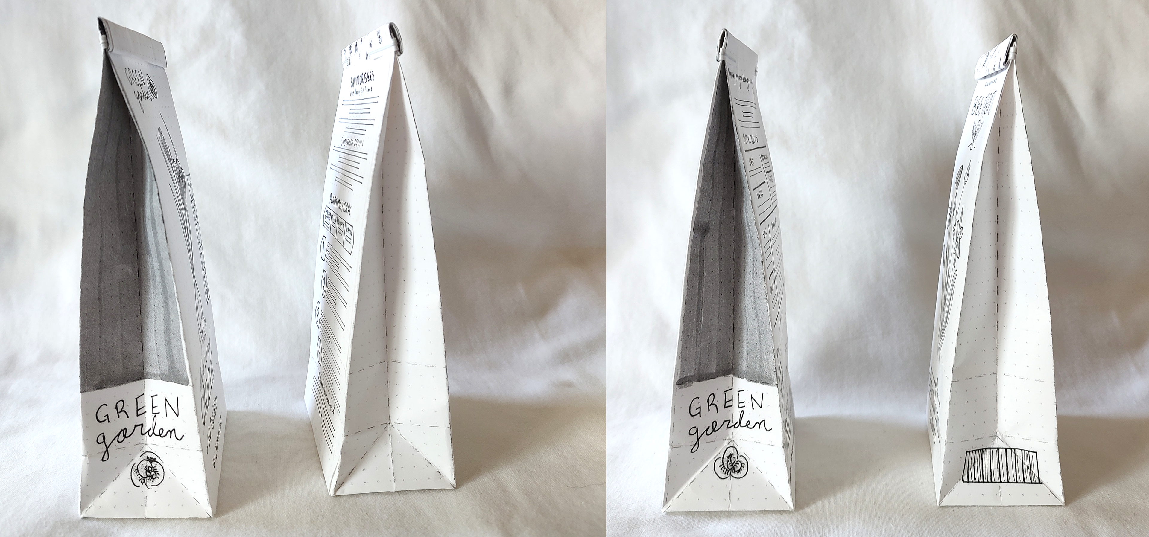
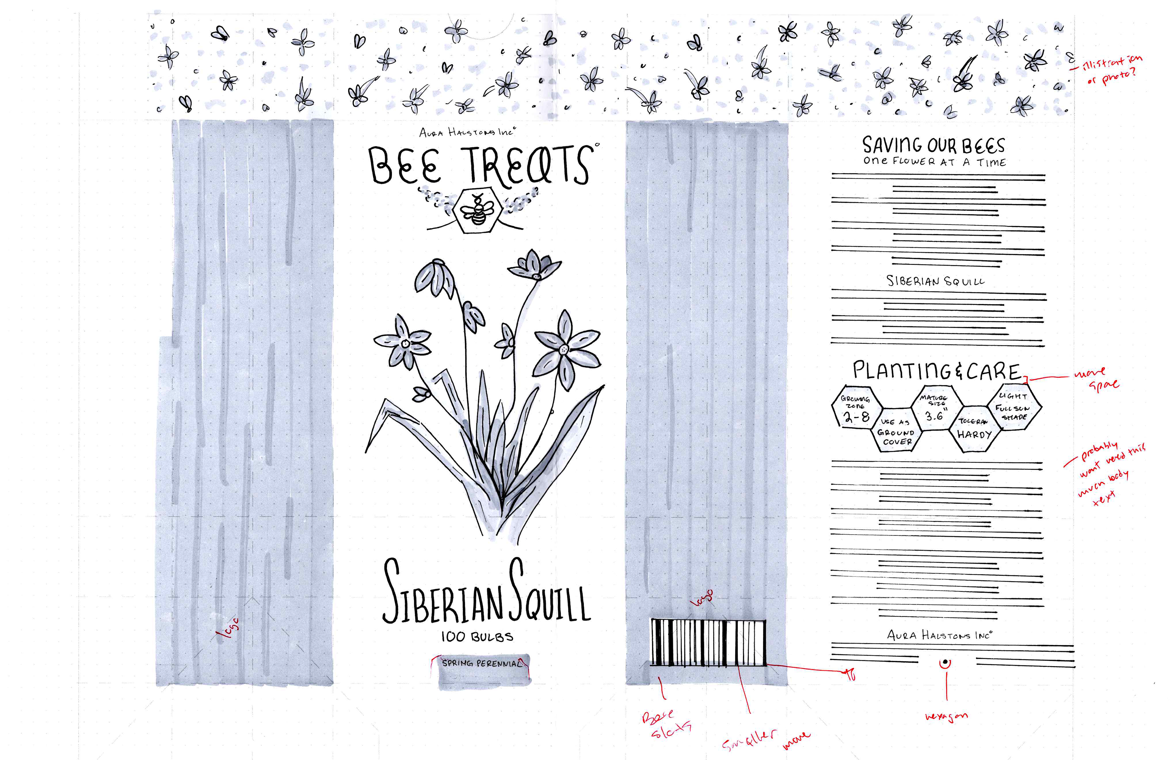
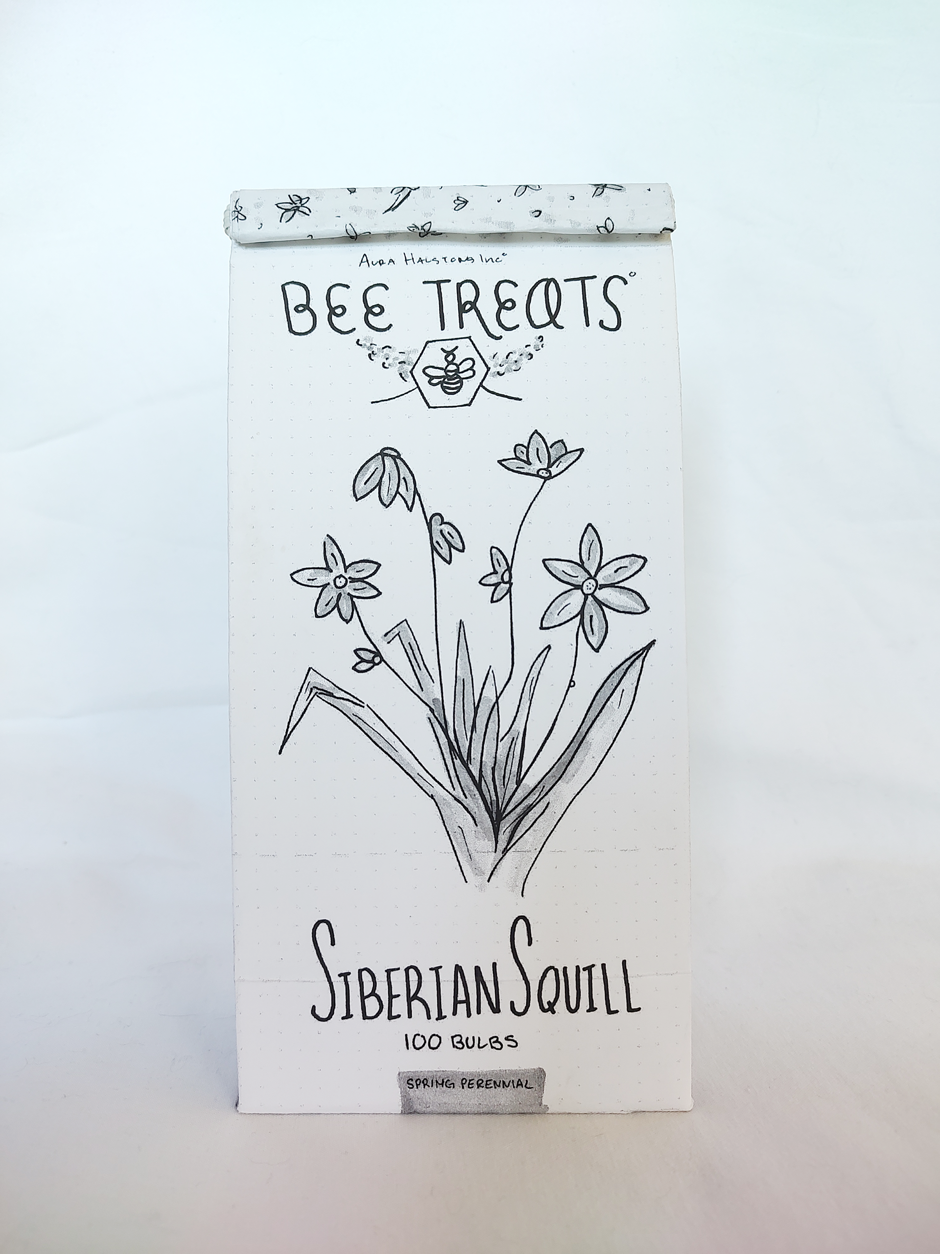
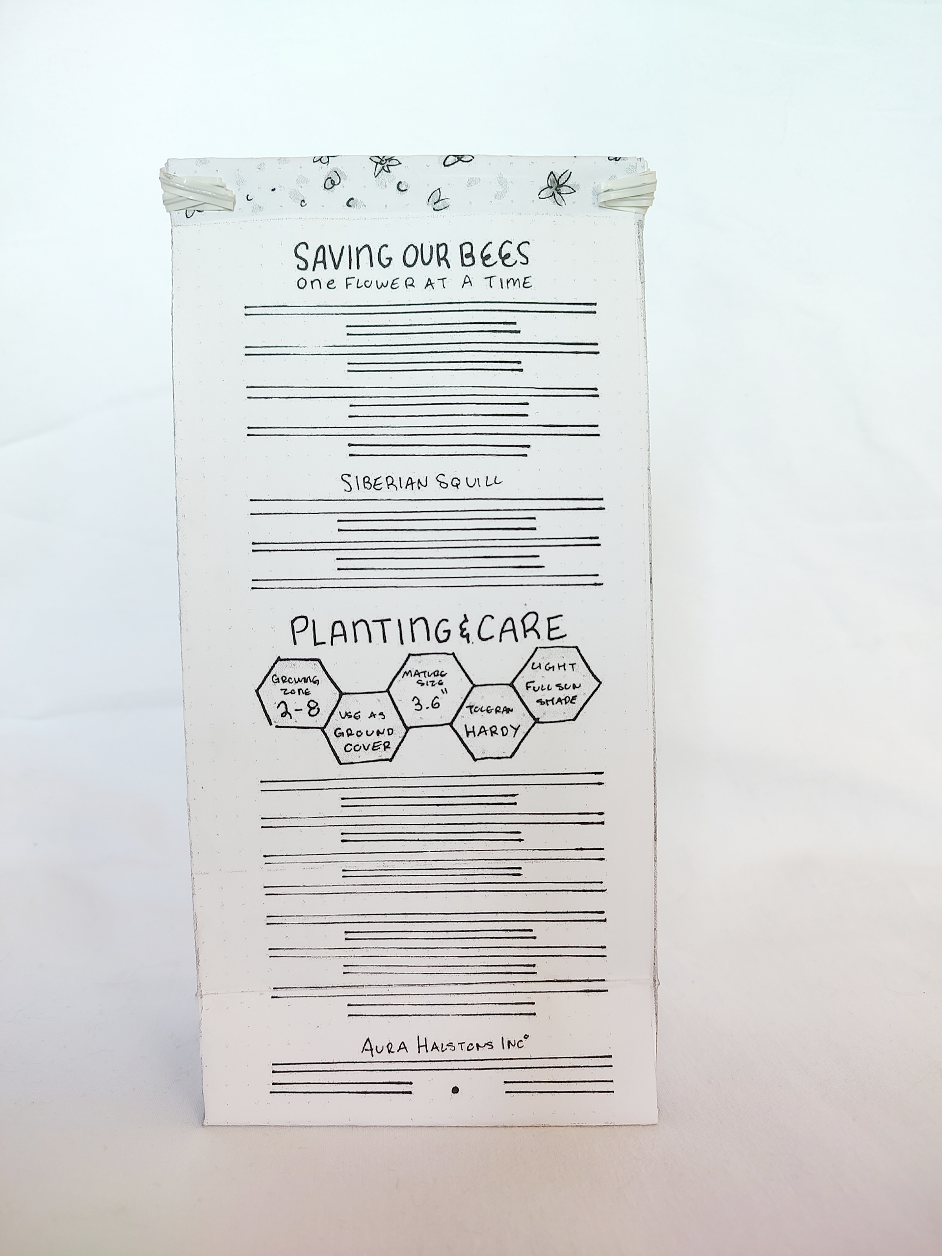
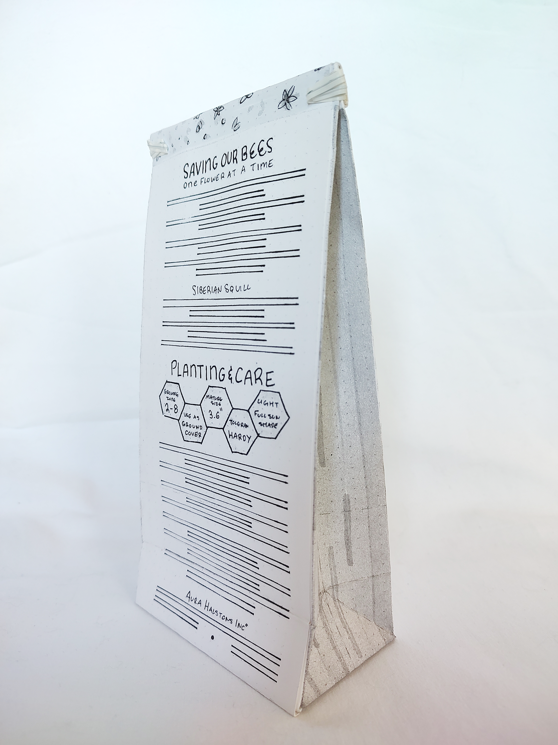
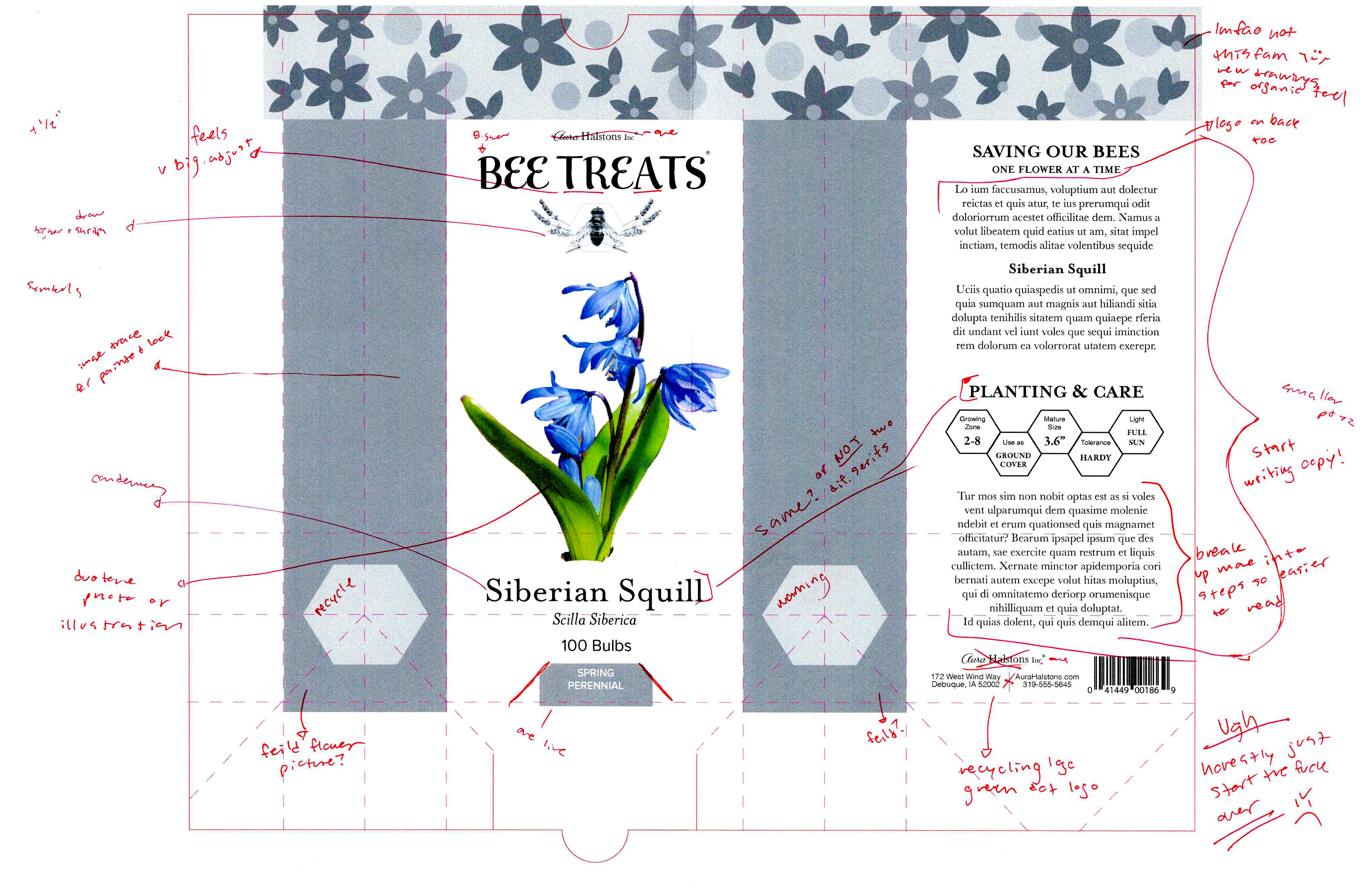
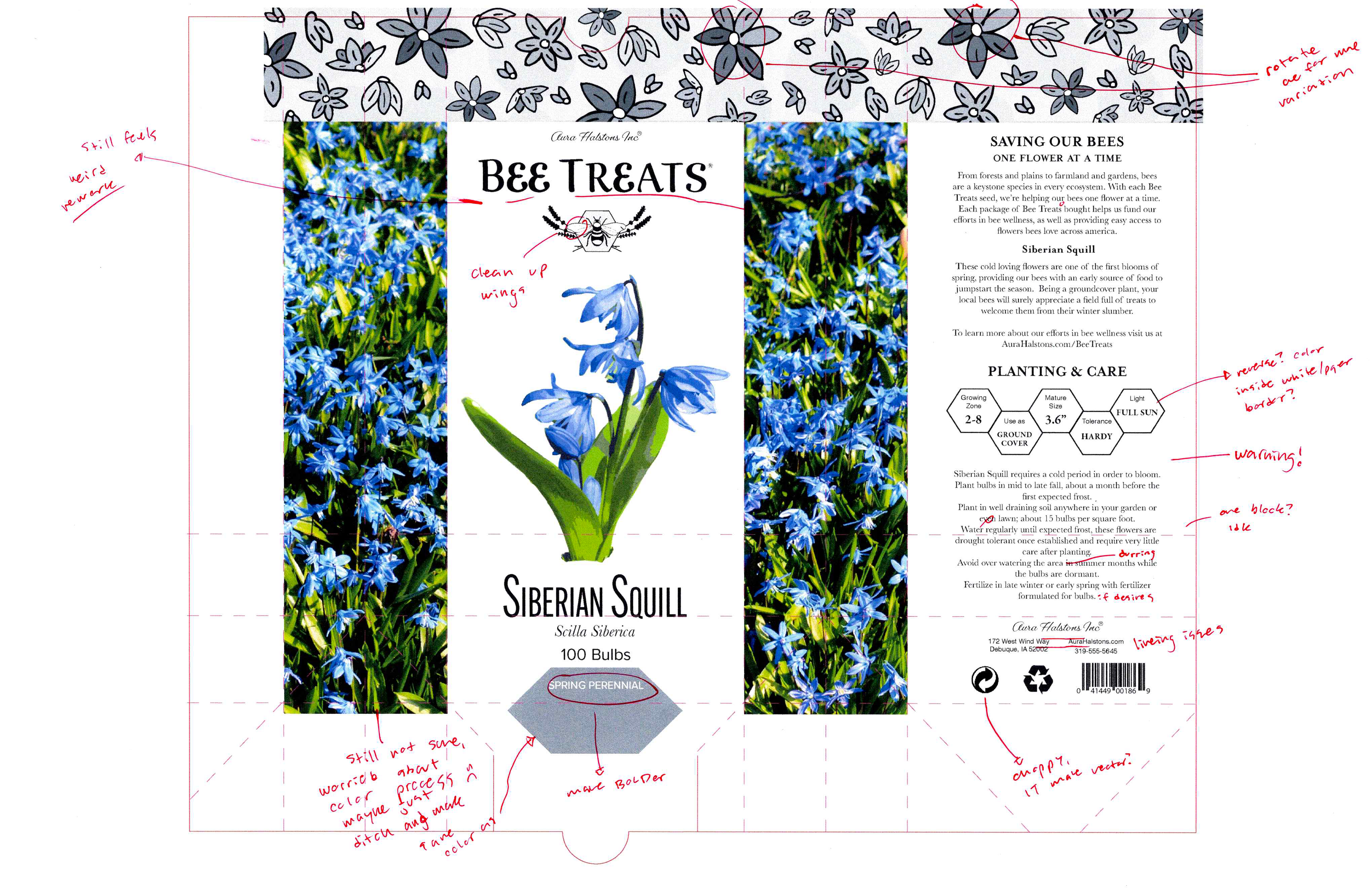
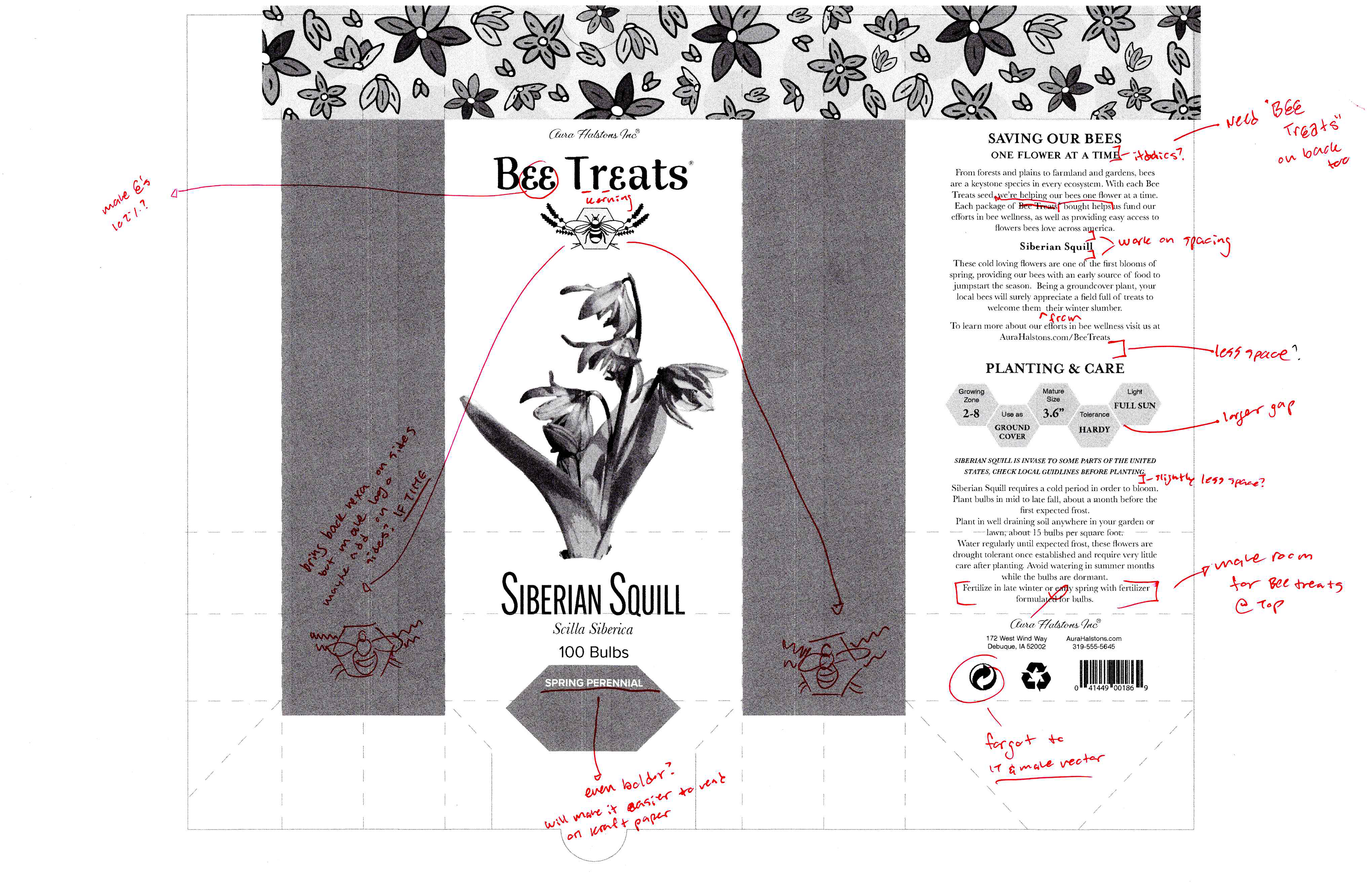
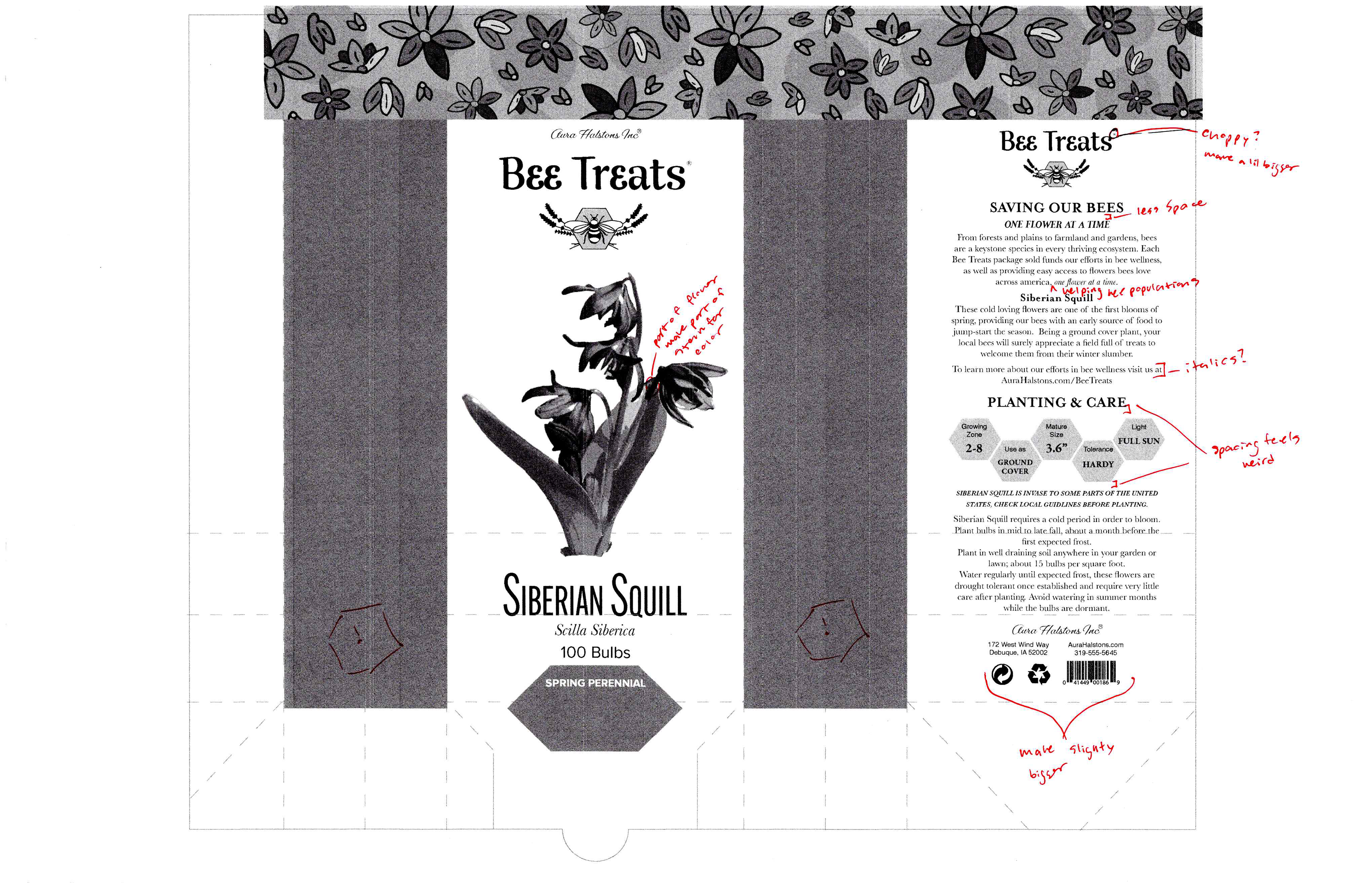
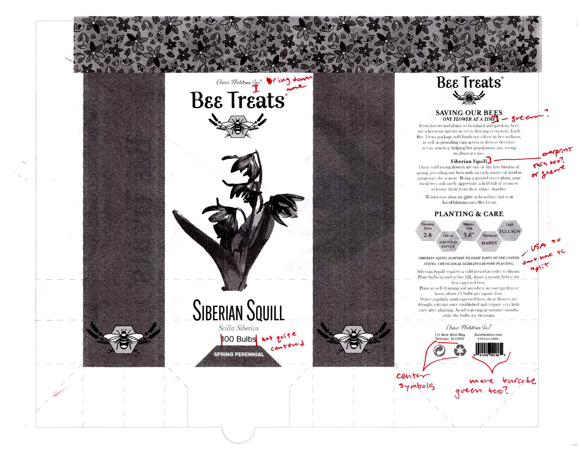
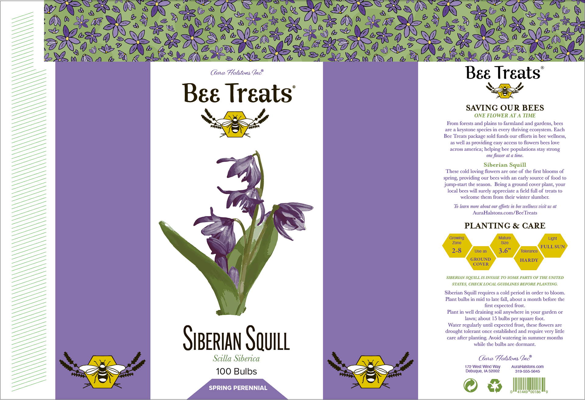
With Bee Treats, I really wanted to move the barcode to the side so it was less of a pain in my ass and make room for a nice layout on the back. I really liked my at-a-glance thing, and still wanted to incorporate it somehow, while keeping it distinctly different from the Green Gardens look. While I still liked the color sides looked, I felt like since I used it with my Green Garden, I should opt to not do it here and see how I felt about it since I could always add it back later. I also did a bit more research to figure out just what kind of info I wanted in the
at-a-glance and learned that Siberian Squill bulbs are sold in 100's or more since they're so small and they're ground cover. It would have been sad if I sold someone enough bulbs for only two feet of their yard (OR a smart but shady business move.)
at-a-glance and learned that Siberian Squill bulbs are sold in 100's or more since they're so small and they're ground cover. It would have been sad if I sold someone enough bulbs for only two feet of their yard (OR a smart but shady business move.)
Intermediates - Dummy


I was having some weird exposure and white balance issues with my camera, especially with the angled ones, so I included the best one, even after attempting to photoshop fix it. I've since sorted it out, but in many photos going forward, you can still see evidence of the mishap. My apologies.
Final Hand Comp - Flat

So we've finally gotten to the blessed holy final hand comp, the final stage before the struggle just seems to start all over again. The final hand comp is what you order from Wish, the first computer output is what arrives at your door four months later.
Before I really started doing my final hand, I felt like I still had a million ideas in my head of how to combine the things I liked about Green Garden in with Bee Treats, so I went back and did some more sketches and doodles before committing to the task. This was when I was finally able to kill my darling of a Mondrian layout for the back. Took me long enough, but it was laid down to rest before it got too stinky.
Typography is hard, indicating type faces is hard. It makes me wanna not do it which will just make it feel harder since I'm not practicing. Ugh, a cruel cycle indeed.
Final Hand Comp - Dummy


I have oversize tabloid paper! Which is really handy dandy since I could do it all full size without splicing.
But it was cardstock, so folding it almost made me wish I spliced instead.
Computer Progressions
Output 1
You said "make the first output as close to your hand as possible" and I, for some reason, said "nope"
Output 2
Output 3
Output 4
Output 5
Output 6

The first two outputs are the epitome of panic. With the first one, I was just wasn't sure what to do, or how to do it. I didn't have any faith in myself for illustrations of my own of any sort, so I just ended up putting in some dreadfully awful placeholder deals for the logo and banner.
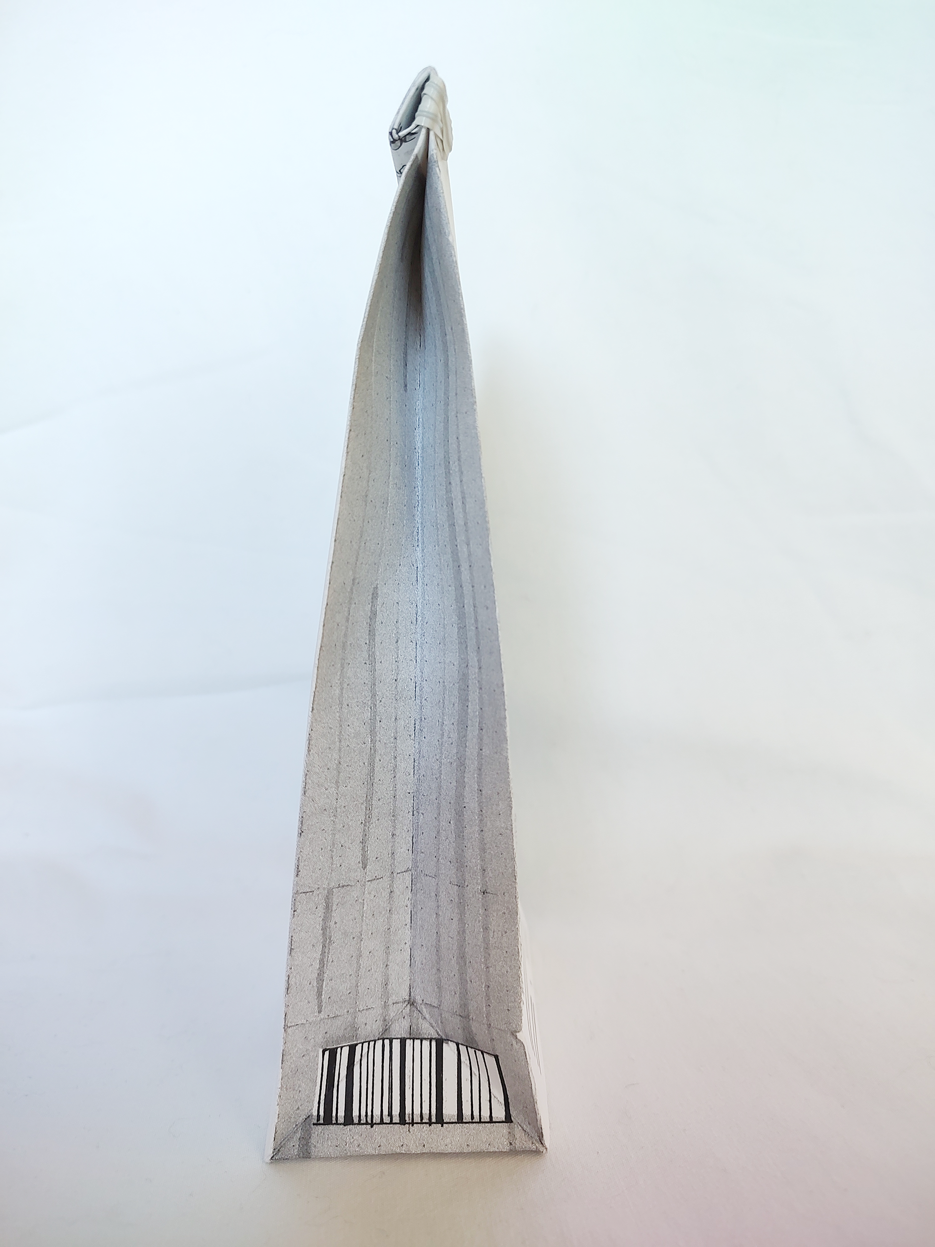
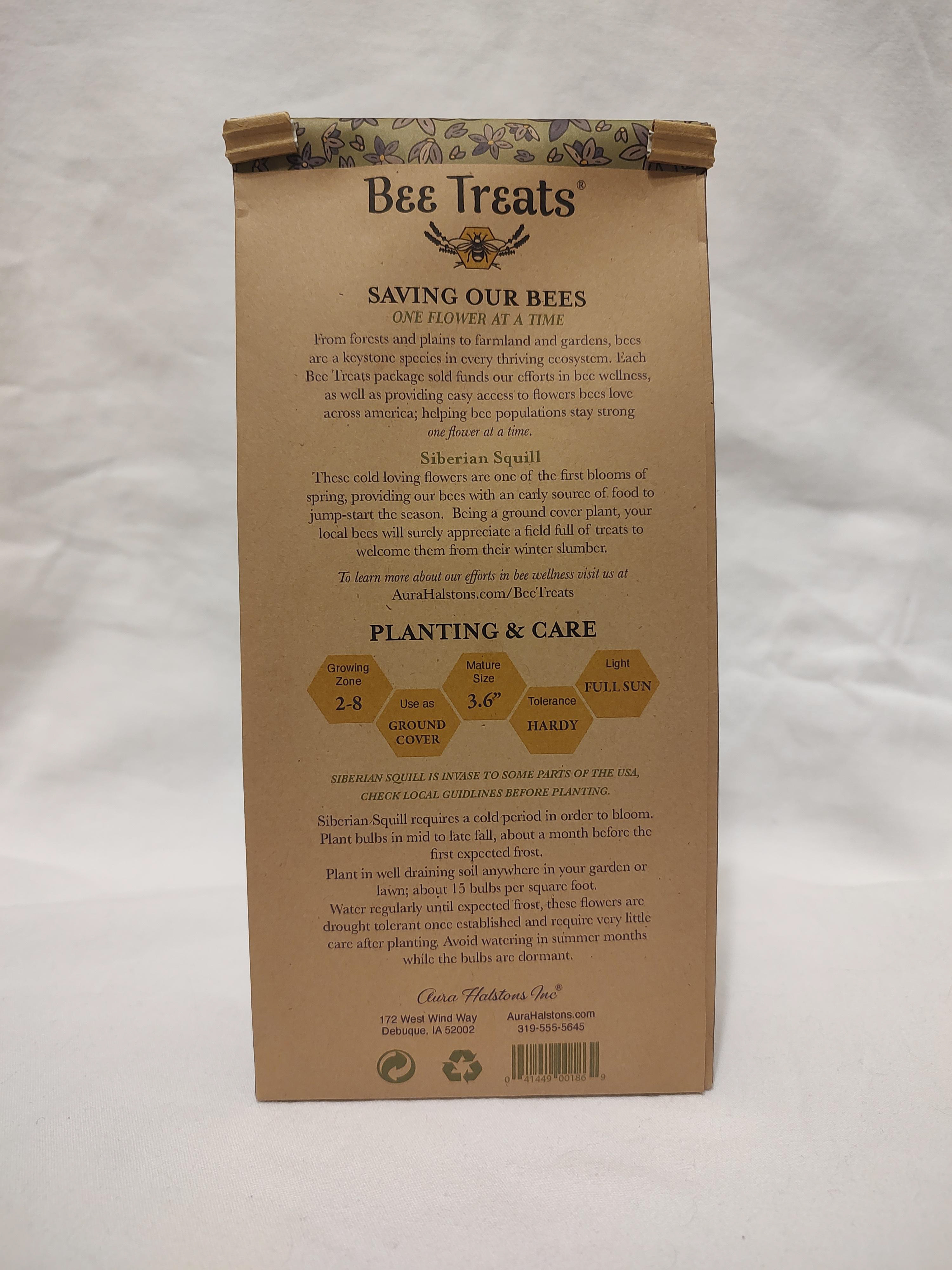
It was deemed pretty early on that I should put the barcode on the back, lest a fold of the bag makes it illegible by a machine. This was also when I decided to add the green dot and recycling logo.
It was so hard to find a picture of this flower that I felt like I had any chance of cutting it out in photoshop half decently since it's just a field of flowers or artsy focus. I finally found two photos I really liked with similar lighting and ended up splicing them together. (I think I'm getting really good at that part.)
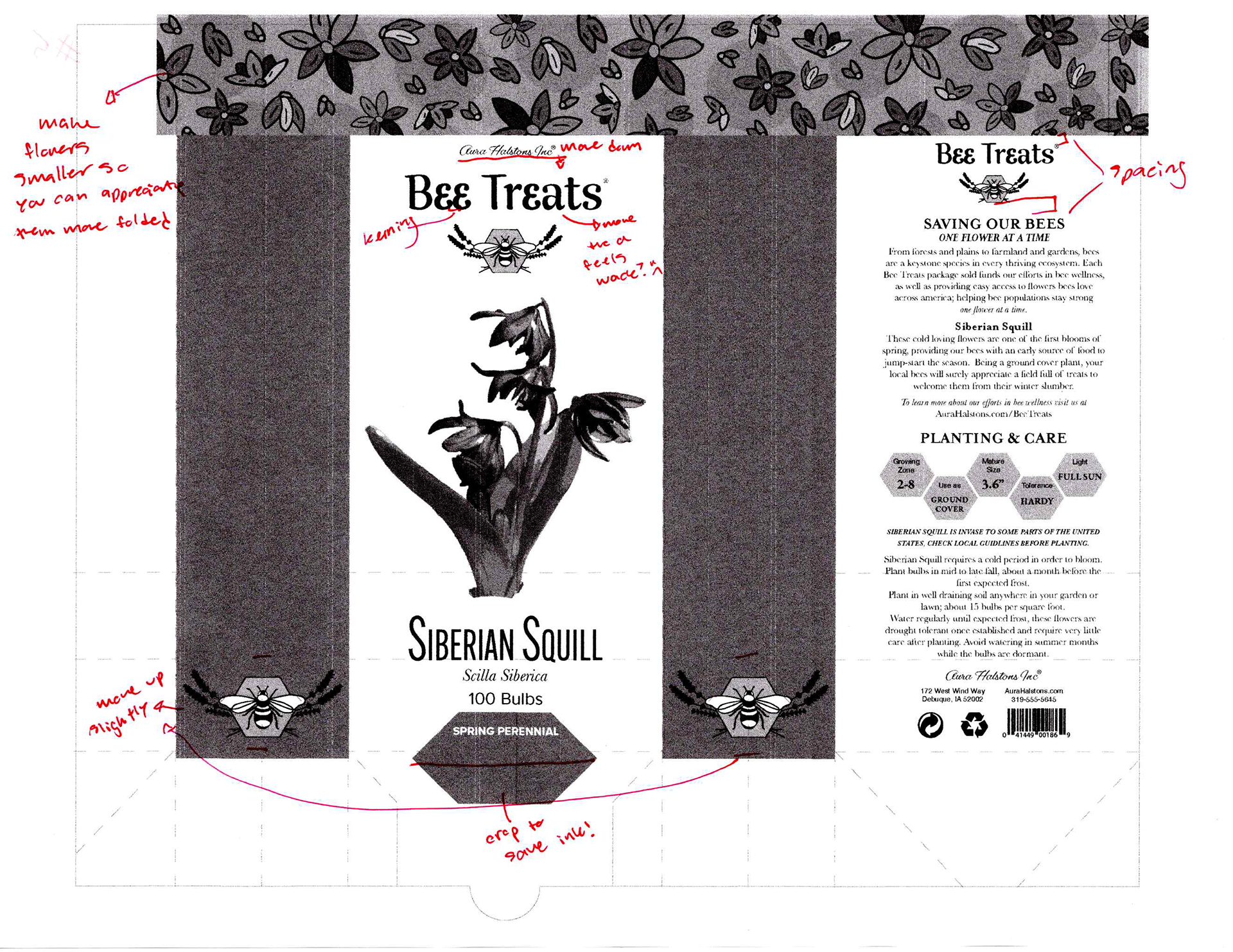
I attempted to draw new flowers for the banner but hated how they all looked. Luckily for me I had some awesome drawn flowers featured on the front of my final hand comp for me to snag and use.
A big issue I had was with the logotype, first I wanted it all caps, or with just the "a" lowercase like in my handwork, but it made the weights feel all off and funky. Even just everything being standard out of the box, it felt weird, and I was determined to keep the curly e's. After lots of tweaking with outlining to make single-point adjustments and kerning, I'm pretty darn happy with the final result.
I tried so hard for that bee and hexagon logo thing, shoutout to my peer William for giving me some advice on how to draw it by hand and have it be not as much of a pain in the butt as expected. I still had to draw five different bees until I liked one, but it's better than what I would have come out with without the advice.
Feeling like output 5 was my final one, I made a dummy and realized one big final change I needed to make was to the size of the flowers in the banner. It was really easy to appreciate them on the flat version, but once it was all put together and folded over, it got lost. I made them about half their original size.
Please note that color studies and computer progressions were happening at the same time in the interest of time, so many notes on these progressions also included notes about the color.
Color Studies

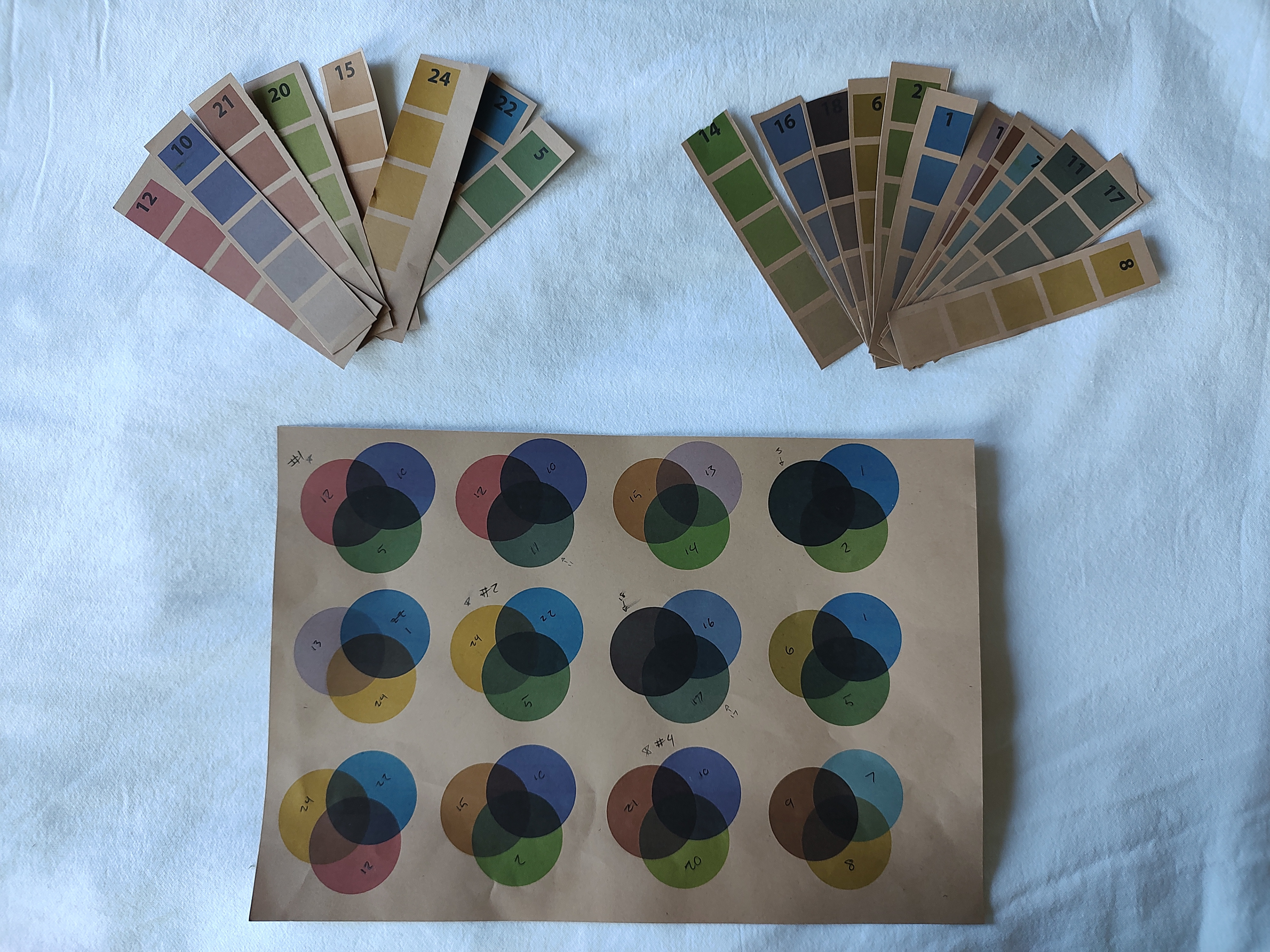
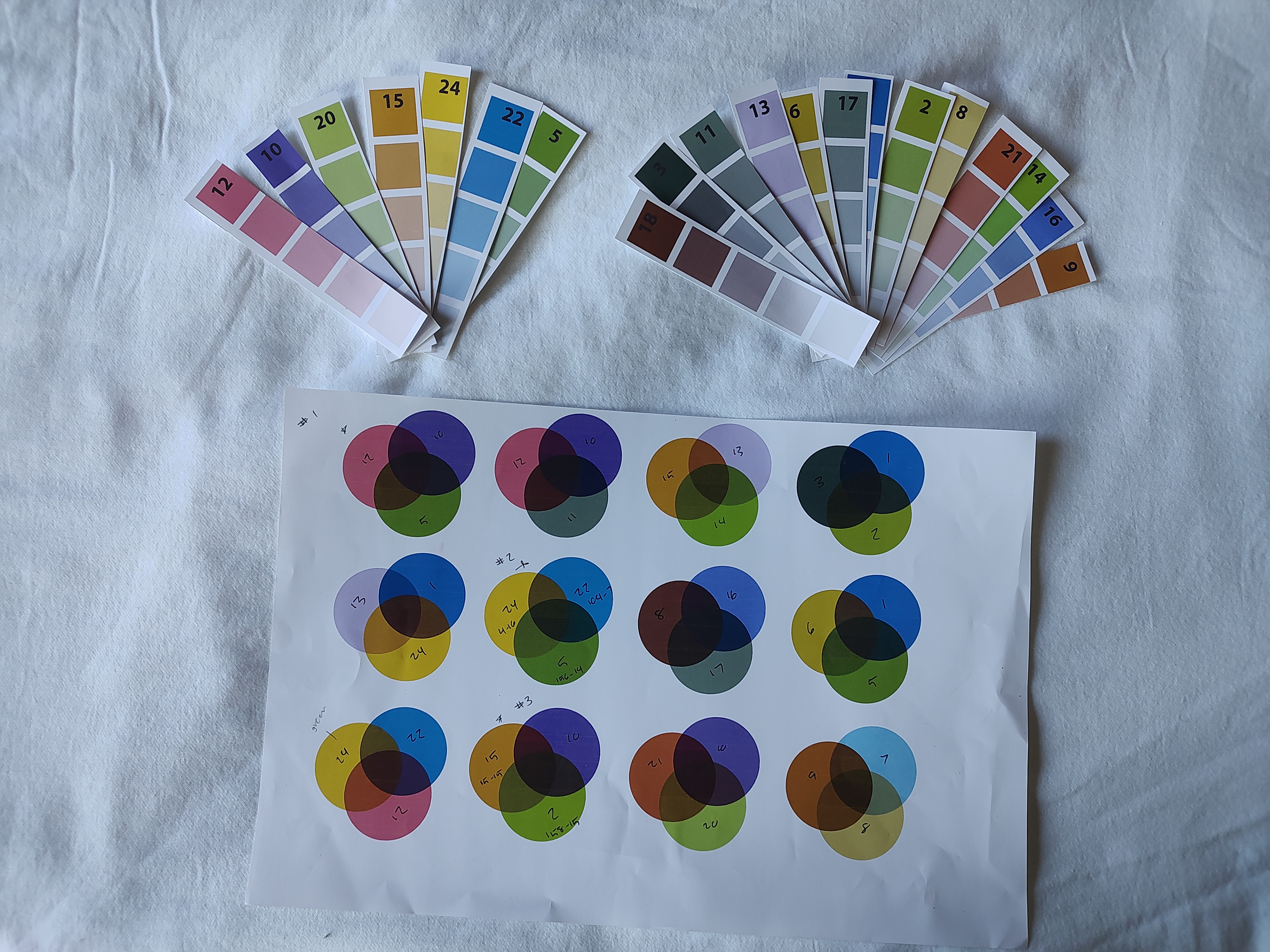


Top #24 yellow vs. Bottom #15 orange/brown for bee imagery.
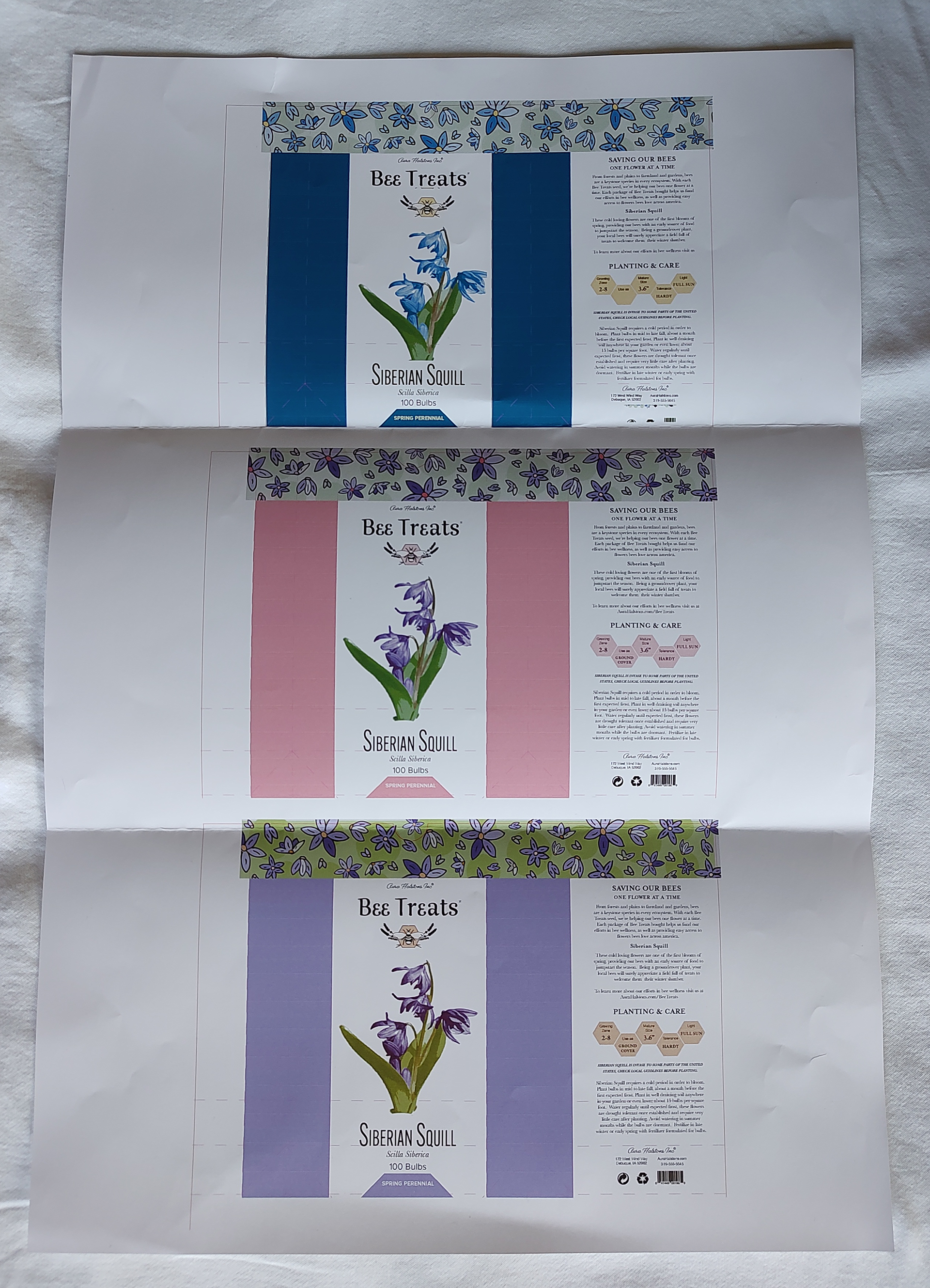
I knew pretty early on I wanted to challenge myself and try and use craft paper, and not just fake the craft paper look. I'm glad I had the foresight to order some because it took some time to get here, but I was determined to get some a size I could print, but also not have to splice later.
I'm really good at choosing too many colors. I either give myself too many options or not enough it feels like. With the greens, blues, and purples, they're all pulled from pictures of the squill, while the red, oranges, yellows, and browns were pulled from honeycomb pictures. Doing it this way helped me not be so stressed about the exact value I was choosing while helping me keep within the "feel" range.
Once it got to printing, the craft paper definitely have more of a natural feel-good about what you're buying vibe and I hardly even had to think about which paper I wanted to use.
(Knowing Epson presentation matte paper isn't recyclable, also slightly contributed to that decision, thinking about how much I'd be printing for flats and dummies.)
I apologize for the white balance issues with the craft paper photos.
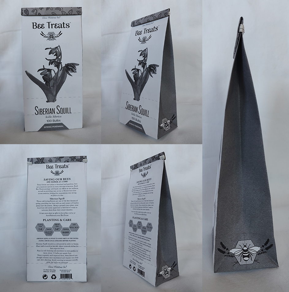
Final


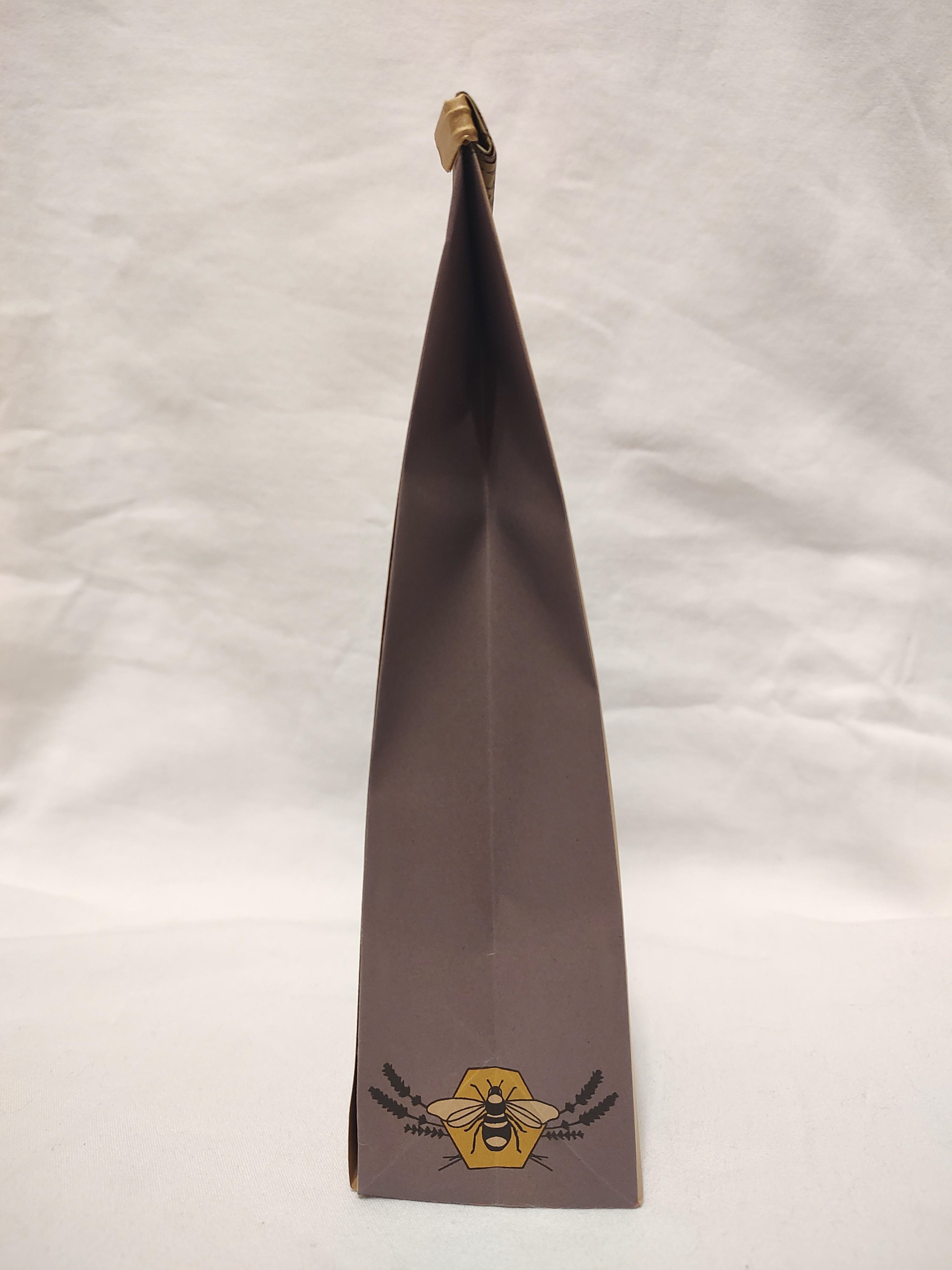
Honestly, if at my first computer output, you told me I'd end up here, I'd tell you you're full of shit.
I ran out of sunlight (it wasn't in the budget) so the photos don't look as pristine as I want. You'll have to excuse the harsh shadows, especially on the front where it folds, hiding the parent company name (I even moved it down several times after dummies because it was hidden in the shadow during computer progressions, thwarted yet again!)
I'm really proud of how this turned out, especially with my struggles with creating the logo. I have pages of attempts at the bee and lavender, that I just simply refused to take the time to scan as proof.
I'm saving this purple, yellow, and green combo for later use.