


Brainstorming - General ideas
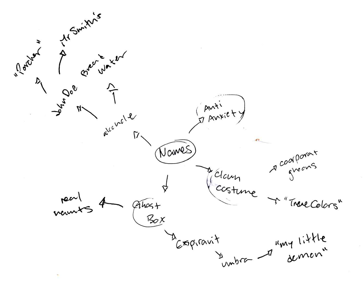
Brainstorming - Names

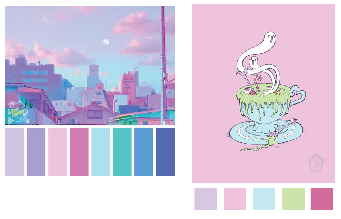
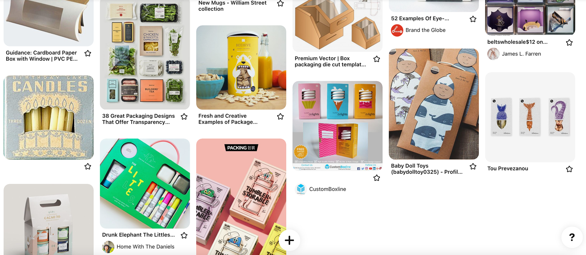
Initial product Pinterest research.

Initial product Pinterest research.
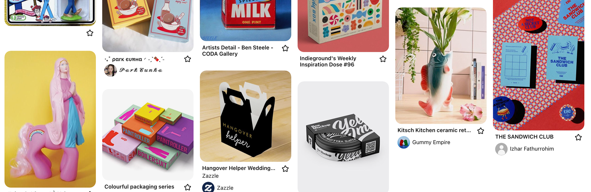
Initial product Pinterest research.
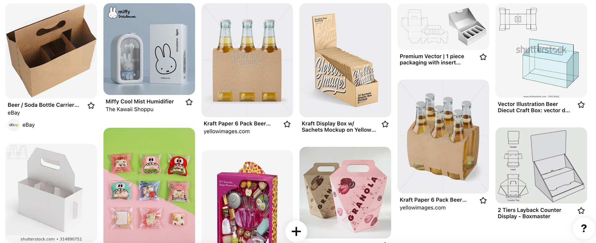
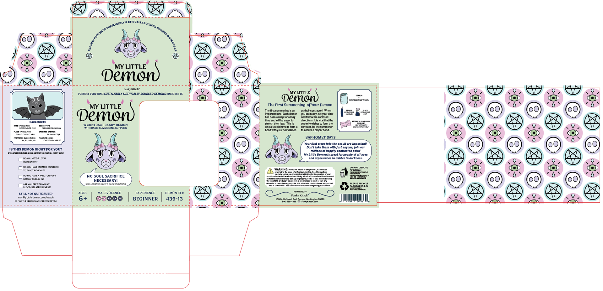
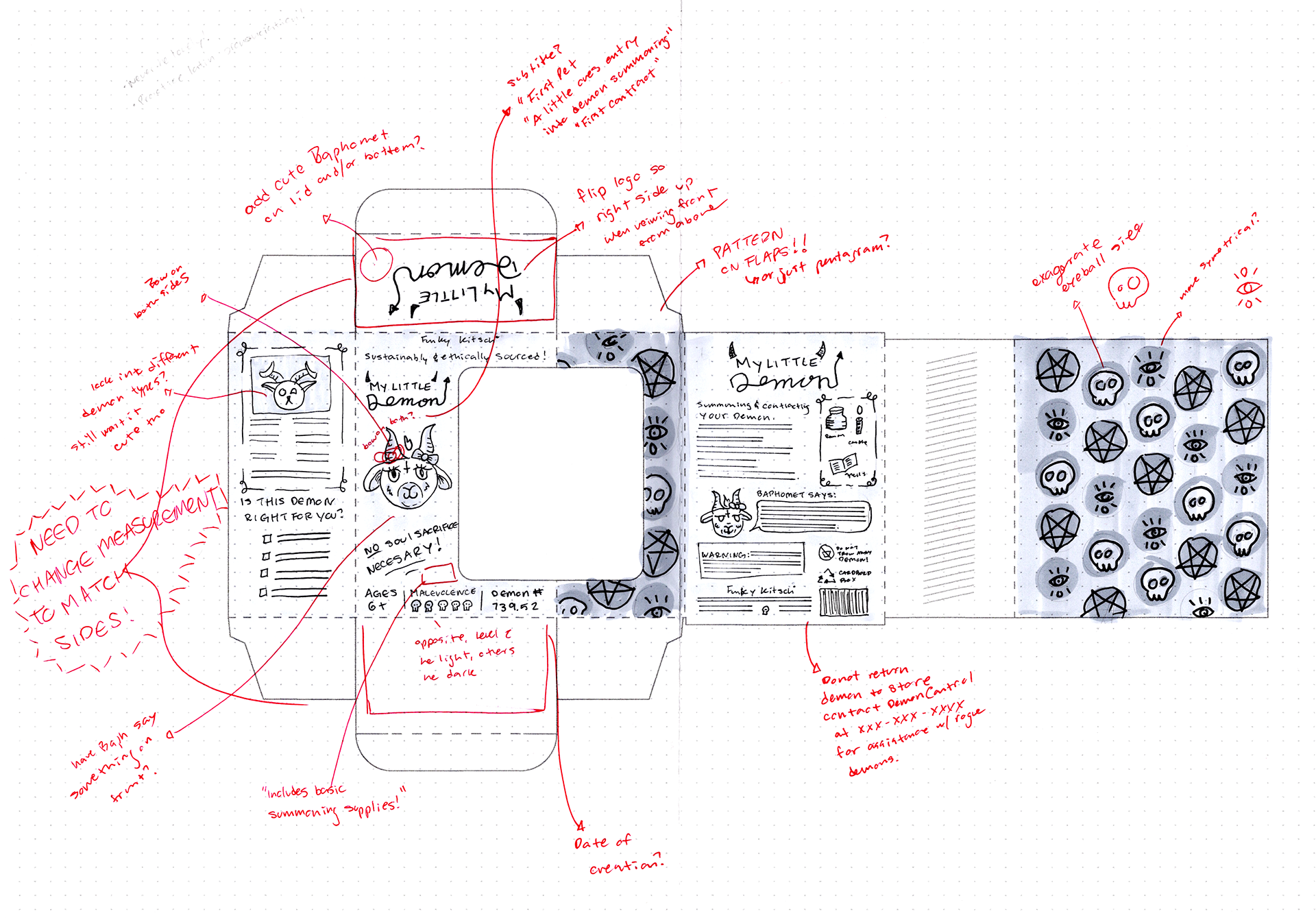
Windowed packaging research.
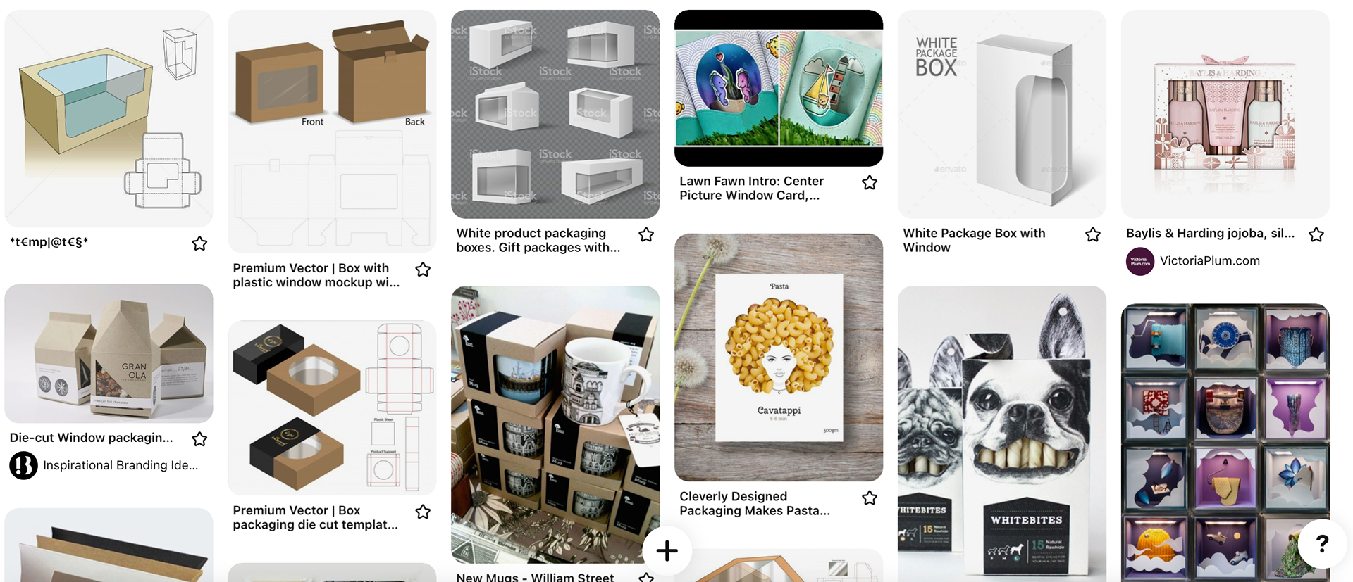
Windowed packaging research.
Windowed packaging research.

"3D" sketches
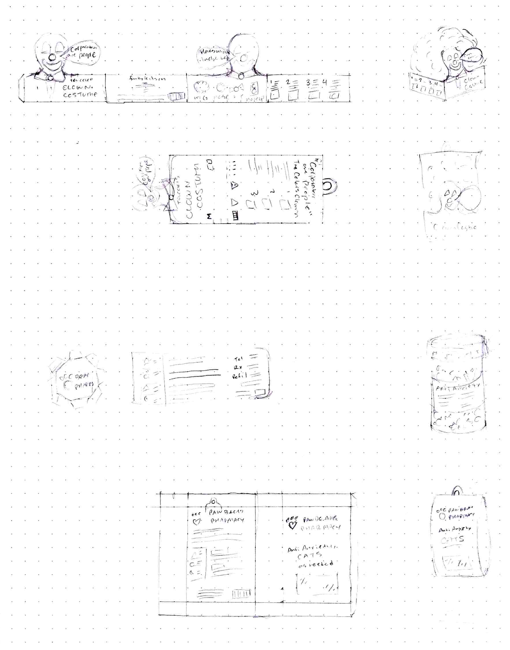
Flat sketches (attempted, then given up)
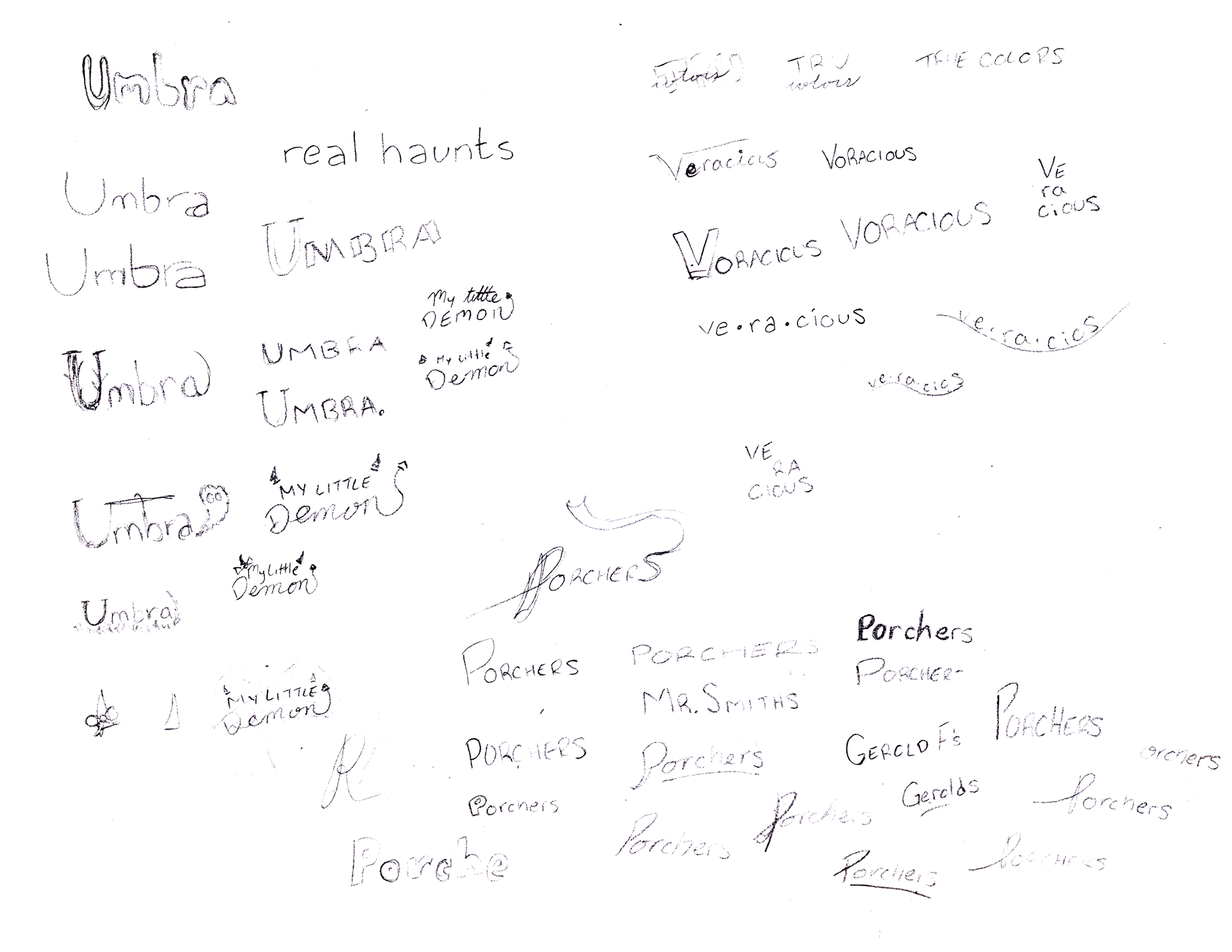
Company name doodles

Parent company doodles
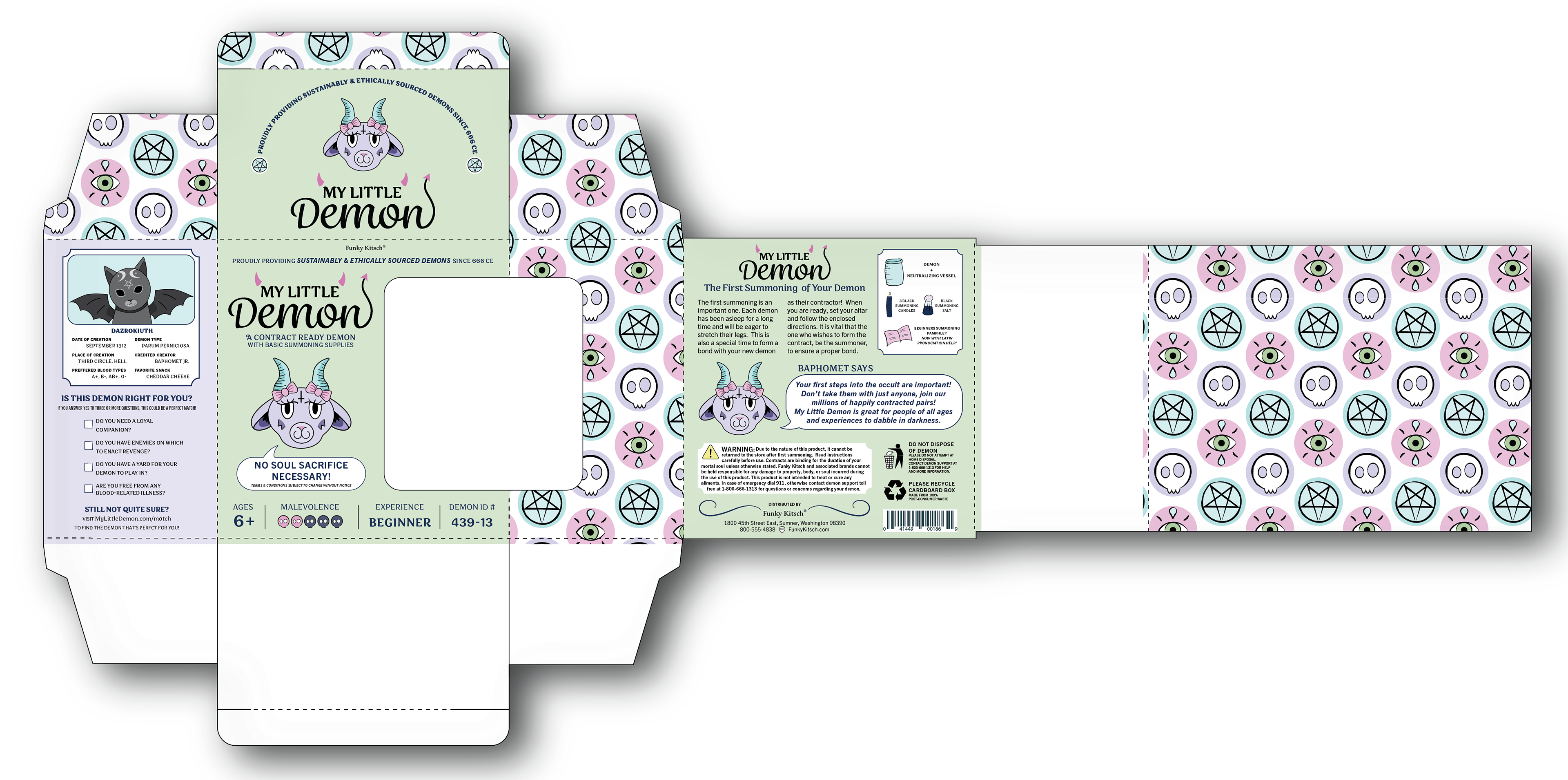
I was feeling really frustrated with trying to picture and draw dies and ended up just moving on by finding and settling with a pre-existing die-line and altering it as necessary (why I didn't do that in the beginning? I was trying to be big and bold and creative to think of my own unique shape, but spent a lot of time doing stuff that didn't actually end up feeling all that helpful or groundbreaking).
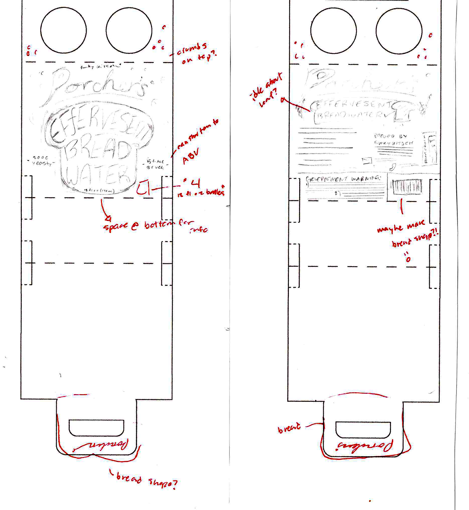
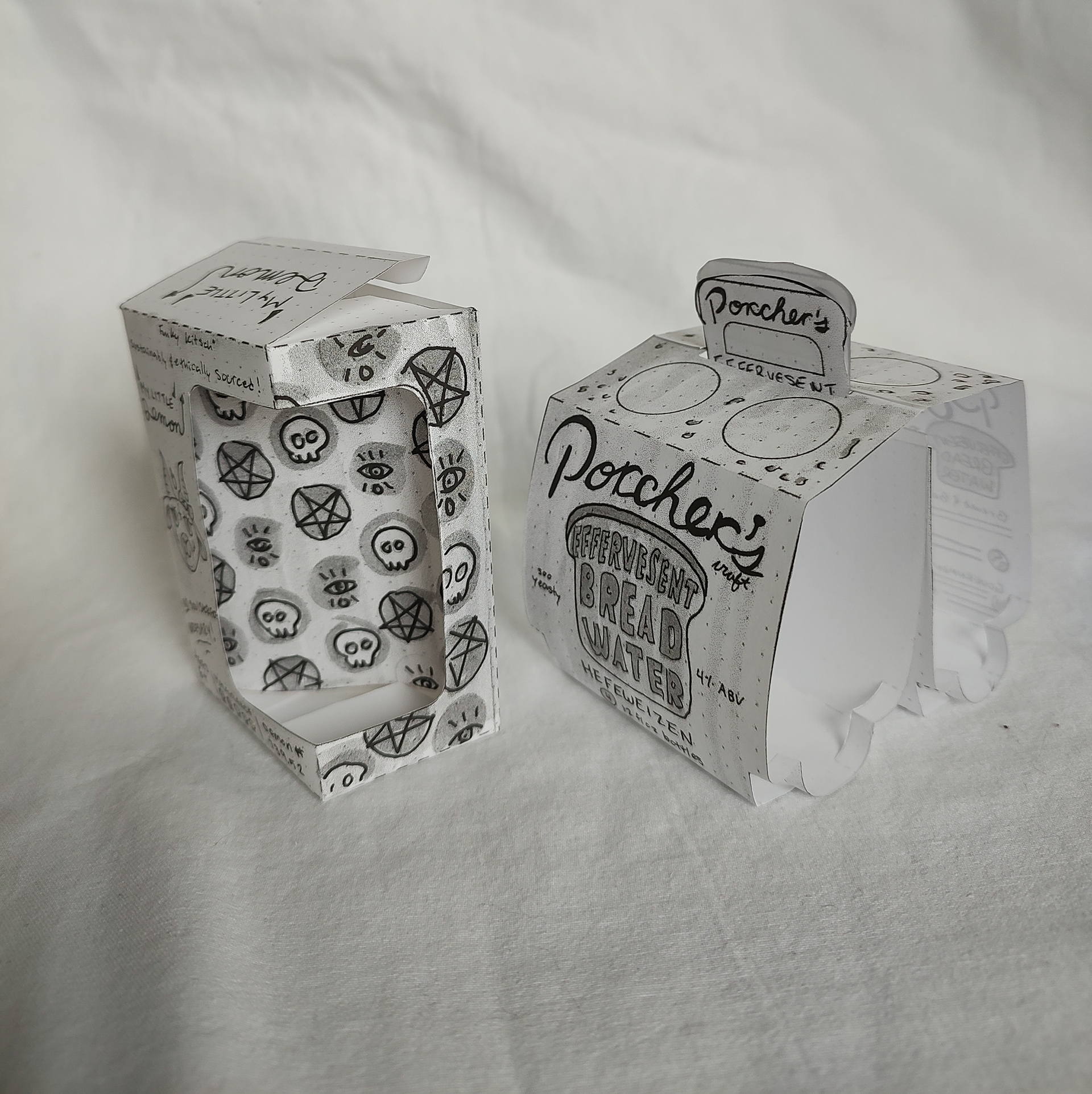
Porcher's carton thumbnail
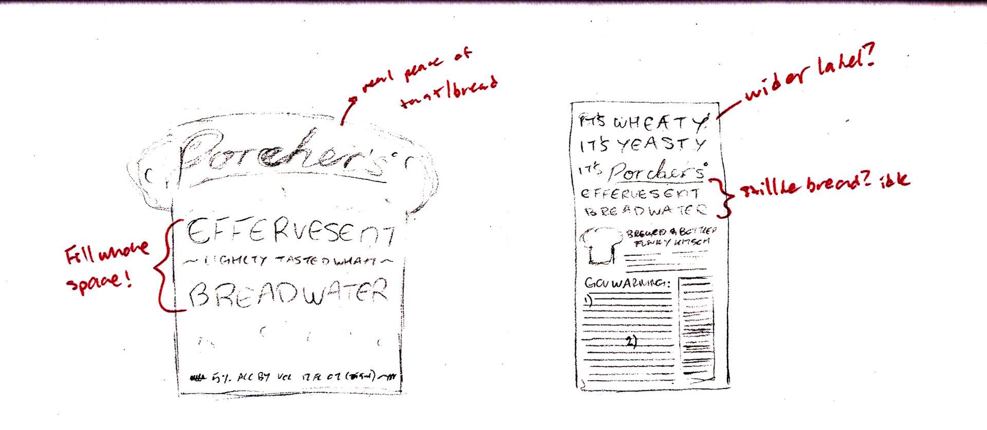
Porcher's bottle label thumbnail
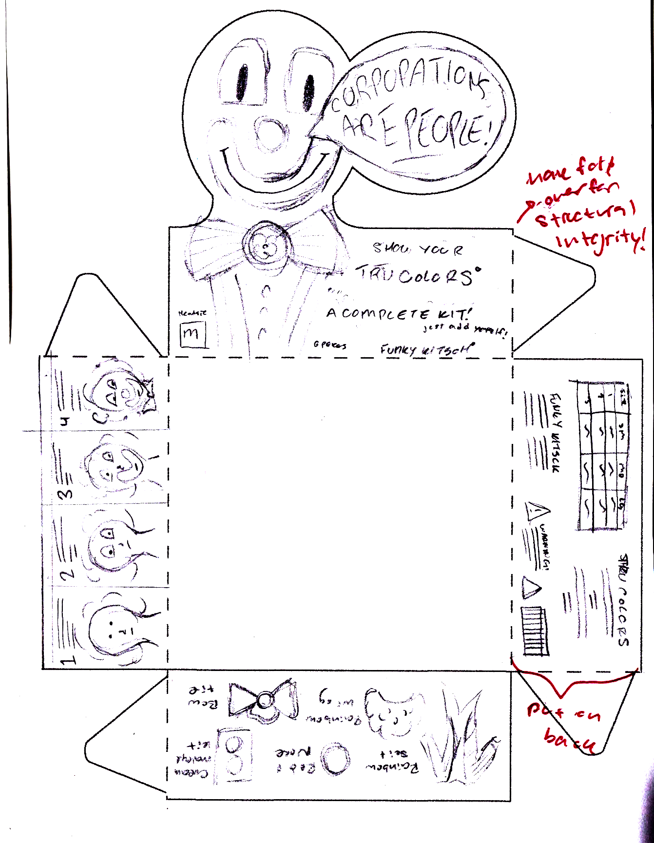
"Corporations are People" clown costume thumbnail.
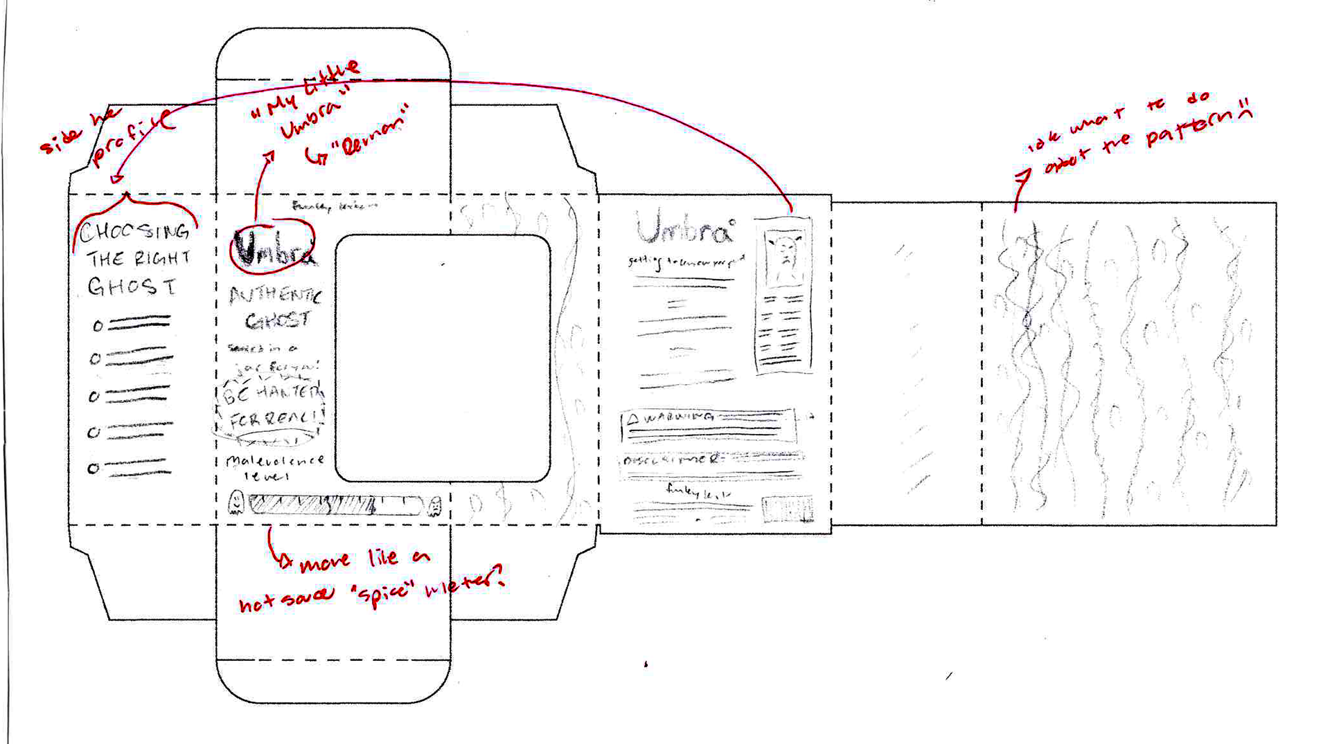
Ghost box "Umbra" thumbnail
Example of clown meme.
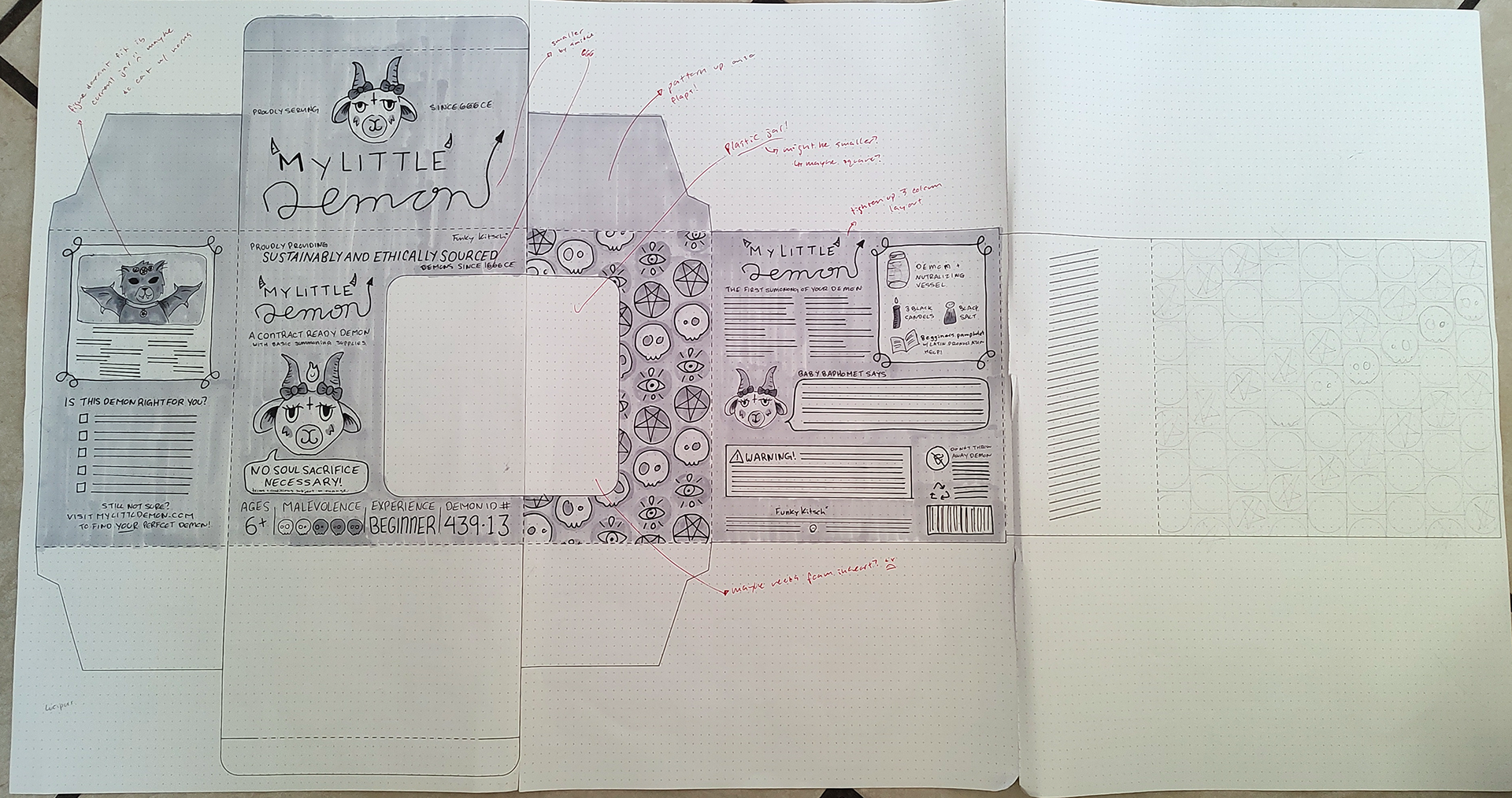
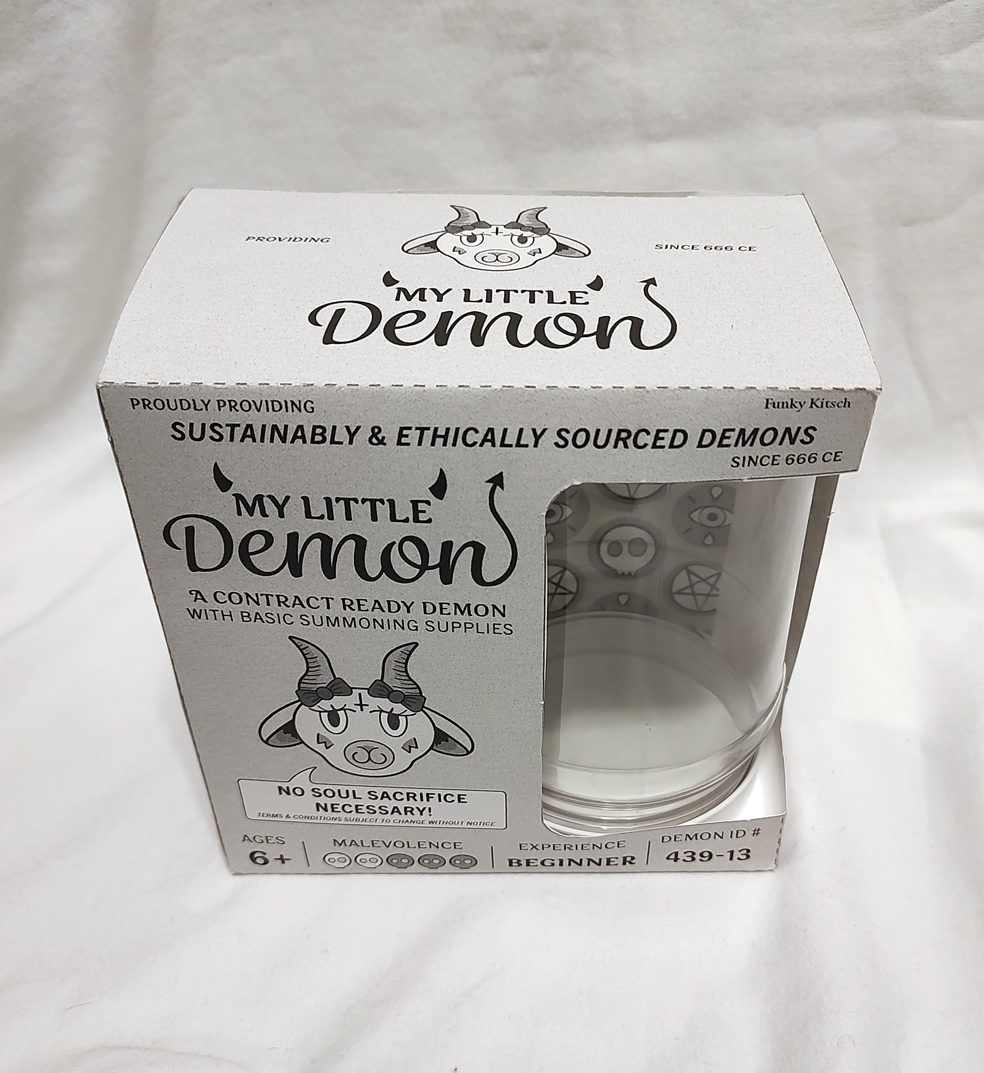
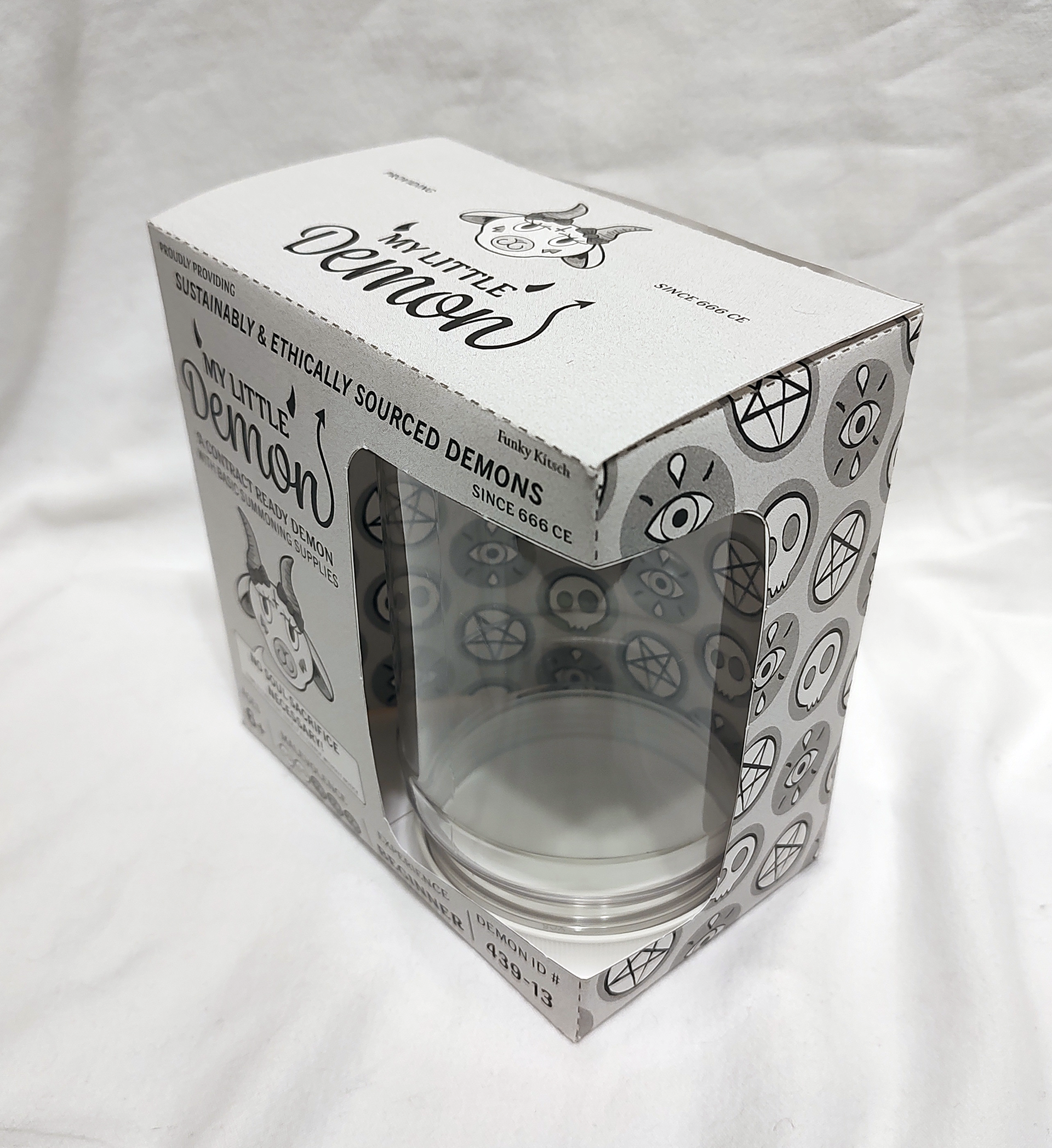
Though I look back on it and think "oof" it's fun to see all the little bits that still carried over through the stages, but evolved! (Particularly the malevolence meter, which had to stay somehow.)

Blank dummies
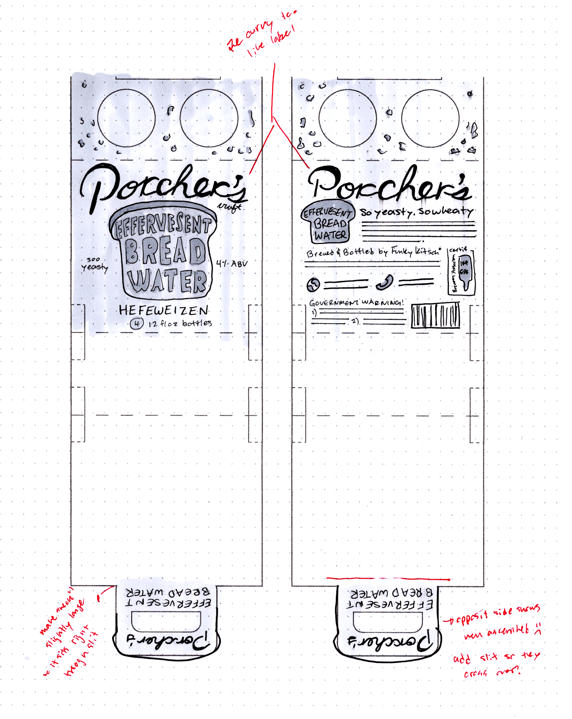
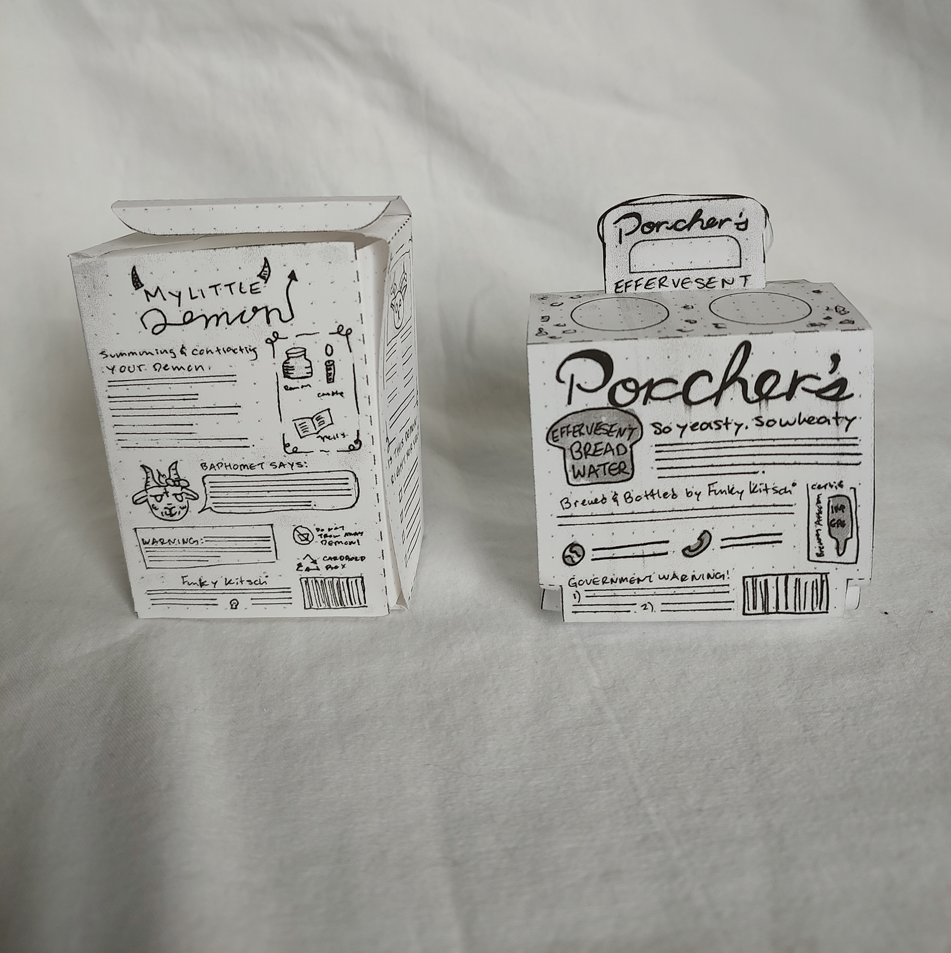
Porchers carton intermed
Porchers bottle label intermed
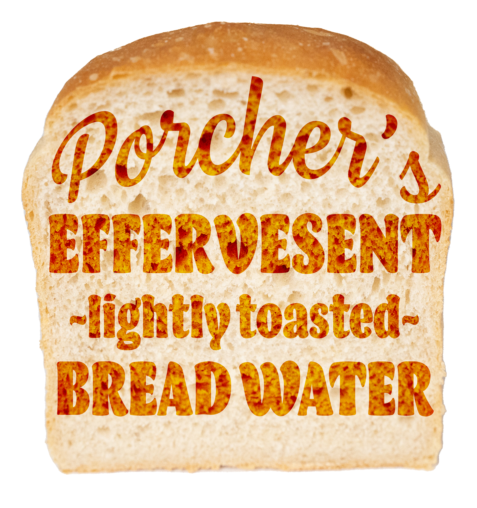
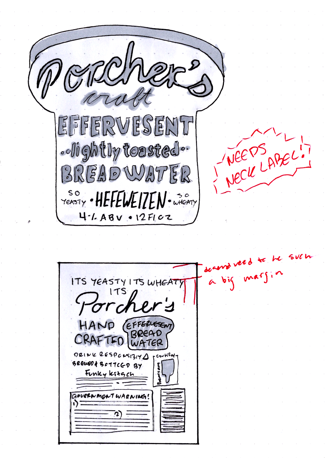
Porchers proof of concept (toasted bread idea, to help envision the hand compt)
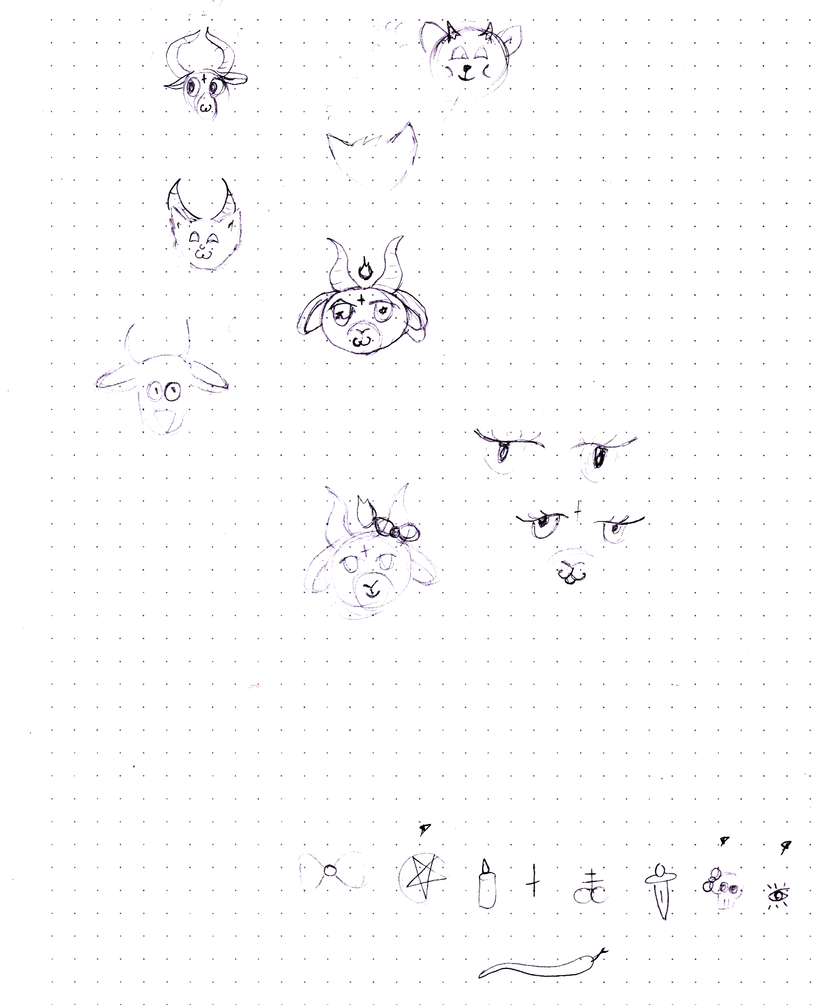
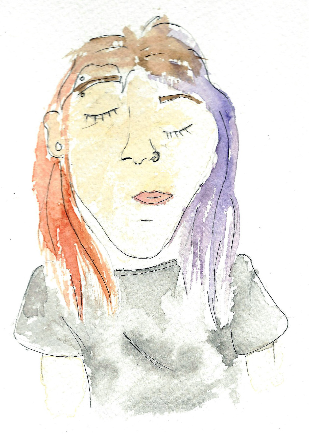
Doodles on trying to make a cute demon mascot and simple imagery to make into a pattern.
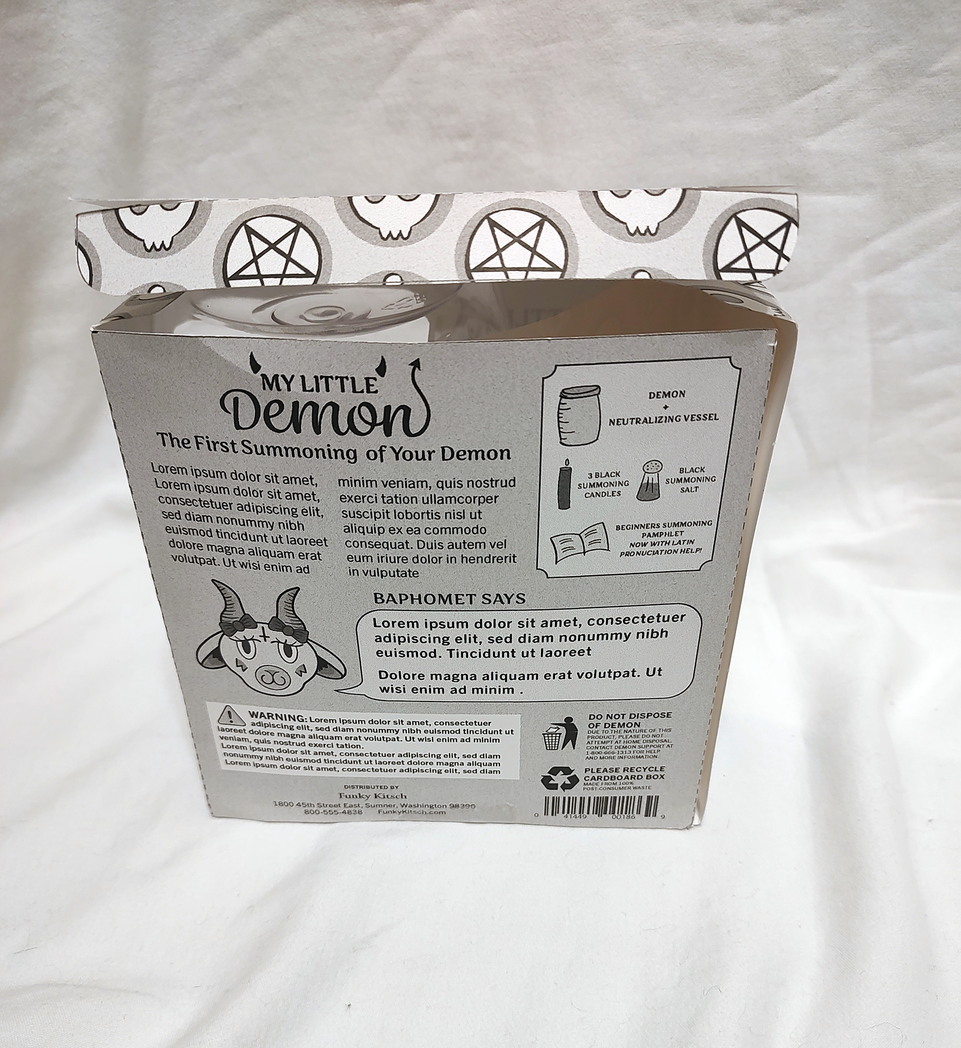
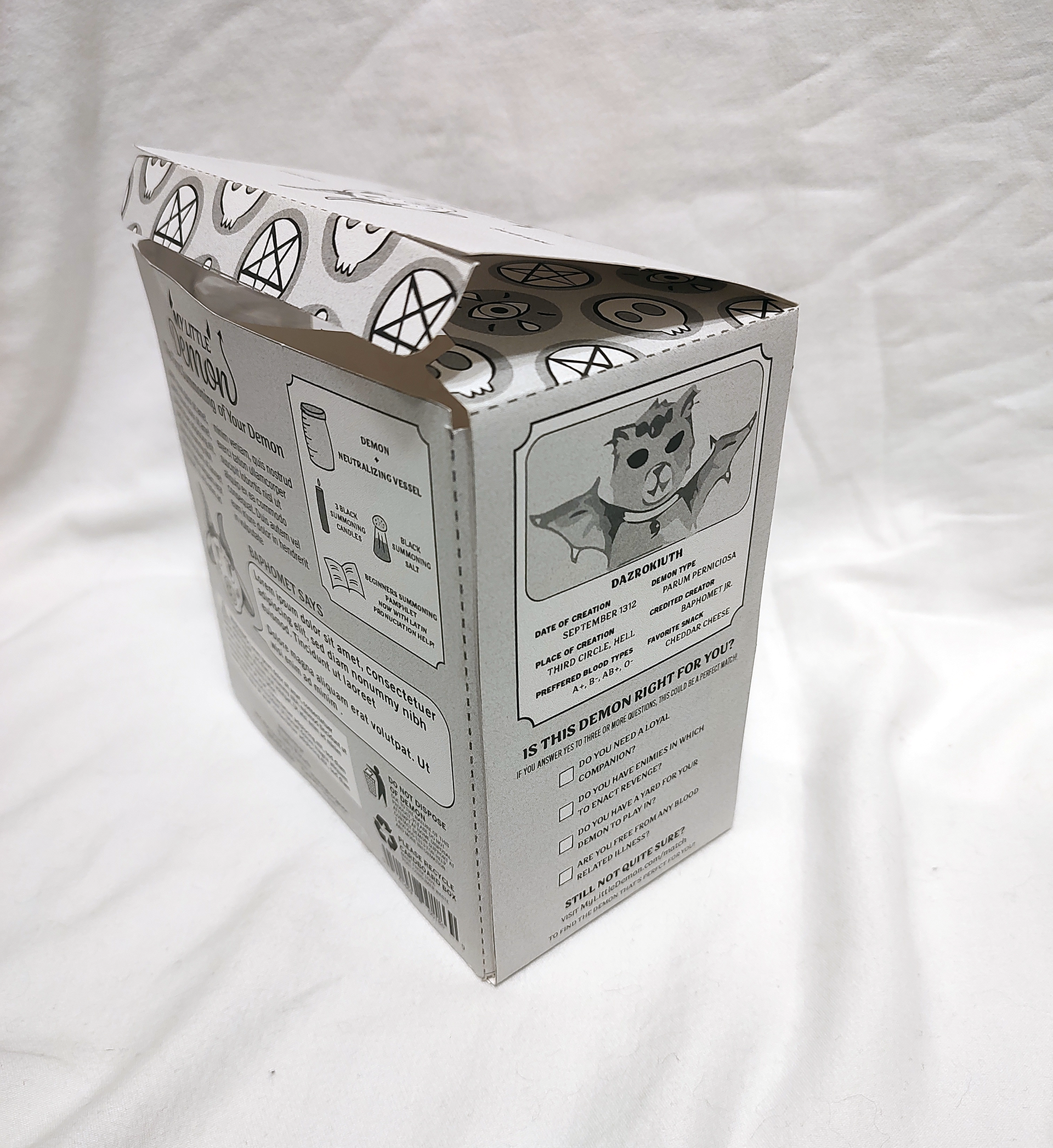
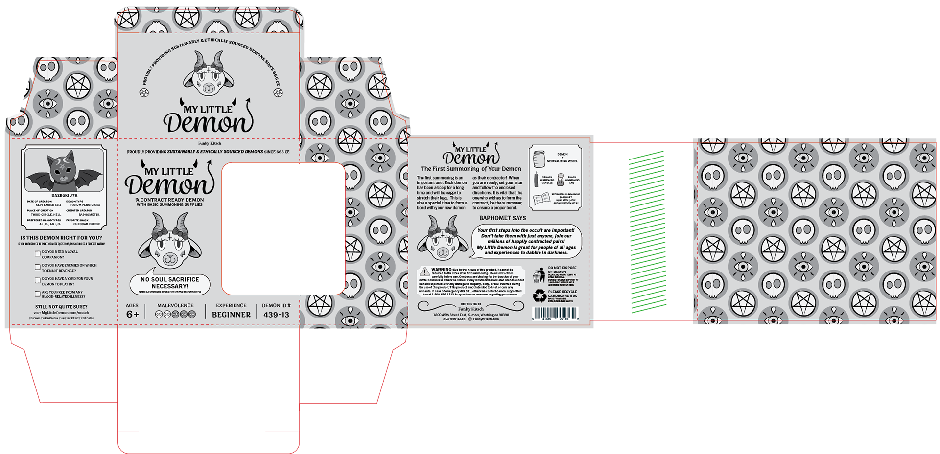
My Little Demon intermediate


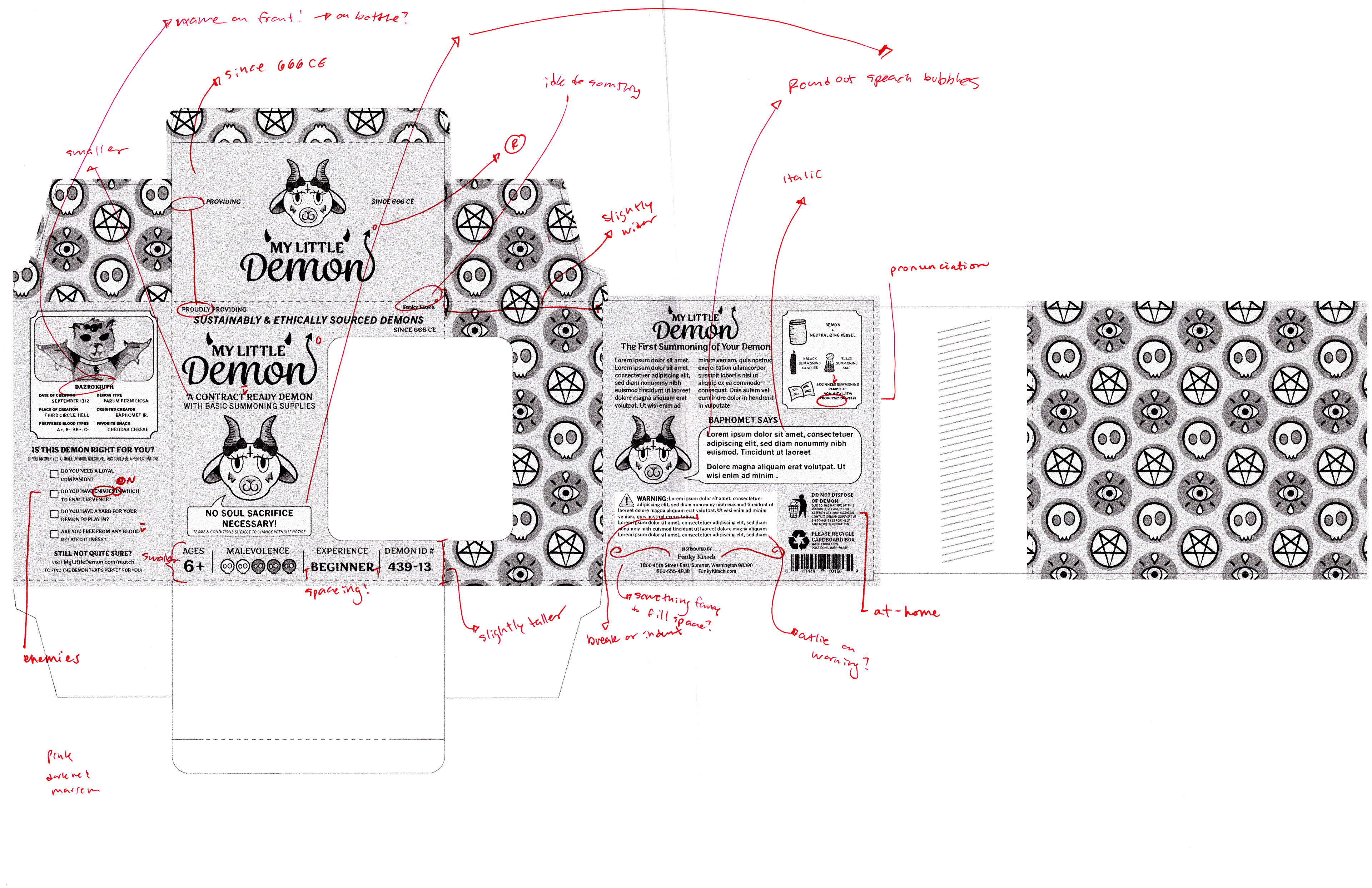
First computer prog
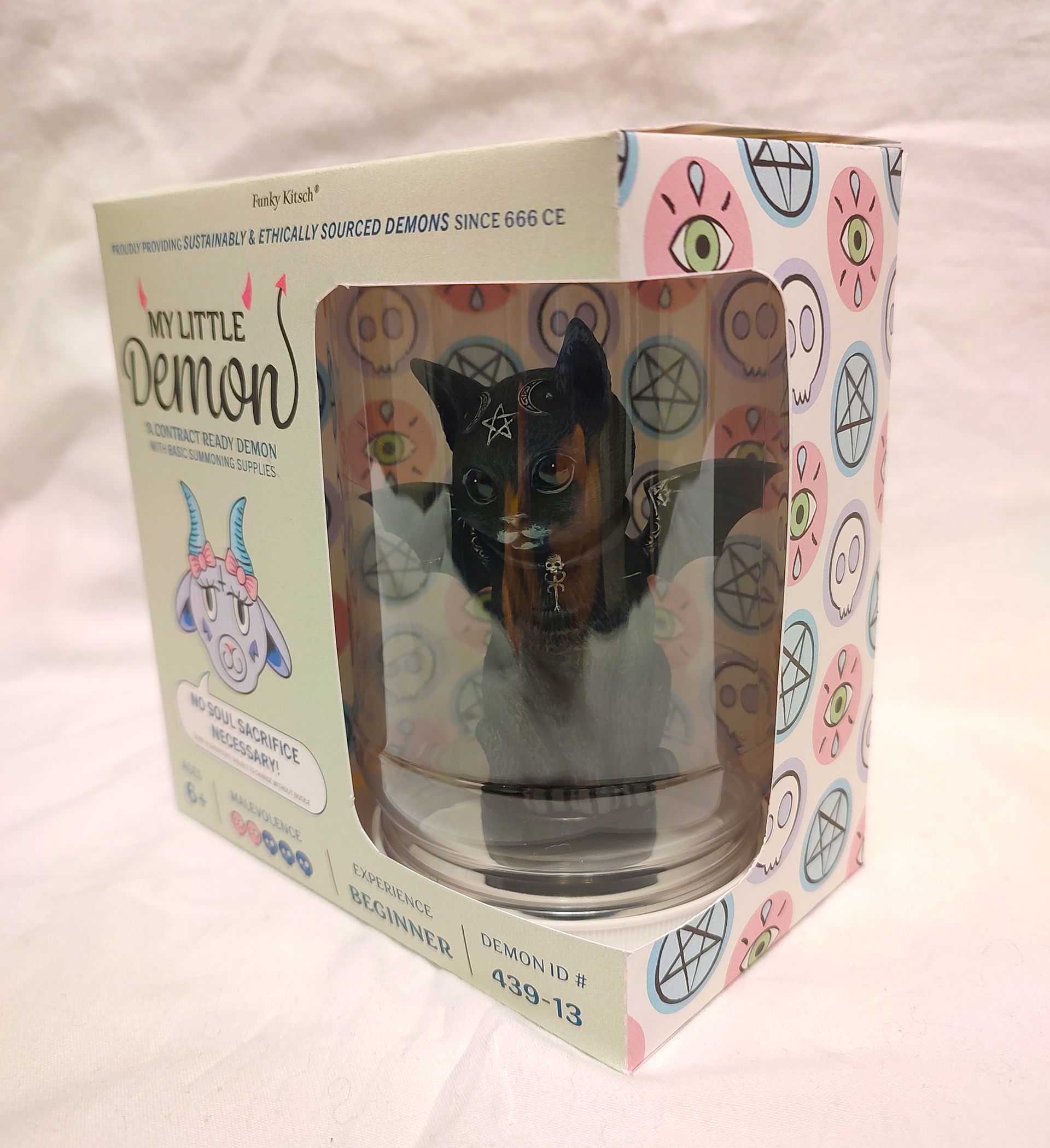
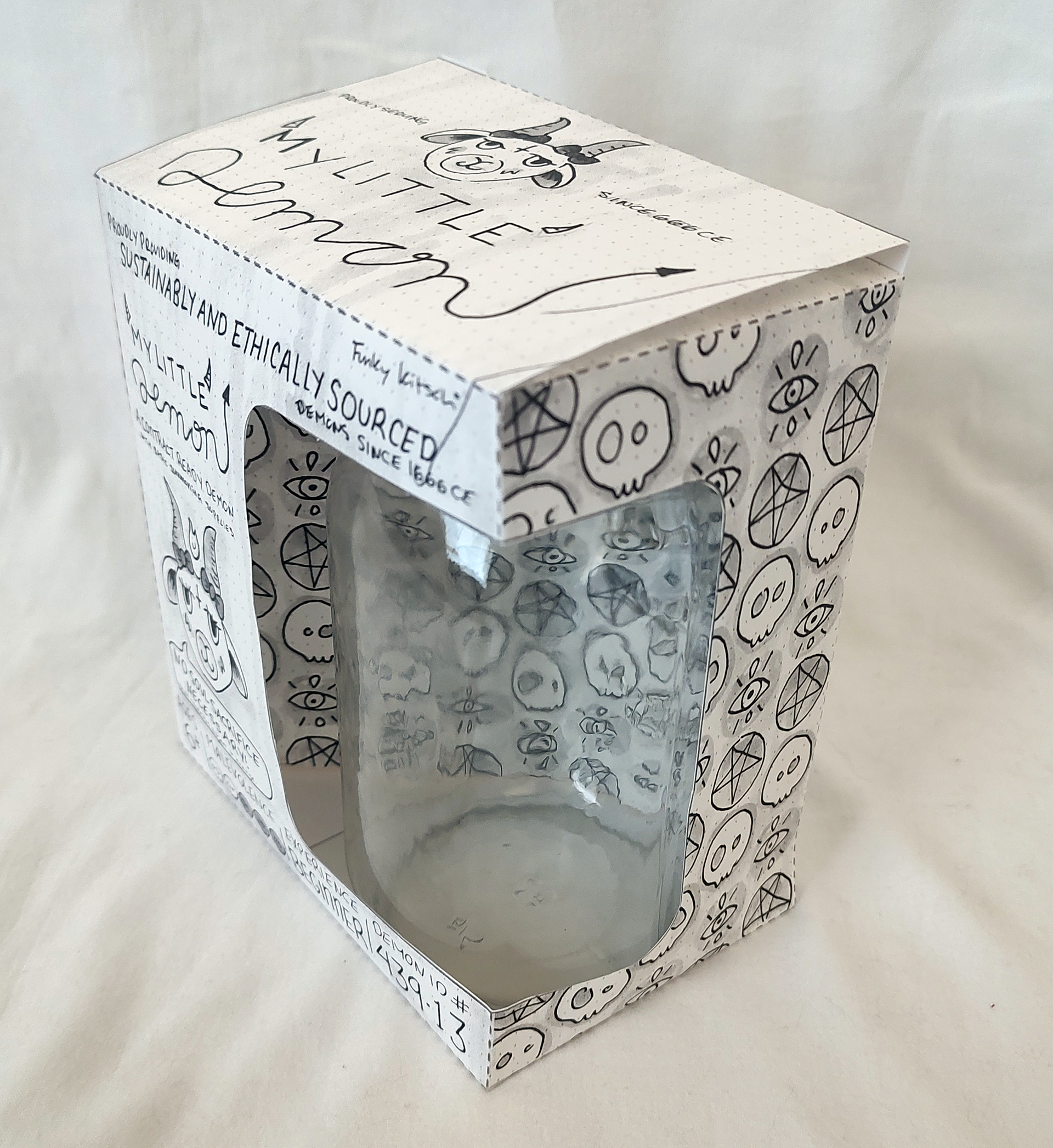
First computer prog dummy - front
First computer prog dummy - front/side
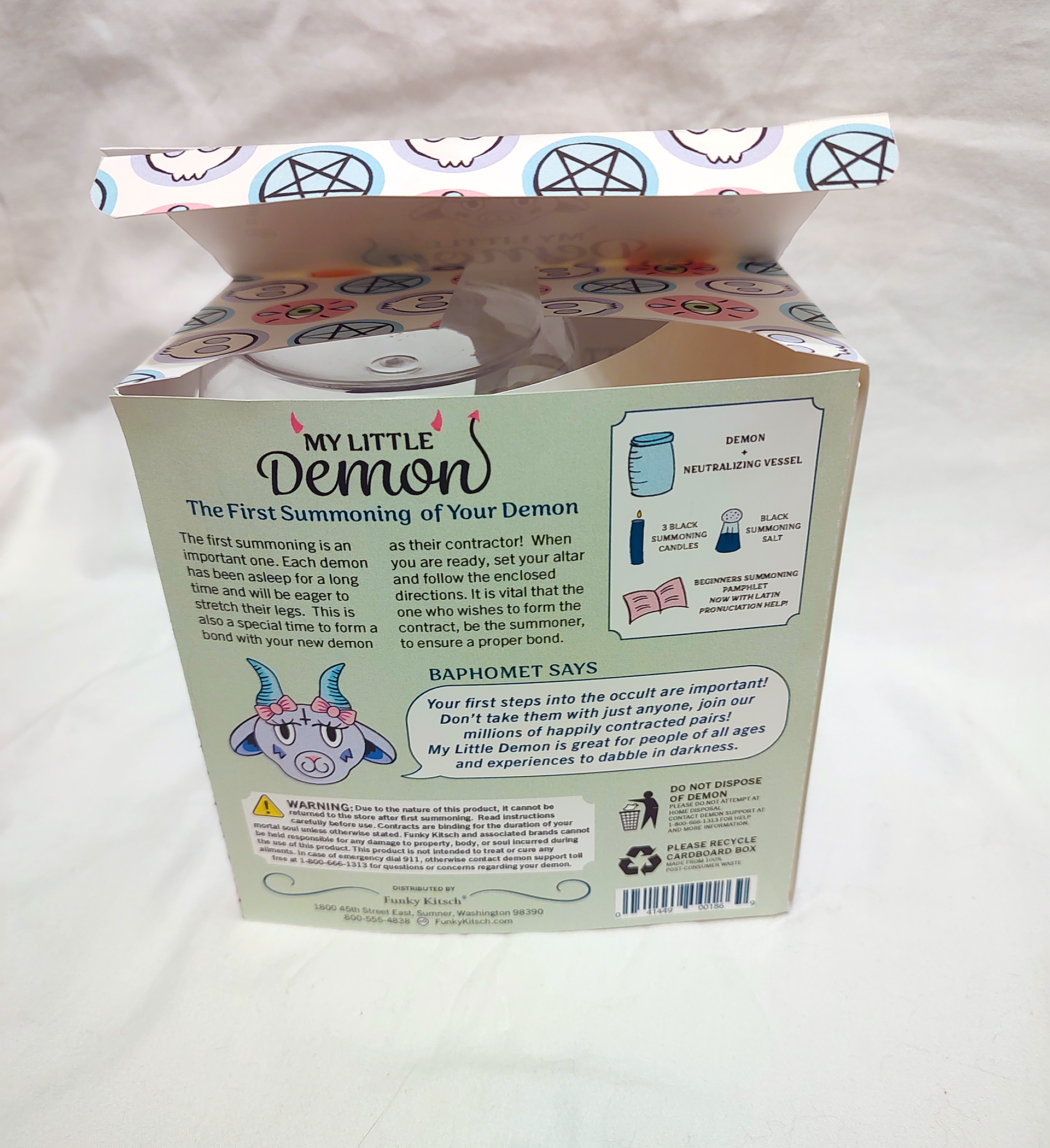
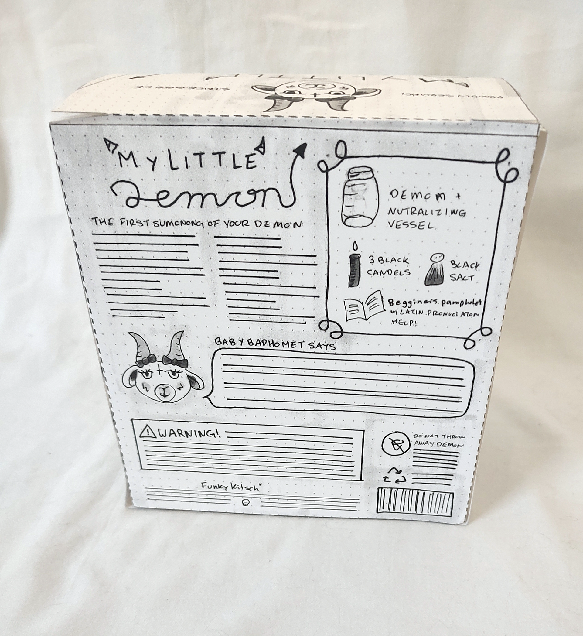
First computer prog dummy - back
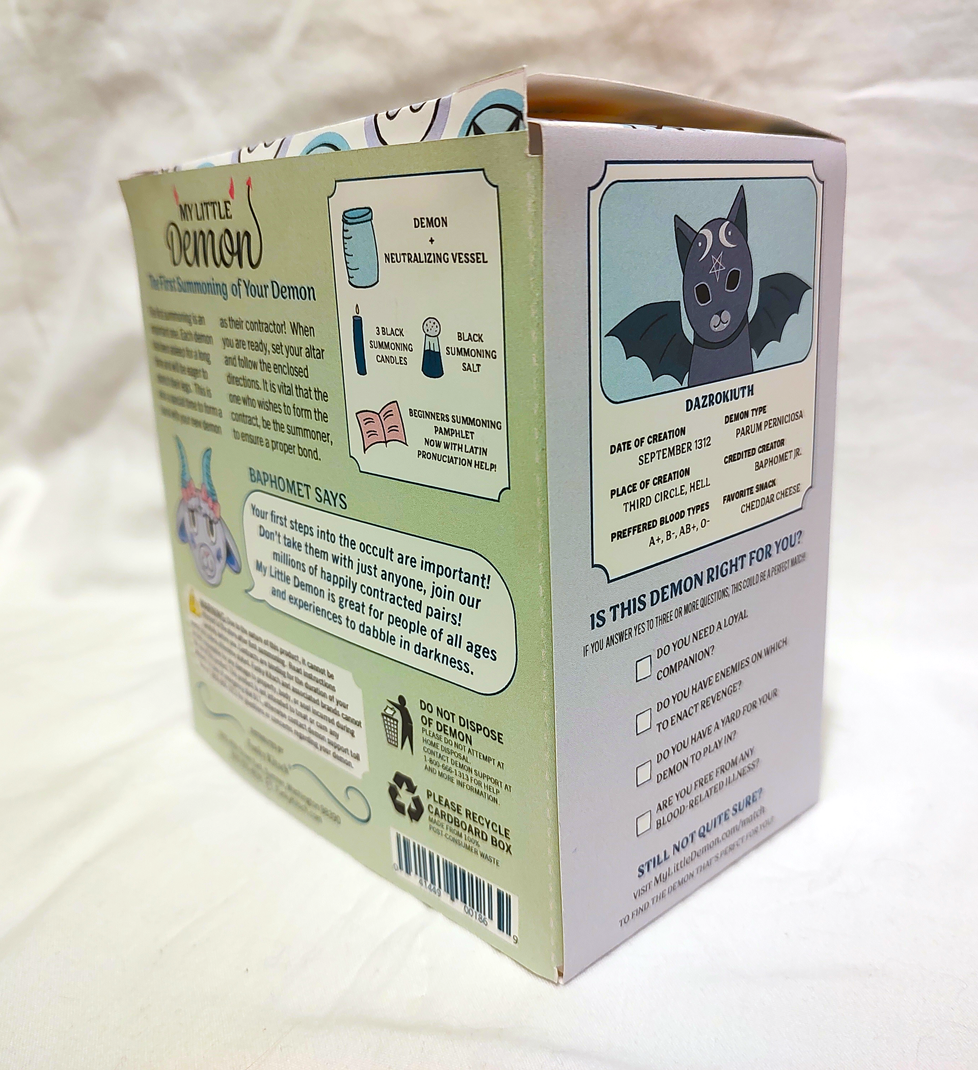
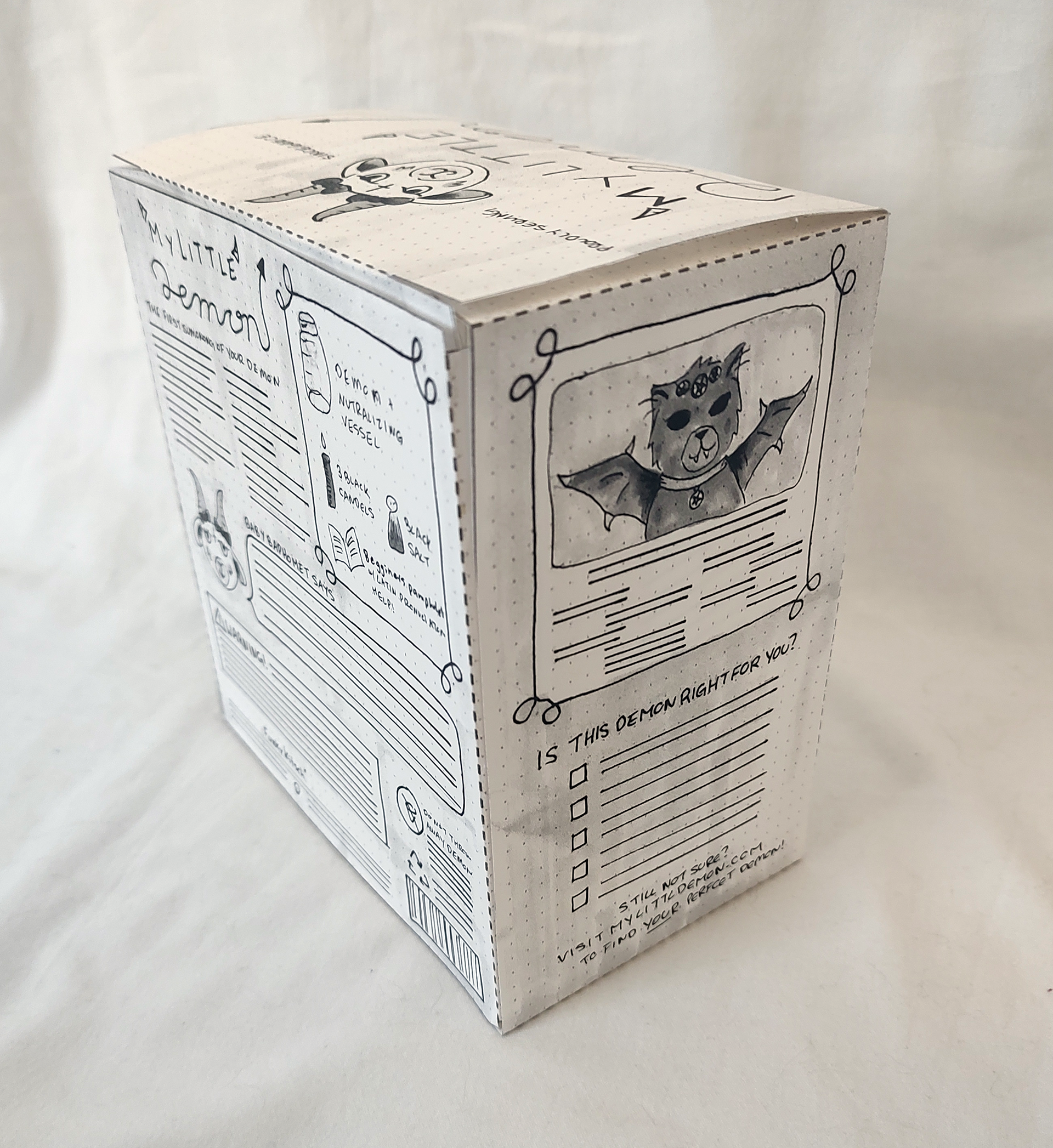
First computer prog dummy - back/side
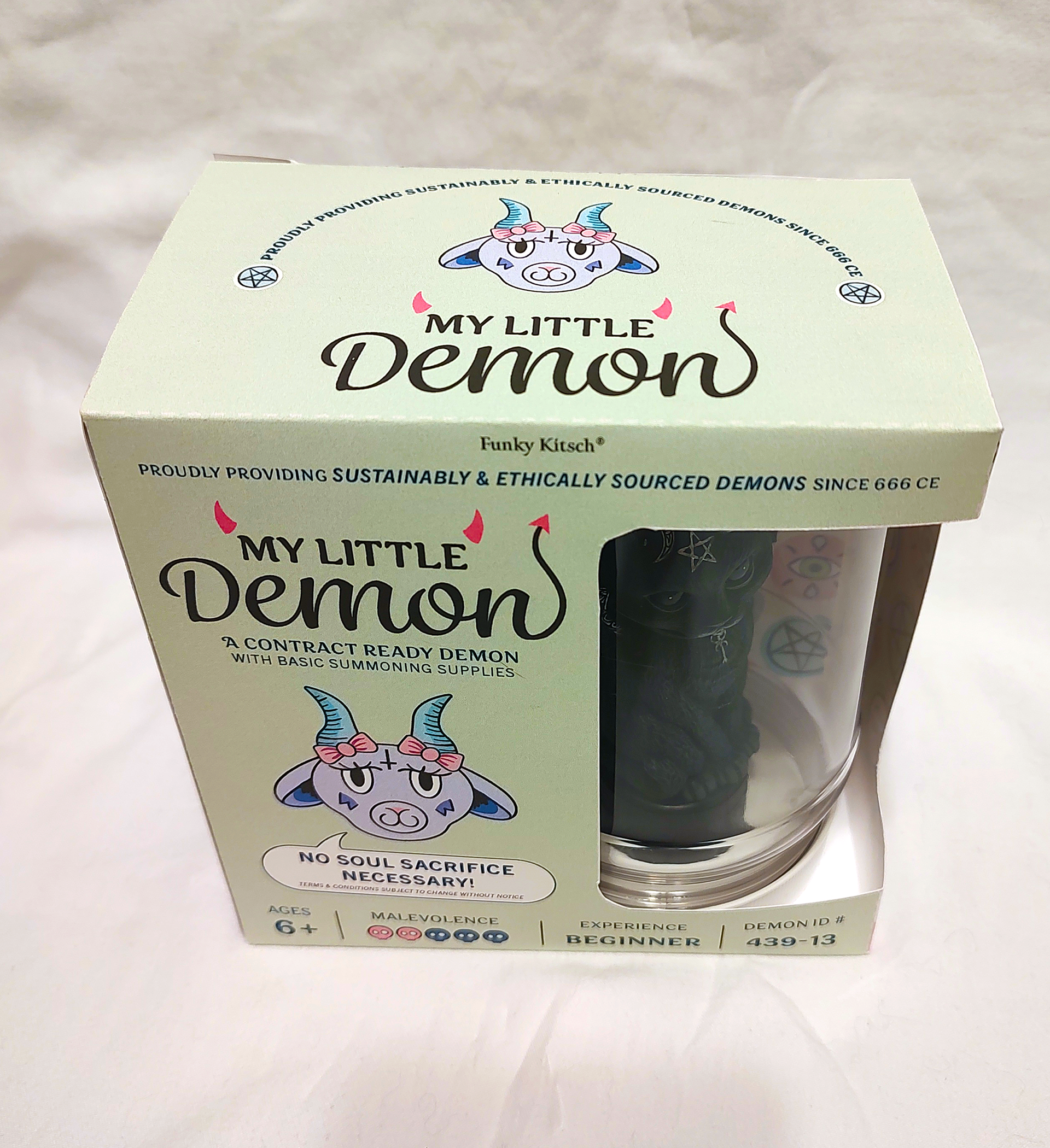
Second computer prog