

This project was to create a magnet set that includes a full body figure of ourselves, with 3-5 "accessories" to go along with it, with our name in the title. A big portion of this assignment was to get fun with the type and the title, especially since we're designing for just one side.
Research and Brainstorming


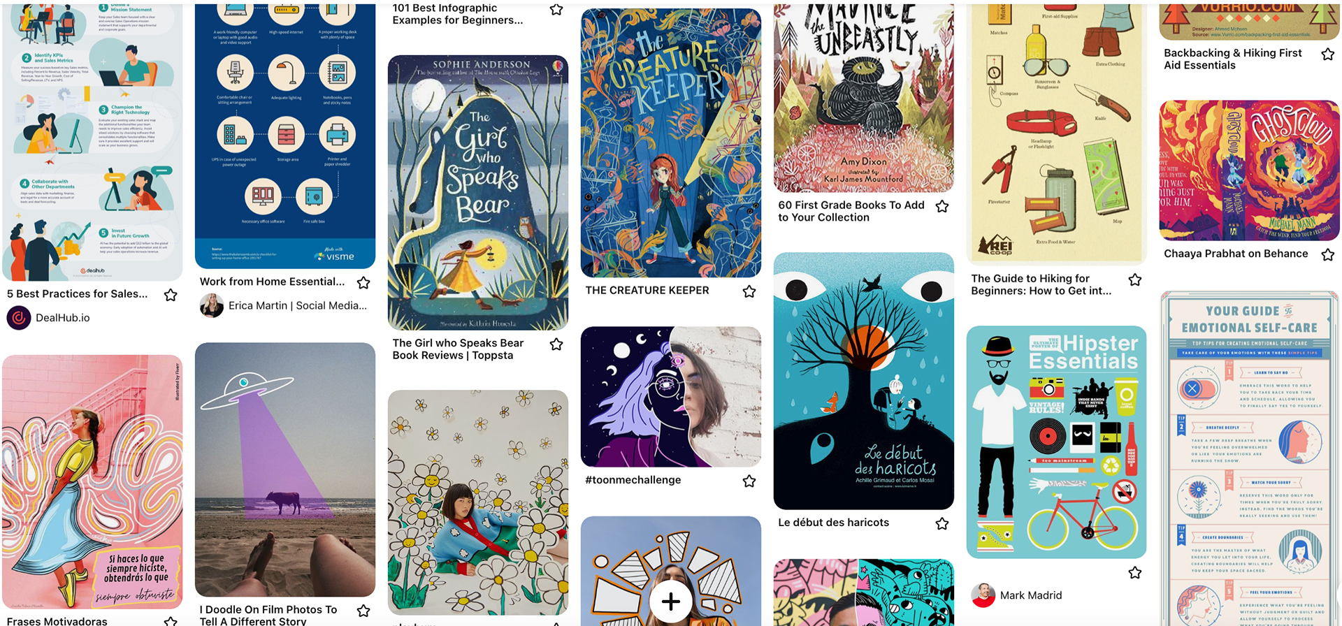

To start off my research, I wanted to look at some paper dolls, as well as kid's toy packaging that shows the items inside. I did this to get a basic idea of layouts, art styles, and titles. I got really interested in doing part photography and part illustration, so I started to look at a lot of examples of that as well.
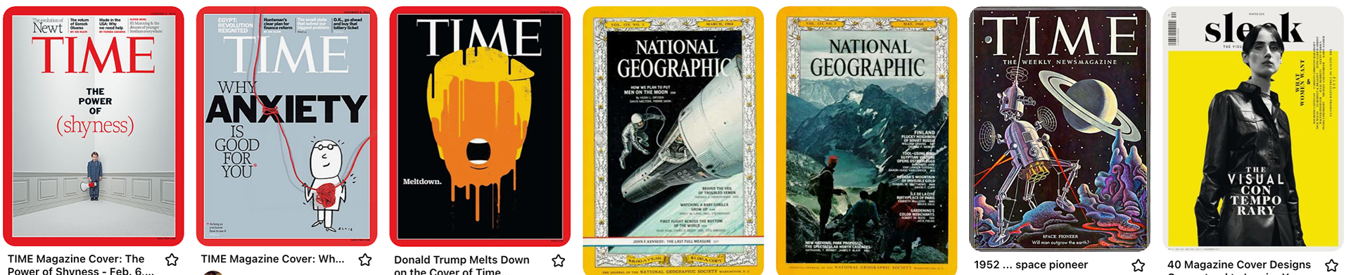
Once I got more into it and had more ideas to work from to narrow down my research, I looked at a lot magazine covers and comic book covers, as well as infographics. I needed help figuring out how to organize all the information I needed and the stuff I wanted. I also started looking at children's book covers and art styles and title treatments to help spark some creativity.
(Ever since working at the library, putting away kid's books is my favorite, but now I have a million pictures on my phone of book covers.)
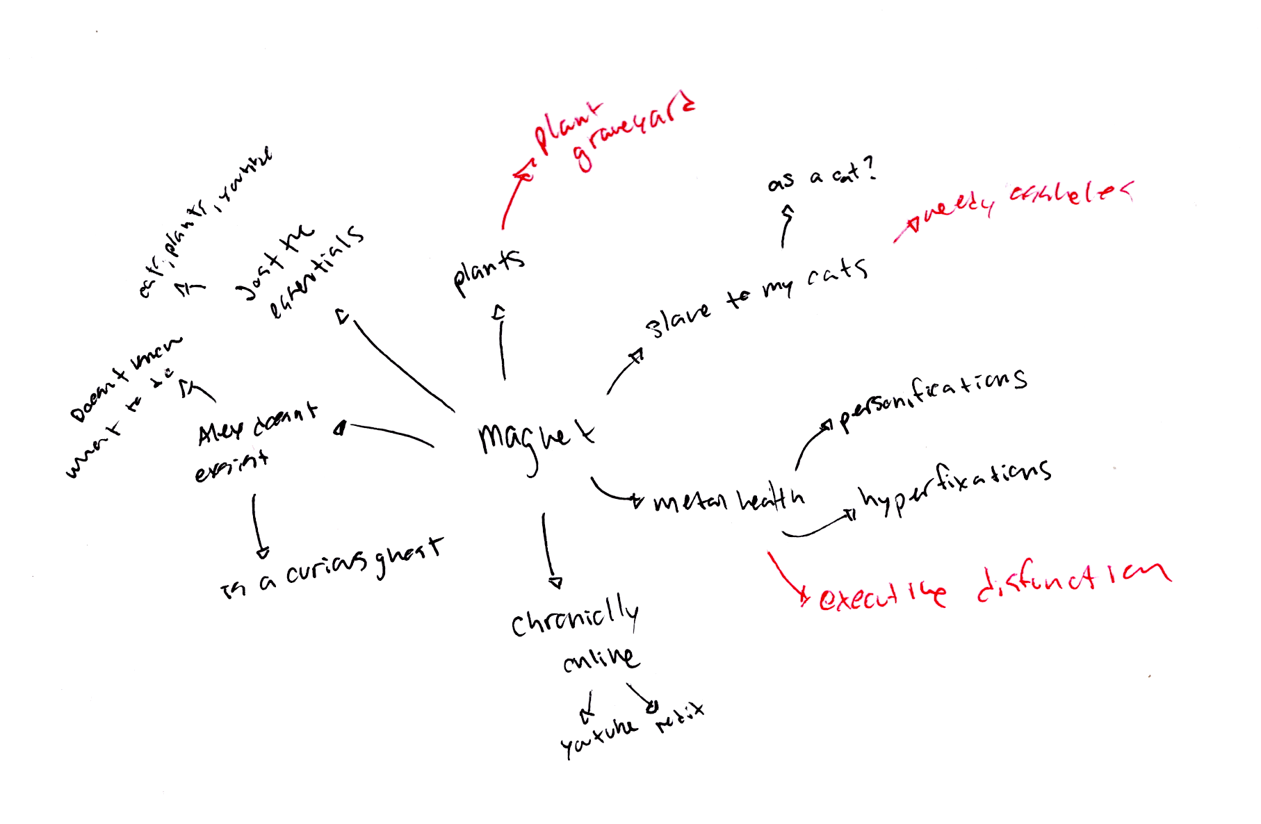
As for brainstorming, I just thought about my everyday things and how I could use that. So a lot of it came down to mental health, plants, cats, being online, and just existence.
Sketches and Doodles

I tried to just keep things pretty loosey-goosey at first, I just wanted to focus on a name and items, and not so much on the figure yet. Trying to put all the info in different spaces to try and ensure I don't just do the same layout nine times. At this stage, I'm not so focused on title treatment.
Thumbnails - Flat
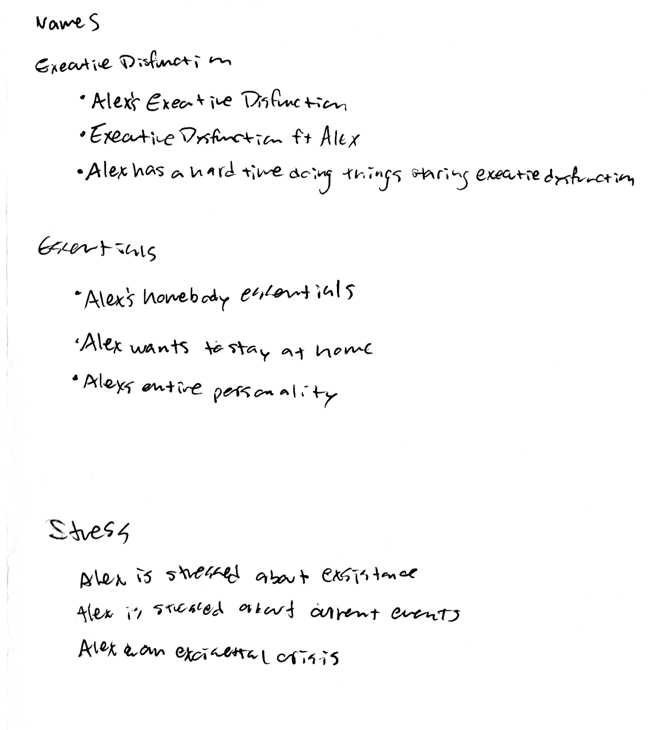


Once I had chosen which three ideas I wanted to move forward with, I started to brainstorm some names, as well as going back to researching.
"Alex VS Executive" dysfunction I wanted to feel like a comic book cover. I'm not so sure it really reads like that, but I like the layout overall. Part of the reason I was attracted to comic book layouts was the treatment of series/item numbers. Lots of little information that's organized well. I'd like to add little blurbs about what each item is though.
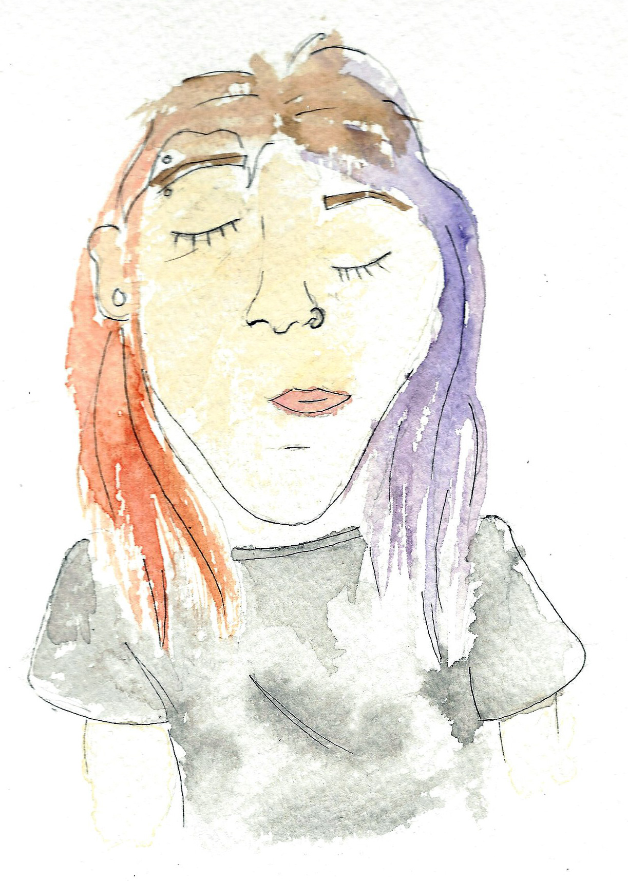
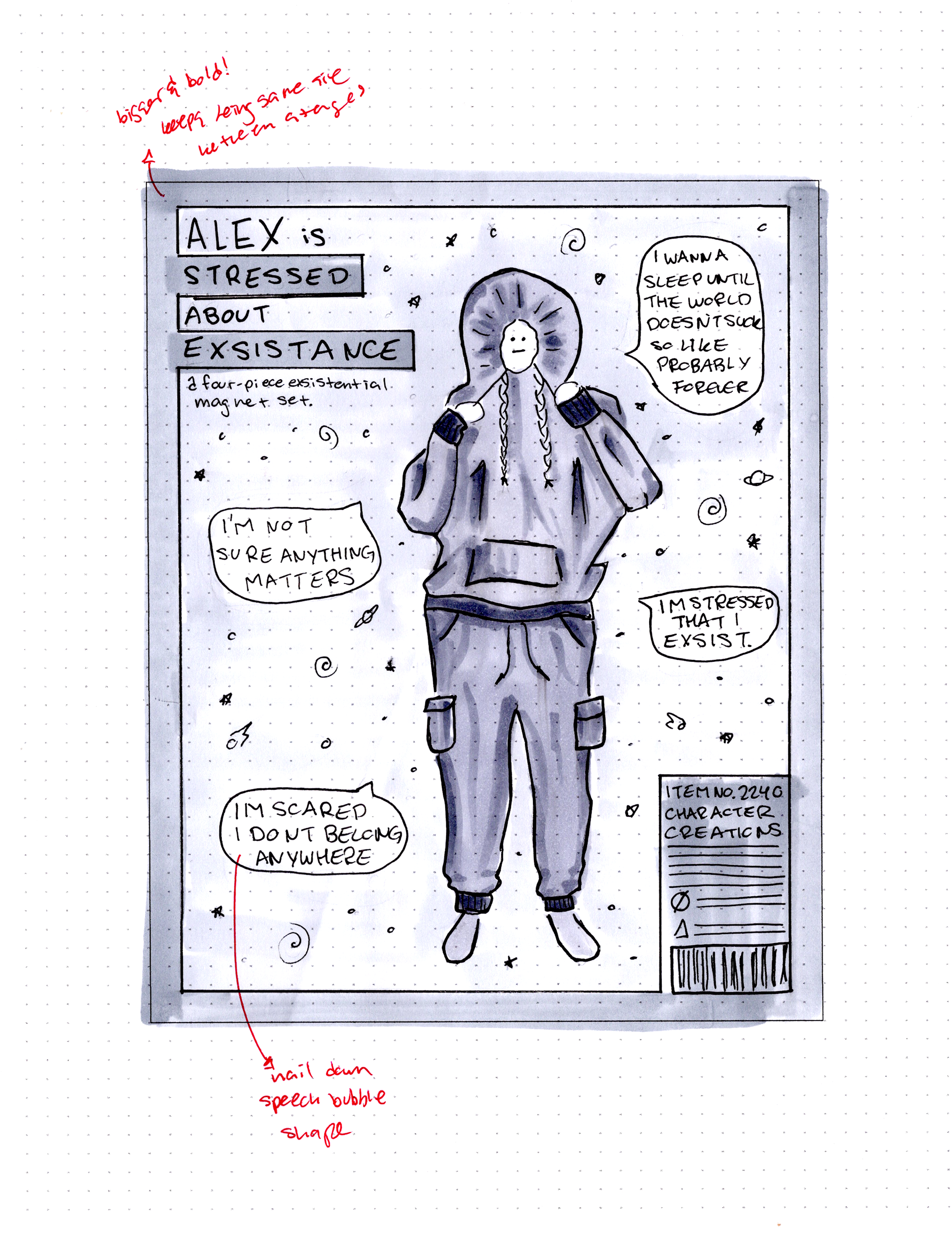
I wanted "Alex is Stressed About Existence" to feel kinda national geographic-y. I had a lot of fun making this one and drawing the figure. I moved forward with that one from my doodles because I was feeling stressed about this project, and thought "fine, I'll do the project about how stressed I am." I really enjoy how I treated the title and organized the information as well. The general consensus was that the flaming earth felt out of space, and to maybe just make the third accessory another speech bubble.
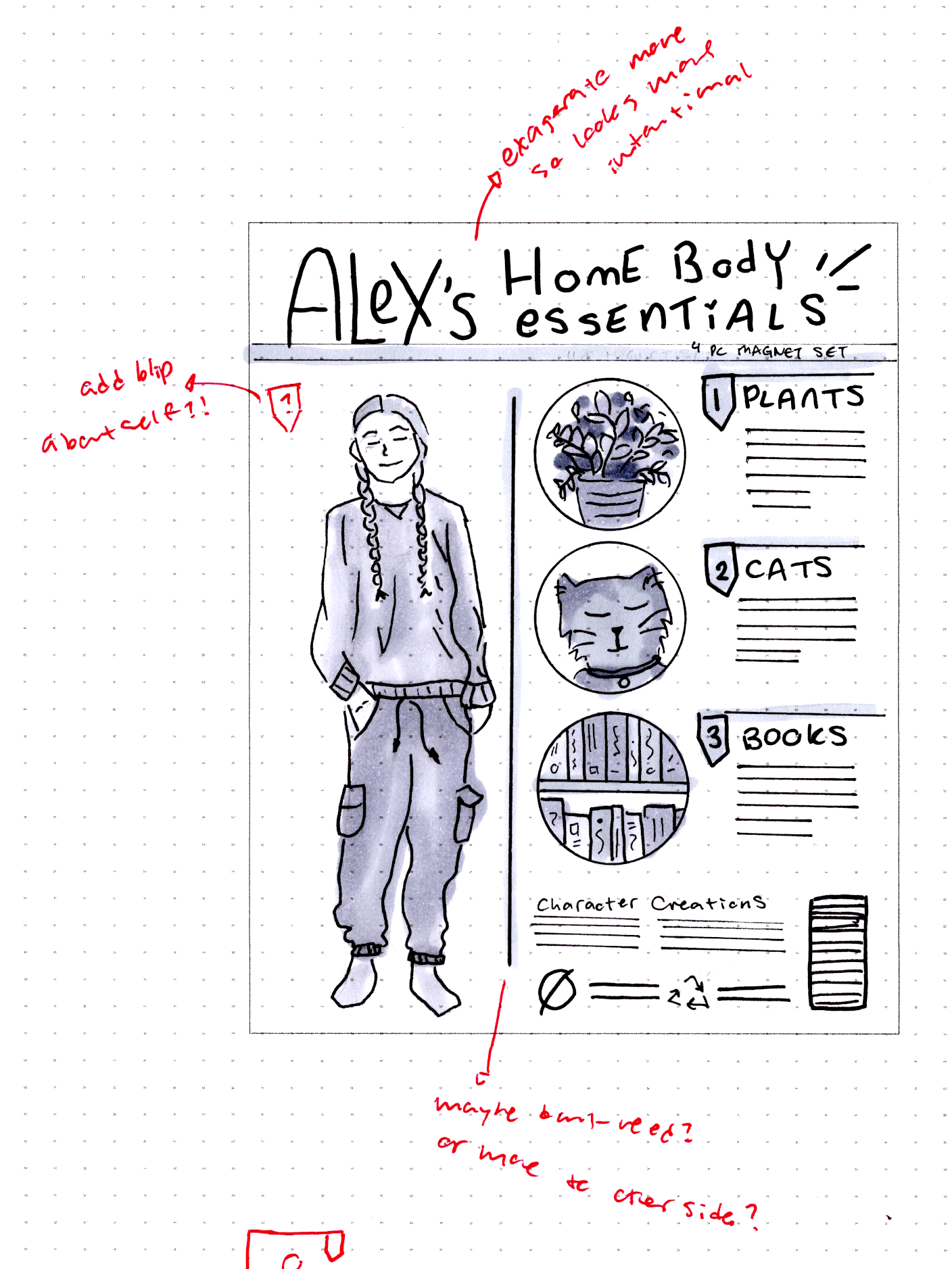
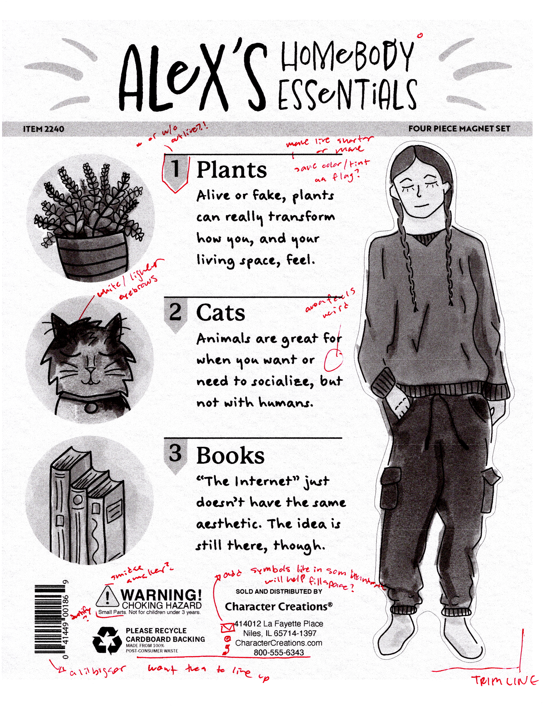
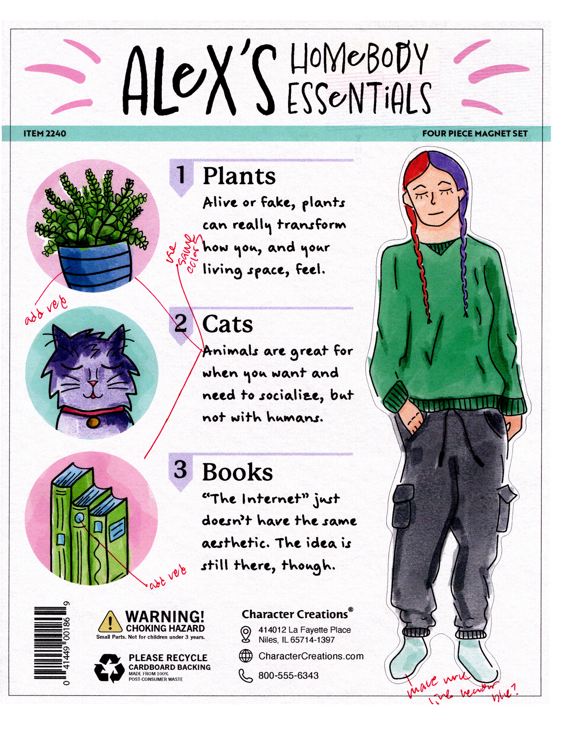
"Alex's Homebody Essentials" was a struggle at first, because I knew I wanted blurbs to talk about the items, but I didn't really know how to organize it. I also wanted at least one option with magnets that were a simple shape. I looked a lot at info graphics on how they were organized, as well as the type of art style they used and how it complimented the layout or not. One of my issues with this one was figuring out if I needed to have a little blurb about myself as well.
I think this stage is my favorite, I really like all three of my thumbnails and how different each feel and the title treatments. I feel proud looking back at these and the art I did, especially with the figures. I guess I didn't forget EVERYTHING from my figure drawing class.
Intermediates - FLAT

I got rid of the flaming earth with "Alex is Stressed About Existence" and added two more speech bubbles. Some people said that some of the bubbles were too dark, and they preferred the lightly humorous ones the most. Overall I felt like I had a lot more things solved on this one, and I just like the shapes with the border.
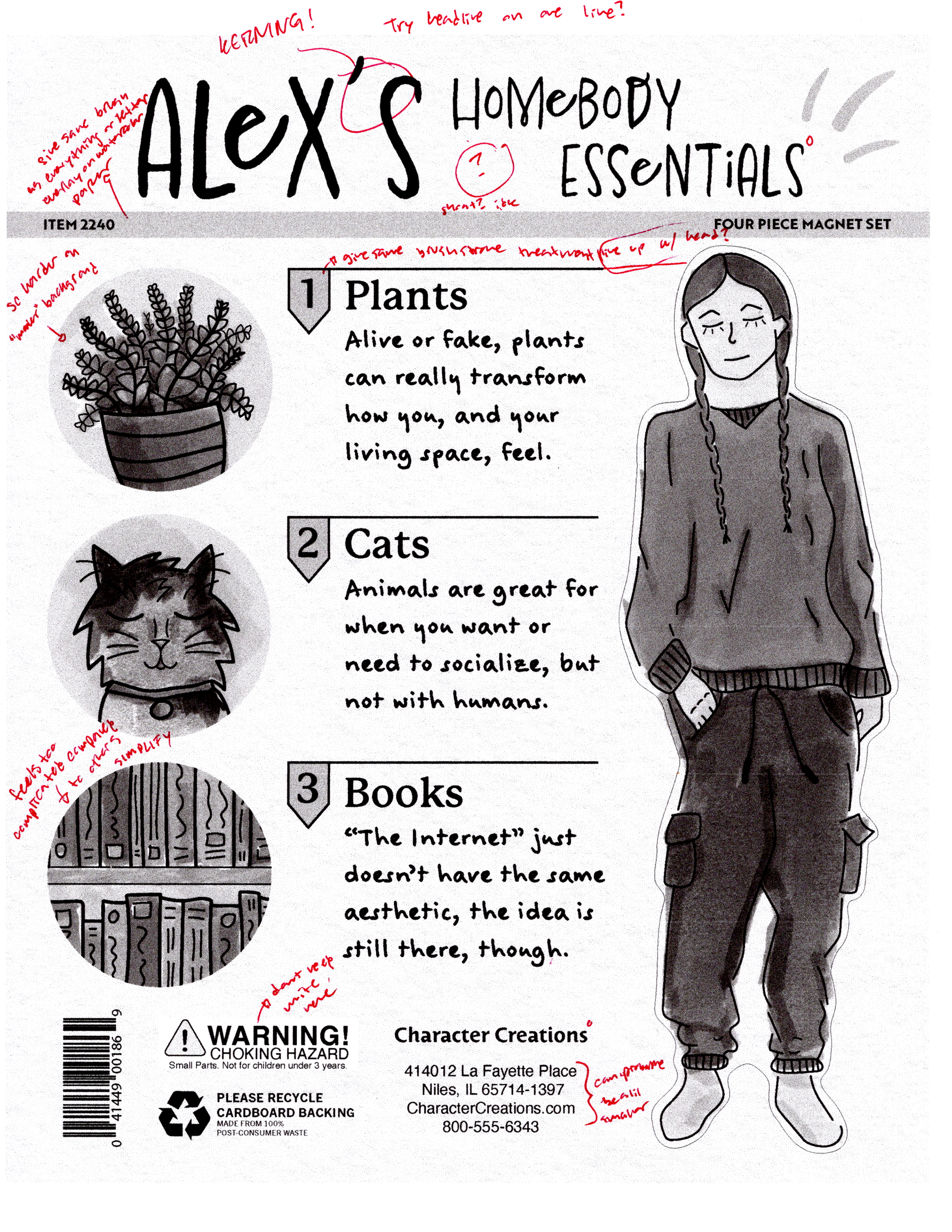
I added a blurb for myself for Homebody Essentials, I started to really struggle with fitting all the footer information. I think I forgot that I can slightly adjust the end dimensions. I wanted to try a different outfit for this one, but there was just something about that first drawing sit down, so I ended up just enlarging the figures and tracing them. I started to feel stressed about what a background might be though. I thought about big knit blankets or a comfy sweater type texture.
Gosh, I just really love these both for different reasons. I had such a hard time deciding between the two, and they're both very different feelings, so I didn't really see a way to combine the two. I ultimately chose to move forward with Homebody Essentials, but even now, I'm extremely drawn to the hoodie figure, and I'll definitely revisit it in the future.
Final Hand Comp - Flat

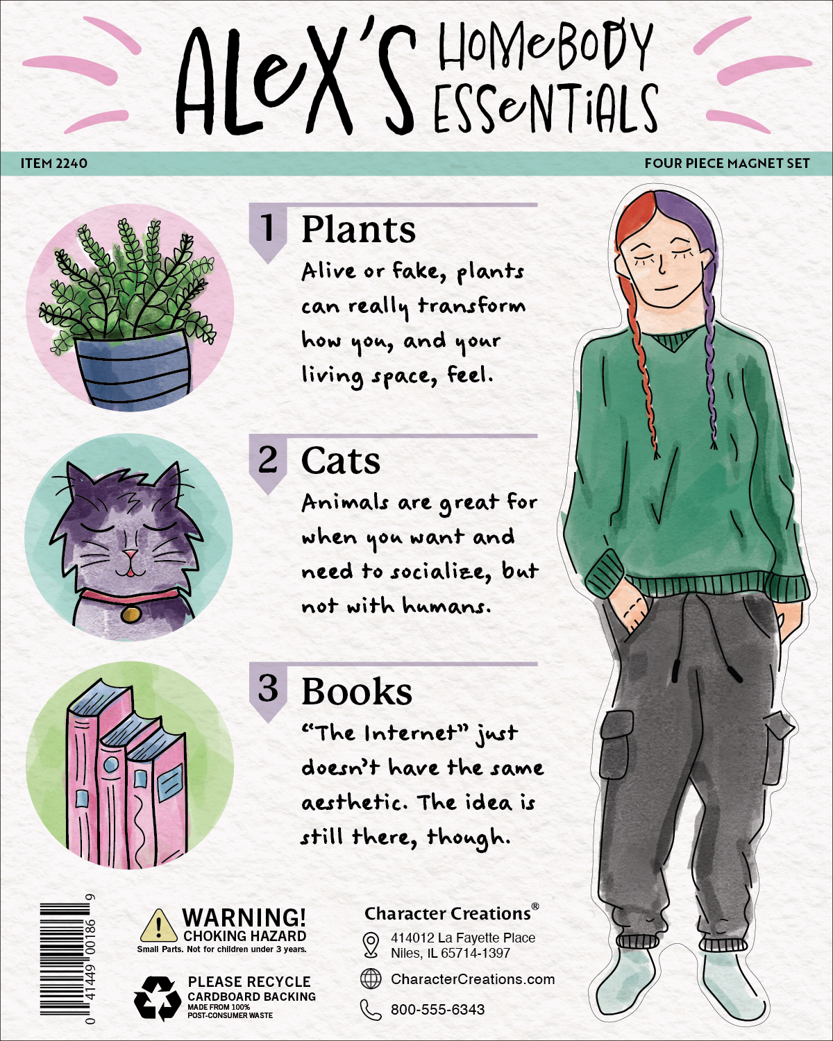
So here we are, the final hand comp, and as you can see, I clearly made a decision. I ended up choosing this one because I felt like my mood might be better while working on this one since it's more feel-good and kind of self-care related. This time of year is always really hard on my feels, so that's my number one priority so that I can remain a functioning person.
The biggest change between the intermed and this one is the placement of the magnets, it's more balanced this way, and it's also just more practical. It means I'll be able to put the hang tag more in the center for aesthetic reasons, whereas if all the magnets were on one side, I'd have to put the hang tag on that side to make it hang level and I think that, while not on a peg, it might look funky. But mostly just because I like the way it looks.
While I was doing this portion, my dad walked in and said "Oh, it's Yoyo!" and it made me happy to know that my friends and family can recognize that it's my cat right away, that's a huge success in my book.
Computer Progressions
First computer comp
Second computer comp

Third computer comp
When I got to the computer, I though "if worse comes to worse I can just scan my clean final hand comp and use those images and just recolor them" but something that really helped motivate me to do it all digitally was that photoshop has a free marker pack, that acts very similarly to the markers I already use. That set me off to the races! and I was really happy with how my artwork was looking digitally.
After my first computer output, I decided I needed to completely rework the books. They stand out and feel cluttered almost, so I decided to make them more similar to the others by simplifying it and making it so it only breaks the boundary at the bottom.
I also decided to completely ditch the little blurb about myself. I wanted to keep it the 8 x 10 size so I could print it on letter size, and if it was a different size I'd have to print it on a bigger paper, and could probably only fit one out on it and that just really rustled my jimmies.
I struggled a lot with the empty space in the title, I tried a little bit to add the lines in there, but it looked silly, and I tried to make it all one line, and I hated how that looked, so I just stacked em right on top and added the lines on either side. They look like whiskers to me, and I think that's cute as hell.
For the background I chose to go with a watercolor paper background, it's very subtle, but I think that's just what it needed. I felt like a knit pattern would become too much.
I also want to note that I had to search for a font with a lower case e, so all those e's are a different font. I'm really annoyed that the main font had many glyphs to make characters lowercase, but nope, not with e's.
Color Studies
UGH. Color studies. I hate it. So much.
Part of the reason I struggled so badly with color studies was that I couldn't figure out how to recolor something I already digitally drawn in photoshop. I found a few different answers but none of them were really satisfactory, which made me feel like I had to just recolor each and everyone with different colors, and that just plummeted my motivation.
I met myself kind of in the middle by choosing some colors and just playing around with slight recolors. I can't say I'm proud of any of them, and I just couldn't get the books to look like they belonged so I think I hyper-fixated a bit too much on them, and lot of my time went into just book recoloring.
I feel like every single time, I say "I wish I did more, I wish I did better" and then the next time around I stress myself out into not. I swear I'll learn Kerry, I'll get it one day. I think I'm better at color studies when I'm not the one choosing the colors, or when I have more limitations (ie. the bag, gosh, that's just my peak I feel like.)
Behind the scenes in photoshop, I did a lot of recolors of the plants and the books mostly, but I was stressed and rushing so I didn't think to save many. I printed all the ones pictured here, but I didn't write many notes, so there's no printed one featured. I should have killed my darling and tried recoloring different elements of the design, and not just the illustrations.
Really dropped the ball last second self with the color studies, self. Tsk tsk. I really really need to practice color in general, and every project is just proof of that. Though I do think I'm getting better at even just choosing initial colors, even just ever so slightly.
Maybe I ought to do what we did for the banned book poster, and just give myself a color theme by choosing paint sample booklets.
Final
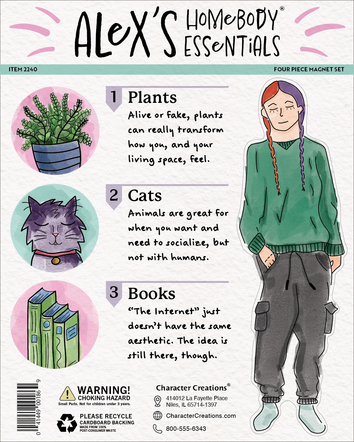
Overall I'm quite happy with how this turned out. Still not super thrilled with my colors, and I ended up going back to an early version and just slightly darkening the blue of the books, but I needed to just call it. Cutting out the magnets weren't as hard as I thought it might be, and I had invested in a hole punch which luckily also punched through the magnet sheet, which I guarantee saved me some tears! Mounting and cutting it out from a mat bored made me extremely thankful that we didn't have to do that in this class, it reminded me of what a heckin' struggle it is and it made me feel for past me.