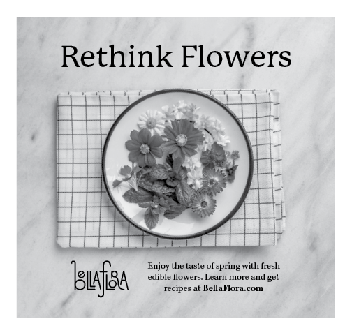
Some of the only restrictions for this ad were that it needed to be black and white, and needed to include our website (and of course the size restrictions as well)
Research and Brainstorming
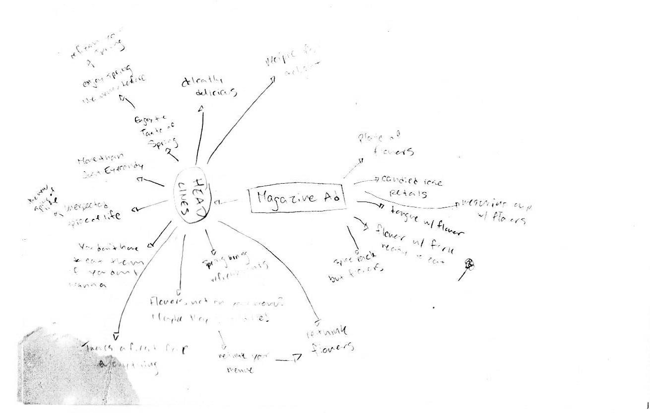
Since I knew I had a good idea for the concept of Bella Flora, I took a lot of my brainstorming into nailing down the theme for this year/ad campaign. SO thankful for brainmaps here, I'm sure I wouldn't have gotten to "rethink flowers" without it (even though it might sound silly).
Sketches and Doodles

I went into this really wanting to take my own photos since I did that for the brochure, and I feel like because of that I was able to be a little more free and open and not feel so worried of "will there be stock photography of this?" and just focused on getting some good concepts down for the photoshoot.
Because of the small scale, doing many sketches and doodles was much less intimidating than other projects and it felt easier to just throw ideas out because I didn't feel so much like I was potentially wasting time doing a complex sketch of something I'd scrap later (I know that's not the right mentality to have about it, but when motivation is already low when in the down swings, you want to use your energy wisely.)
Thumbnails

Really, markers make all the difference. I've said it a million times, and you'll probably hear me say it a million more in future classes, and I'm sure I'll also continue being intimidated using them for no reason sometimes. I think these are some of my favorite thumbnails, they're just cute and I like looking at them! I really fell in love with the lolly pop idea.
Me and my sister spent hours and hours taking photos and trying to make lollipops and it just didn't work out and I was unfortnintly not able to make any of the photos we took work how I wanted. Part of this was because they just didn't look good in black and white, and while I tried to keep that in mind, it still turned out this way. I still had a blast with my sister though, fun memories I'll be sure not to forget anytime soon.
Computer Progressions

I know it's not best practice for this class, but when the photos didn't turn out and I had to start from scratch (at least that's what it felt like) I should have done more sketches and doodles with layout of some photos I had found, but I just was on "gotta gooooo" mode (much like I am now, shoutout to 11:40pm me, we've been going for hours, we're doing our best out here)
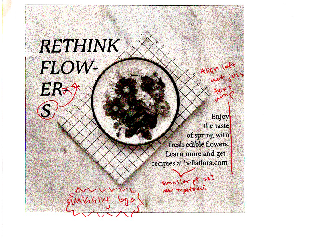
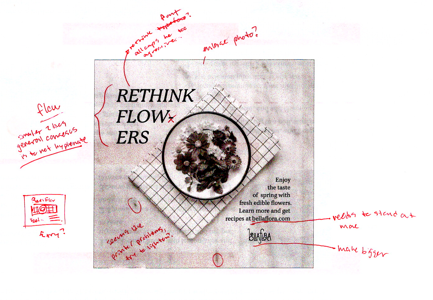
I think overall my idea was good, but general conses was that the hyphenation was throwing people off, and while it looked nice, it didn't READ nicely. The easest thing for me to do (and sometimes the easy one is the right one) was to just straighten out the photo so the towel wasn't angled.
Final

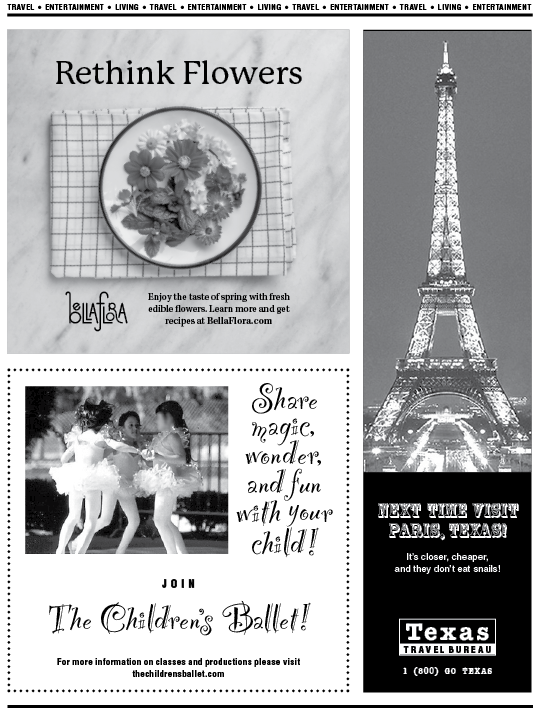
We made it here! For having to toss all my photo ideas, I'm pretty proud of how this turned out. I think it's one of my more successful pieces. "Rethink Flowers" is a strong headline that pulls one in with the photo as well, piques some interest!