
This type figure assignment was to practice using type itself as a form of design. By being unable to manipulate the text to fit a form, we had to think more creatively about how to execute it. We also had to be thinking about how the typeface we chose can create different kinds of patterns and textures, that can either work with us or against us. One portion of the figure will be a 2" shape of the original photo (ideally the most difficult portion of the figure to execute)
Research and Brainstorming
You know, they say "fail often, fail fast." and I'm just putting it into practice for this project.
(could have failed a little faster though, that would have helped)
(could have failed a little faster though, that would have helped)
Unfortunately I didn't do much initial research, and it was mostly spent looking for images that would be, hopefully, suitable. Much of my initial time with this project felt like playing catch up due to poor time management on my part (way to go past-past me, making past me suffer like that and present me look bad, tsk tsk.)
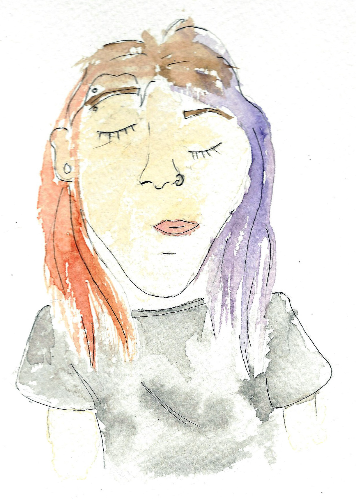
Initial Figure #1
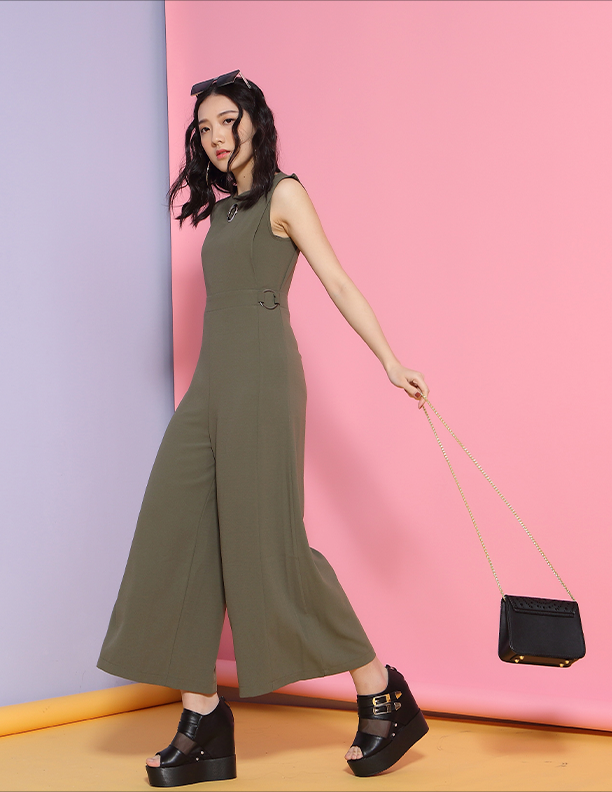
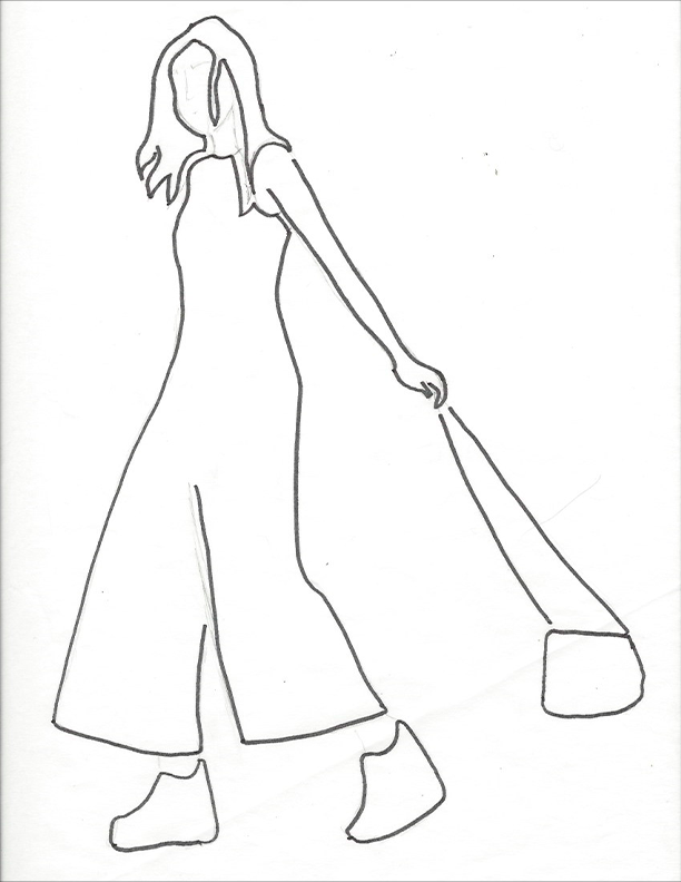
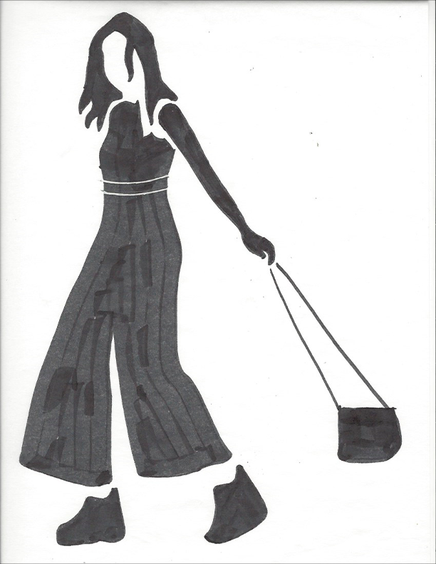
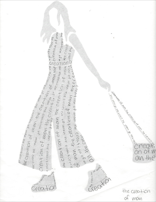
One of the few figures I found that was suitable, I had many "grand" ideas for in my head. I thought it would be fun to give her a pinstripe suit and to have the the 2" shape be the hand and bag with the phrase "creation of man" (I know it's "The Creation of Adam" but that didn't suit my big brain social commentary).
The panic eventually set in that I was only this far, and was expected to have TWO initial figures with two different type treatments, that I decided I needed to move on from what I had here and panic about the next figure instead in an attempt to stay caught up.
Sometimes life is like Yahtzee, it's easier to make up the points on the lower numbers at the top of the sheet over the high rollers at the bottom.
Initial Figure #2

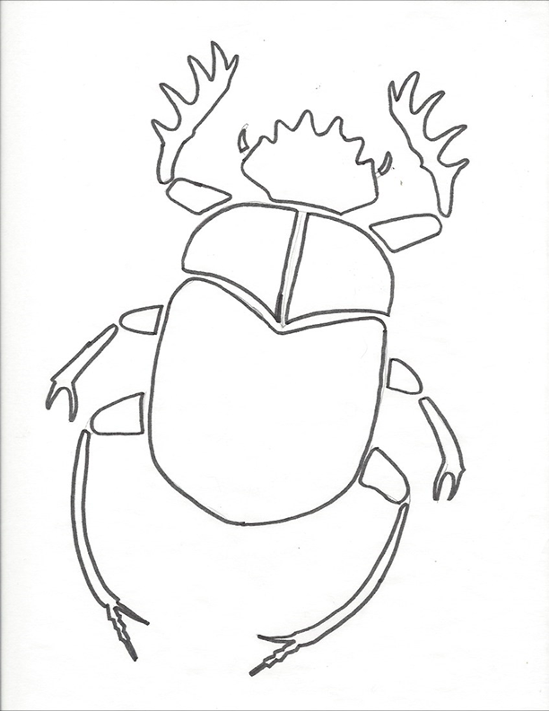
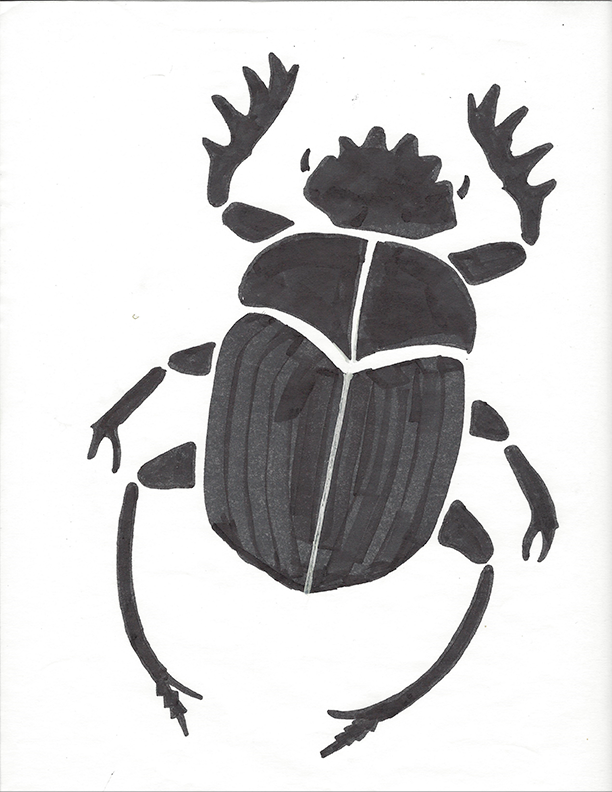
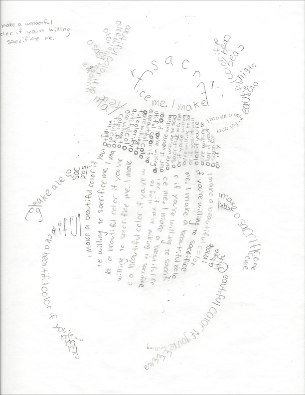
I was originally going to try and do another human figure, but I exceeded my "crying budget" for this section which means "try something else" and I ultimately scrapped all my other figure photos to pursue this scarab.
In a million and a half ways, this figure is easier than the first initial one, but I don't feel quite as inspired by it as the first one, but I had to choose something I could realistically do and get done. I also fooled myself into thinking "oh it's symmetrical so it's totally okie dokie if I just solve half of it" and lemme tell you that it wasn't totally okie dokie.
Looking back now I wish I was more confident in my ability to indicate typefaces as well as not be so intimidated to commit to putting it down with a thick pen (or even just a darker pencil) to bulk it up and get an actual feeling of the overall contrast of the figure. I'm working on my commitment issues in therapy.
Problem Areas
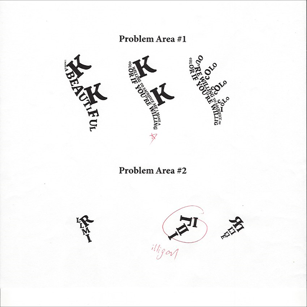
This was a conflicting portion to move onto. I simultaneously felt as though I had no problem areas, and as if the whole thing was JUST problem areas. Coming back to our running theme of "poor time management" I didn't experiment too much with fonts (my BIGGEST regret, tell them Kerry, tell them to experiment with fonts, tell them of my suffering *dramatic fist wave*) and I think because of that I shot myself in the foot and didn't allow myself full creative expression.
Some area's I thought would be challenging, proved to be otherwise, the foot is an example (except of course, for my initial illegal solution to it).
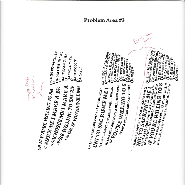
Computer Progressions

I wish I had done things in such a manner that I would have gotten some more feedback from my peers before getting to this point, but alas, what's done is done and the milk has been spilt and I've done my best to clean it up.
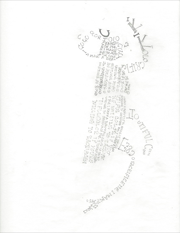
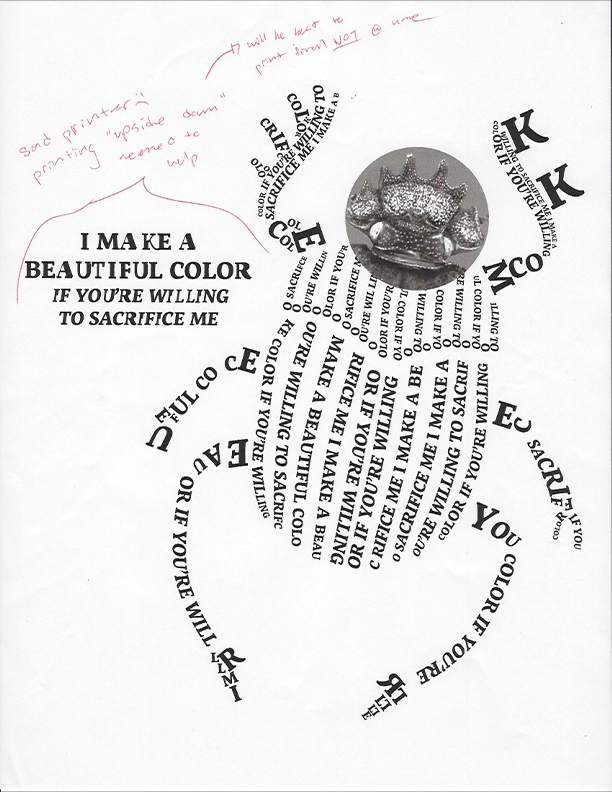
My home printer is very hit or miss, sometimes it prints real nice, sometimes, not so much. This is a great example of that (the "I"s in the phrase somehow consistently came out all funky). Luckily I have some insider info on where some other, higher quality, printers live, for my final print.
Final type Figure
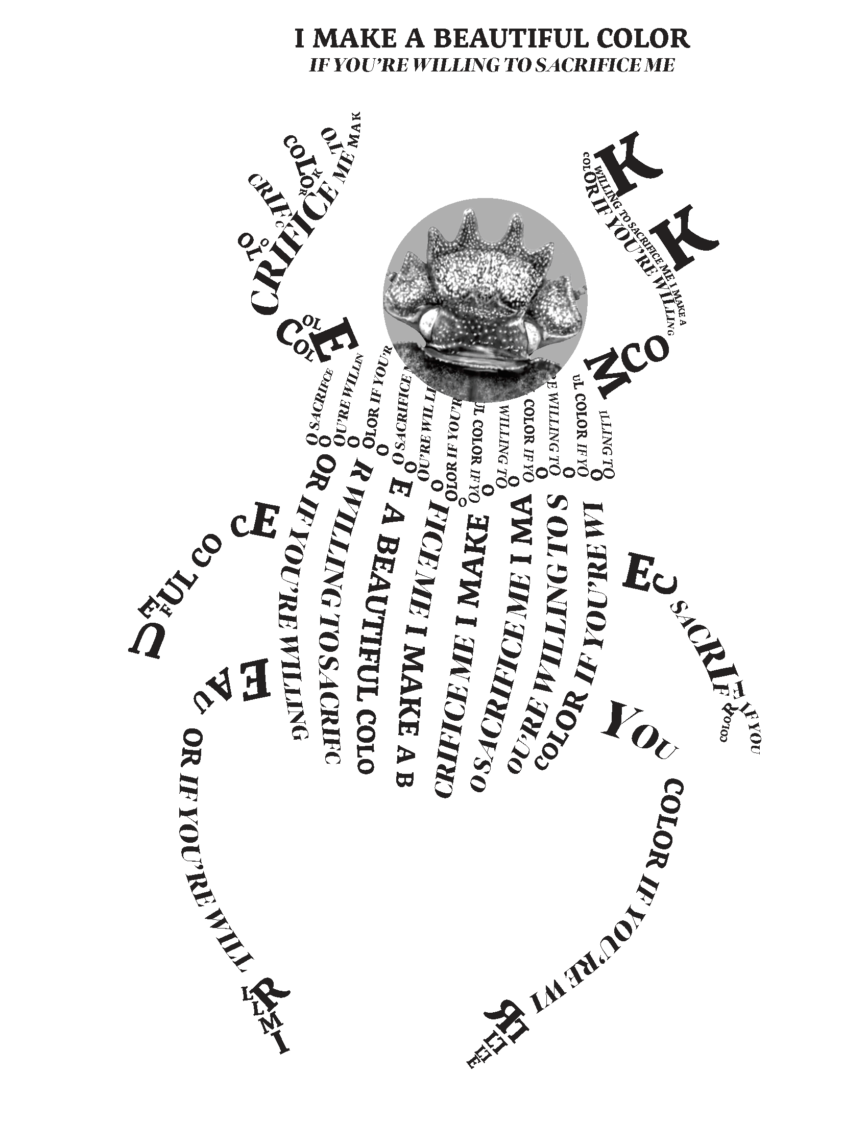
I eventually ended up changing the font of the italicized "if you're willing to sacrifice me" last minute to make the figure a bit more interesting. I still feel like there's lots of improvements that could be made so it's had to feel completely satisfied with my final result.
Regardless of what it may be, I worked hard to produce this, and in many ways I worked harder instead of smarter. It feels nice to be done with it, and as usual, it's a lot easier to look BACK at the suffering fondly, than it is to enjoy the process as you're doing it.