


This project was to create a gable-style box for small animal figures/toys that you often find in tubes. This box could be 4 spot or full-color process. Some things that needed to be included or considered are warnings, UPC code, quantity/weight, parent company name address website, a picture of the object and clarification of what and how big the product is.
Research and Brainstorming
Truly pitiful
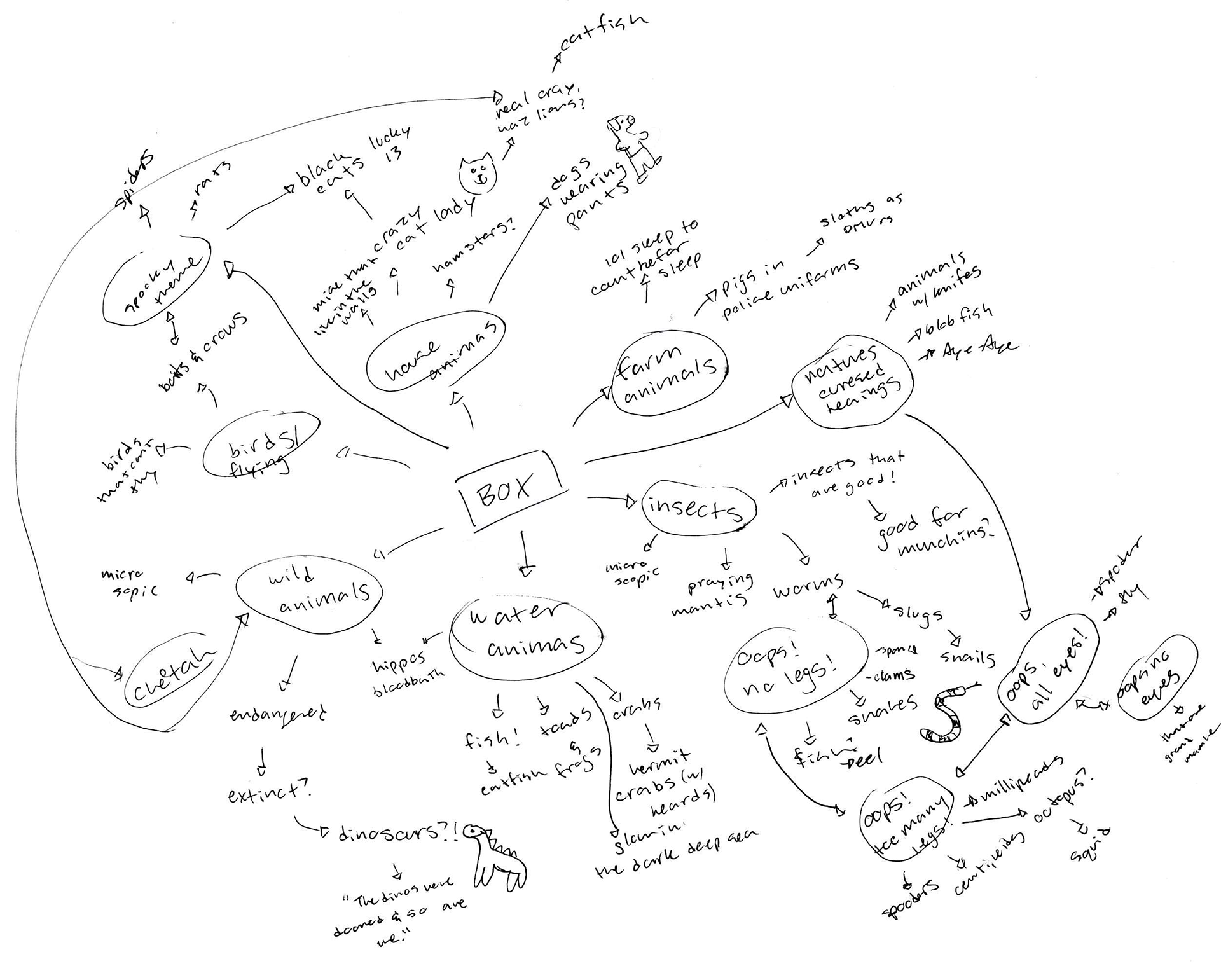
General brainstorming, starting with general ideas for the types of animals.
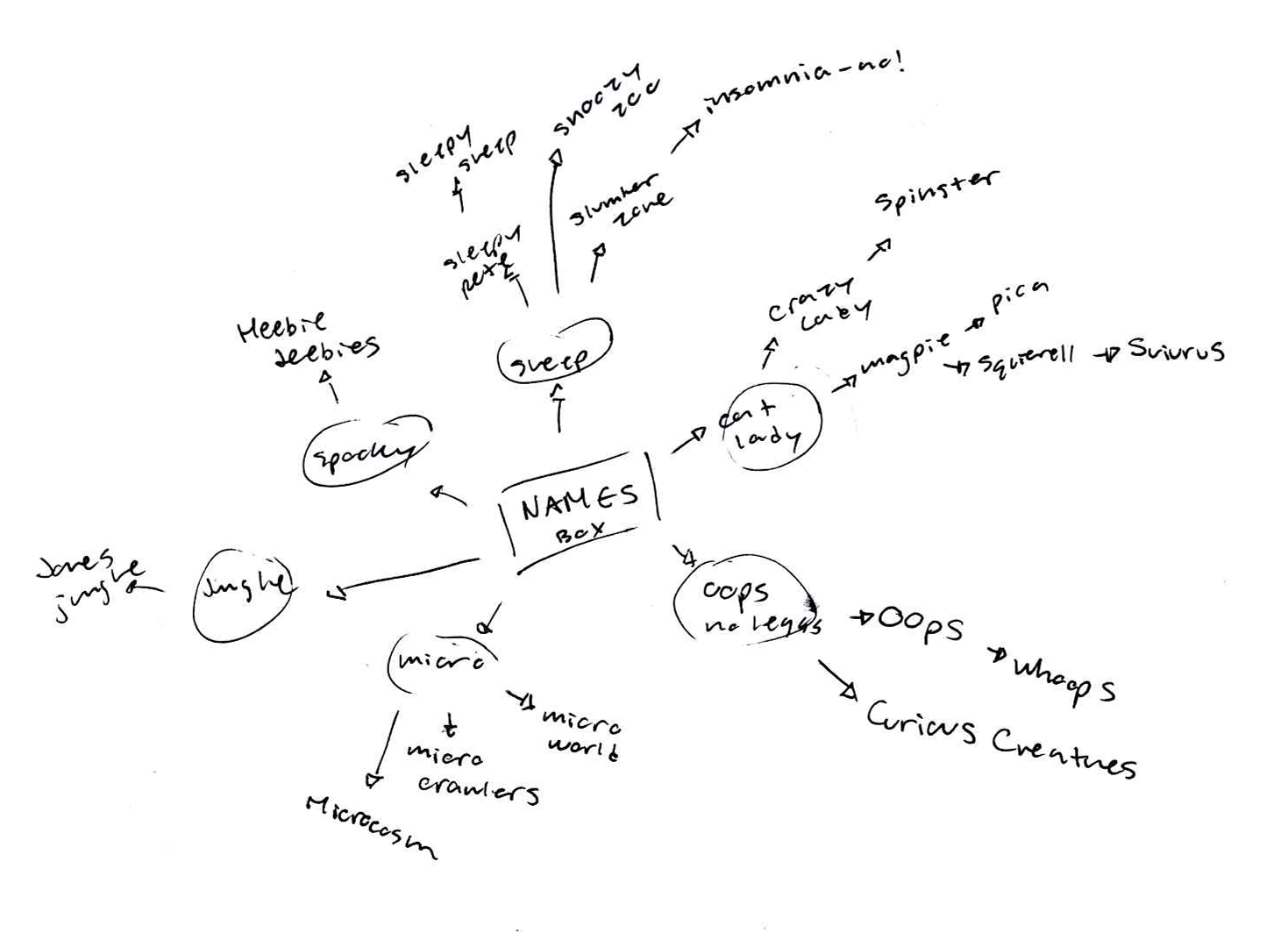
Brainstorming for names.
To get started, I went off onto pinterest. I started off behind, so I didn't do nealy as much research as I have in the past, I also wish I would have started off more so looking at toy packaging to figure out how to handle all the information. While researching, I discovered a million different requirements for toy packaging. Pretty much the only one I took and ran with was "warnings" and I left the product/manufacturing tracking info alone.
With my brain map, I just started very broad with different "categories" of animals I could do, and just let it flow from there. Once I got some ideas, I went on to a much smaller brain map for names.
Sketches and Doodles
Doodles for logos
Doodles for parent company logo

So I wanted to move forward with different age ranges in mind. I wanted one for a general audience, adults, and then one for kids.
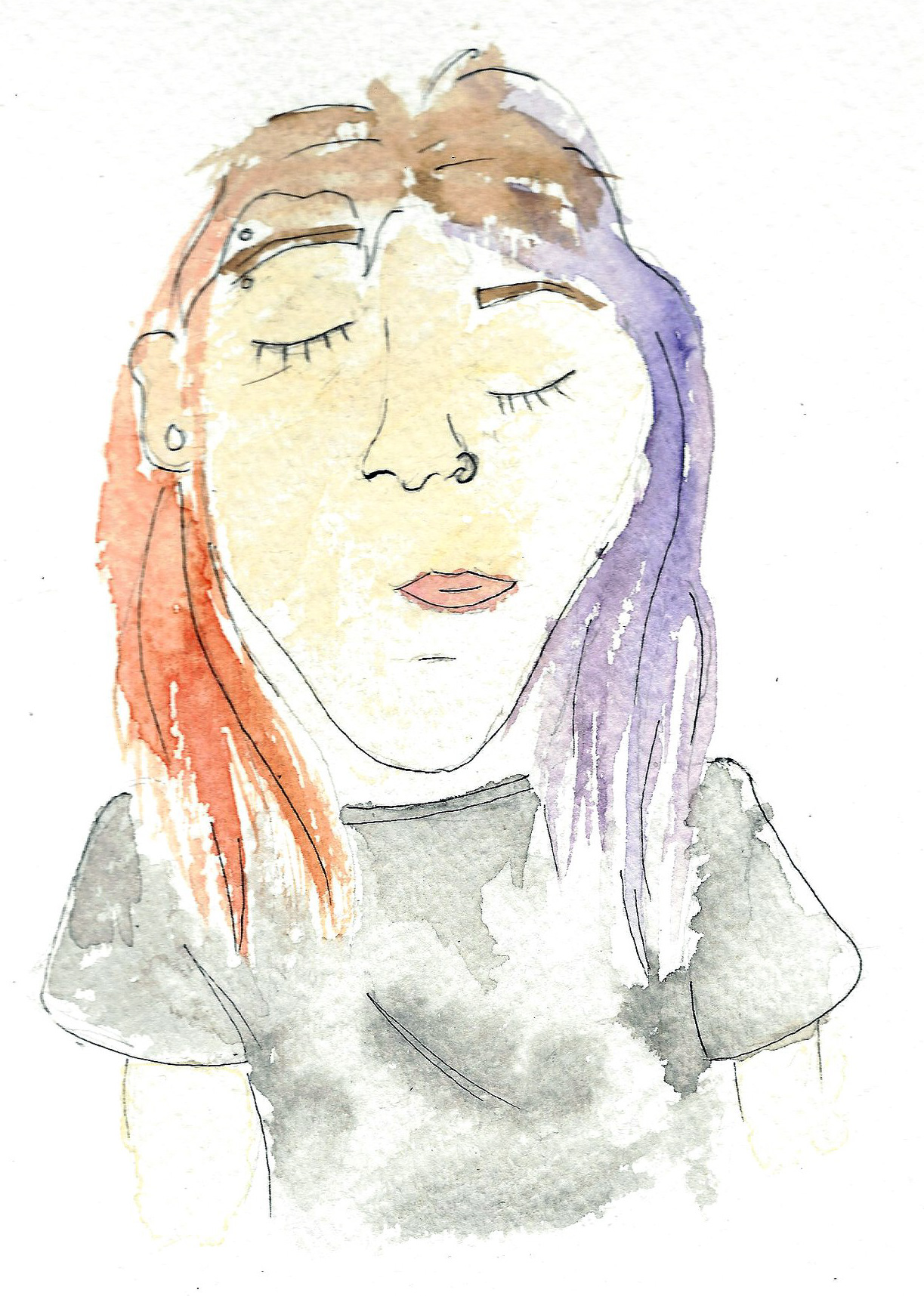
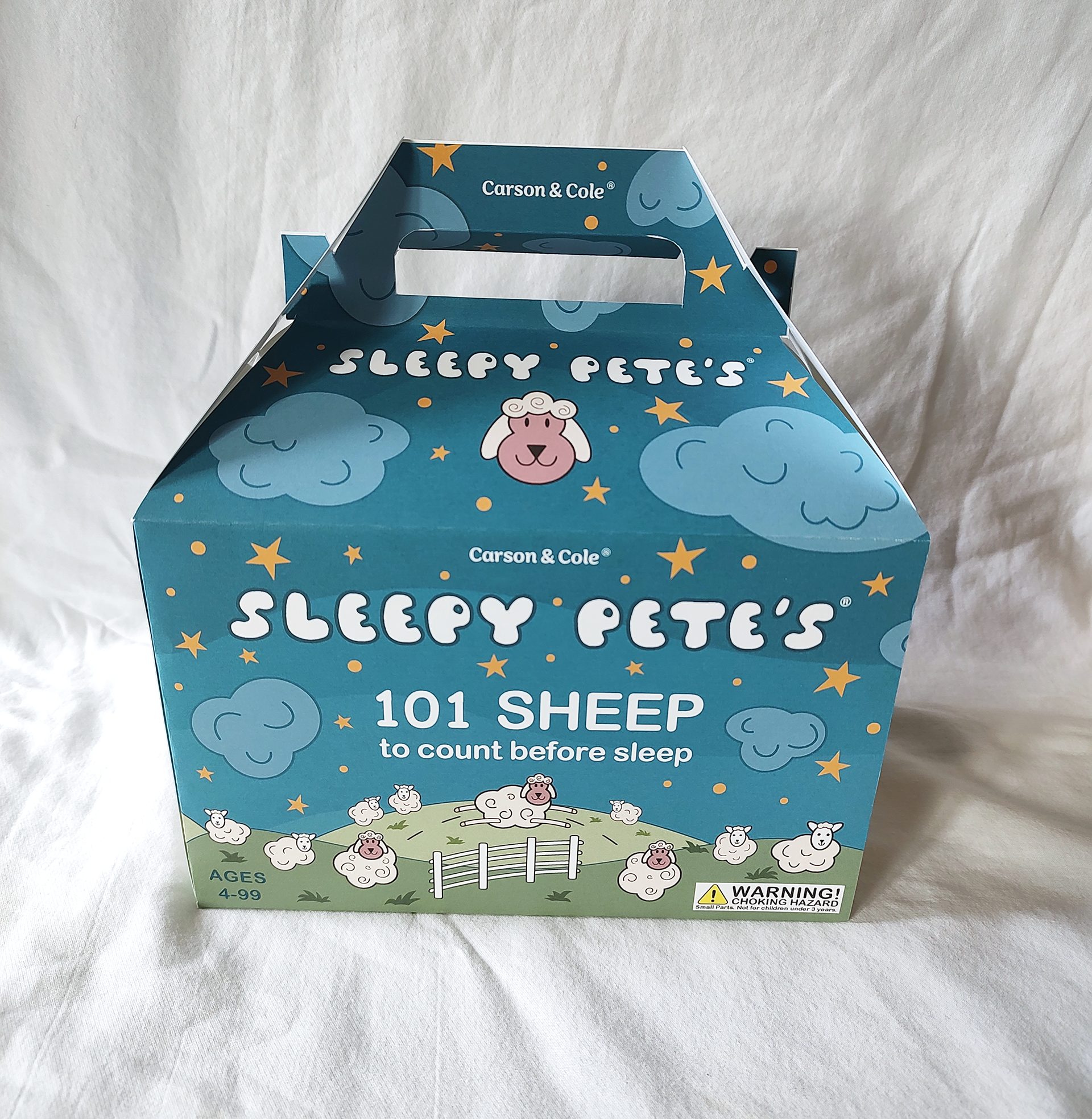
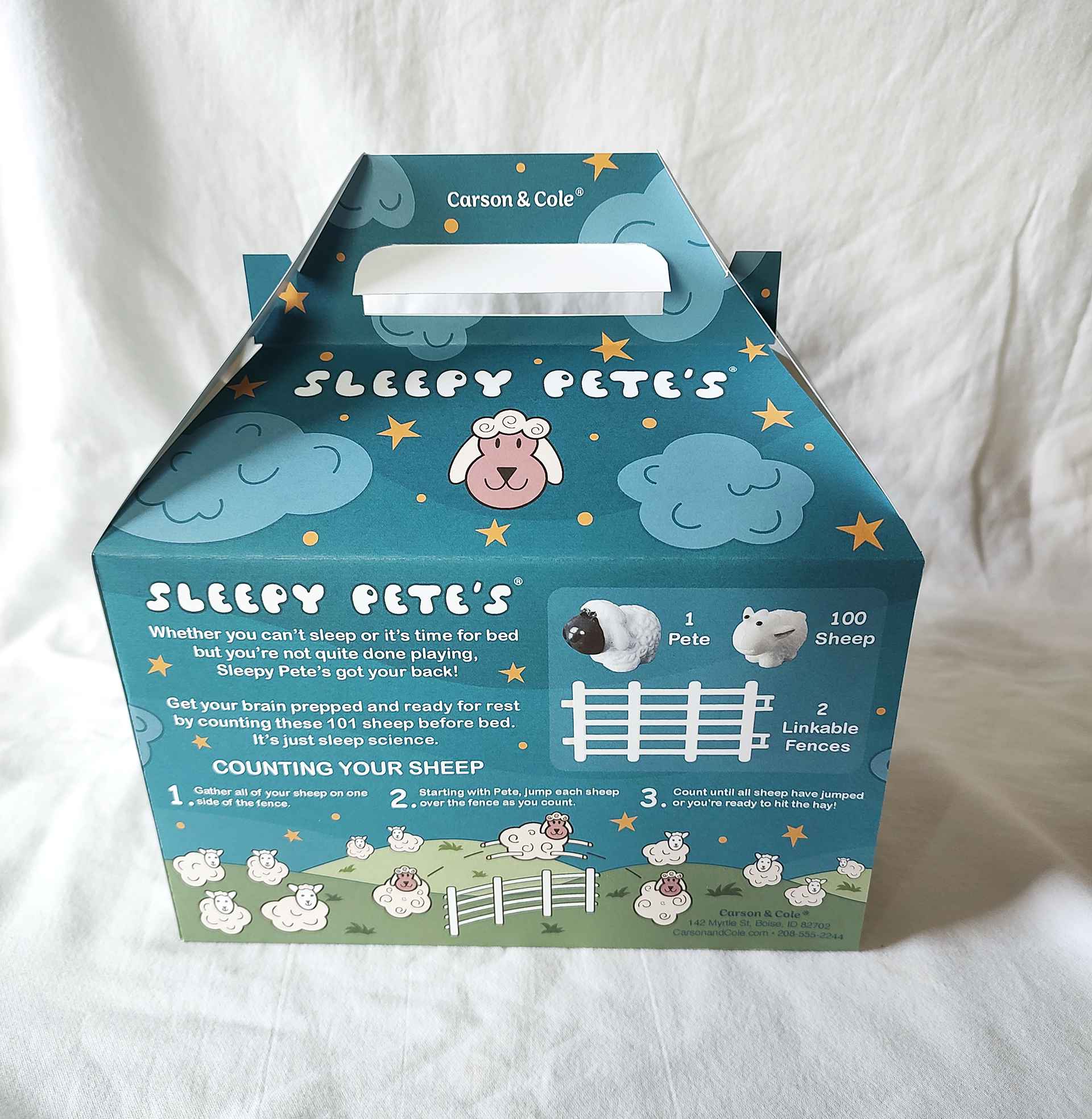
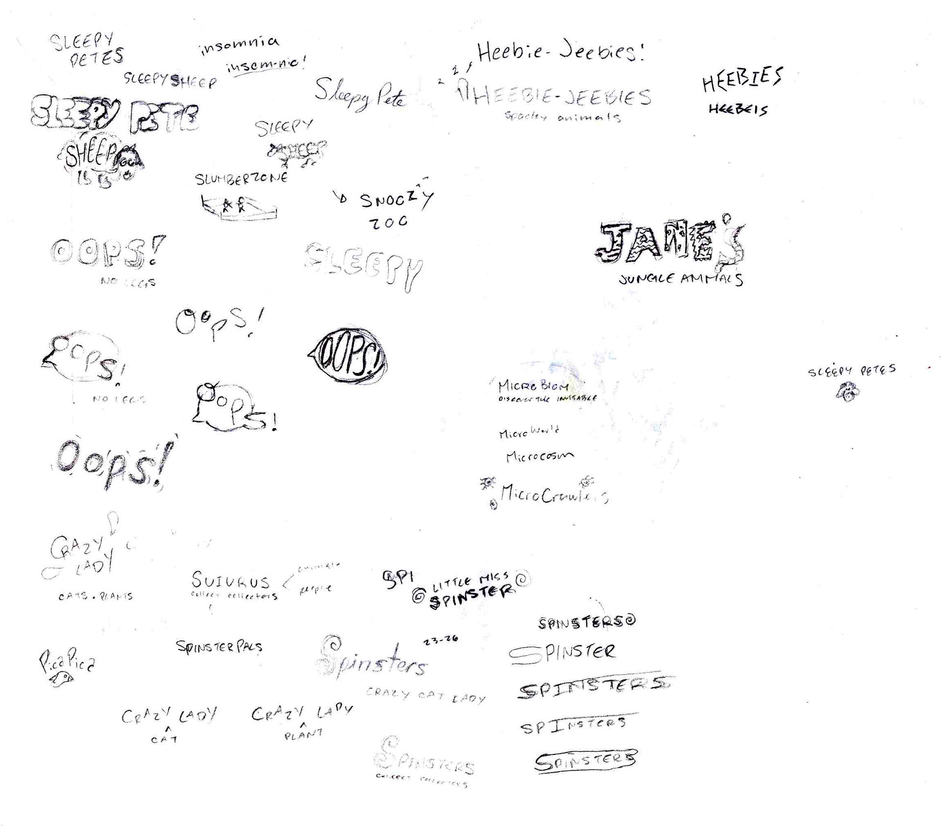
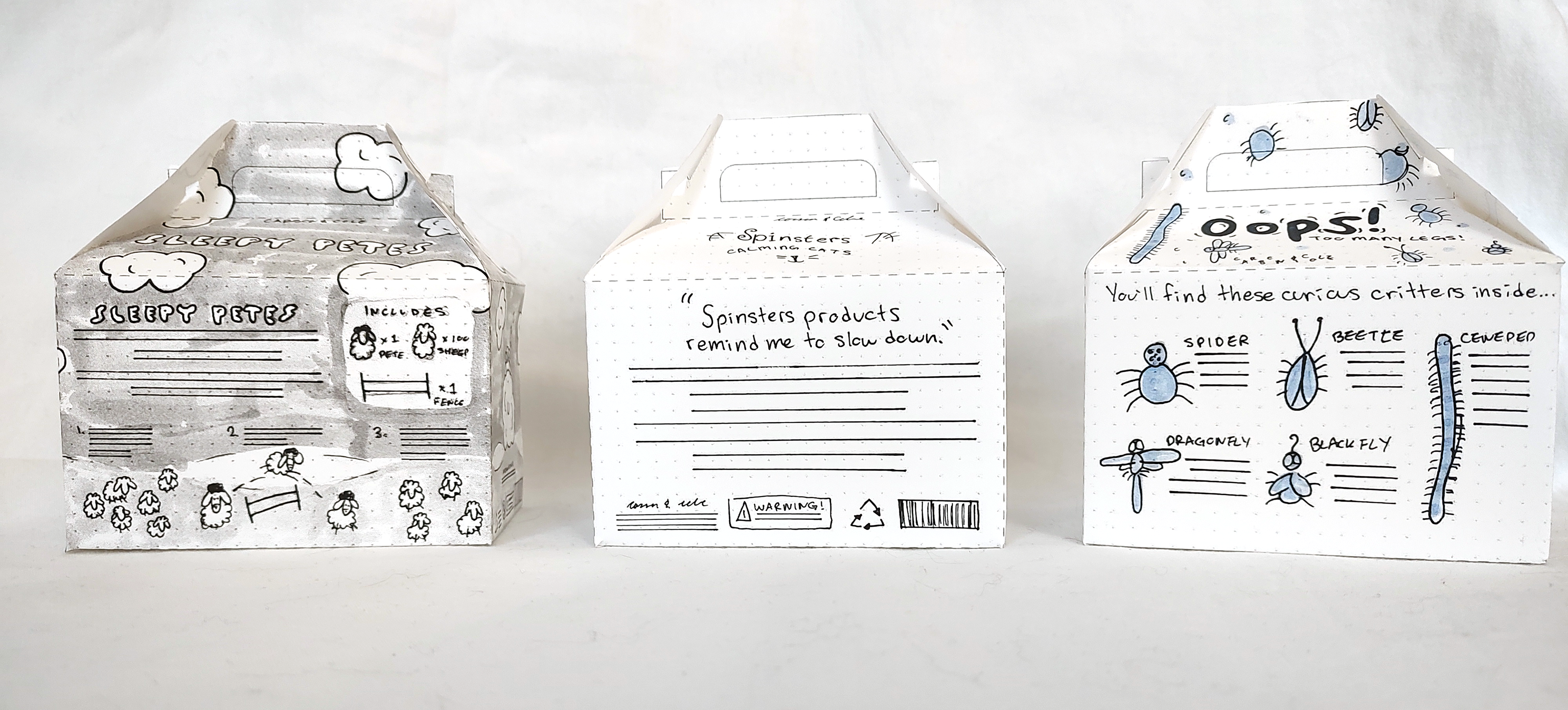
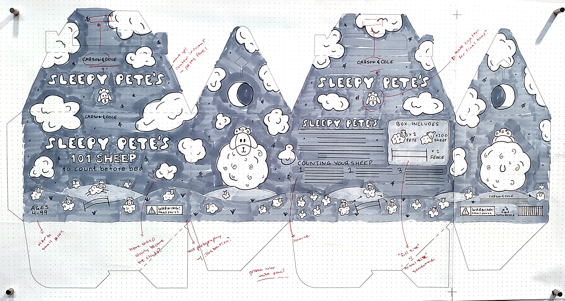
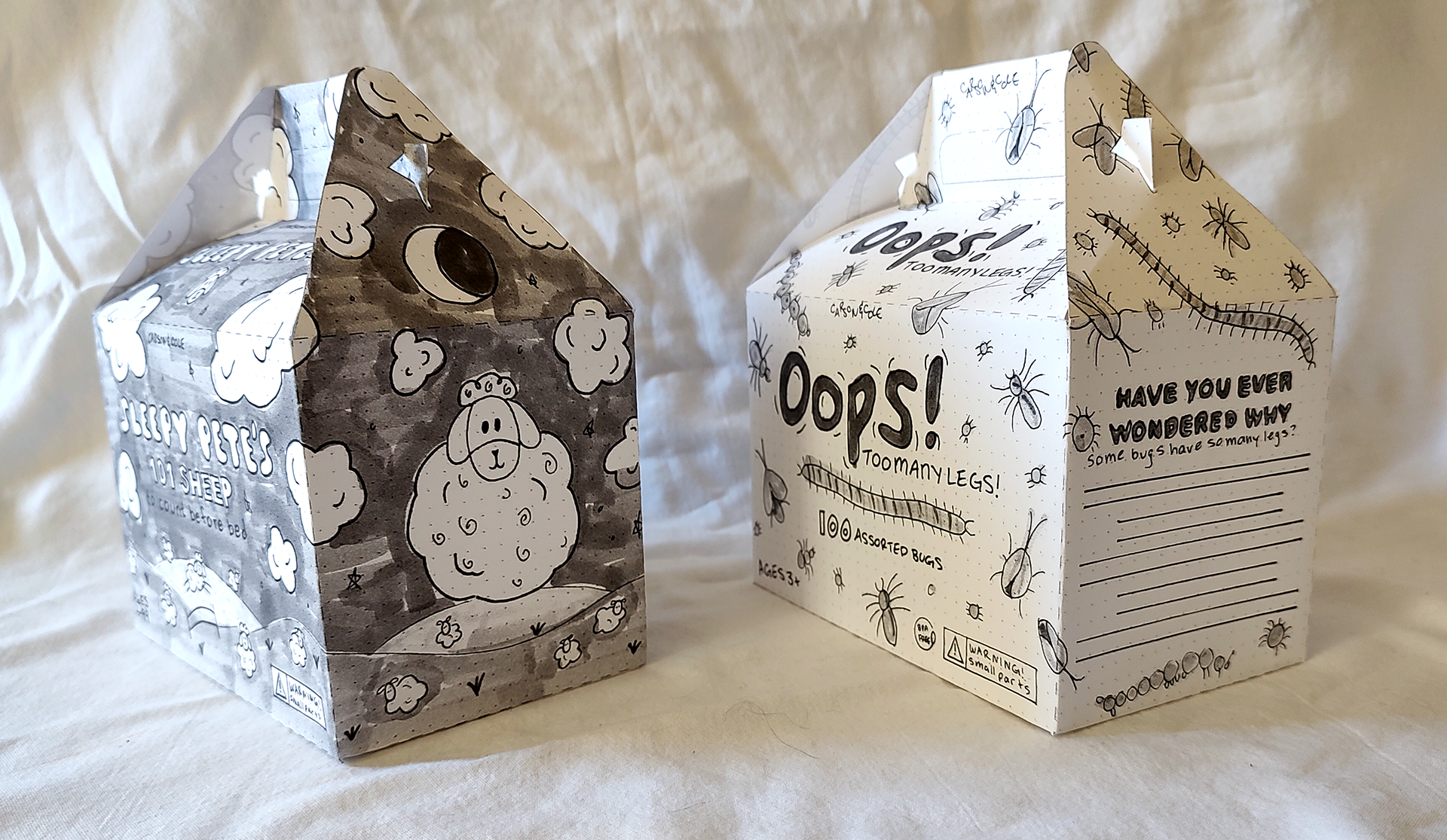
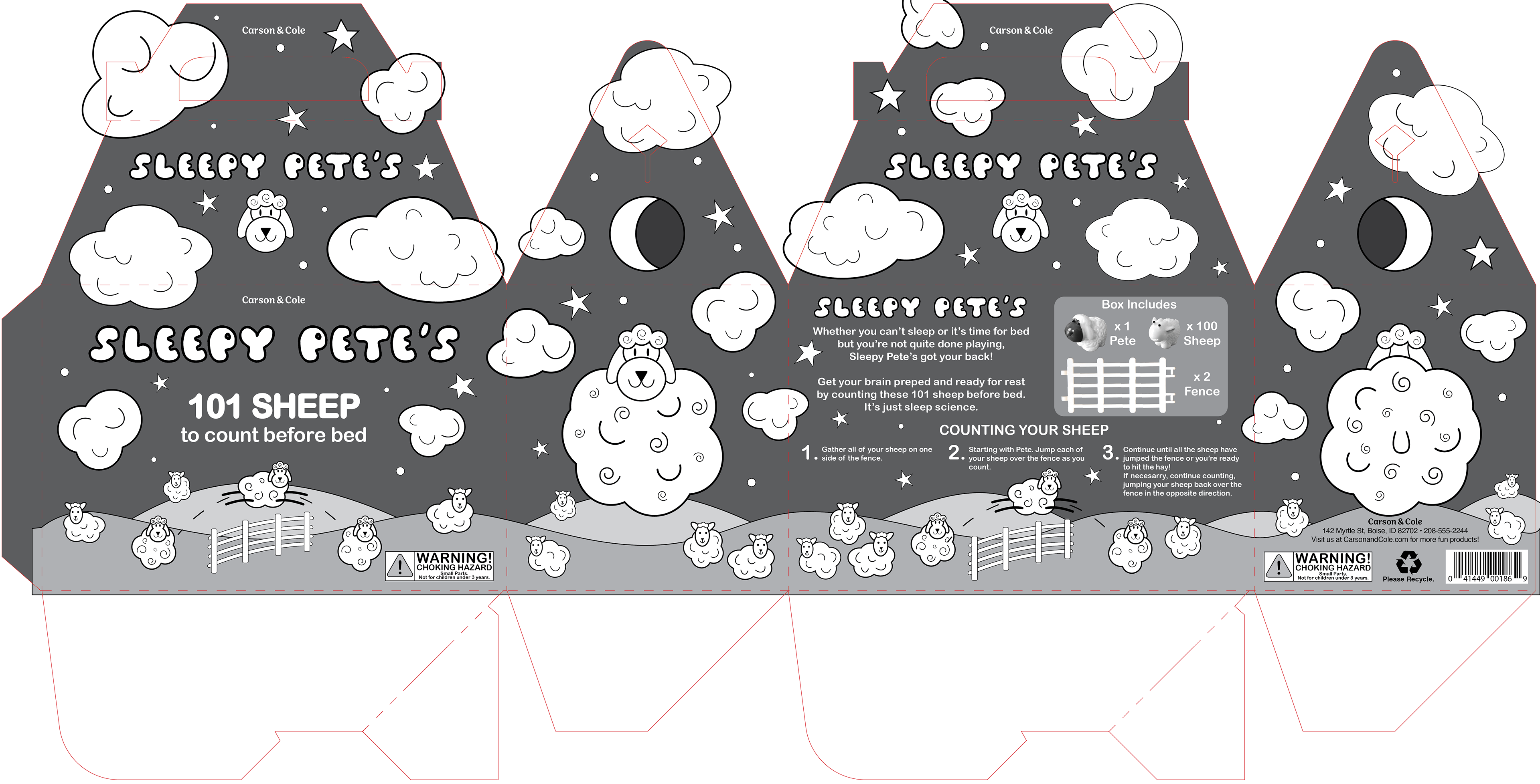
For my general audience, I thought of "Sleepy Pete's" 101 Sheep to count before bed, where the idea is just to count sheep to get your brain ready for rest. I didn't know if I wanted Pete to be an old-timey Sheppard that would testify to the fact that counting sheep helps, or if I wanted him to be a sheep himself. I really liked my second sketch, with the herd of sheep on the front and their cute lil sheep butts on the back. That ended up being the one thing I was like "Yep, it needs a sheep butt."
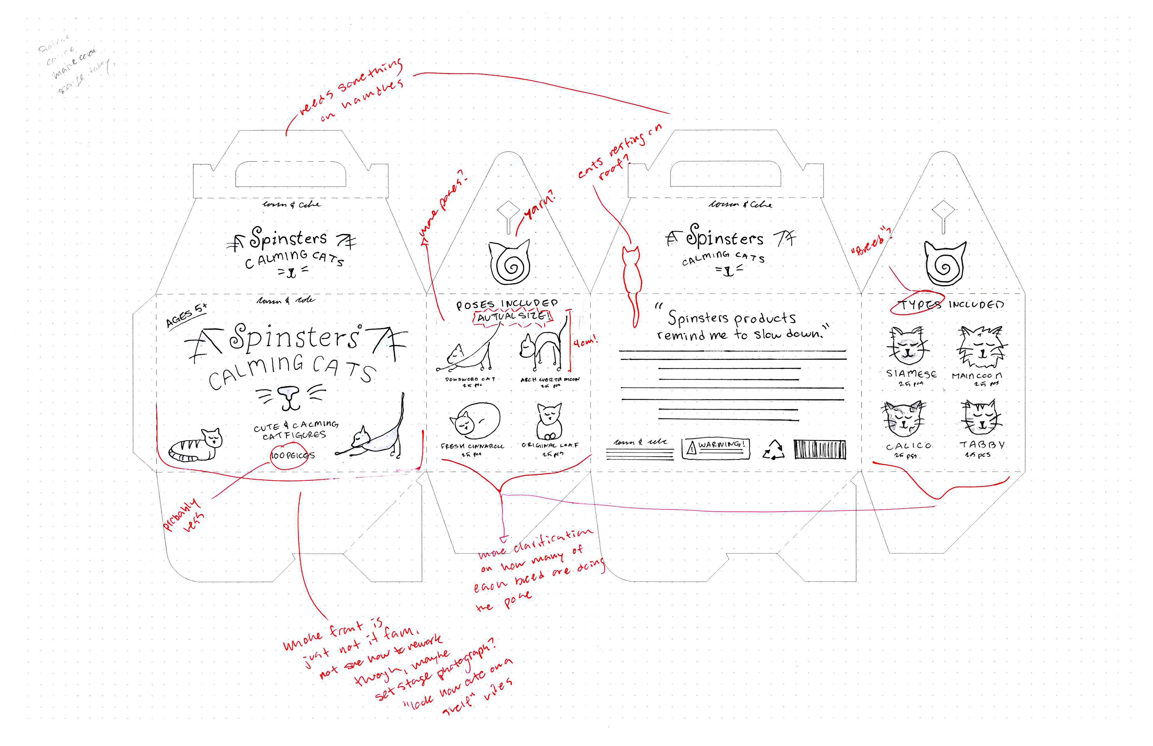
For adults, I thought of "Spinsters" which is what young unmarried women were called in them olden times, my idea was for it to be a crazy cat lady sort of deal. I thought it would be fun to include a lil action figure of a lady, with a bunch of cat figures, with it being a series where you "collect spinsters" so there would be a crazy plant lady and a spoon lady etc. I kept getting all hung up on the action figure part, so for my second sketch, I decided to abandon it and just go for some cats doing some good stretches, as it's the universal "eye and brain bleach."
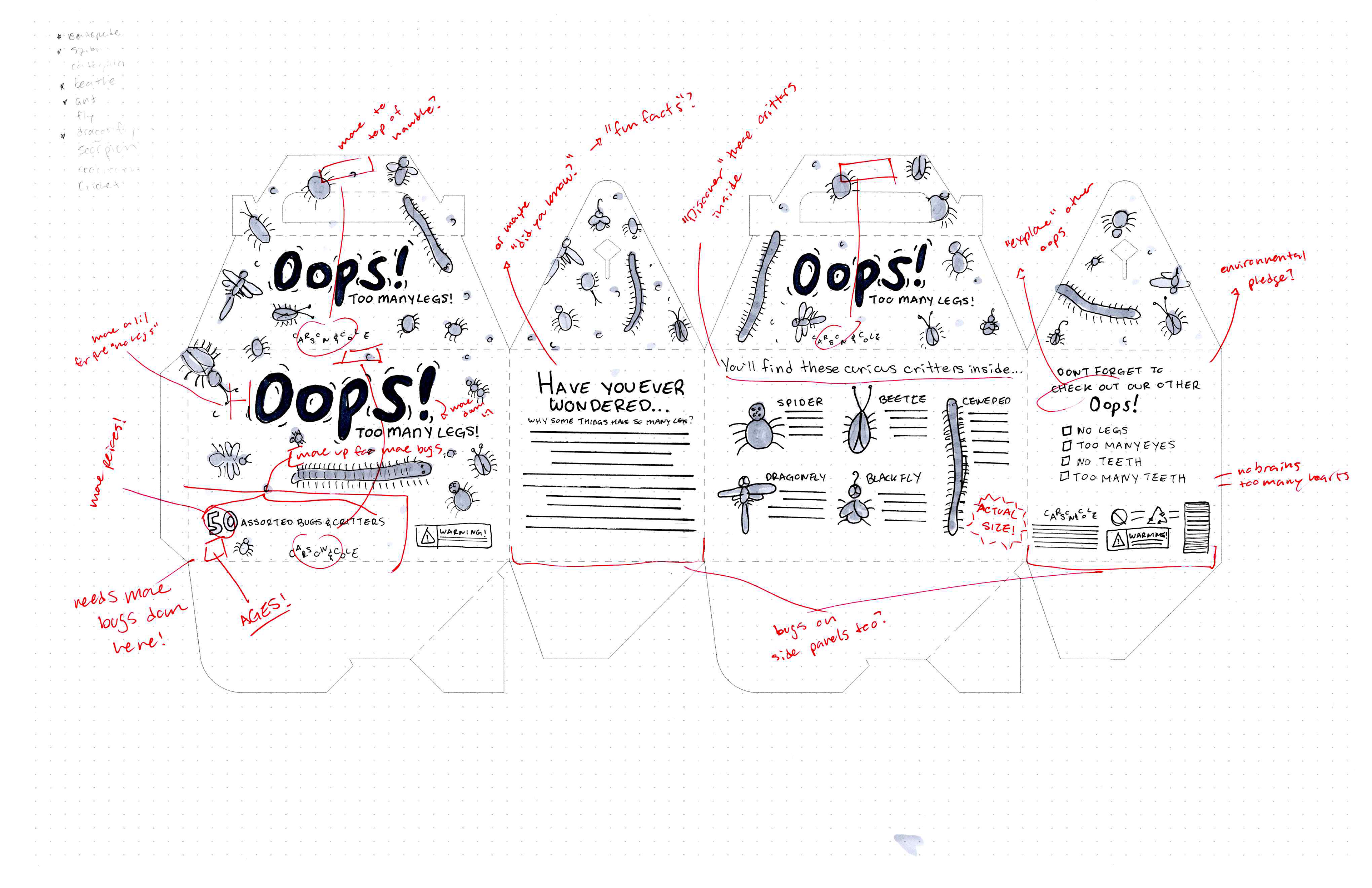
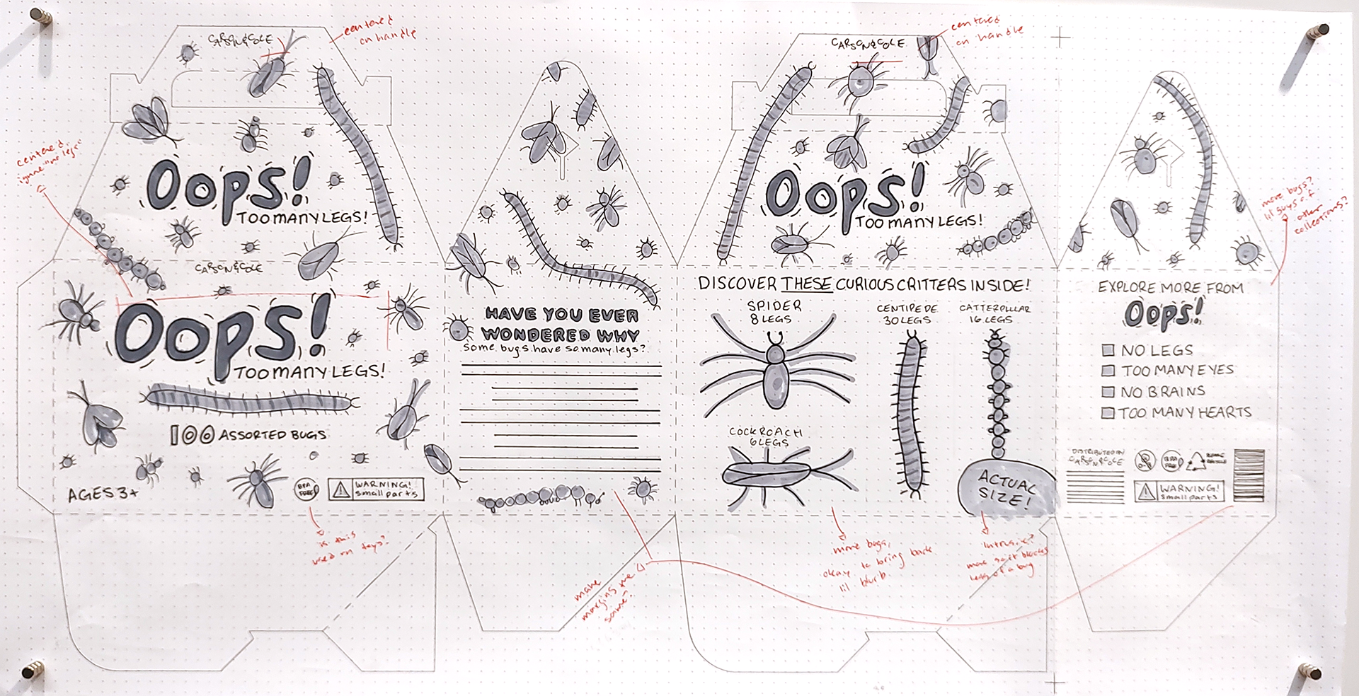
For my kids, I thought of "Oops!" which would be a line of educational toys showcasing how weird and wacky other living creatures are. So "Oops! No legs!" would be bugs and animals that don't have legs, but get around just find and "Oops! Too many legs!" would be bugs n critters with more than a "normal" amount of legs. I really like this idea, and I think I'd like to revisit it in the future.
Thumbnails - Flat
"Spinsters" flat thumbnail, marked.
"Oops! Too Many Legs!" flat thumbnail, marked.

"Sleepy Pete's" flat thumbnail, marked.
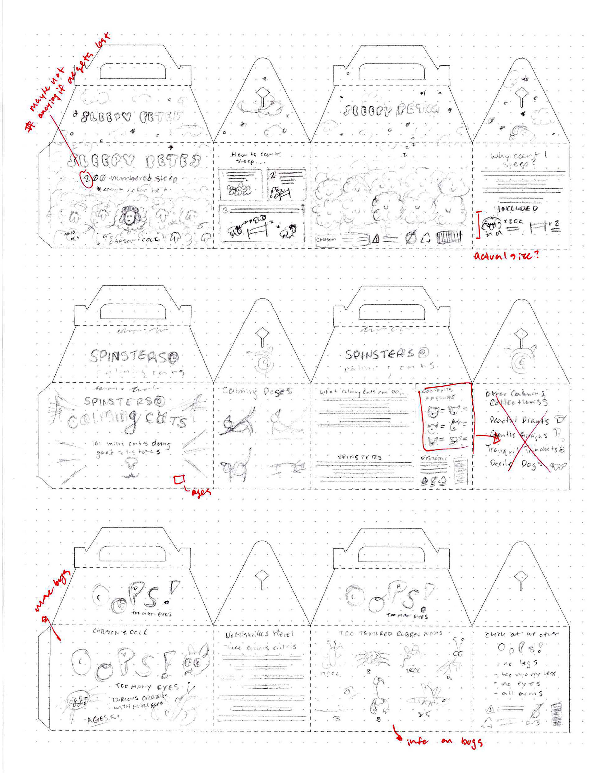
Thumbnails - DummY

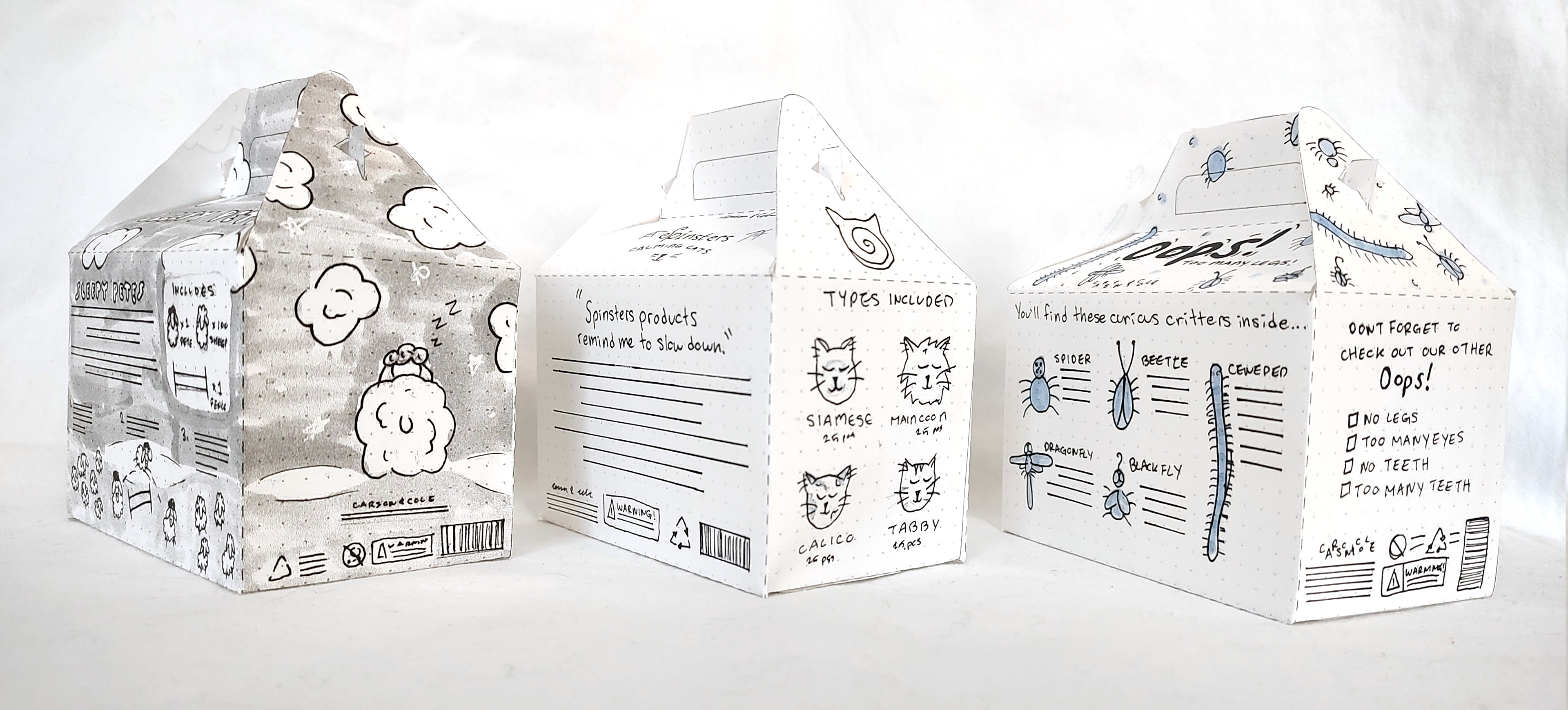
Even though it was widely accepted the Spinsters idea was the weakest in my sketches and doodles, I still needed three thumbnails, just at a glance you can tell it's the most malnourished, though. I tried to not just "make it bigger" and I adjusted the poses that would be included and fleshed out the breeds that would be included a little more as well. The front I just didn't know what the heckeroonie to do, frankly, it's embarrassing, don't feel obliged to look at it for too long.
Overall I think I did a good job at combining my sketches and doodles with what worked and didn't (sans the Spinsters, just a mess, I tell ya.) Most people seemed to like the first sketch of the sheep in general but specifically the landscape that goes around the box, but the front and back of the sheep with the second. I think a reason people were more attracted to the initial sketch was that it is a more classic depiction and feeling of counting sheep. This is also when I decided that Pete was one of the sheep, and that he would be a figure included, that would be unique and easy to spot from amongst the herd.
As much as I like "too many eyes" I settled on "too many legs" for Oops! This was mostly because it would be easier to represent with cheap found toys and for a set called "too many eyes," you wanna be able to see all the freaky little eyes on the bugs. I was also struggling with how to stylize "oops" as it's a very comic book feeling word and if you just google image search "oops" you'll see the comic speech bubble one. I wanted to keep the comic book vibe a little bit since it's very fun and friendly, so I ended up doing a comic sans second cousin type thing with "wiggle" lines around it to help communicate bugs.
Intermediates - FLAT
INTERMEDIATES - Dummy


Not too many changes between thumbnails to here, part of the reason is not having peer review between the two stages, unfortunately, peers haven't been responding much in Discord, and it's difficult to find your own blind spots.
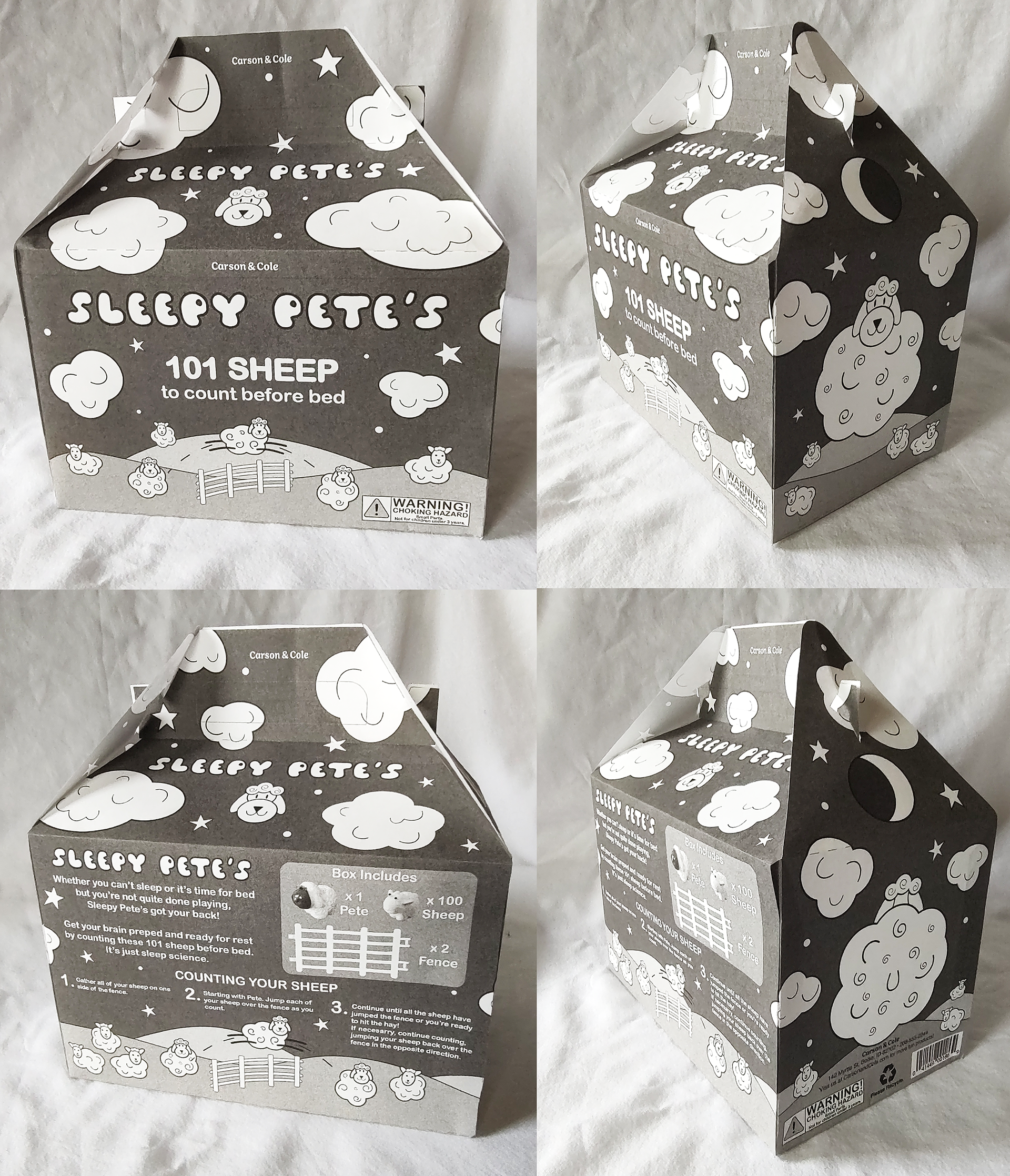
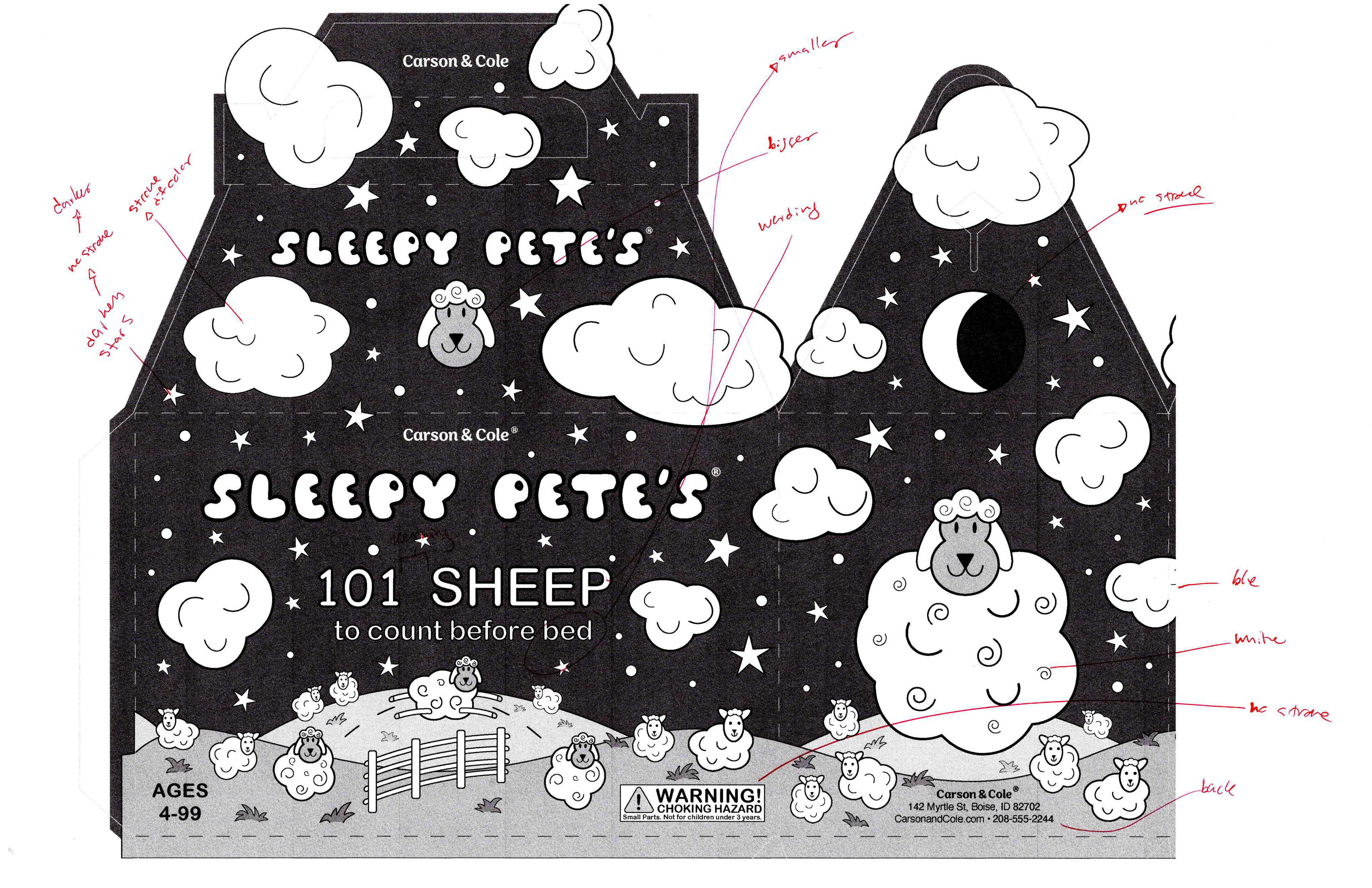
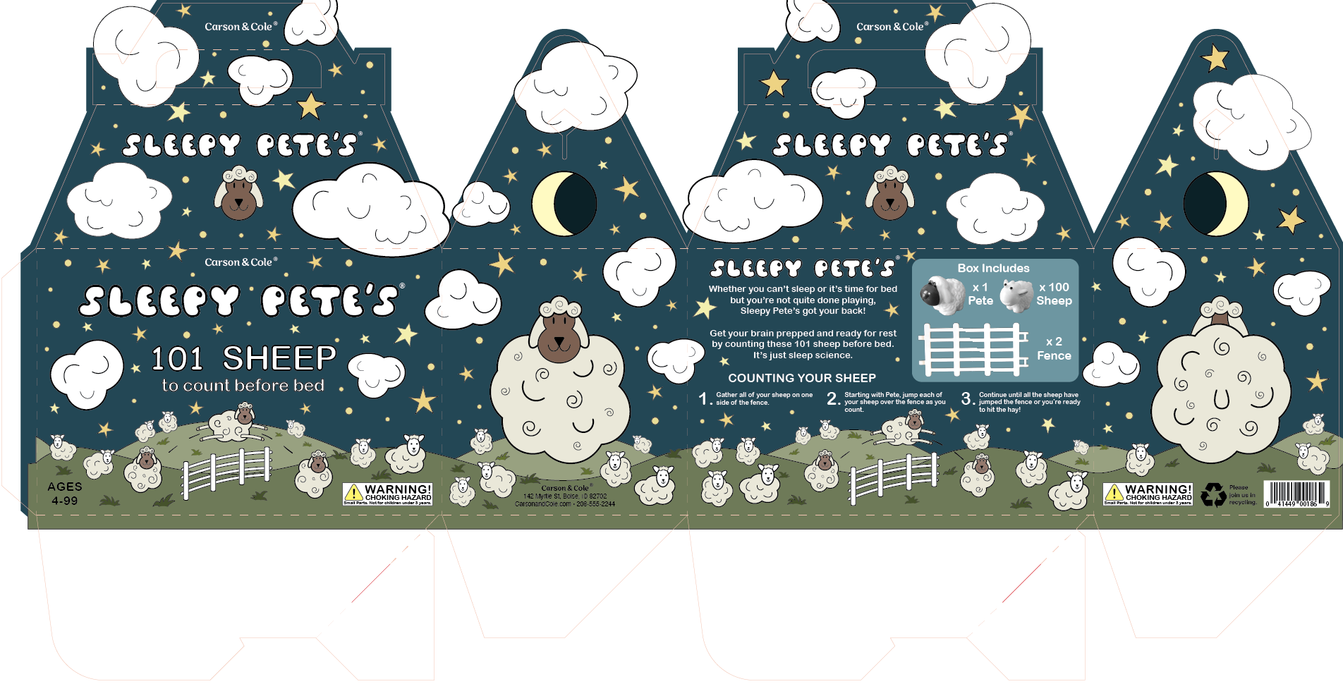
The biggest changes that I made with Sleepy Pete's is adding the dark side of the moon, as well as having the moon be on both sides, and adding Pete's face to the top panels on the front and back. I had also found the sheep figures I wanted to use to take pictures, and the one I wanted to use for Pete has curlier fur, so I started to try and communicate that in my simple sheep drawings. Markering in the sky for this killed me, it took so much time but I know if I left it white it wouldn't communicate the vision.
Oops, I was a bit silly! I got it in my head that the "full size" of the bugs, would have to be the full size of the actual bugs I got, so I cut down from five different types of bugs to four. Looking back retroactivly, I'm quite happy with the all over pattern I drew on, it took forever, using different shades of the marker really pushed it from "eh" to "pretty cute" (for bugs, I mean).
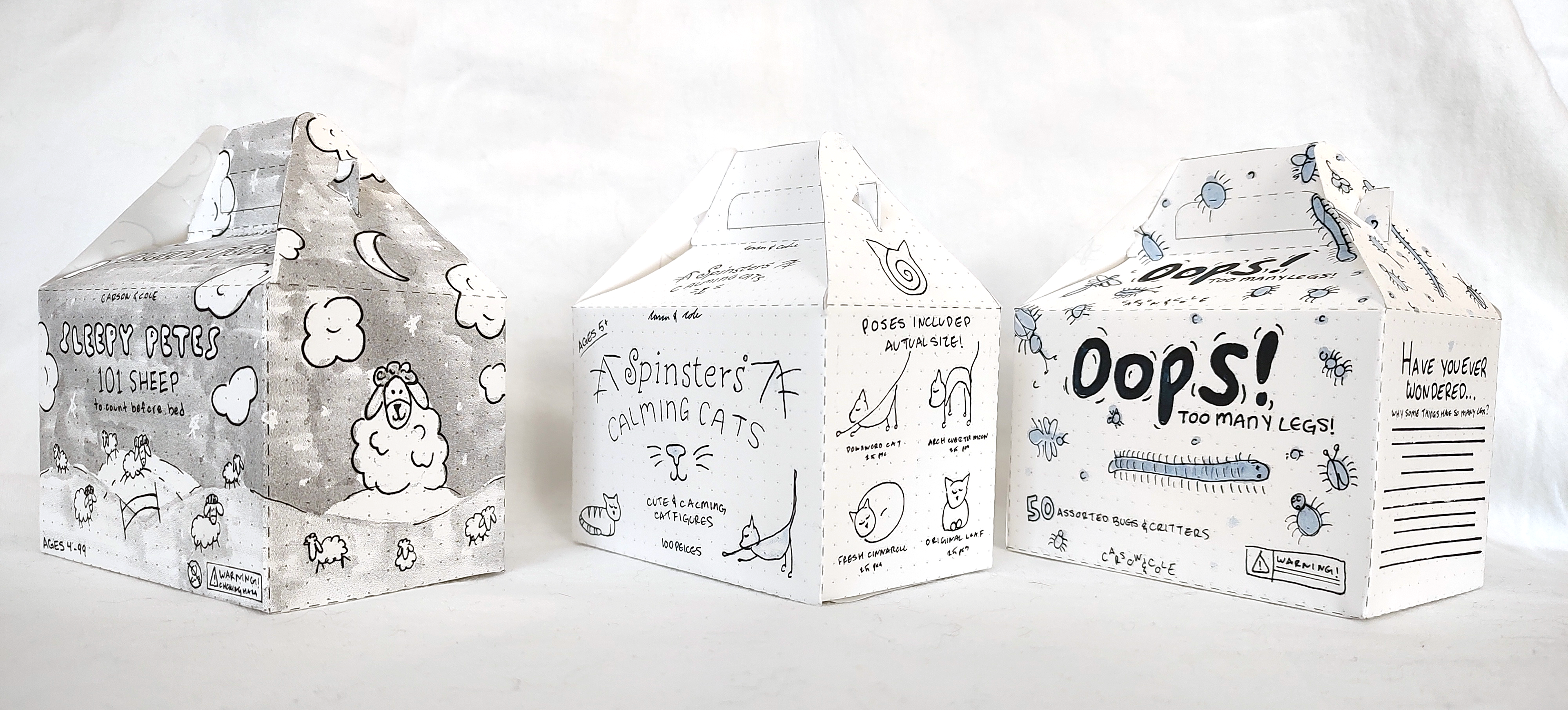
Final Hand Comp
This whole project, I haven't felt real good about what I've done, and when I got to this point I was feeling extremely discouraged. I felt behind, I felt like I did hardly any changes from thumbnails to intermediates and didn't get groundbreaking suggestions that made a final hand comp feel worth the mental stress of trying to push it out in a reasonable amount of time.
Then I got icky sicky, then I also rolled my foot so bad I cried when I walked, and then I had a first day at a new job in a new place with people I don't know. Just everything all at once, it seems. Plus the brain this time of year tends to need more maintenance.
I decided to eat the points, it's a small price to pay to not get tipped over the edge, or at the very least, make it a bit of a shorter fall.
Computer Progressions
I'm including a digital version here so you can actually see what I'm marking up, the scan looks awful.
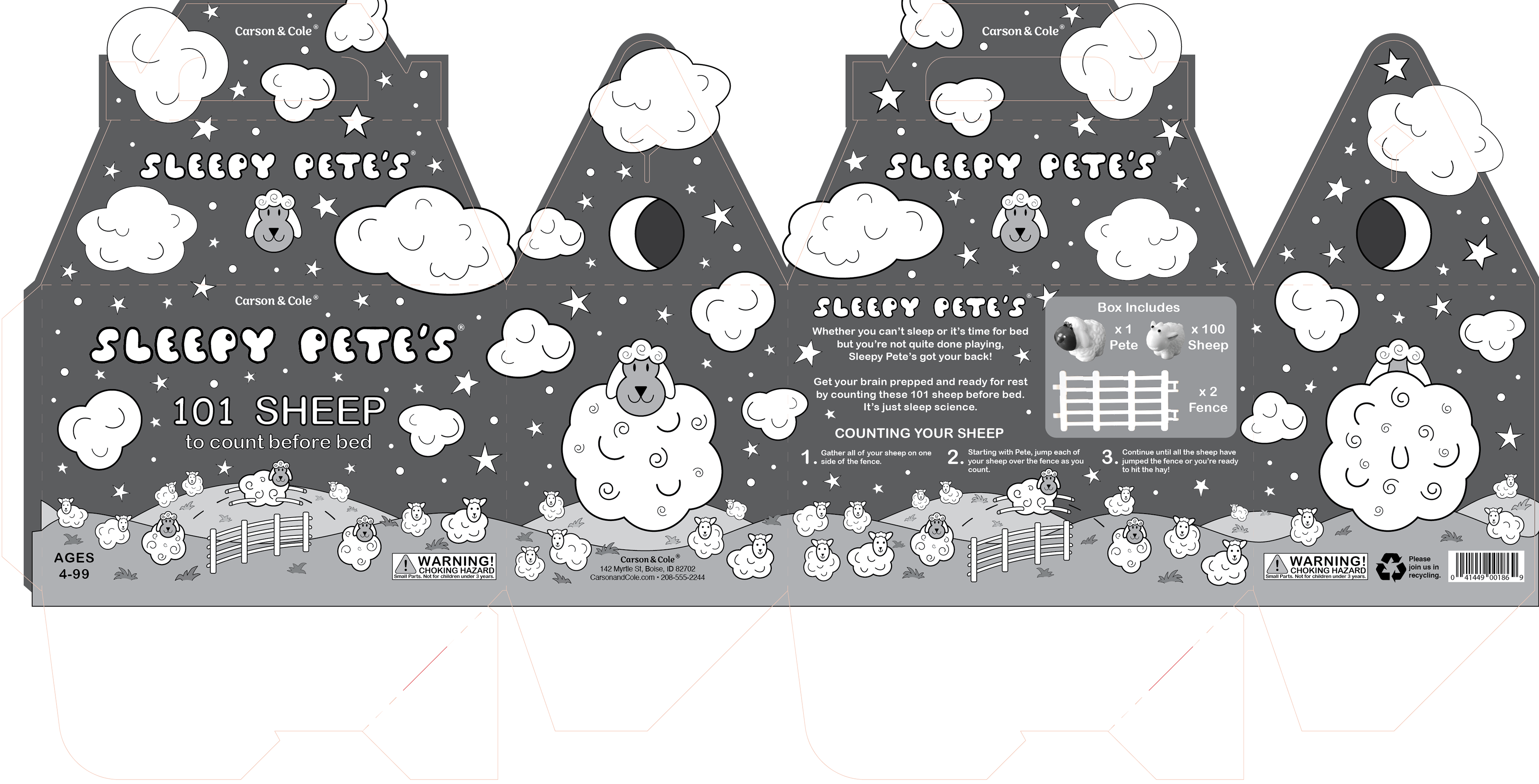
Computer comp 1 - digital

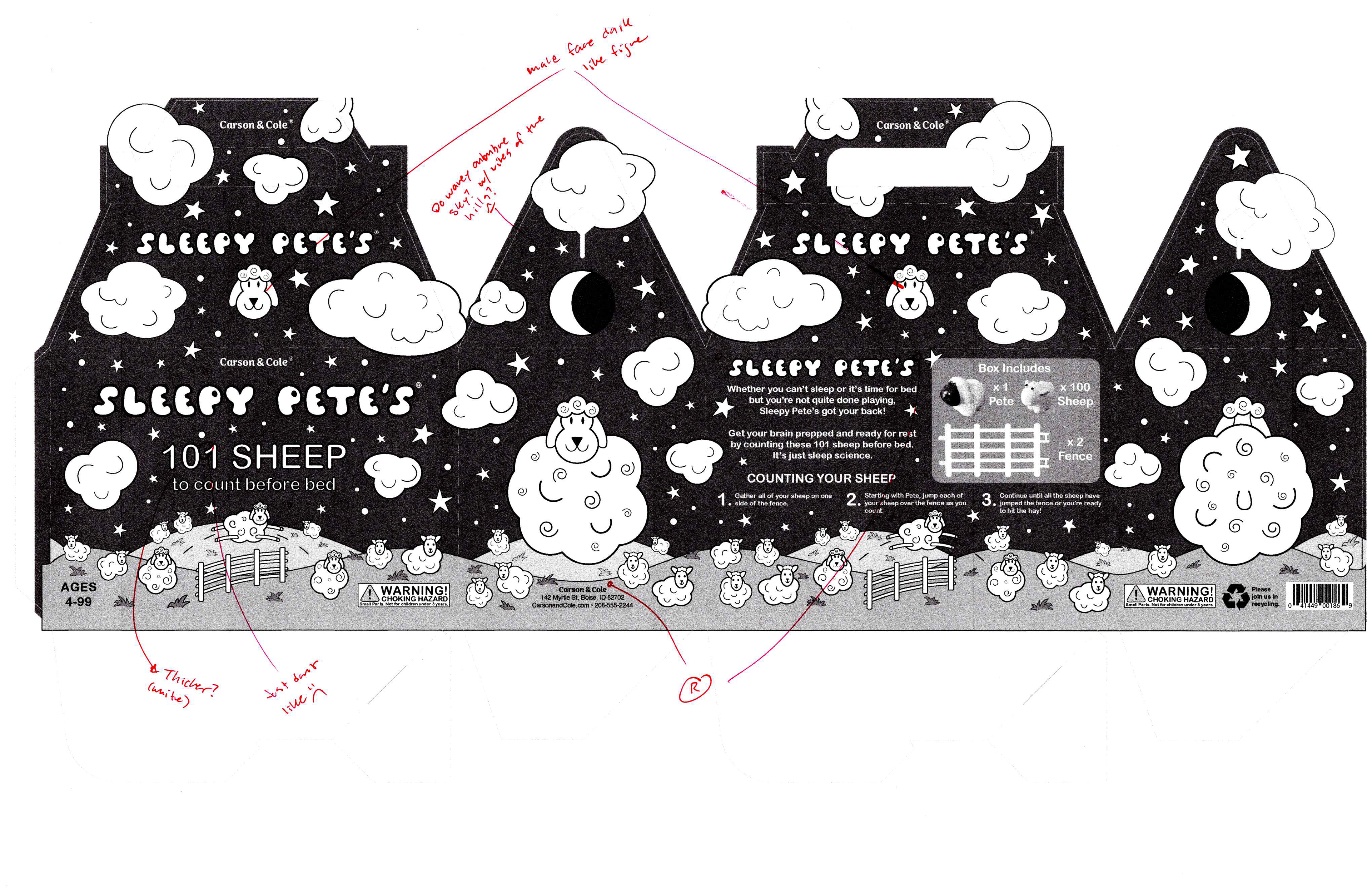
Computer comp 1 - printed, marked
Computer comp 1 full size dummy
Because I didn't do a final hand comp, I made sure to print my first computer comp full size and assemble it for markups.

Computer comp 2 - digital
Computer comp 2 - printed, marked
Computer comp 3 - digital
Computer comp 3 - Front and Side - printed, marked
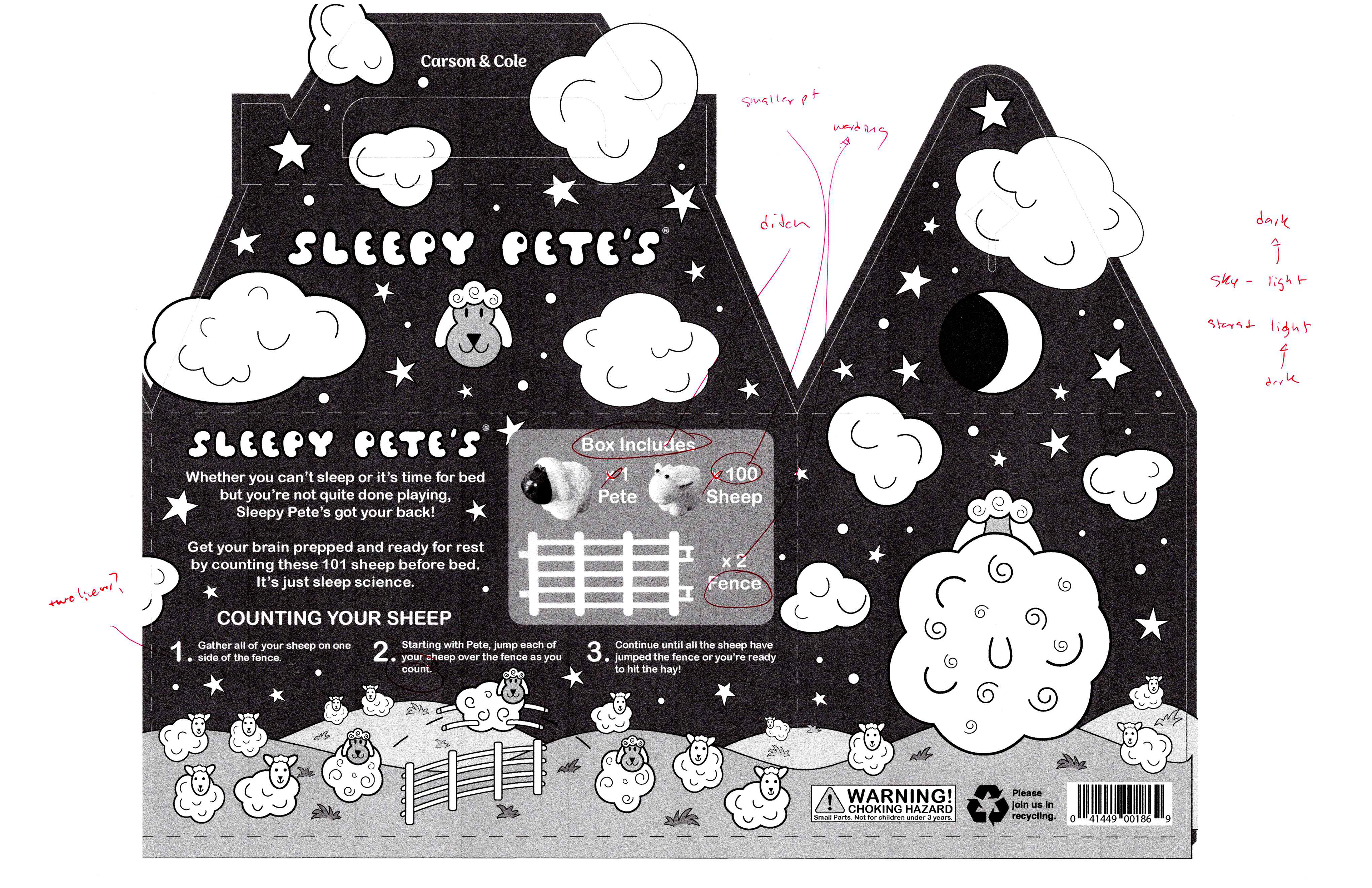
Computer comp 3 - Back and Side - printed, marked
Color Studies

Color studies - digital
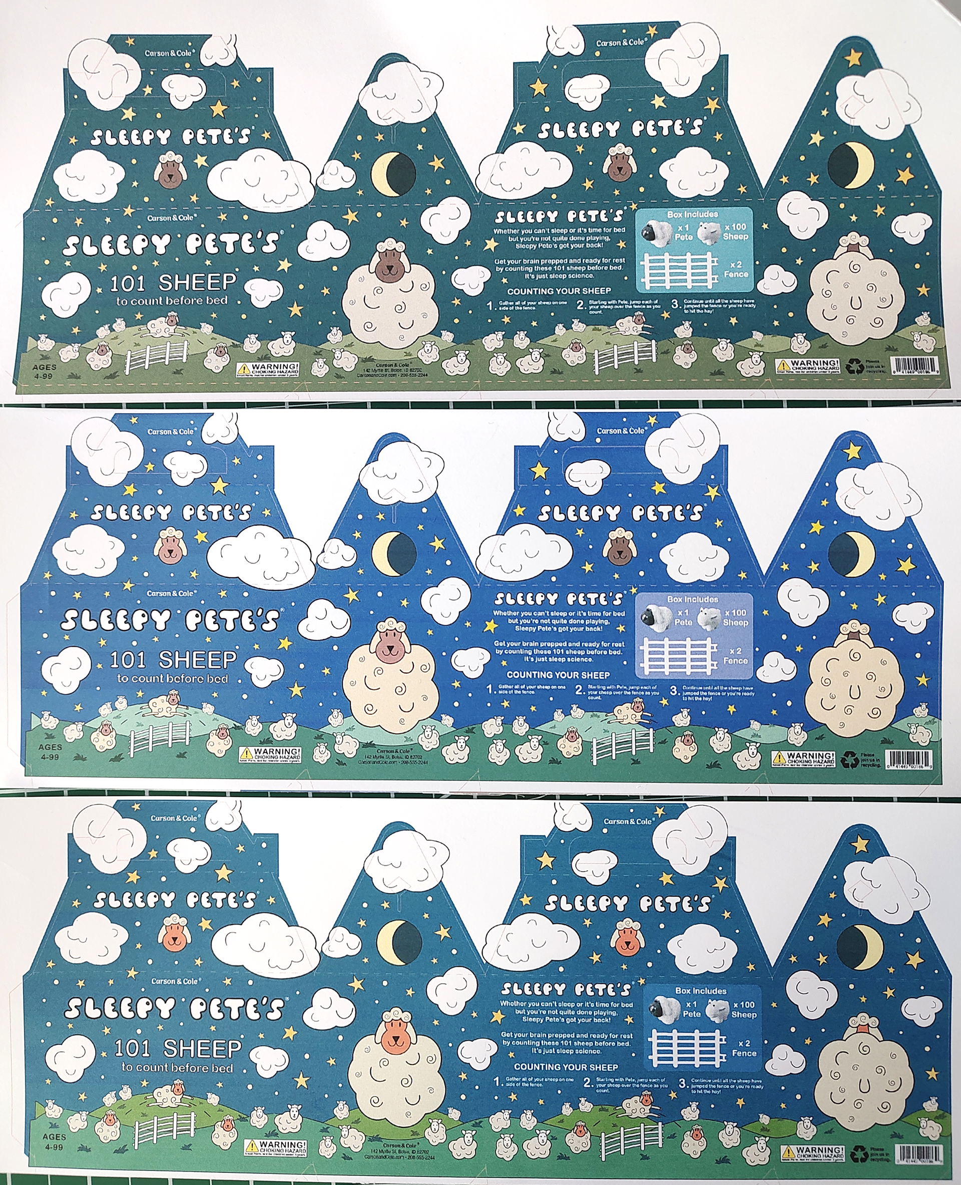
Color studies - printed
I didn't have too many initial color ways I made. I really struggled with figuring it out a good variety. The middle purple one, didn't print so purple, which was a real bummer, but in peer review, everyone liked the first one by a lot it felt like, which was a reliefe since it was my favorite as well, but at the same time, a bit of a bummer.
It's sounds silly to say it's a bummer, but when the brain is in a self-deprecating state, it just finds the silliest of things to latch onto to being upset about, in this case, "you wasted time trying to think of other colors to use, what a fool you are to think your labor could be fruitful." That voice still even lingers now, but therapy helped quiet it down a bit. (Shoutout to therapy, but mostly Brooke bc she's the best one yet.)
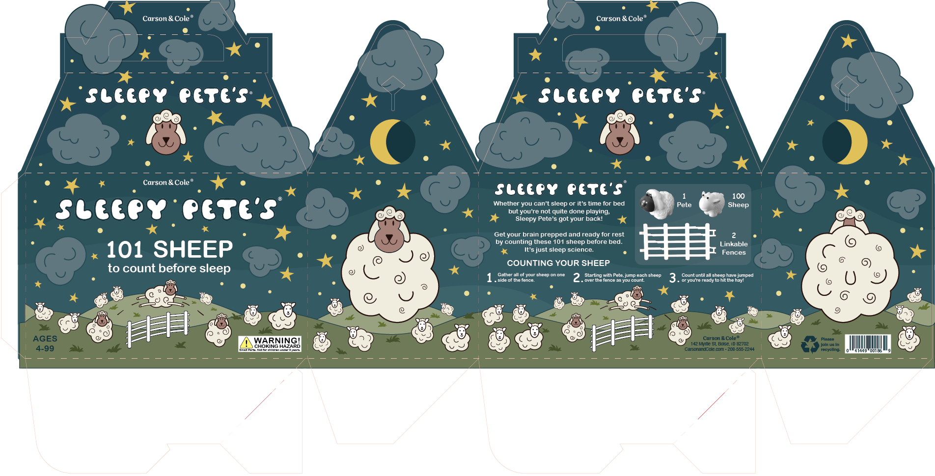
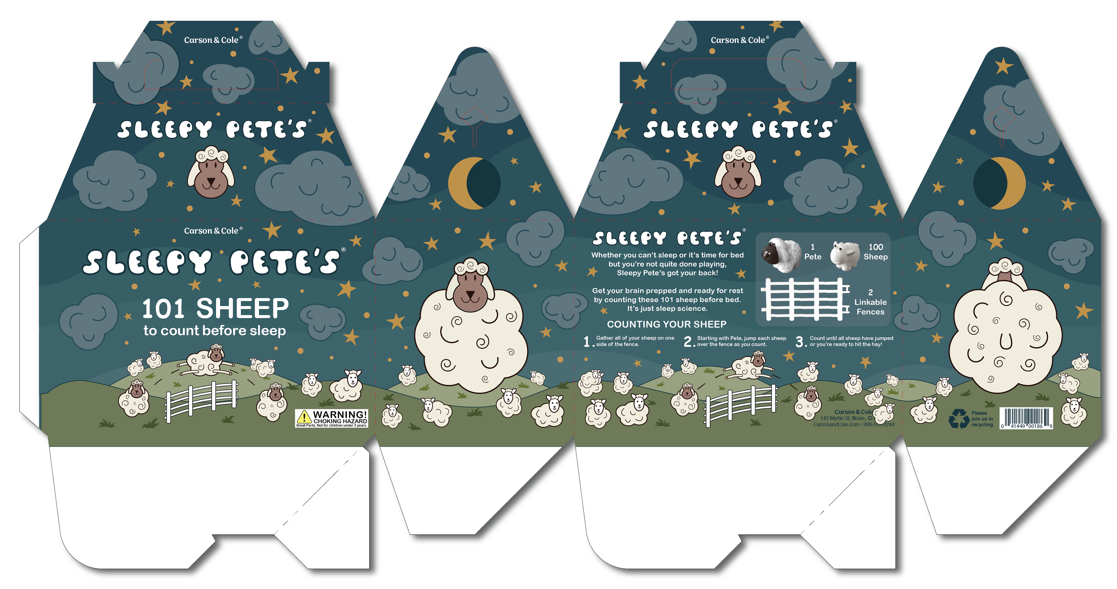
Once I started to feel more confident again, I made the sky wavy and added a subtle gradient to it. I think it helps a lot. I also reduced the number of stars and made them darker, so there was less contrast.
Final


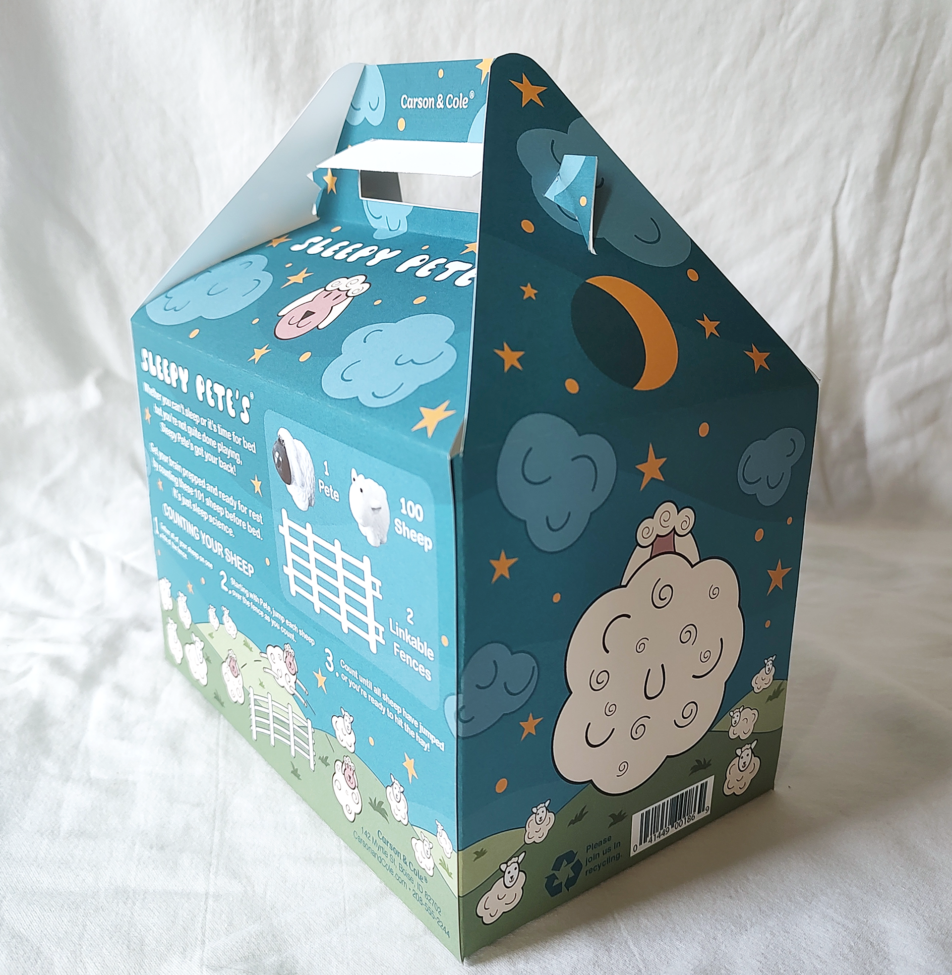
Overall, I'm quite happy with it, especially for the amount I cried during this project (it wasn't all about the project, but crying takes a lot of energy, man.)
I struggled the whole time, the part that went the smoothest for me was definitely sketches and doodles, and thumbnails, after that it just become an overwhelming thing all at once. Now that it's done, and I don't have any more reason to be emotionally distraught over this specifically, it's a lot easier to like what I made and feel proud of it.
(Ha! take that past mean brain, my labor IS fruitful)