


For this kit cover, we needed it to be 2/2 using the same two spot colors as the logo and stationery. We needed a pocket (or extra flap to hold papers in) and a slot for a business card.
research and brainstorming
To get started, I looked on Pinterest for some kit covers. I feel like I struggled and didn't know where to begin because a lot of what I was looking at was very cold corporate looks, or very graphically heavy. I wasn't really able to find something where I was like "wow, that's it, that's the one I actually like." Which was frustrating, and really discouraging.
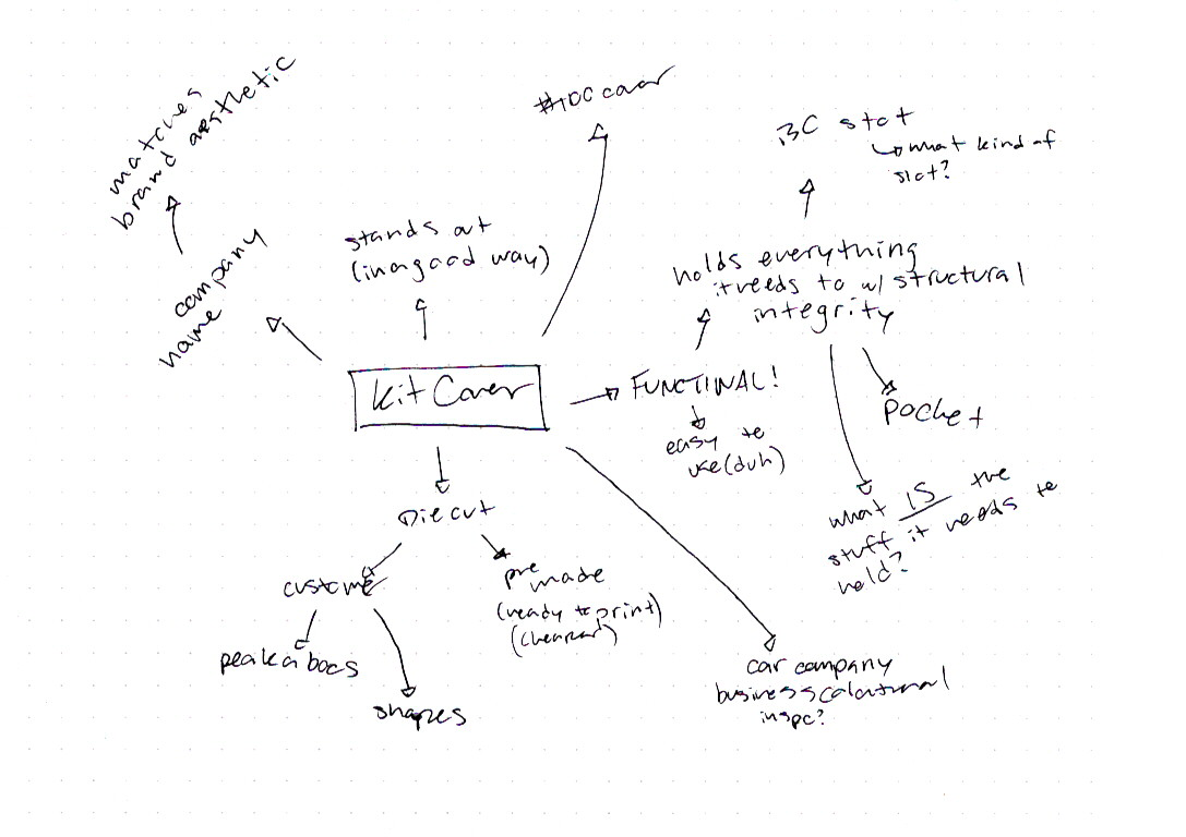
I also did a brain map, but didn't do it in as quite a helpful way. I did it more of "Here's what needs to be on there, and questions I need to answer" and less of just throwing out ideas and being creative with it, which I think would have been beneficial.
I was also lucky enough to get a kit cover sample from work that hadn't been glued yet, and was able to use it to help create a die.
Sketches and doodles

Because this is done in marker and pencil (instead of pen, silly me) the scanner had some contrast problems.
I look back at my preliminary work, or lack thereof, and I really had the AUDACITY to wonder why I hated it .
"Keep it simple" you say every day, and keep it simple I did not. I kept feeling like "oh this is too boring" and wanting to add stuff, and of course, I didn't want to do a classic kit cover die, I needed to be different. You can see I played a lot with adding an extra fold instead of a pocket, and by play around I really mean that I got so stuck in one idea that I got tunnel vision and was unwilling to kill my darling.
You talk a lot about how students always look back and wish they did more preliminary work, so we should do lots, but I think it's really a lesson you can only learn after suffering. Even now, I can look back at this and say "I wish I did more" but I'll move on to the next project and not do more. Hindsight is 2020.
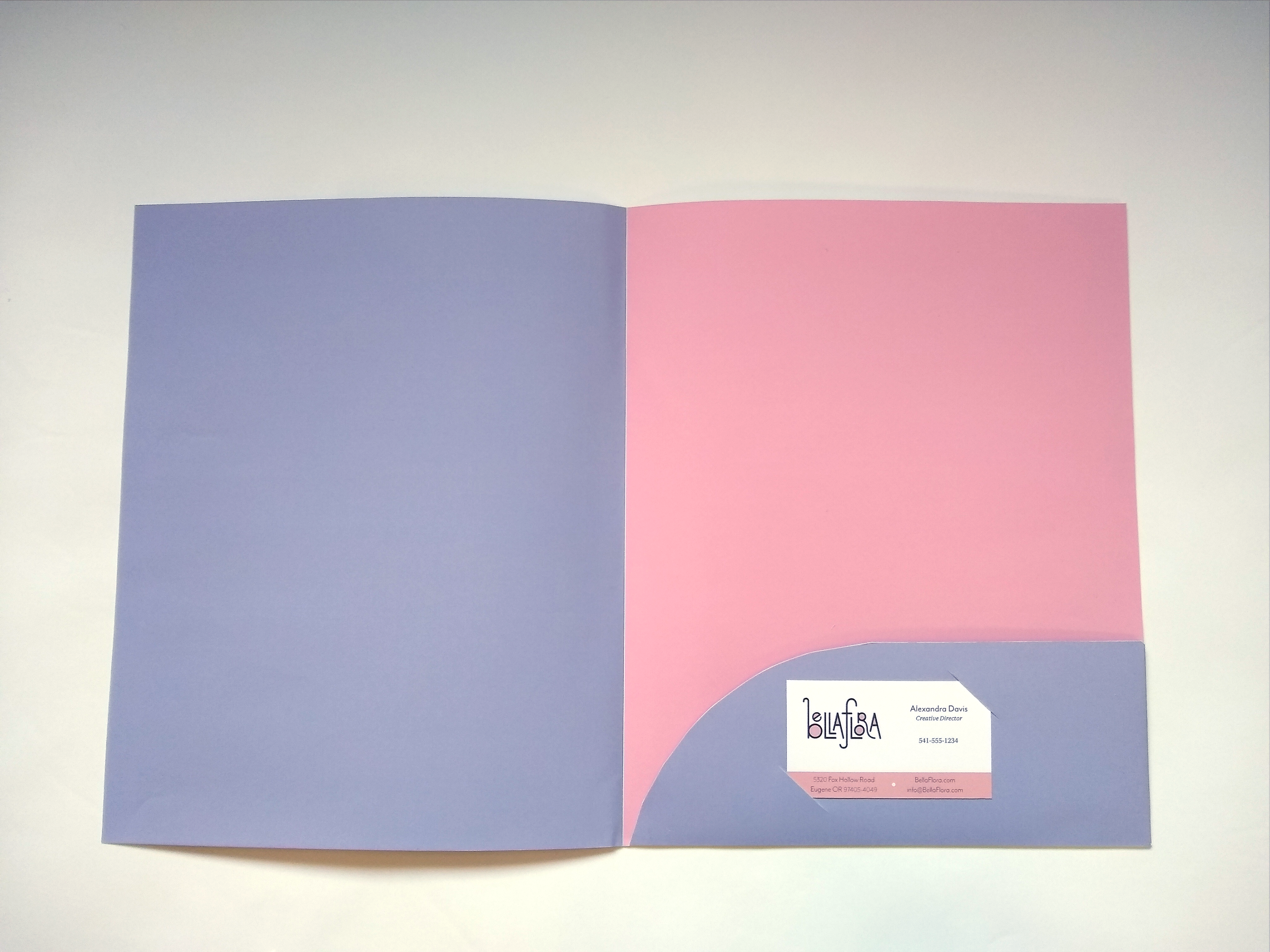
At the bottom of the page, you can also see I was writing out quotes to put on the inside, and it never made it further than that. Perhaps I need to revisit it since my final KC is a little bare on the inside.
Thumbnails
You think I got any thumbnails out of those sketches? Hell nah, but I do just HAVE a thumbnail I can use.
Color Studies

Instead of moving on to doing thumbnails, intermediates, a final hand comp, and finally a B&W computer, I totally screwed myself over by going straight to the computer, a classic move I'm sure you're sick of seeing.
As you can tell, I keep running with the original design I got stuck on in my sketches and doodles (and apparently felt so confident in). I really can't help but kick myself when I look back at these. I didn't really have a picture in mind for the cover/flap (wow, I wonder why) and just went with an all-over flower cluster.
If I did black and white computer (better yet, hand) comps, I'm sure I wouldn't have struggled quite as much.
Dummies

Just a bunch of printouts of my color studies essentially, mostly done because I wanted it to seem like I've been productive. I like the mini colors better than what I ended up doing for the "final". Part of this was because I ditched the nice light pink tint for a more saturated one.
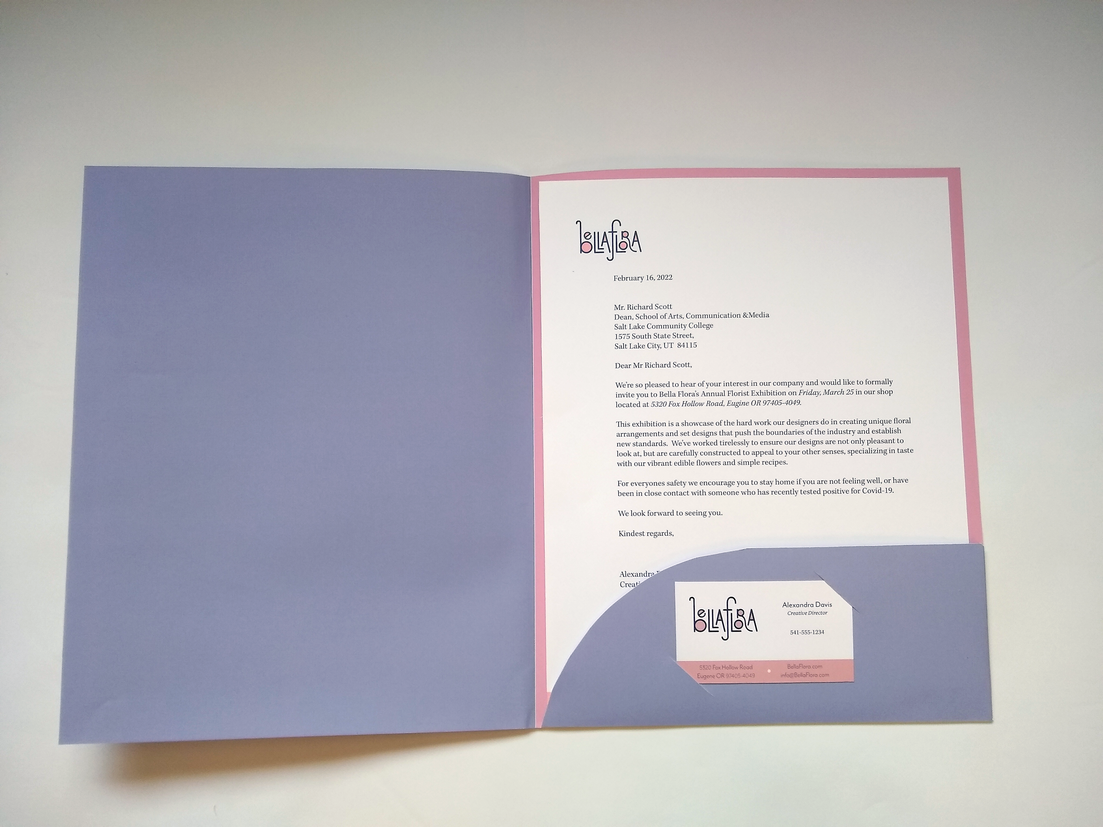
It was also here it became aware to me that I forgot to figure out how I wanted to do a business car
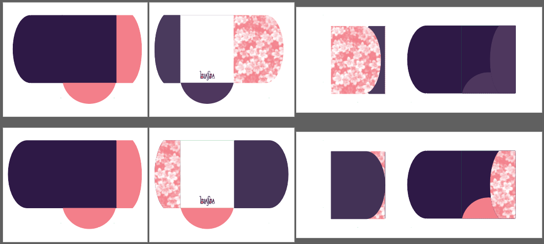
"Final"


It took me so long to print this out, glue all the pages together and everything, just to have it look like "Stampin' Up!" an MLM company that's practically single-handedly keeping my work in business, big yikes. This is part of why I felt like this looked so cheap, and the intense saturation I for some reason decided to opt for magnified that feeling more.
I also printed it on thicker paper, but using toner instead of liquid ink so since it's essentially melted plastic on paper, it cracked really bad after I scored and folded it.
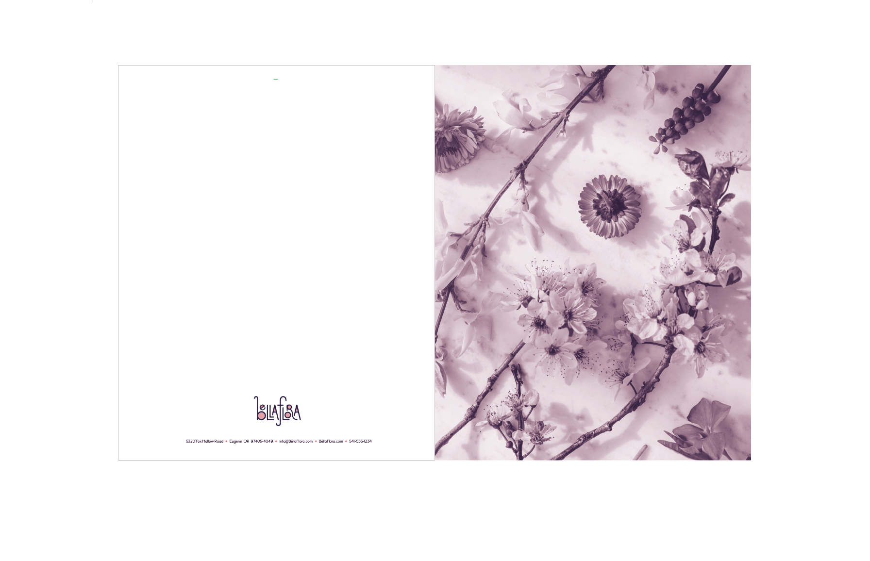
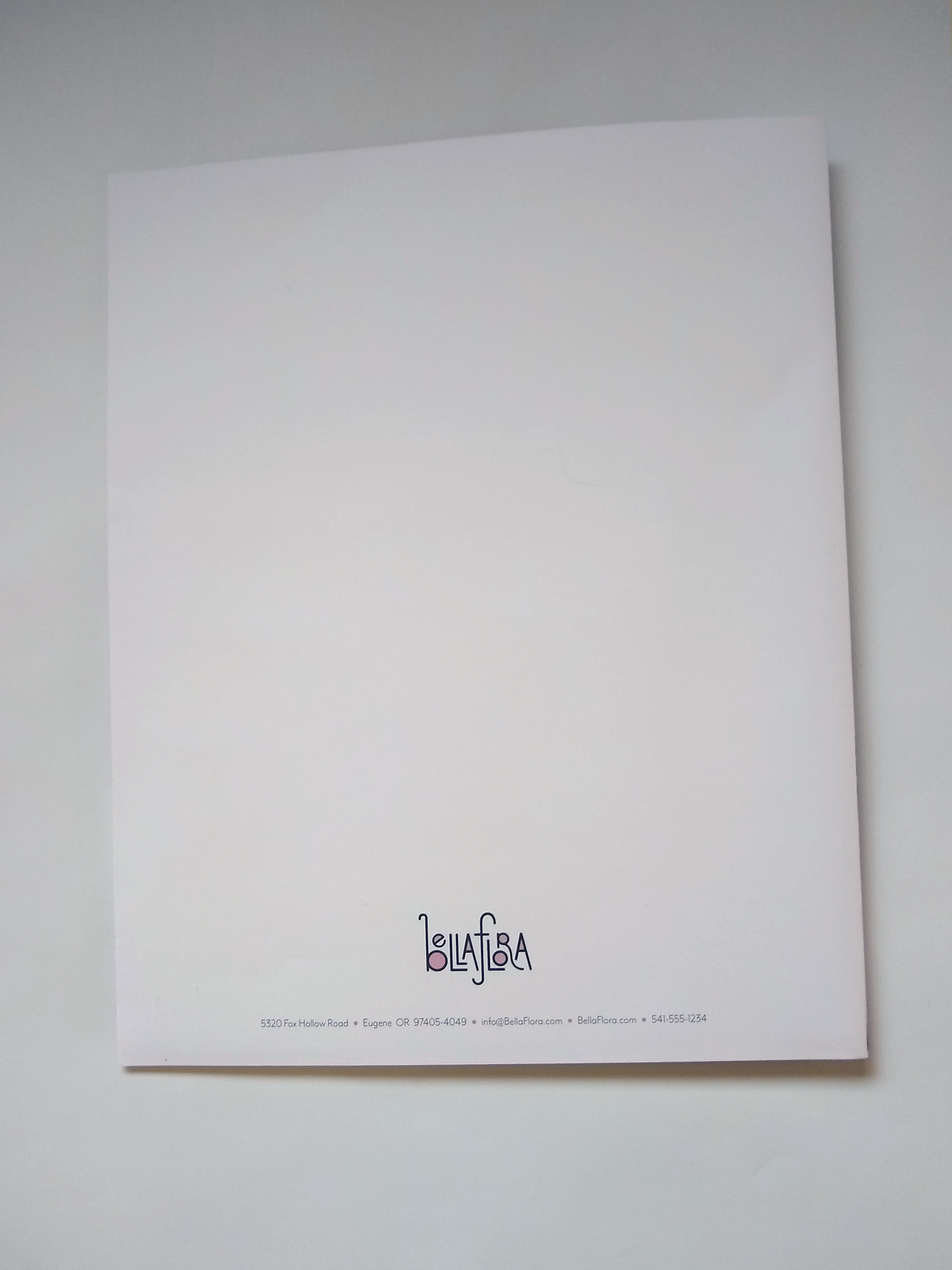
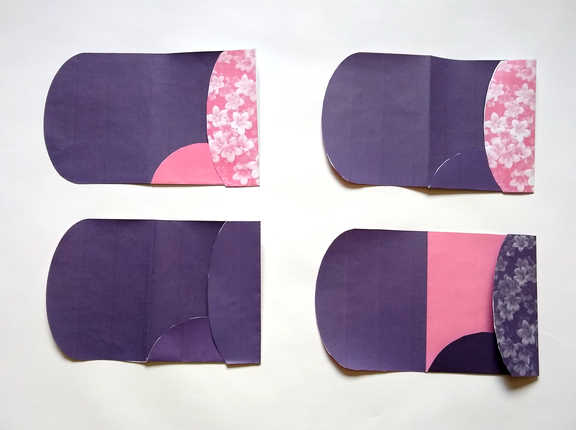
Revision - Actual Final Assembled


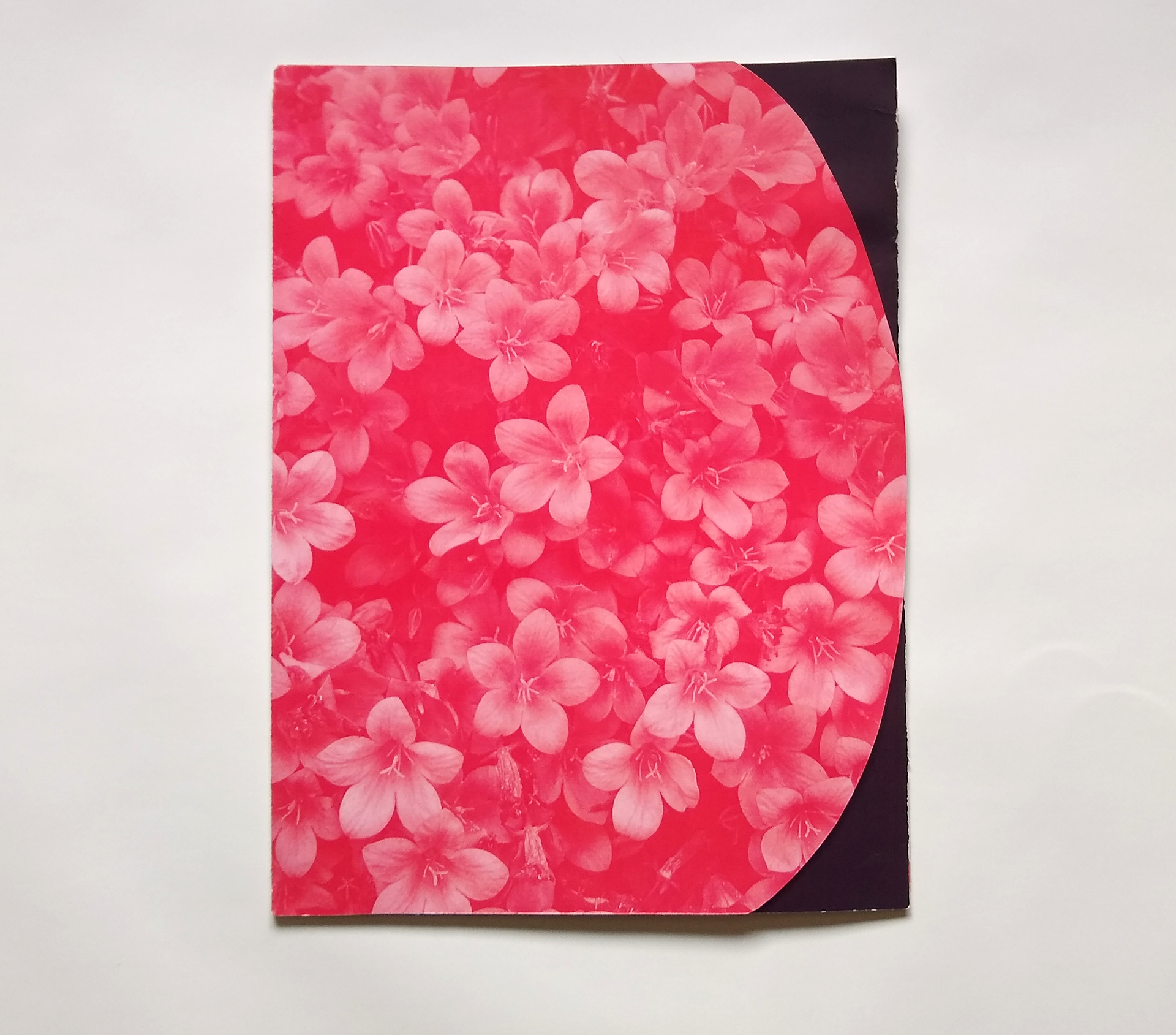
Once I finally had in mind an idea of what kind of flower company Bella Flora was going to be, I came back to revisit this. Luckily it was mostly removing, rather than adding. The intense saturation and having the peek-a-boo area kept stressing me out, so those were the first things I ditched. I needed it to have a softer more delicate feel.
Because I don't use the purple color in a lot of my collateral I wanted to keep it here, but to tint it out to soften it out to a light purple almost gray color, and I chose to simplify the shape of the kit cover in general, with the shape of the cover and business card slits, though keeping a slight curve on the pocket as a subtle ode to my past self's efforts.
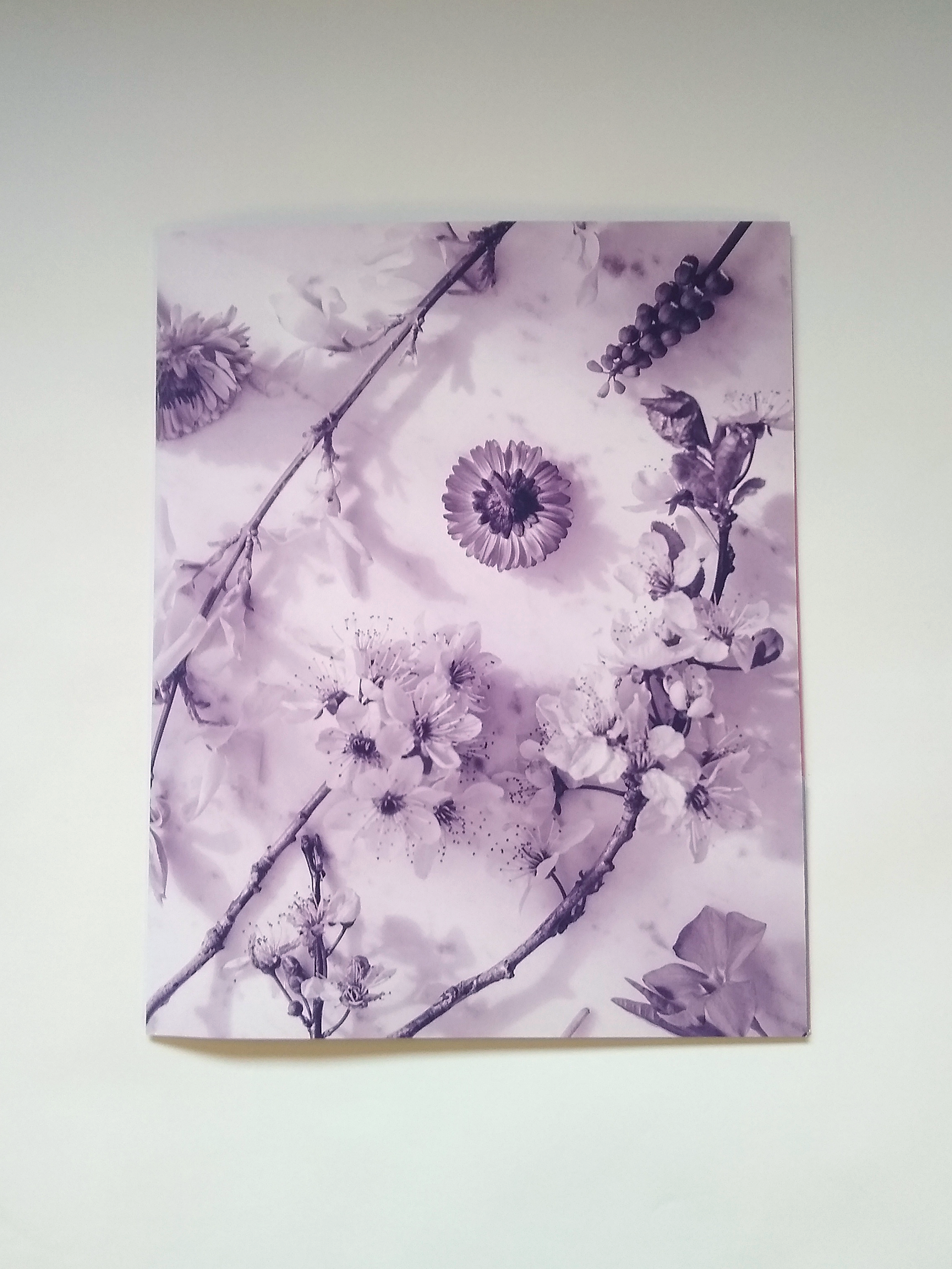
I ultimately chose the photo I did because it's pictures of flowers on a counter, which subconsciously supports the "edible flower" theme.
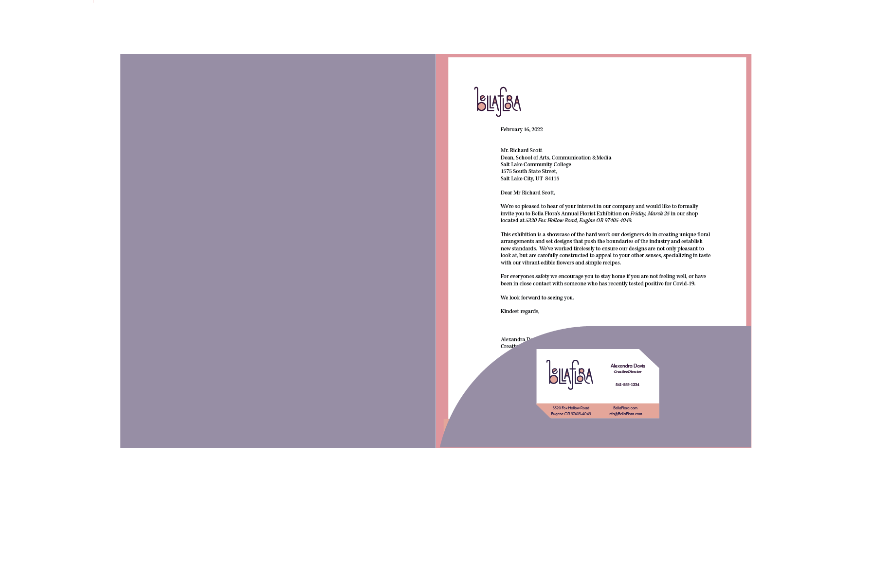
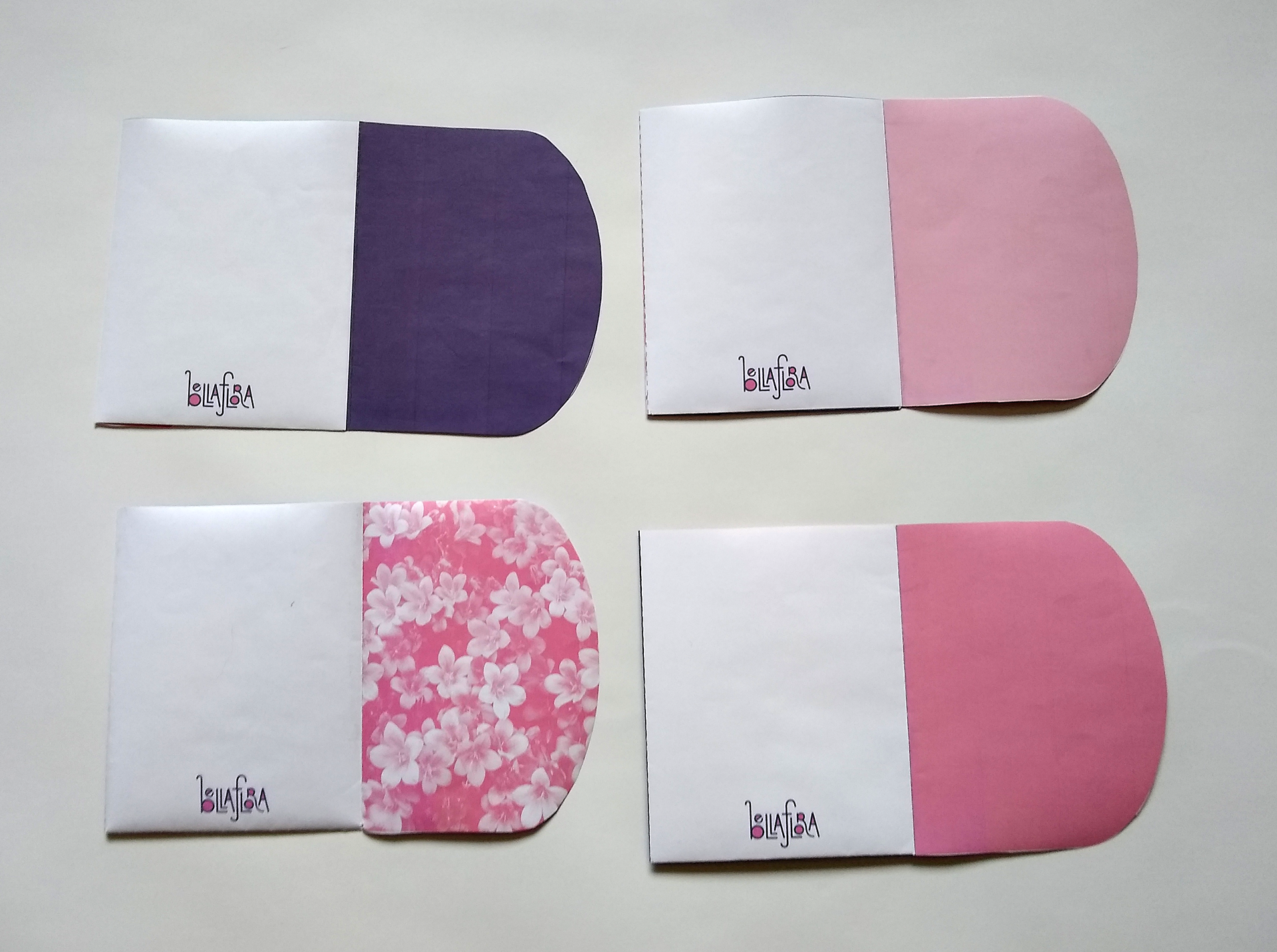
Final Clean Digital

Outside flat

Inside flat

Outside

Inside