This project was to create a 16 page spread relating to our personal experience with covid-19.
I recall last semester I had someone taking this class making the zine.  "Don't bullshit the progress reviews and actually get the things on the website," they said.  Heading advice is something I really 'ought to look into these days.
To be fully upfront, everything I've done for this zine has been done in an "Oh SHIT" panic between the Thursday you remind us there's a progress review and the Tuesday that it's due. It's been a wild ride, I cried a lot, but I wouldn't have gotten here any other way. 
I worked hard to put the "pro" in "procrastination" with this.

Research and Brainstorming

what actually convinced me to start

This part of the process was a bit stressful, while looking at examples and trying to do some research, instead of getting inspired, I felt so incredibly discouraged.  Everything I looked at I just felt "I can't do that, I can't compete with that, why should I even try?" and that made me keep pushing it off working on it more and more.  Every time I sat down to even try and plot out ideas, I just kept coming back around to the conclusion of "I'm hopeless, I should just drop out of school." (I know, it's extreme but it's part of the whole mental health thing I'm working on). 
At my lowest point, my mom came home with a book from the library "whatchya mean, what's a zine?" which is a book full of different styles and stories of why people make zines.  There was one page of a comic spread, not particularly graceful, but the character talked about how they think they suck at drawing, and they don't think they have any ideas, but there's a due date to get this comic done, so they made the comic about how they feel discouraged because of all those things, but they still needed to do something, and all those things didn't prevent the comic from getting done (and making it into the book!).  That's what really made me feel like I might actually have a chance, that I should just do it.  I switched my research to a more casual illustration and layout type (the type that doesn't make me feel inadequate, stuff I like, but felt "achievable.") and more home-made looking things, over more "professional" looking productions. 
At this point, I already knew I wanted to talk about my mental health for the zine, and I had kind of an outline, but at one point I wanted to lean into how hopeless I felt in the moment and thought about "you're full of shit, a love letter to myself" but didn't have anything to offer after that, but I'd love to explore it further in the future
Sketches and Doodles

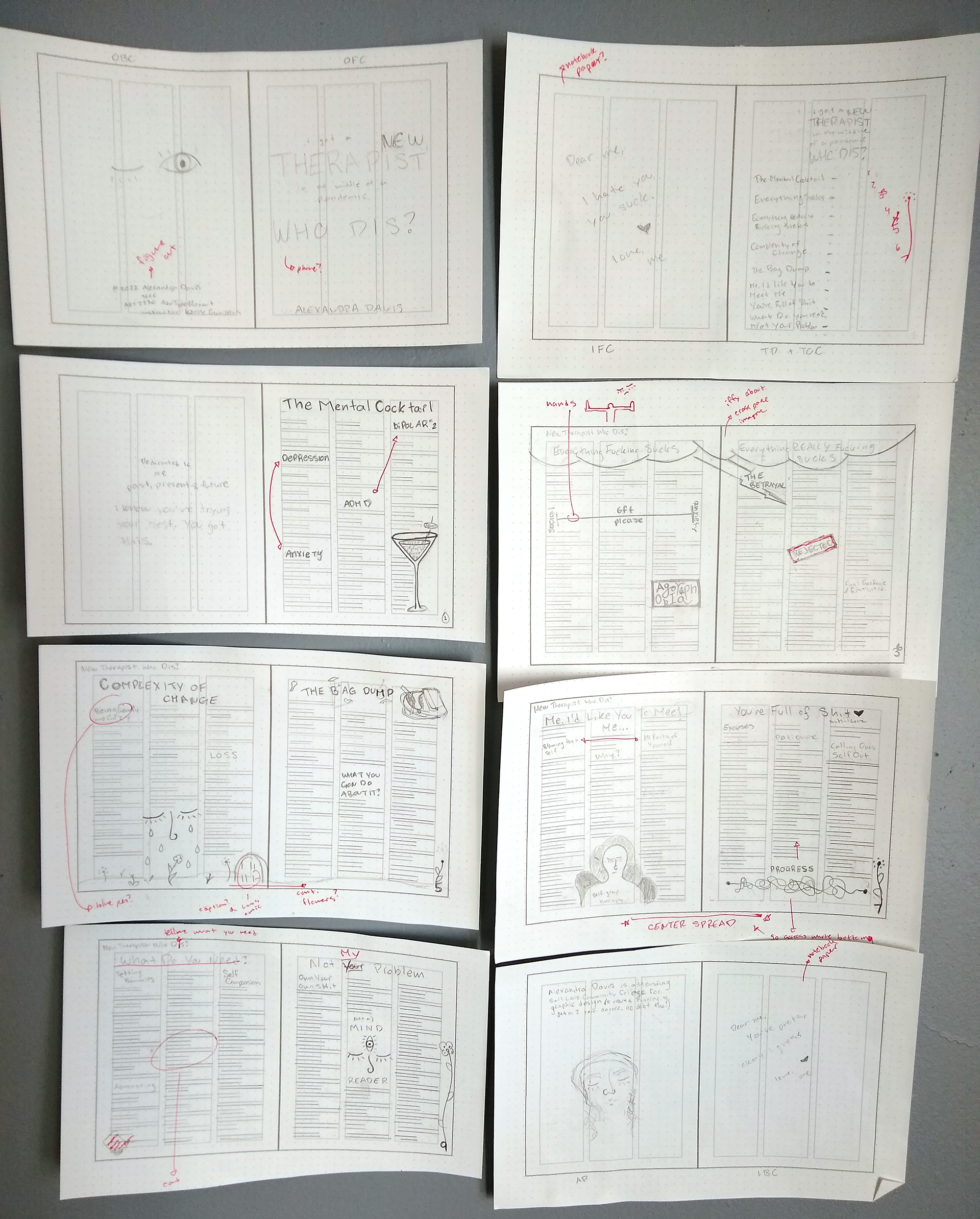
First layout sketch/idea that I just had to roll with.

Round two of sketches, only a smidge bigger.

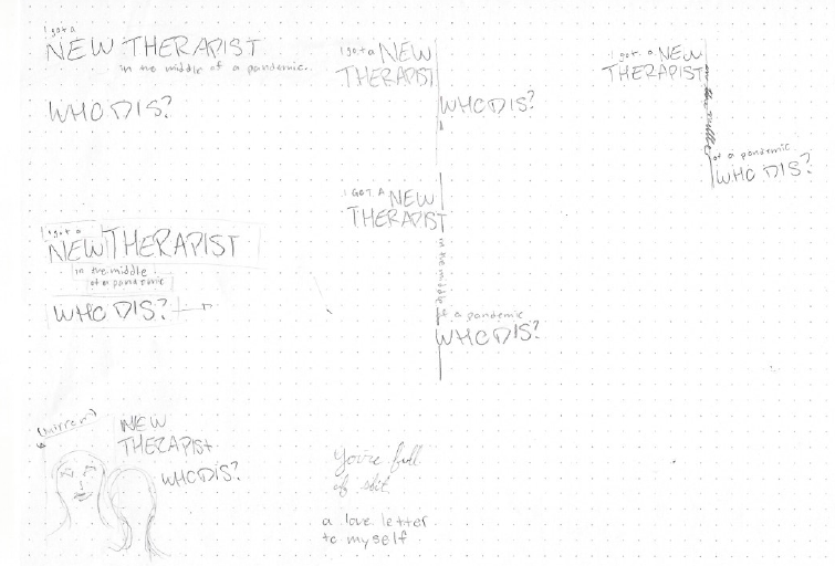
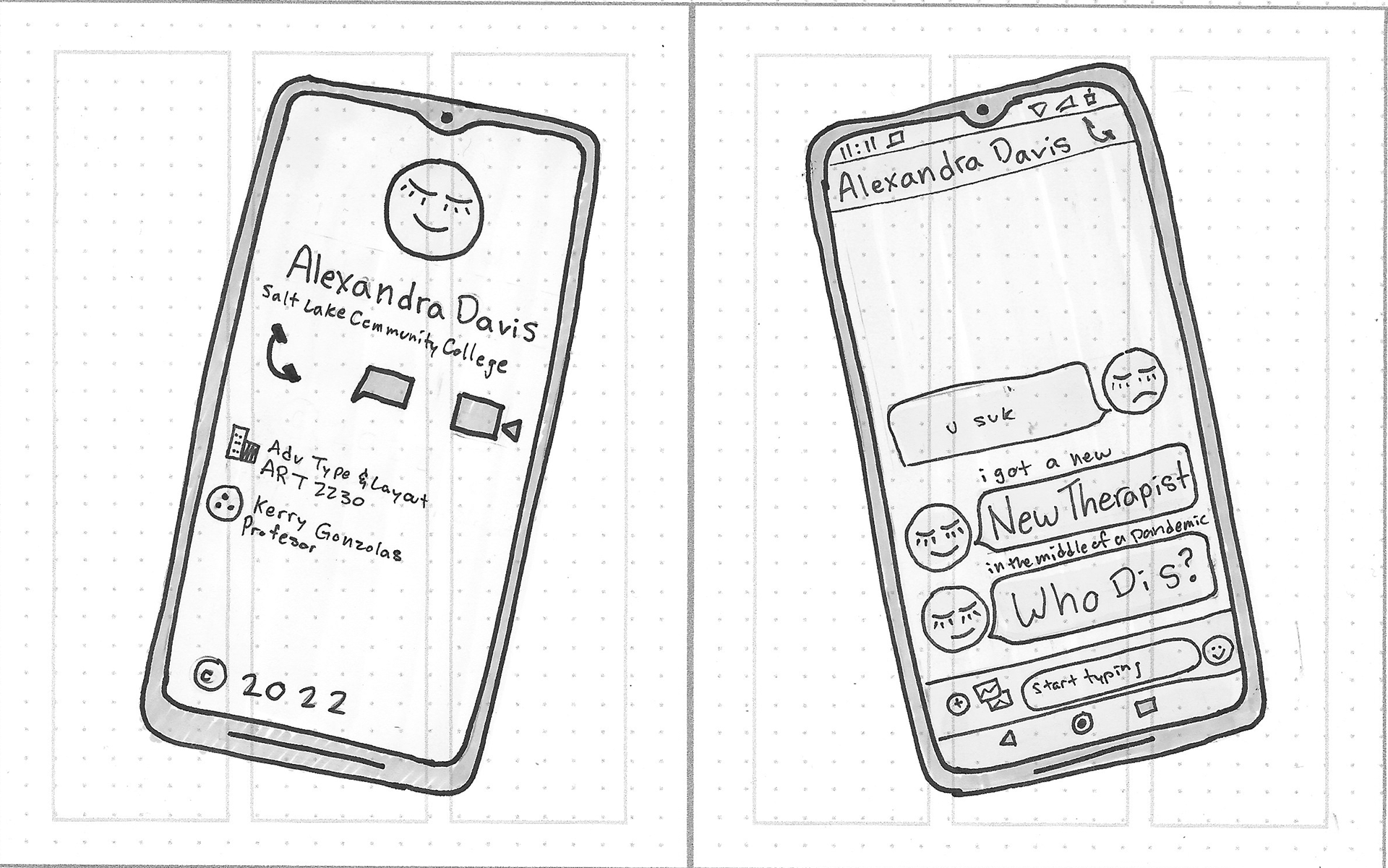
Real sad initial title comp ideas.

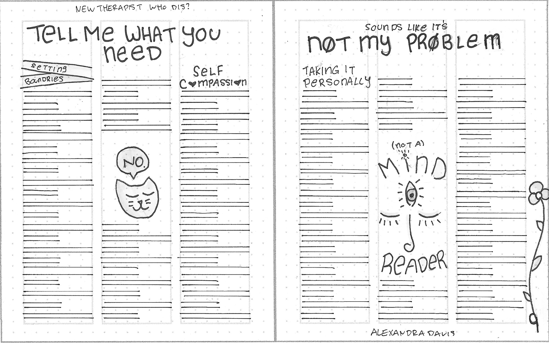
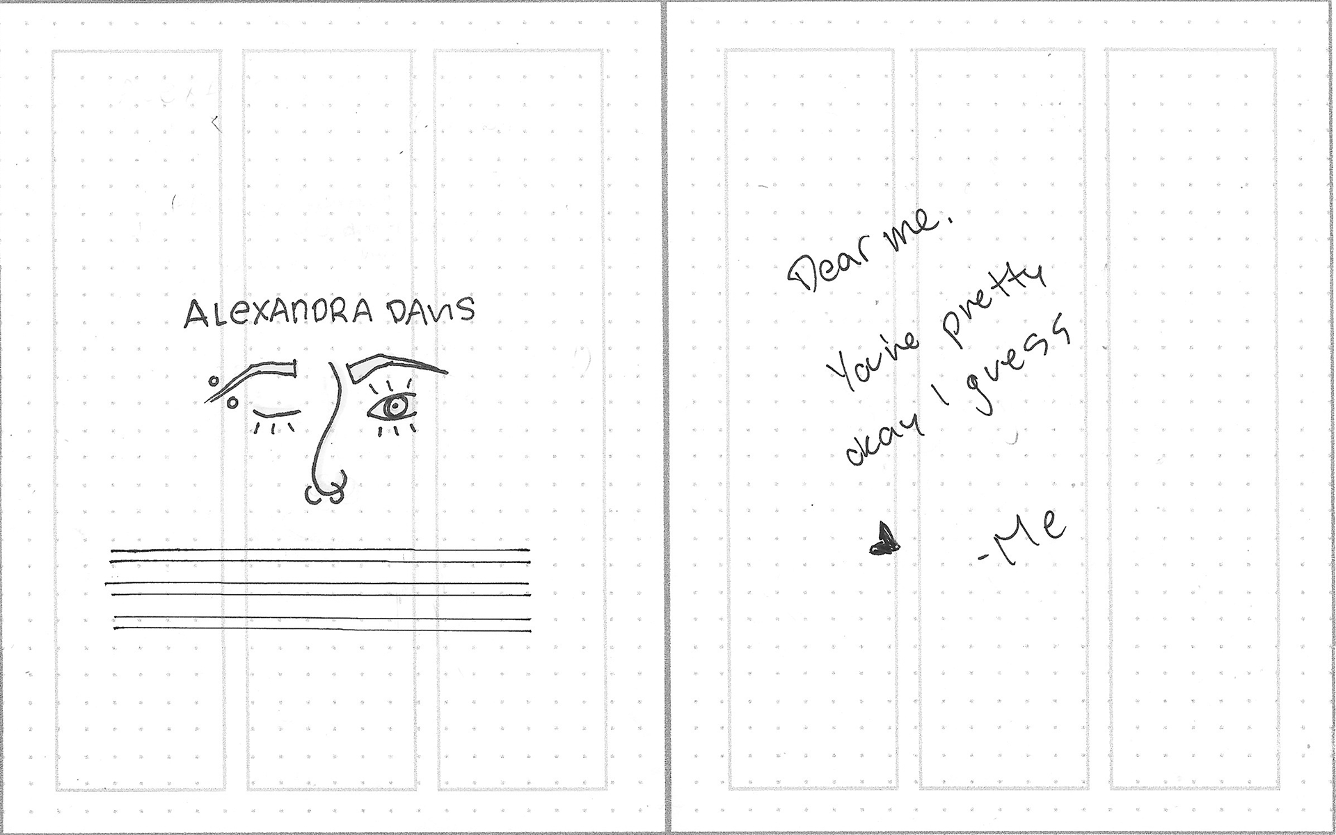
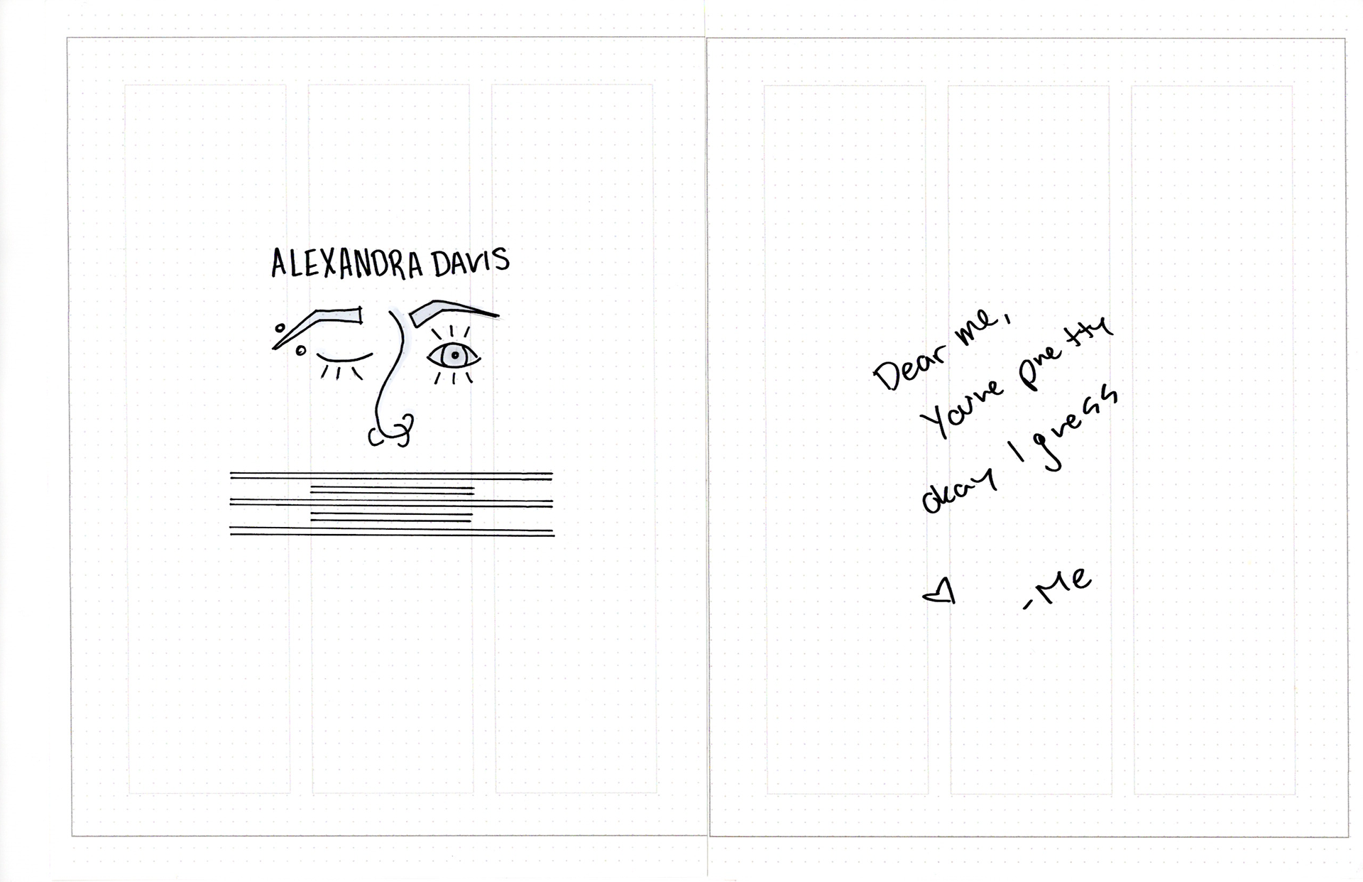
I particularly like the paper cup and string phone saying "I hate you" and "I love you" I do an ode to that in my final zine with the letters to myself on the inside covers, but it's not as cute.

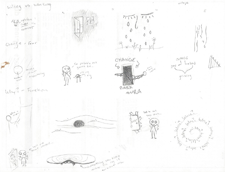
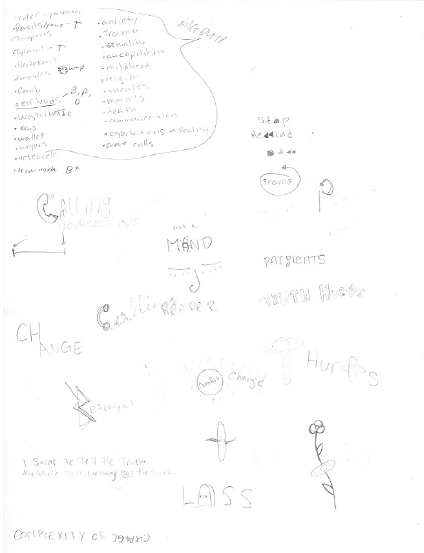
Lil cartoon me's in my classic style. I love my "dark aura but is offering cookie" change portal thing.

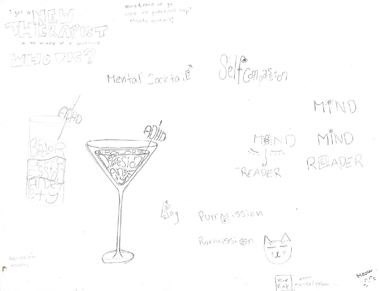
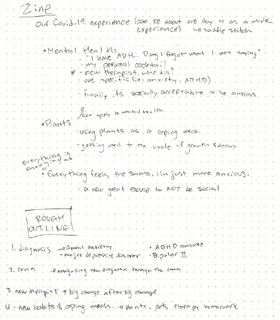
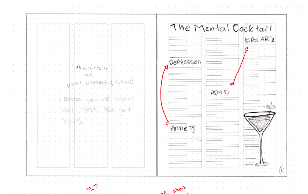
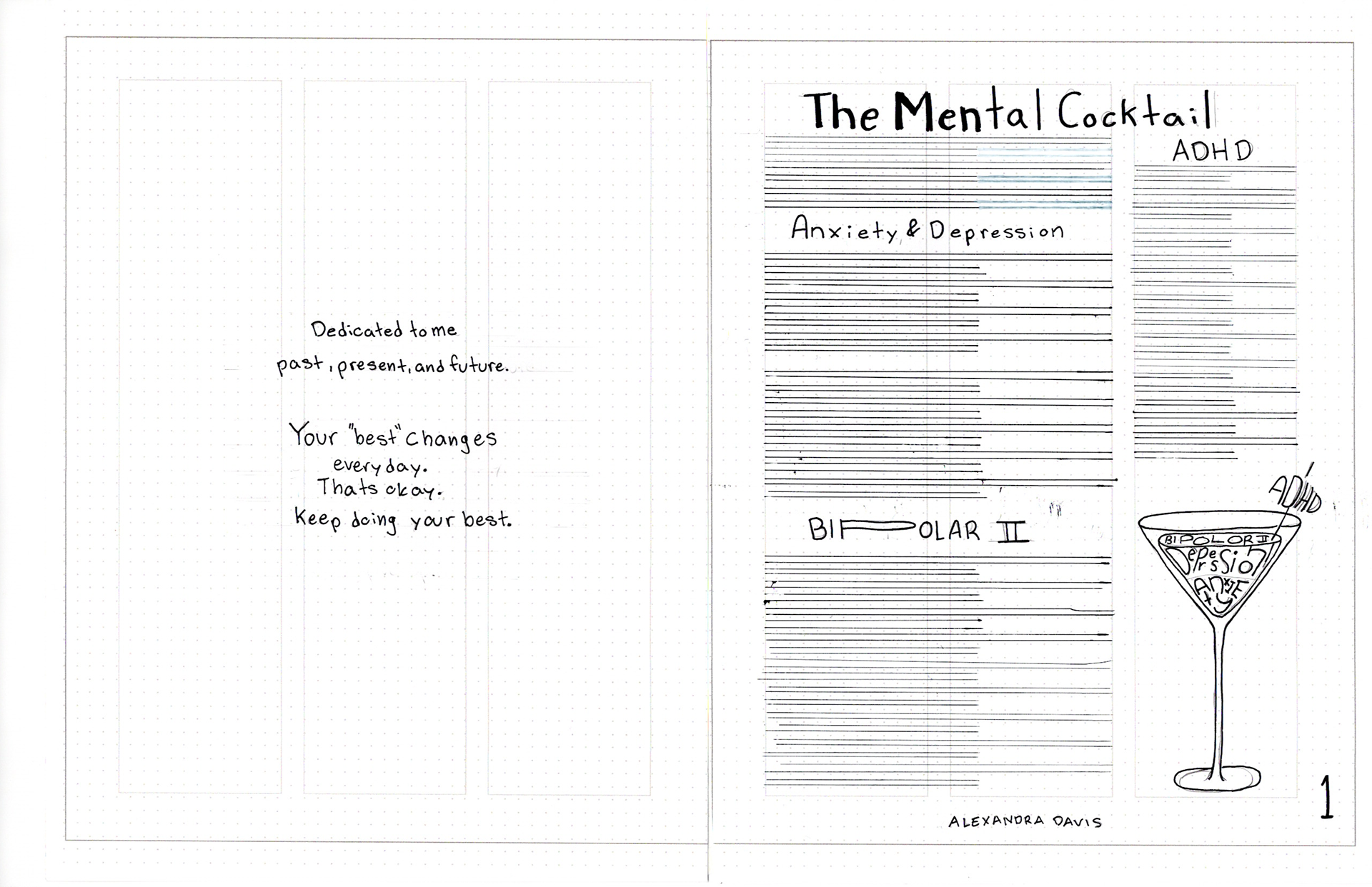
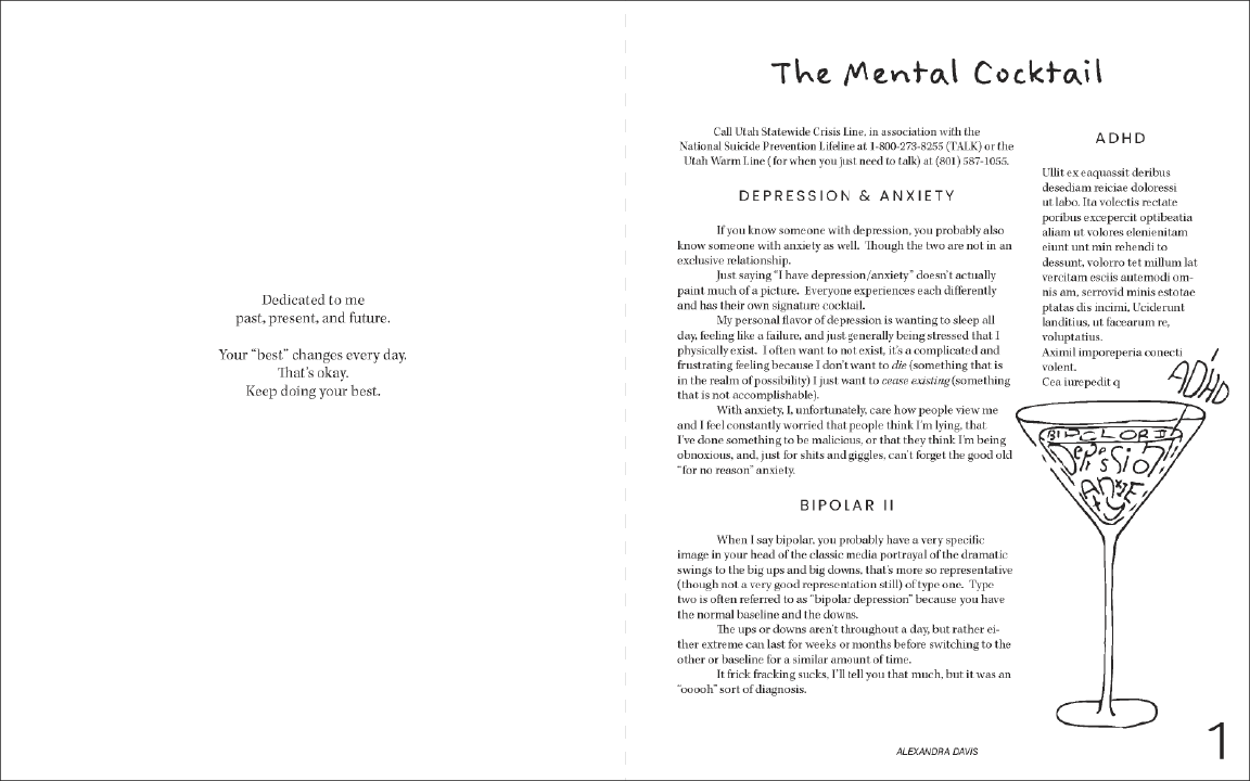
This is THE sketch of the mental cocktail I took into illustrator for my final.  Every recreation just wasn't as good.

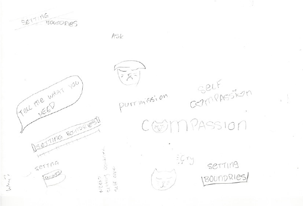
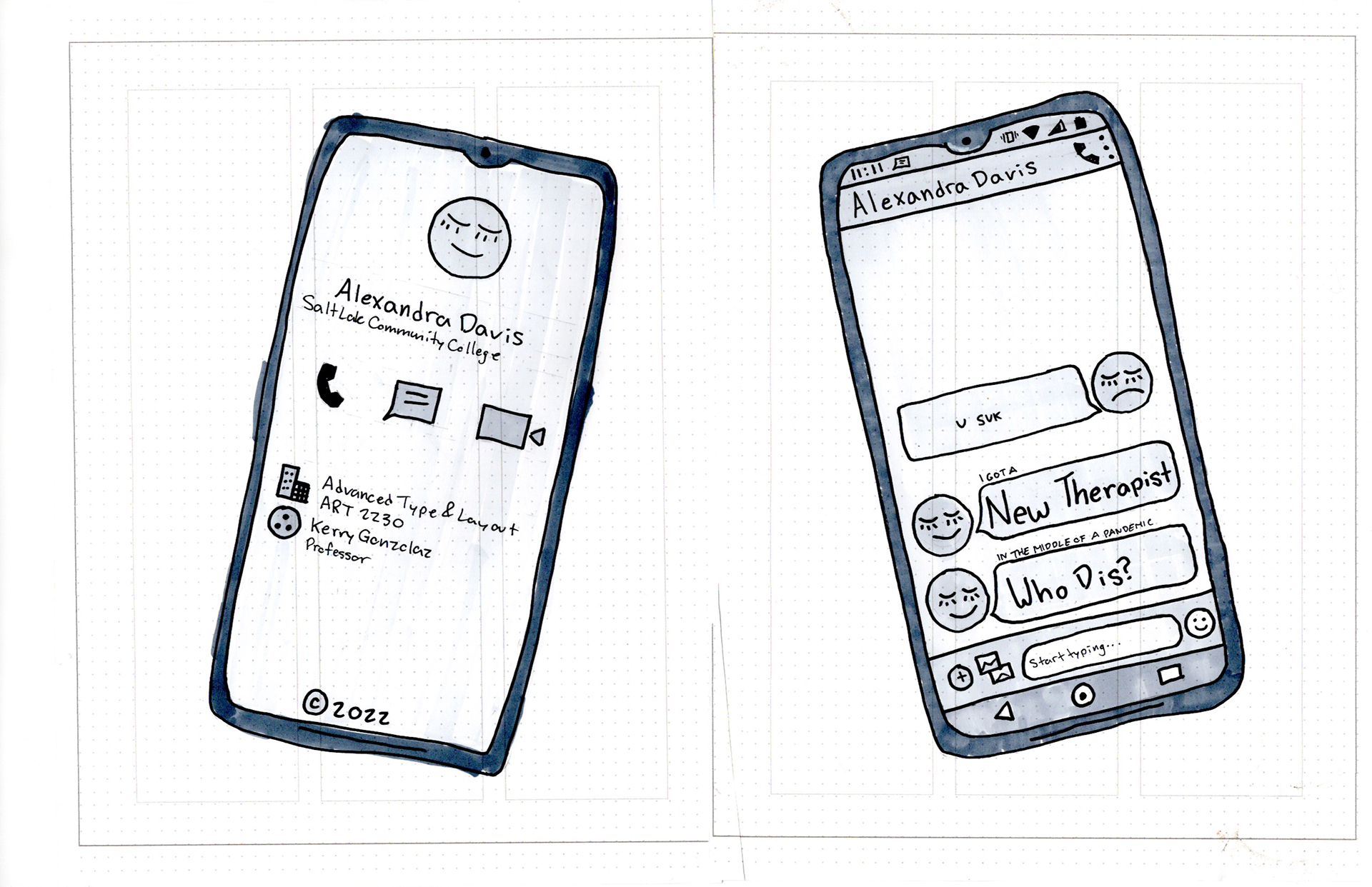
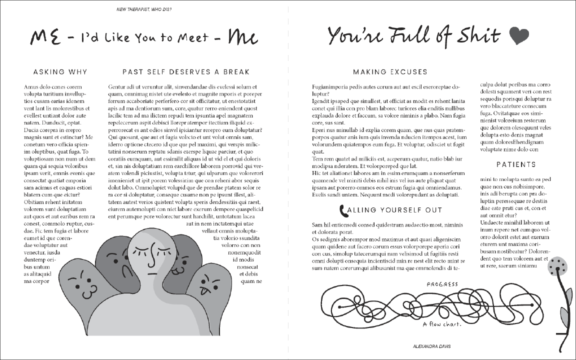
"Oh shit I need illustrated characters" a drawing

The blessed sketch that really carried the cover all the way.

 I know it's a bit of a mess and all over, but that's just how it has to be to get it done.  I can either let my ADHD do how it wants to, or spend the whole time desperately fighting against it.  
 When I got to this point I was just coming out of my "I'm a failure and I can't do anything" feel, and still didn't feel like I knew where I was going.  I had created a rough story outline and started a layout sketch, but (for some reason) decided I didn't like it and spent a few hours trying to find the one idea that was perfect for my sketches. Spoiler! It never came, I got some ideas I liked, but couldn't make into the whole thing and I usually got a few spreads in before abandoning it, so little was done with them that it's not even worth showing.
So I went back to my very first itty bitty initial sketch and decided I needed to just go with it.  I finished it, and decided to do one that was slightly bigger. (Part of this was so that natural changes would happen without me thinking too hard about it and psyching myself out, I needed to just let the process happen.)
A lot of this stage was just a practice in creativity. I created a lot of doodles I think are fun and helped me loosen up, even though they don't match the style I decided to go with.  I really enjoy the lil cartoon doodle of myself, I'd love to explore it further with some simple (dare I say mundane) comic strips about daily life dealing with my cocktail of mental illness.
I also realize I'm not like, TOTALLY sure what you want when you say "make a shell" I think I know but whatever I end up executing is not it, but I never wanted to ask for clarification because I feel like a big dumb dumb for it and it's a little late in the game to ask, so you get to work the confession booth today.
It's also important to note that NONE of this was done until well after "story outline" and "initial dummy."

Story Outline

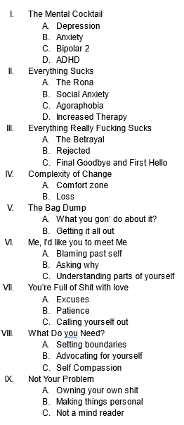
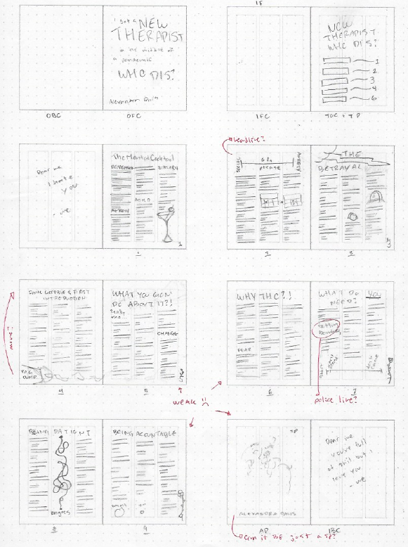
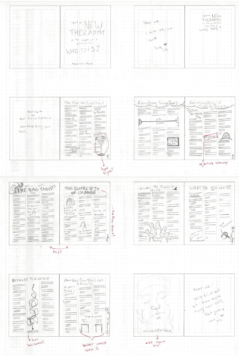
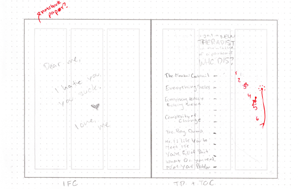
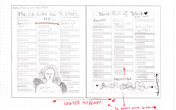
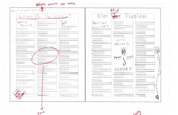
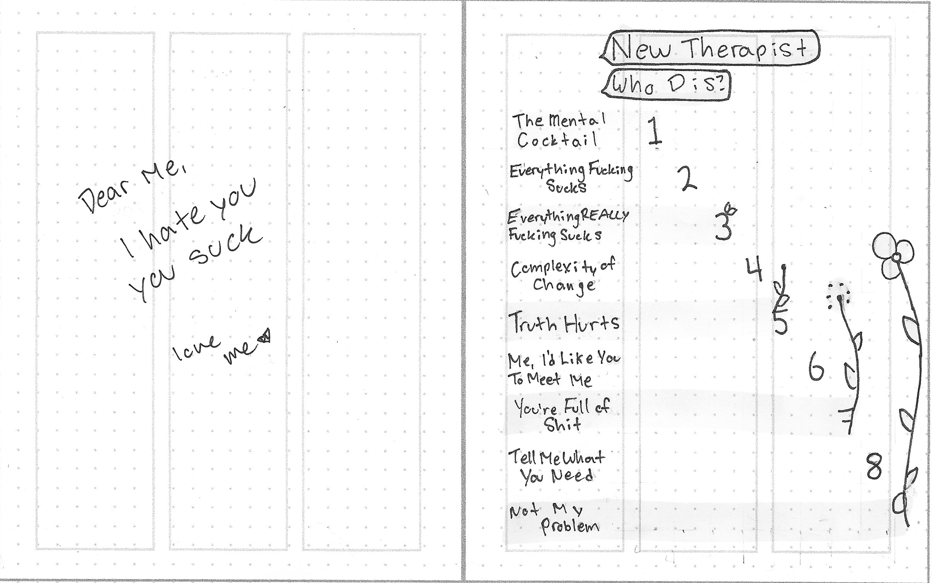
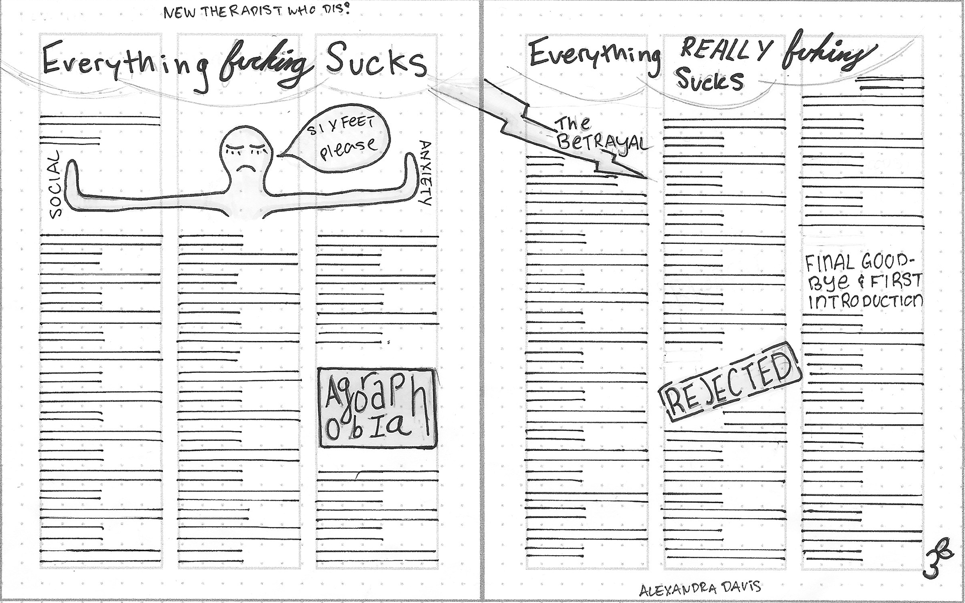
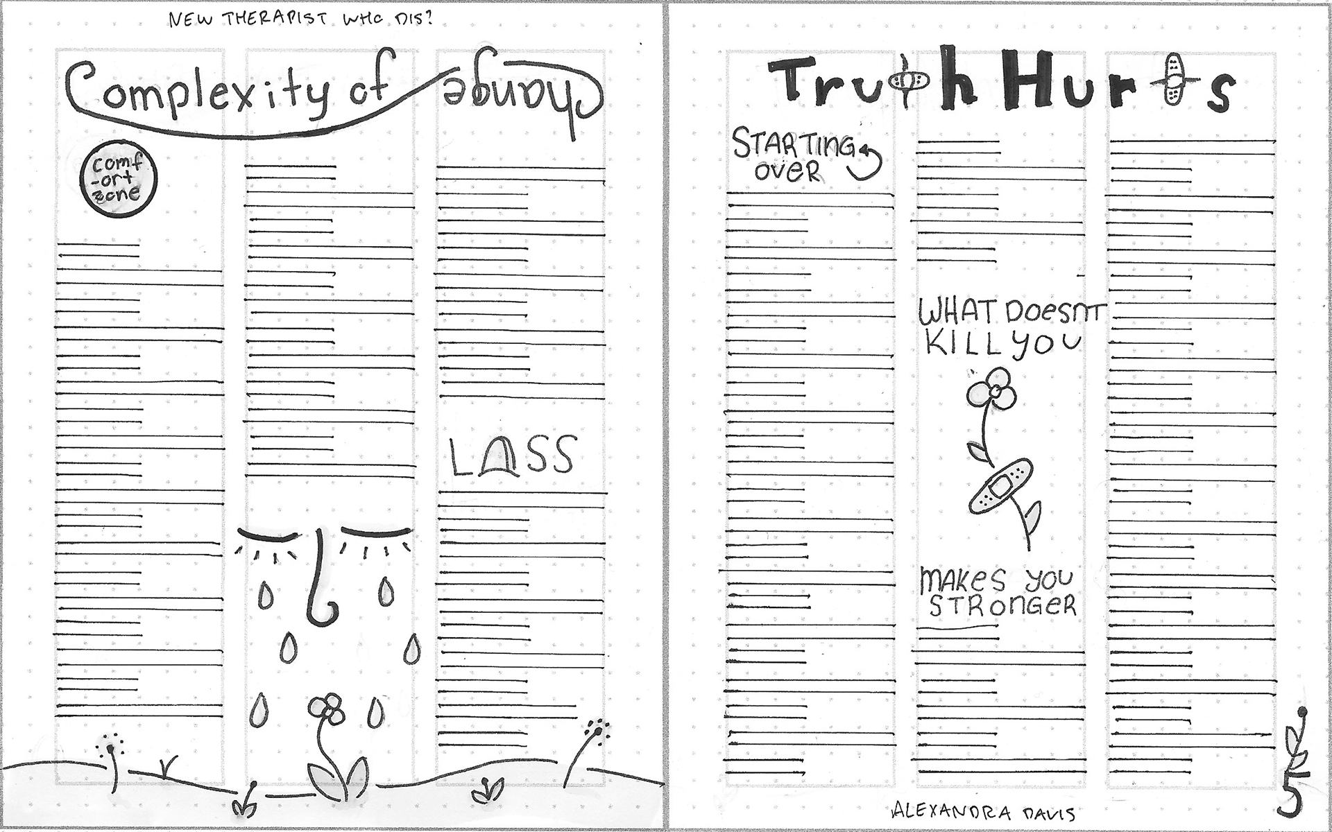
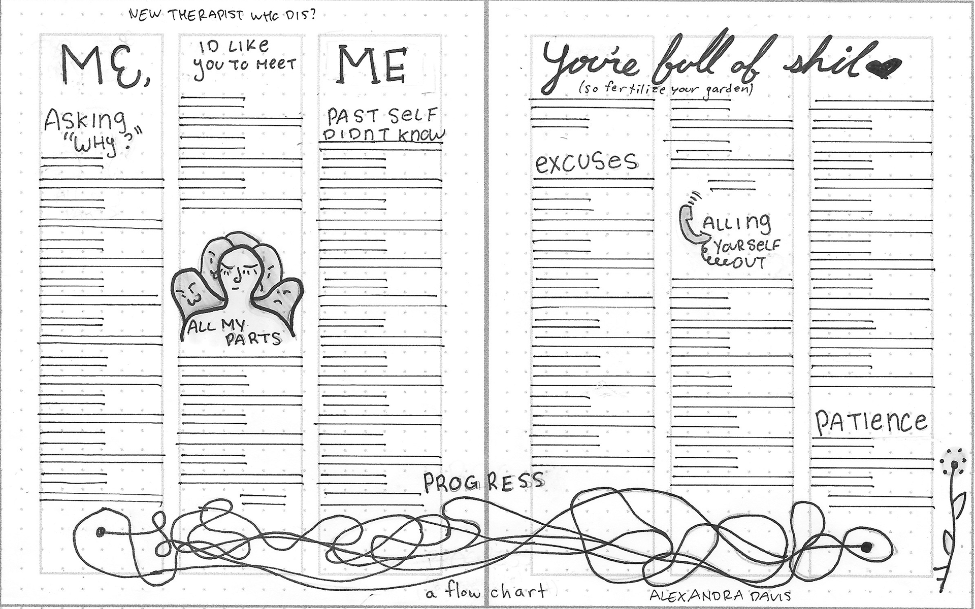
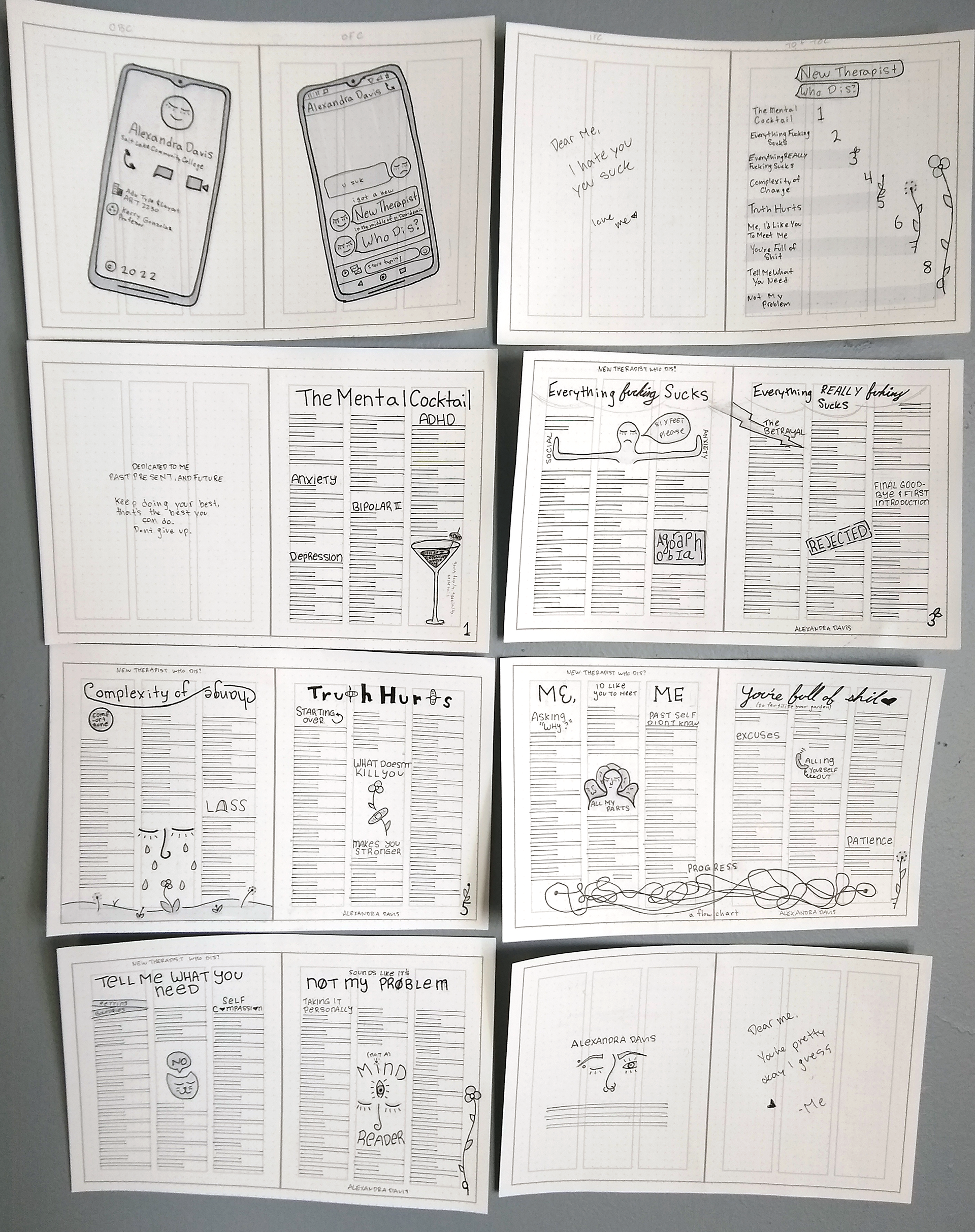
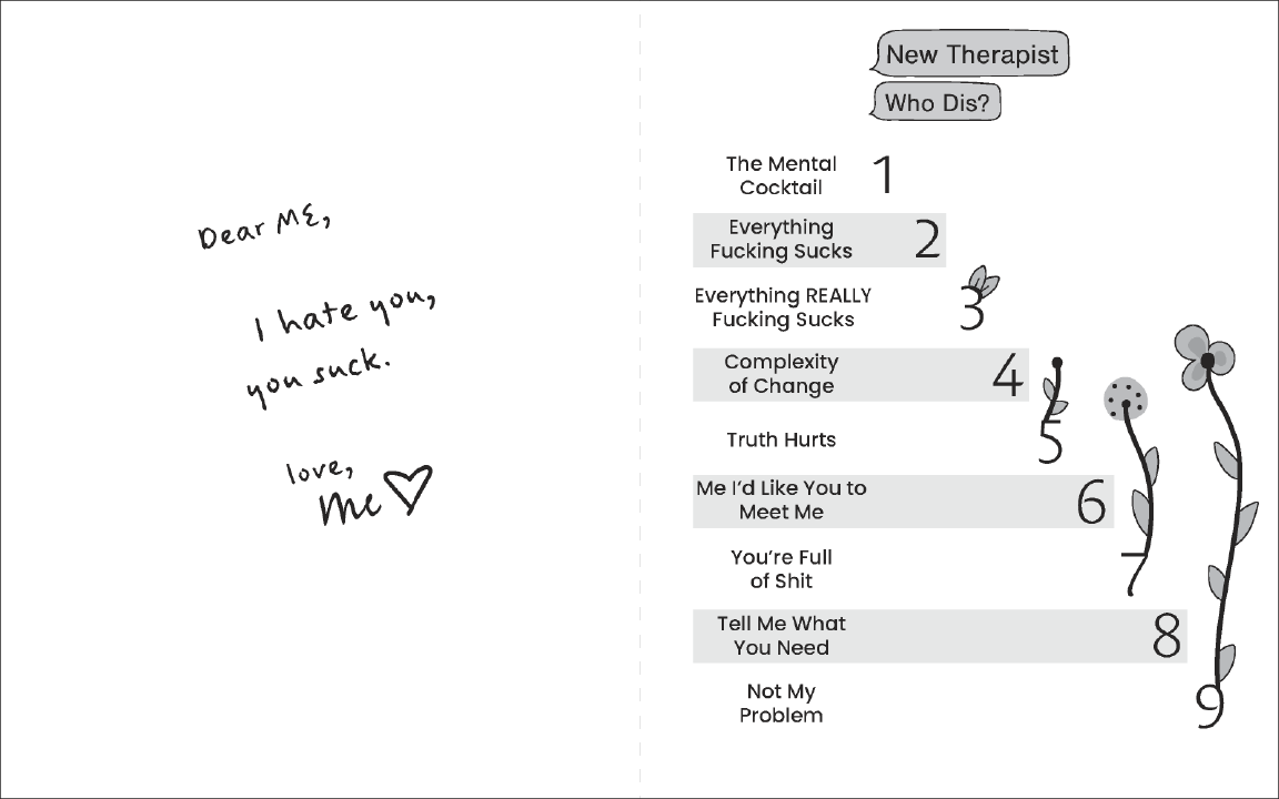
Final story breakdown

This was the only and only part of a "progress review" that I had gotten done a head of time, and not the very last second.
I knew from the start I wanted to talk about mental health, I felt like I didn't really have a lot to offer on the general subject of "our experience with covid" because everything felt so normal now.
I have gone so many years believing that "bag dump" was a commonly understood and widely used term, but everyone was like "what the hell are you talking about?" so I'm not sure WHY I thought it was a term but it's in reference to The Breakfast Club when Allison (the "Outcast") dumps her bag out and it kind of starts the whole conversation of "oh you're not who I thought you were" so that area I think changed the most.
I really didn't touch the story outline at all from my initial markups, the story just kind of gradually changed with my gradual changing of the layout in general, so I feel like not really a whole bunch of visual representation of the changes, and I didn't really know how I'd go about faking it, so, as the saying so carelessly goes: you get what you get and you down throw a fit.
Initial Dummy
Why didn't the "Initial Dummy" cross the road?
Because it didn't have the guts!
Pretty bare-bones, tried a few different margins, though I find that I'm very much like "Yeah, an inch sounds good" when it comes to all my layout margins, and when the time comes, I always wanna make them bigger. 
I had the idea for the title in mind of "New Therapist who Dis?" but not really any treatment of it at all. (In the sketches and doodles, there's a little bit where I tried stacking them in different ways.) and I felt frustrated that I had to have a subhead of some sort that related to covid, I just hated the "tacked on" feeling. 
Clearly, a problem for FUTURE me to figure out.
Thumbnail Reader Spreads
In my process of just gradually going bigger and just trusting that natural changes will happen, you have no idea how happy I was when I realized that these just so happened to be the exact right size for the thumbnails, and I since I actually started feeling good about it, I felt ready to move onto the intermediates.
I'm so lucky that I have the sister I do, she helped me mark this up so I could bust into my intermediates with flying colors! Honestly, a good portion of my degree should go to her.
The move for most of the "on the wall" pictures really would have been to take a picture of it at school on the whiteboard, because it's a pain in the BUTT to tape it all up and try no to ruin it and try to get an okayish picture of it.  So my apologies going forward for all the "on the wall" pictures.
INTERMEDIATE READER SPREADS
It's crazy how using the markers, even just a little bit of the lightest tint, makes so much of a difference.  This is when I nailed down the obvious phone cover theme. I'm not sure why I was so resistant to it at first even tho "new phone who dis" is basically the title.  This is also when I nailed down the eyelash thing as a key component to my illustrations and figured out the type of flower look I wanted.
I started feeling like "holy cow, I might actually be doing something here" which felt really nice after a LONG week of crunching to get this out.
I remember when I thought of my "six feet please" dude, I wanted to do something more complex but ended up sticking with my very first initial red pen "oven mitt" style, and I'm glad I did.
INTERMEDIATE DUMMY
This was before I got a printer that could print anything but letter size, so I ended up splicing them all with tape.  Because I taped both sides it created a LOT of bulk and the final thing is kind awkward, thank goodness that's not the final binding method!
FINAL HAND READER SPREADS
A disaster, and actual disaster.  After I finished my intermediate comp for the progress review I told myself I was going to keep working on it so I didn't put myself in an "oh shit gotta get this done" situation again. Any guesses what I did?
This was done on the weekend you reminded us that initial black and white computer comps were due the following Tuesday.  So much of me wanted to just skip this part, partly for time and partly because I felt like my intermediates were so good, but ultimately chose to do them anyways to trust the process.
I double-lined the first page, and that's when it set in really how much body copy I had "accounted for" in my other layouts, I also felt like I was making it look like absolute trash (well, even more so than I already felt like) and so I didn't double line the rest.  If I didn't use my finest smallest pen, that might have helped it too.
It was ALSO a disaster in splicing practice, I've done splicing at work so I came in all confident but splicing a little 2 inch sticker ribbon is way different than this.
FINAL HAND DUMMY
Because I already had how I wanted to bind it down and sorted out problems with it, but mostly because of how much I didn't like my final hand comp, I opted to not use energy to print and trim and to instead just move on to the black and white computer comps.
Probably not the best move, but it's a move.
INITIAL B&W COMPUTER
Oh my frick fracken gosh the covers took so freaking long to do, ridiculously long to do, I'm glad I tackled them first and I'm glad I had a good hand comp to base it off of!
At this point in the process, the three-column layout (and I mean, with three separate columns of type) wasn't going to work because it was just too much.  Doing a small outer column with a large inner was recommended, but I didn't account for it actually being recommended as "sidebars" and not part of the main story, so that made the reading it feel pretty weird, awkward, and a chore.
It was pretty agreed that the notes to self on the inside covers, and the dedication page felt pretty bare and sad and needed some love.   Some of my images used a lot darker tints and they printed out a lot darker as well, but I didn't feel too worried about that because it would (hopefully) be fixed with color.
"Truth Hurts" headline stood out and felt awkward because it was the only headline that used illustrated type in it. "You're Full of Shit" also stood out because it was the only one in an all cursive type.
Final B&W READER SPREADS
The biggest change I made was the column issue.  I kept procrastinating coming back to the zine because I didn't really WANT to do the sidebars, so ultimately just decided to ditch the thing that was making me not DO the things I needed to do, and I don't feel even a little bad about it.
I fixed the dedication page a LITTLE by changing the font to the handwritten font, which helped, but it still didn't make the page really belong.  I knew I wanted to do notebook lines for the "notes to self" as well but for some reason decided to wait until the color portion to do that (honestly couldn't tell you why, silly brain).
B&W DUMMY
This dummy is NOT the initial dummy I turned in for class since I felt like the one I turned in was really a "first B&W output" I was also not in a super great mental state so when you gave it back to me so I could take pictures of it, I took like, really really bad pictures of it because I just didn't have the energy to take great care in it, since I didn't have the energy to care for myself.
But present me is here to pick up after past me's sad low production days, we're doing our best out here.
COLOR STUDIES & APPLICATIONS

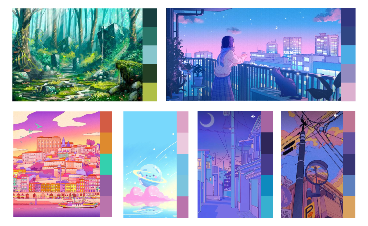
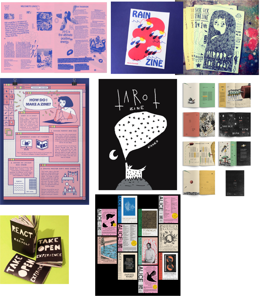
Inspo, top right is wacca
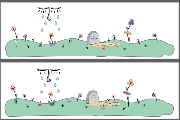
Final color pallet

Wanting it to be kinda "surreal" or something, like a dreamscape I suppose.

Accepting I need to probably go a little more "realistic"

Was feeling frustrated it wasn't reaching my "anime sunset" vibe expectations, I tried adding a gradient to the background, I liked it but felt like I'd have to figure out how to use a gradient everywhere else too for consistency n such.
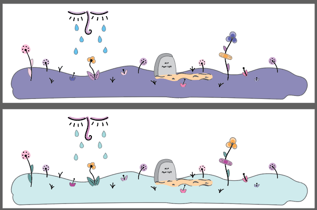
Final color!

Another classic case of "this is a disaster."
I focused on the facing pages because it's the most complex and pretty page that I spent the most time on (other than those god forsaken covers, oh lord).  I had SOME color ideas in mind. At the very beginning of this whole process, I was thinking about doing it in a similar style to "Kathy's Key" a book that is kind of like a typed journal, but with little blue and red pen doodles in the margins and circling things n such.  I also listened to well over 24 hours of "Jass Hop Cafe" playlists (jazzy chill lo-fi) and my two favorite thumbnail covers were done by a Japanese artist called "wacca" (https://www.instagram.com/wacca005) who uses primarily a blue and pink color pallet, so I kind of wanted to do that as an ode to getting me through this, but color is hard and it just didn't work out.
I was starting to feel pretty hopeless again at this point, I started off wanting it to be more surreal, but didn't like it and just gradually narrowed down what I felt like worked and didn't work.  I say I did that, but my godsend of a sister helped a bunch.  She's really good at helping me when I feel overwhelmed or frustrated by helping me focus in on one thing and sometimes just giving a simple suggestion causes a domino effect.
I also did one separately on the cover, but hated it so much that I just quite and very aggressively said "don't save" and instantly regretted it.  Managing emotions is hard, and this project has been a great example of while YES I have come a long long long way in the "managing emotions" department, I'm still not particularly good at it.  Even though having patience and sympathy for yourself and your past self is something I talk about in my zine, it takes a lot of practice to actually be good at it.
Knowing things logically and emotionally are totally different things.
I wish I did a "save as" for my first color output instead of saving over the top each time, something for the future I suppose.

COLOR COMPUTER DUMMY
The first computer color output (RIP the nonexistent save file for this specifically)
I was fortunate enough to be able to get this marked up with the help of my peers! Lots of great suggestions, I changed so much I'm sure I can't tell you all and I'm sure you don't really WANT me to list out every single thing, you're working hard, reading a lot I'm sure, I'll go easy on ya, Kerry.
Also, just a friendly reminder to get up and stretch your legs, get a drink of water, and a lil snack too!
Final Color Reader Spreads
The ghost on the dedication page was a last moment move it felt like, but also such an obvious one for people who know me.  In my web design class I somehow managed to snag the absolute BEAST of a domain name "Curious Ghost" and I'm still paying for it and I've kind of made it my brand because I love it so much, it's cute.
Check it out, even if it's just the homepage (the homepage is my favorite part, I worked real hard on it). It's definitely in my "oh my favorite colors" and is dark and emo, but I'm glad that with both classes this semester I went WAY opposite what I would normally "want" to do!
I know you're a busy lady though, so no worries if you don't take a peak. (Looking at it now, it definitely lacks my now better typography, layout, and design skills though)
Final Assembled Ensemble
Back to Top