
This project was to design a form. We're given everything that needs to be on it (no adding anything extra, abbreviation is allowed) and our task is to organize it in a cohesive manner, producing a form that's easy to look at and fill out.
Research and Brainstorming
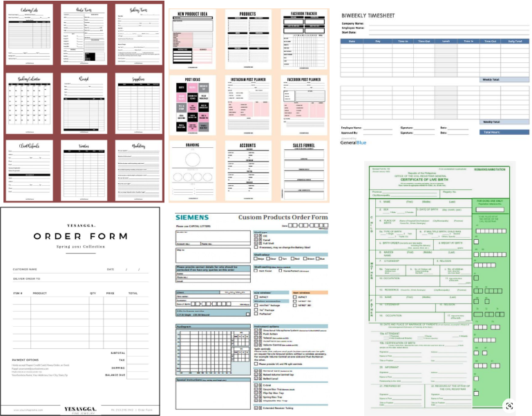

To get started, I looked at several forms, I wish I looked at more forms in person, but I didn't come across any naturally and I'm not much "go out into public and hunt" sort of person, which is a me problem that I actually need to work on.
My brain map is a bit bare, but a good form is simple, right? Keepin' it simple from the beginning, all according to plan.
Sketches and Doodles


To get started, I wanted to start off with a color-coordinated "wireframe" (not totally sure that's the right word, but it feels right, so let's lean into it) I don't think I would have any chance of my preliminary work being this tight if I didn't do that. It helped the process feel less overwhelming and ensured I made a spot for everything.
Having the wire frame done, doing the actual sketches and doodles felt easy peasy lemon squeezy, plus things always look nice small, they look even nice small when they're that tight!
Only slightly worried I'll never live up to these sketches and doodles.
Thumbnails
I felt so confident going into the thumbnails from the sketches and doodles that it took me hardly any time, and I still managed to solve a few problems (at least I'm SURE I did, I couldn't tell you what they ARE, but I'm human, so I'm bound to learn and solve problems unconsciously, so let's just trust the process). It took hardly any emotional energy to get done as well which is a major win (emotional energy does not come cheap).
It really goes to show how the start of a project, can really set future you up for success, or failure.
I'd like to have used markers, but I always convince myself that it's going to look worse with (then often prove myself wrong when I finally do it and it actually looks a million times better, silly brain).
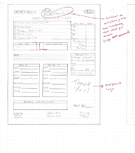
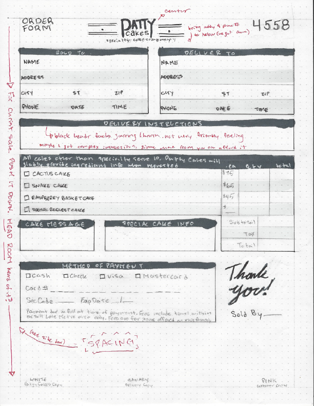
Intermediates
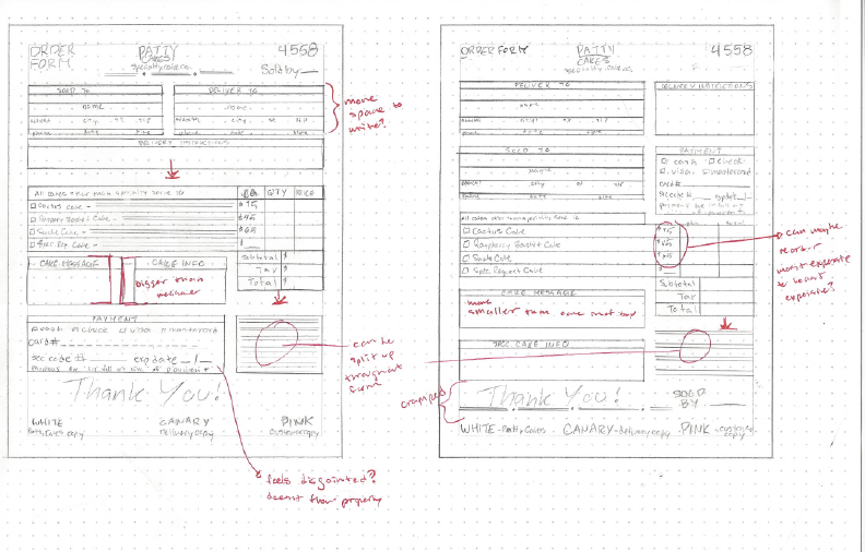
Each of these has its glaring problems. The first was done on cheaper paper that the marker bled and looked messy on (I'm not saying none of it was my fault, the lighter shades are much more forgiving to a shaky hand) but putting that aside, I felt like the black headers felt too heavy and overwhelming. I also didn't like the placement of the payment information, but couldn't think of a way to change it without changing the ENTIRE layout (basically starting from scratch).
I liked the softness of the second one, but the logo placement is a little questionable (I just needed to try something different, okay?) Overall I like the layout and think it's successful, but some of the details need rearranging.
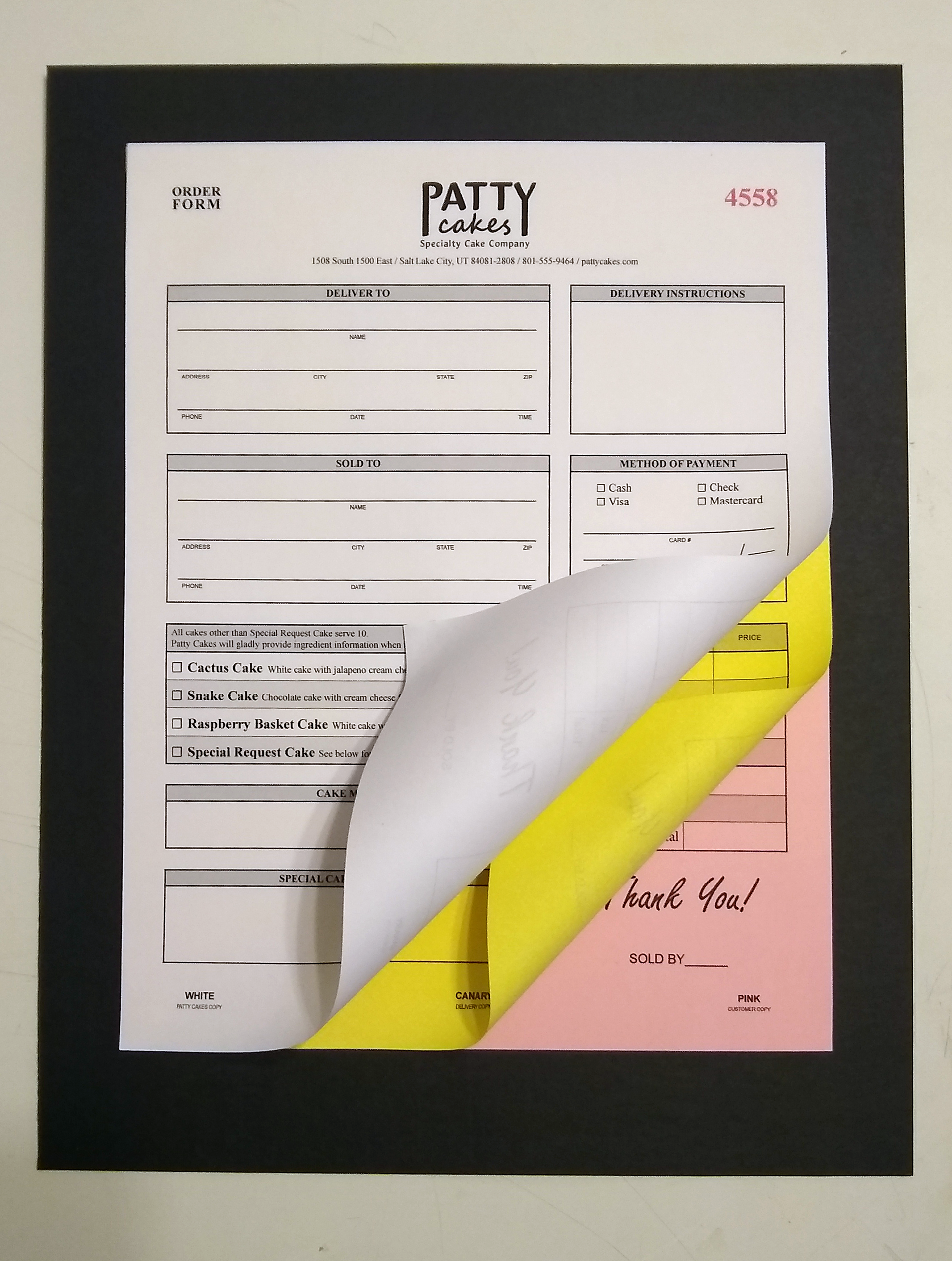
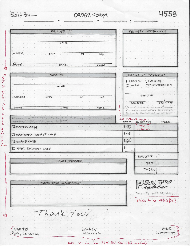
Final Hand Comp

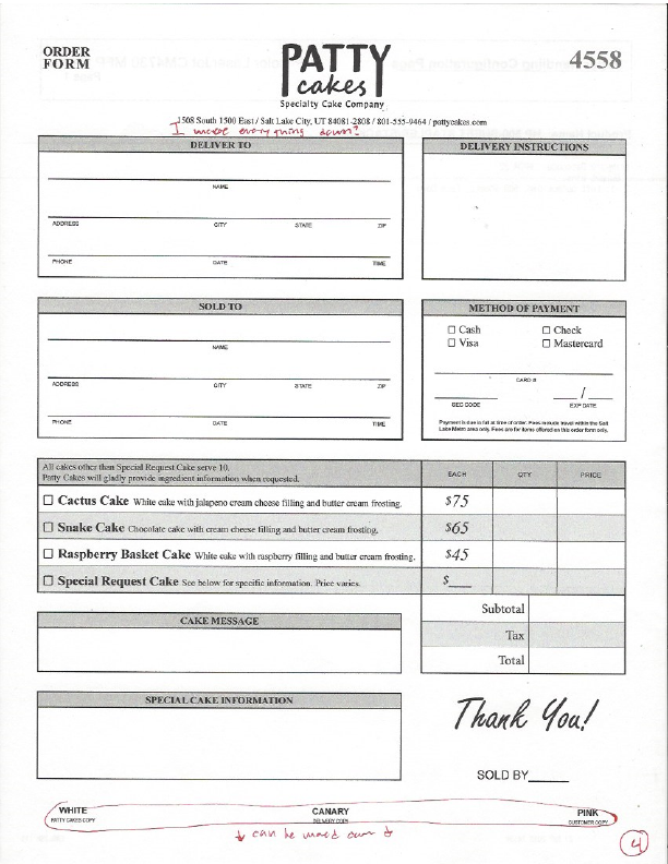
An absolute chef's kiss of a final hand comp. I could not bring myself to mark it up, and, as far as I'm concerned (at least at the time) it's absolutely perfect and nothing can be done to make it better, send it off, scan it as it is and send it out to the masses.
Computer Progressions


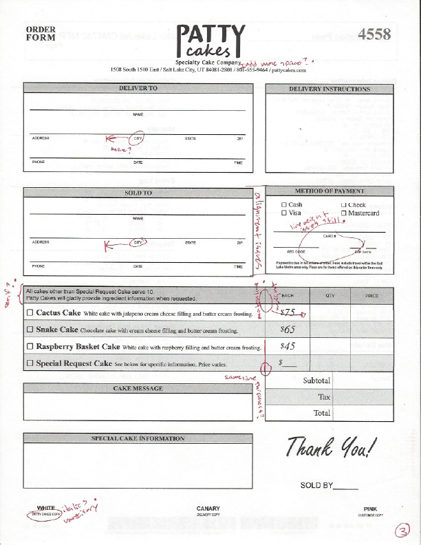
The first time ever I have proper computer progressions to offer! I definitely underappreciated the value of printing things out to look for mistakes over computer viewing.
I do feel a little concerned how little it changed from my final hand sketch, but I'm just gonna chalk it all up to me being so great and tight in the early stages. (Woo-hoo! Go past me, you rock! And thank you present me for acknowledging the hard work past me did, it means a lot.)
You haven't even seen my final form

But now you have!
Sorry, I was thinking of ways to insert a "final form" joke, it was irresistible.